The Renaissance of Wallpaper: With a twist
September 17, 2012 § Leave a comment
 The first thing my husband did when we moved into our house many years ago was rip a long piece of wallpaper off the bathroom wall. “We won’t be keeping this,” he proclaimed. Well, I wasn’t planning to start a bathroom renovation that afternoon (I had to hide the ugly blemish with towels for months), but he certainly had the right idea. All the wallpaper came down eventually and was replaced with paint.
Many of us have visions of homes with old faded wallpaper and knick-knacks everywhere or rooms where every available inch of real estate was covered: ceiling, switch plates, wastebaskets– even the window treatments matched the wallpaper.
The rebirth of wallpaper that we’re experiencing, however, is far different from what you lived through in your grandmother’s parlor.
1) Contemporary wallpaper makes a bold statement either with color, texture, large graphic design, or all three.
2) The wallpaper is a feature of the room, like a piece of art, and not simply a wall covering upon which to layer a hodgepodge of family photos, diplomas, and other objects of interest.
And that’s the major difference. It’s more about what else is going on (or not) in the room and less about the wallpaper itself. Contemporary use of wallpaper involves a more judicious placement in areas like the focal wall in a foyer (as in the photo), the walls in a guest bath, the headboard wall in the master bedroom, and the walls above wainscoting in the dining room. The wallpaper is also selected to be the appropriate scale in the room (you won’t see so many little tiny pink flowers anymore). And the furnishings in a room with bold, contemporary wallpaper harmonize with it, both through color and fabric design and scale.
So be adventuresome. If you’re feeling like your room is just a little too blah, even after you’ve painted a fresh new color, try wallpapering an accent wall. Just for fun. Your grandmother would be proud.
Choosing a Paint Color for the Cottage
May 31, 2012 § 3 Comments
It’s time to repaint the cottage — it has been that shade of grassy olive green since about 1970 and I think we’re ready for a chang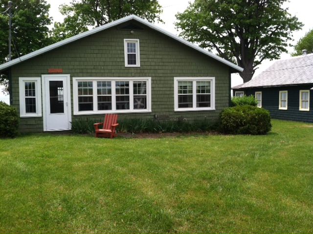 e especially since the cottage next door is also green, just a darker shade. You might think that choosing a color for my own place would be easy for me since I work with color all the time. But just like you struggle with paint color schemes, I have to go through that process too.
First of all, what colors are already in the neighborhood? We have dark green on one side, beige siding on the other, and brown and beige two doors away on either side. So that leaves quite a few options.
Next, what color is the roof? It’s a gray metal roof with a white fascia piece in front. The roof doesn’t show from the front, but it’s quite prominent on the sides so roof color is a consideration.
What color are the windows and other non-changing elements? The windows are all white vinyl (I know, but they’re easy maintenance for a cottage). We had the chimney removed (that had been the inspiration for the brick orange Adirondack chair).
So with fandeck in hand, I spun through the color possibilities. I eliminated yellow and white because they would take too many coats to cover the green. Red was thrown around as a possibility but I didn’t like the idea of red next to the dark green. Not summery enough. Orange is a great accent color but our cottage is not interesting enough architecturally to draw that much attention from a wild paint color. That brought me to gray and blue.
I tried some grays, both dark and light, on the Sherwin-Williams paint site and liked several with the gray roof. My reservation was that the cottage would need color added somewhere — otherwise it would look kind of blah. (Note: I LOVE the Nantucket weathered cedar look, but you need salt air to pull that off.)
 Finally, I tried blue. Hmmm… not a bad idea. I ended up with a WoodScapes opaque stain in a color called Chesapeake (SW3051) with a cool white trim (Rhinestone– it’s on the blue side of white) and my Adirondack chair color for the accent. I like a dark blue cottage color — it speaks to the lake water in the background and does not attract too much attention from passersby. I also like the contrast with the windows especially for a summer cottage. I used the Adirondack chair color (a custom red-orange) for the doors including the big garage door facing the road. Now it’s easy to find the party.
Spring Spruce-Up-Your-Front Door Campaign
March 1, 2012 § 3 Comments
 Your front door says more about you than you know. Who lives behind this front door?
Someone who appreciates simplicity (look at the actual door –besides the wreath, there is not one embellishment) and architectural drama (check out the Corinthian columns and the heavy layers of molding on the portico).
The person who lives here also has ties to culture (a Moravian star pendant hangs above the door) and a sense of humor (the three little silver starfish on the wreath are so cute!).
The homeowner’s color sensibilities are subtle and elegant (the understated cream siding blends effortlessly with the soft, light sage door color).
The overall impression is eye-popping as you drive by. This house is tiny (I assure you) but the entry speaks volumes.
What does your front door say about YOU?
Choosing House Colors: Pine-Green?
February 8, 2012 § Leave a comment
 Dark blue-green pine needles and rich cedar mulch present a warm house color palette perfect for homes that want to sit quietly in a wooded environment or at least conjure up the same.
Although much of the leafy countryside in many landscapes is a mixture of greens, notice that most have a yellow undertone. But not pine green. It leans more toward blue and for that reason can really stand out in a grove of maple trees.
To warm up the cool green shade, add brown and no better place than the roof (a gray roof is fine too but it will keep the house cool). Creamy trim provides contrast between the two darker shades and serves to outline the architectural detail (dark trim will get lost but use it if you are seeking camouflage).
For the front door, why not splurge and get solid wood stained a darker version of the roof color or choose a similar paint hue like Maple Syrup (Ben Moore 1105).  Black wrought iron is the best metal for hardware, lighting and accessories.
Once again, nature’s palette does all the work.
Choosing House Colors: Gray-Green?
January 20, 2012 § Leave a comment
 Look all around your environment for color inspiration. Sometimes the most complex color palettes come from places we might least expect, like a kayaking trip, for example. Look at the different shades and tones in the water and sky. They evoke a calmness that’s relaxing to look at. Then the red kayak pops out of the photo — we know it doesn’t belong there but it grabs our attention.
What if we use this scenic palette for a house exterior! The gray-green of that  water is not a color you would necessarily pick out of a paint store color chip lineup, but it’s a great house color. It’s muddy and dark and has a little bit of brown mixed with green and gray. Very complex — not a Crayola color, that’s for sure!! But paired with cream trim, a brown roof and pops of red accents, the combination fits right into its environment just like the house was plucked from the shores of Maine.
Choosing House Colors: Taupe?
January 10, 2012 § 3 Comments
 When selecting the palette of colors for your exterior, use natural materials in the environment as your inspiration. This stonework has all the colors you need for your entire house, from the dark charcoal of the roof to the taupey gray siding and even the orangey brick walkway.
Tying your house color in with its surroundings “grounds” the house — it looks like it belongs there. A house that strays too far from the natural palette looks more like a spaceship that has landed on a foreign planet. Don’t do that to your neighborhood. Save your taste-specific color applications for inside the house.
Updating a Porch with Columns
January 10, 2012 § Leave a comment
 When it comes to exterior design elements, if it looks too big up close, it’s probably perfect. And that certainly applies to porch columns. Spindly toothpick posts do nothing for the overall curb appeal of a house except add busy detail (Victorian houses with turned porch columns are the reluctant exception).
If you are building a porch or modernizing the one you have, select a few oversized columns with substantial girth. Resist the well-meaning but uninformed little voice that says the columns are too big for the house. They’re not.
Who Says You Can’t Paint Your House Pink?
November 10, 2011 § Leave a comment
 Pink can be a tasteful house color for old Victorian homes and even new-construction homes with made-to-look-old character. Ranging from bubblegum to rose to petal pink and even lavendar, you name it — we’ve seen it.
Although some homeowners may go a little over the top with the pink, here’s a house that I find to be really well done. The soft ballet-pink hue is paired with creamy white trim and topped with a medium gray roof. What works so beautifully for this property is that the gray is carried over to the garage outbuilding that stands alone completely in both style and color. By limiting the pink to the house only, the homeowners have balanced what might be considered a soft feminine palette with a dose of solid, neutral dark gray — a touch of masculinity, if you will. The design principle of balance, the yin and yang, is evident here. And it works!
Sporting a Patriotic Color Scheme
November 7, 2011 § Leave a comment
 With all due respect to my international bloggers, this house sings America the Beautiful to me every time I drive by. This time, I stopped to capture its beauty and share it with you.
What makes this red, white, and blue color scheme work so perfectly is the balance of color between the candy-apple-red siding and the creamy white trim. Notice on the flag hanging on the door that, for the most part, neither the red nor the white stripes dominate. Both colors balance each other. That same effect is evident on this house — the exceptionally wide trim painted a soft cream keeps the red from overpowering the house. Just like the flag, the house is balanced.
Navy blue accents the doors — just like the small block of navy blue in the upper lefthand corner of the flag provides a contrasting backdrop to the white stars.
If you have an old farmhouse or an outbuilding on your property that you would love to feature, consider painting it red with creamy white trim and navy blue doors. Hang the flag out front. You’ll attract attention but go ahead. Be proud!
Choosing Shutters and Trim for Historic Homes
November 1, 2011 § Leave a comment
 Historic brick homes like this one, built in 1810, have an exterior look to maintain. Many are under the control of town boards that determine what changes can be made to the house. But even if you own an old home or are considering buying one that is not in an historic district, don’t even think about replacing the wood shutters with easy-maintenance vinyl or the wooden front door with fiberglass.
Exterior “upgrades” that only consider the time management issues of the homeowner are not upgrades at all. Instead, embrace your older home and its history. Preserve the look by choosing a paint trim color that is not too new-looking. A gray, beige, or grayed-white will give an aged look to the trim that is appropriate for the age of the house. Charcoal instead of black will give the shutters and door a faded-black look that freshens up the paint job without destroying the look of the house. Use wrought iron or brass for your metal instead of nickel (too contemporary). And use native plants for your landscaping instead of the current, most trendy flowering shrubs.
Buck the urge to over-improve with new man-made materials. Let’s preserve as much history as we can!
