Stone and Brick Reveal Your Exterior Color Palette
January 25, 2013 § Leave a comment
 Yes, it’s winter and the roof in this photo is covered with snow, but now we can focus on the rest of the house, particularly the stone. What works on this house is the color palette that is taken directly from the numerous available hues in the stonework itself.
The bricks are a monochromatic rusty red color that complements the stone without competing with it — a challenge when you have multiple materials on the house. The siding is a gray neutral, also in the stone. The trim is pulled from some of the darker taupe stones. How easy is that? Job done.
If you are building a home with different materials, use the busy one with the most colors (stone or brick) to make the rest of your color decisions. That way, the whole house will come together in a harmonious cornucopia of color.
The alternative? Choosing a color that is not in the palette at all. The result? A disjointed effect that divides the house into sections and makes it seem smaller. Can be done, but it’s tricky and needs a professional colorist to pull off. Do yourself a favor and stick with the natural palette that presents itself to you from your building materials.
Color Your Home Happy
January 18, 2013 § Leave a comment
 Whether you live in a deluxe villa or a double-wide, you deserve a happy home. And the place to start is by adding color. Numerous studies have shown that color influences the way we feel and can even be used to describe our emotions (“I’m in a blue mood”).* But what may influence us the most is a lack of color.
The study found that people with depression associated their mood with the color gray. And you don’t have to paint your walls gray to have a gray aura in your home. Take a look around your house, in the corners and shadowed areas and particularly the ceiling. Do you see gray? Do you feel blah? Well then… time for color.
Start by painting your ceiling either a bright white or a tint of your wall color. That will either maximize the light reflection in the room (and bolster your mood) or make the room feel bigger and more open. Either way, you’ll feel better.
Next, if you’re timid about your color-selecting skills and afraid to make a mistake with the wall color, then start small. Add some colorful accessories to the room — pillows, artwork, other changeable items. Doing that will help you create a palette of colors you like without making a big investment or paying a painter to repaint two or three times.
When you’re ready to take the plunge and add color to your walls, try an accent wall first. Pick the wall that you see when you enter the room (the focal wall) and paint that a color you like. Add accents to the room in the same color to pull the room together. Keeping three walls neutral with pops of color on an accent wall and accessories here and there will help you step into the world of color without any Crayola catastrophes.
Note: There is nothing wrong with neutrals and whites in the home. To many people, neutral means calm. But if you are somebody who likes to wear color and you are drawn to color yet your home does not reflect that love of color, then it’s time to add color. That’s what I’m talking about.
*http://www.livescience.com/6084-colors-describe-happiness-depression.html
Furniture Arrangement Challenges May Call for Different Furniture
January 16, 2013 § Leave a comment
When it comes to furniture placement, some rooms just will not cooperate. With bay windows, bow windows, niches, dormers, and other odd architectural challenges, where on earth do you put your sofa? One solution is to forget the sofa altogether and replace it with a circular arrangement of very comfortable chairs, either all matching for a formal look or all mismatched for a casual eclectic look.
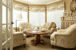
Either way, the arrangement gives you an instant, inviting seating area where you can sit down with others and have a cup of coffee or read the paper. In this photo, the designers put a round coffee table for holding popcorn, drinks, books, and just about anything else. But as you know, I’m a big fan of the big overstuffed ottoman– what I consider to be the perfect piece of versatile furniture– so that would be my choice for the center.
If you simply cannot figure out where to place your living room sofa, consider moving it to the family room or wherever the TV is. Replace the sofa/loveseat/chair concept with four comfy upholstered chairs. You’ll love the change.
Tired Brick Fireplace Takes Cover
January 9, 2013 § 4 Comments
 Sometimes the “bones” of an old house fall under the category of “What were they thinking?” You could say that about this brick fireplace with its random placement of dark bricks and the outdated brass enclosure. But not to worry. Your family room is not doomed to the styles of 1972 — you have options. One of the best ones is to paint the brick as shown in the after photo (from Southern Living Magazine’s Makeovers).
The homeowners covered the offensive brick with a flat, textured paint in the green wall color. They painted the hearth in a natural stone color. Then they added two bookshelves for a built-in look and painted them the same green. The new fireplace insert in a bronze color blends nicely. A narrower mantel and corbels painted cream pop off the green — art finishes the focal point.
The overall result is a fireplace wall with emphasis on everything but the original dated fireplace. When faced with old brick or other outdated hardscape in your home, consider painting it for an almost instant update without the expense of covering it or replacing it. This makeover was a huge success. No more ugly brick.
Everybody’s Favorite Neutral: Revere Pewter
January 4, 2013 § 2 Comments
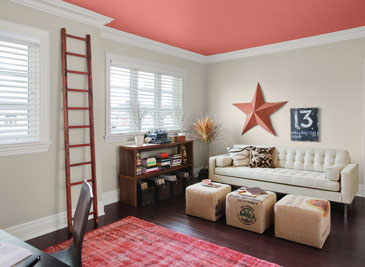
As our design aesthetic moved steadily from beige to gray over the past several years, one warm gray popped up as the perfect transitional color. Benjamin Moore’s Revere Pewter HC-172 is currently the number one all-around neutral as it is not too light, not too dark, not too yellow, not too green, not an ounce of pink, and even not too gray. Perfect with all kinds of complementary colors including this luscious Persimmon 2088-40 on the ceiling.
I like Revere Pewter in public areas like the dining room as it looks spectacular with warm golds and crystal. In the kitchen, it highlights the stainless steel appliances. In the hallway, it even makes a golden oak bannister look terrific.
As one fan describes it, the color “calms and restores, like driftwood found on the beach.” Yup. Kind of makes me want to dunk the whole house in it.
Return of the Gilded Age, Well Not Exactly
January 3, 2013 § 1 Comment

We have Downton Abbey, Princess Kate, and the popularity of all things English to thank for the resurgence of gold in interior design right now. At least that’s my opinion… And what a welcome sight it is.
After too many years degilding homes of anything that even hinted of gold, brass or yellow, the hue of royalty has returned.
The new interpretation, however, is decidedly fresh as we see in this living room from Traditional Home magazine. The wall color is so subtle that it accentuates even the creamy tan stripe on the window panel and the moldings on the ceiling. The gold demilune table and classic gold-framed art above it pop. As does the Chinese porcelain, as if pulled directly from the painting. Even the floor color is perfect, establishing a solid grounding upon which to layer all those beautiful blues and wheat tones.
The look is not your grandmother’s living room, with all due respect to your grandmother. Gold is nolonger shunned from updated decor.
Welcome back, gold.
Interior designer: Joseph Minton, with Paula Lowes and Michelle M. Wade
Hop the Trend: Consignment Stores
December 29, 2012 § Leave a comment
Okay, I admit it. I am a consignment store junkie. And with good reason. Not only is it “green” to furnish your home with items that have been around awhile, it’s amazing what you can find for a fraction of the retail price for a new item. And the consignment bug has started to spread to my clients. During one project, we were looking for a settee of a specific length to fit in a tight spot. Tricky to find new anyway unless we went custom. My client decided to check out the local consignment store, and he found the perfect piece. Even the legs and wood color were perfect. Call it luck or call it karma.

The Cannery Exchange in Newport Beach, CA. (photo credit: Jody Tiongco)
I am convinced that these vintage pieces have a soul — they certainly have a history visible by the lovely worn patina on the arms or the scratches on the tabletop. But every scratch has a story attached to it, and that story comes with the piece to its new home.
You can always paint and recover a chair, for example, if you want a painted furniture look. Again, you’re probably starting with a chair that’s far better constructed than what you can find now so you’re already ahead. It’s like finding a piece of gently worn designer clothing or better yet a piece with the tags still hanging on it. Bonus!
Give your home some character by adding a piece or two of consignment furniture. But beware. You might catch the consignment bug too.
Brick House Trim Colors
December 26, 2012 § 338 Comments

Creamy white trim with black shutters (and door) give brick houses like these on historic Nantucket Island in Massachusetts a classic traditional look that is timeless. But for a more contemporary look, use the brick itself for your trim color inspiration. Choose a color that you see in the brick or the grout– tan or taupe or another earthen color. If you select a color from the brick, it will blend with the brick and provide less contrast than the white. The overall effect will be soothing and contemporary but it will call less attention to the architectural details. The Boston building below is hardly contemporary, but the color scheme is taken from the brick and grout and is one example of using coordinating trim colors instead of contrasting trim.

Painting Your House Red
December 3, 2012 § Leave a comment

What Color Should I Paint My Ceiling?
November 29, 2012 § 266 Comments
The ceiling is the fifth wall and many decorators and designers feel that keeping the ceiling white is like “throwing a sheet over the room” (Christopher Lowell said that years ago). But there are a few conditions to consider before painting the ceiling anything other than white:
1) Is your ceiling heavily textured? In many old houses, the ceiling is patterned (and God forbid, “popcorned”) and therefore very difficult to paint well. Also, painting it anything other than white will call attention to it and maybe that’s not what you want. One solution is to have your ceilings replastered to match your walls and painted, but if that’s out of the question, I would stick with white.
2) Is your ceiling a smooth plaster? If so, you should definitely paint it. How lucky you are! See below for what color.
2A) Is your ceiling really high? If so, you can paint it virtually any color that goes with the rest of the room. If you’d like to bring the ceiling down visually, consider a color darker than your wall color or a warm color (both will advance and appear to bring the ceiling down to a level that’s more in scale with your room). Also consider adding crown moulding if it’s not already there. The moulding will also bring the ceiling down by calling your eye’s attention to it. And it really finishes the room.
|
|
|

2B) Is your ceiling low or average height? Consider painting it a tint of the wall color. If your walls are a medium blue, then your ceiling would be the very lightest blue on the color swatch or even lighter (white with a dash of blue). This will help to round out the room and make the ceiling part of the overall decor — not just that white sheet over the top.
3) Does your room have enough light? Bright white ceilings do help bounce light back into the room so if your room is already dark, pay special attention to the ceiling color. White can be used effectively, but light tints on the ceiling will also reflect light. Just avoid a ceiling color that is going to absorb all the light and leave the room dark.
4) Are you painting a guest bath? I like to paint the wall color right up over the ceiling in a guest bathroom. Doing that makes the room feel larger by blending the walls and ceiling together and avoiding sharp lines and corners. Or do something kind of exotic on the ceiling, like the Moroccan tent (see photo above).
5) Are you painting a bedroom? In what other room do we lie around and stare at the ceiling? Why not paint it something interesting. In a bedroom, the sky’s the limit (literally) — from puffy blue clouds on a backdrop of sky blue to a quilt of squares in different colors (Candice Olson did a fabulous multi-colored geometric ceiling in a master bedroom). And in kids’ rooms, the ceiling is just one more space to use your creativity.
Hope this helps the “Do I paint the ceiling?” dilemma.
