Choosing a Metal Roof Color
January 7, 2013 § 4 Comments
Just a pet peeve of mine, but I really do not care for a bright red metal roof on an old historic stone house. I know that some of my bias is regional–I’m sorry if I’ve offended anybody’s taste. But what I much prefer is a color that comes from the stone itself. What that does is blend the roof with the house and not call it out like a big old stop sign on a dirt road.
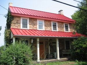
This photo shows a neutral option for a metal roof color. Perfect actually for the little stone house above.
If you are choosing a metal roof color for your home and you do NOT want to feature the roof as the focal point of the neighborhood, choose a color that blends or approximates a traditional roof color (grays, bronze, brown, charcoal, black). On the other hand, if you need people to find your house in a snowstorm, then choose a bright Crayola color and love it. Fair warning.
Black: Sophisticated, Modern, House Color?
January 2, 2013 § Leave a comment
Just like the LBD (little black dress), black houses are popping up all over and with predictably dramatic effect. The trend seems to be particularly hot in Southern California although I’ve seen it in Massachusetts too. Why black? Well, why not.
-Black as a house color fits into any neighborhood and certainly stands out from the myriad white, yellow, and beige houses already out there.
-Black looks terrific in the winter if you have snow in your area. We all know how dirty white houses can look even after a fresh snowfall.
-Black can make a small, insignificant ranch look modern and even spacious. Add a pop of bright color to the door and you have a stand-out in the neighborhood instead of a ho-hum been-done-before.
-Black, like white, makes any color look good. Imagine the opportunities for vibrant landscape color along the foundation of a black house.
-Black is a color to consider if you plan to paint your red brick rambler. If you’re tired of the tract house vibe, why not make a major statement.
When does black on the house NOT work? When it starts to fade unevenly and make the house look like charred remains of a terrible event.
If you decide to paint your house black, you must prepare to keep the paint fresh, the lawn mowed, the weeds pulled, the clutter corralled, and the driveway plowed because your house will create quite a sensation on the block. Nobody will drive by without noticing. And that’s kind of fun.
Bored with beige yet? Consider black.
Brick House Trim Colors
December 26, 2012 § 338 Comments

Creamy white trim with black shutters (and door) give brick houses like these on historic Nantucket Island in Massachusetts a classic traditional look that is timeless. But for a more contemporary look, use the brick itself for your trim color inspiration. Choose a color that you see in the brick or the grout– tan or taupe or another earthen color. If you select a color from the brick, it will blend with the brick and provide less contrast than the white. The overall effect will be soothing and contemporary but it will call less attention to the architectural details. The Boston building below is hardly contemporary, but the color scheme is taken from the brick and grout and is one example of using coordinating trim colors instead of contrasting trim.

Light Up Your Front Door
December 12, 2012 § Leave a comment
Why wait for the holidays to light up your front door? You spent enough time choosing the color — show it off all year with a boost in your exterior lighting.
Choose properly spaced recessed fixtures that will wash light down on the door color and other parts of the porch as in this photo (lighting by Illumination s, Inc.). Or add a large pendant over the door and sconces on either side. Make sure the lighting fixtures are big enough that they don’t look skimpy from the street. Bigger is usually better when it comes to lighting.
While you’re choosing your new light fixtures, take advantage of all the different metal color options you have now. Don’t settle for wrought iron if another color would update your house and make it look fabulous.
So when the holidays are over and you take down the hanging twinkle lights and box up the spot light from the front door, take a close look at what lighting is left. Maybe it’s time for an upgrade.
Let there be light!
Painting Your House Red
December 3, 2012 § Leave a comment
Choosing Paint Colors for House Trim and Doors
November 29, 2012 § 448 Comments

The front door is the focal point of your house and it can make a big splash. (Even though Great Britain’s former Prime Minister Tony Blair reportedly changed his 10 Downing Street door color from conservative black to Labour Party red as seen in this photo from the Daily Mail, evidently it was all an April Fool’s joke — see the full story at http://news.bbc.co.uk/1/hi/magazine/8677004.stm)
Doubtful that changing your own front door color will create as much of a stir in the neighborhood, but you’ll want to give it considerable thought anyway.
But first, what about the trim color?
House trim color: If you have a small house and you want it to look bigger, consider painting the edge trim the same color as the house or just a shade lighter. This will blend the corners of the house in with the body and draw your eye to color — hopefully, the front door. If you want to show off the trim in a more contemporary way, consider painting the edge trim two shades darker than the house color. To accent your trim in a traditional way, choose contrast by using either white or cream. If you have a stone house, the grout color is a great trim color.
The message here is to avoid too many different hues (different colors) when painting the house, trim, doors and shutters. Unless you have an architectural masterpiece, I would avoid choosing trim colors that are unrelated to the house color (for example, painting a gray house with navy blue trim, red shutters and red garage doors). Not only will you draw attention to all the different colors themselves and away from the front door (regardless of what color IT is), but you will have visual chaos!
Exception: If you have an old Victorian home, you may want to accent all the different architectural elements with paint in many different colors.
Trim around windows: To keep the windows looking as large as possible, paint the trim around the windows the same as the window frames, either white or cream or whatever color the window frames are. Matching the trim to the actual windows will make them look bigger than if you break up the color by painting a dark trim around a white window or a white trim around a dark window.
Garage door color: Unless you want to broadcast to your neighbors that you have a three-car garage, you probably don’t want to highlight your garage doors. Standard garage doors should usually be painted either the color of the house or a couple of shades darker to “anchor” them. Plus, by painting the garage doors the house color or a little darker, your house will look bigger and less chopped up. The focus is reserved for the front door. Note: yes, metal garage doors can be painted even if they’re white when installed. Just clean the doors very well and use a good primer.
Exceptions: Garage doors associated with brick homes are often painted either the trim color, the grout color, or the shutter color — black or dark green, for example. No need to try and match a paint color to the brick. The other exception is the new carriage-style garage doors, designed to be the focal point on the front of a home. If you have fancy garage doors, it’s okay to show them off! Even keeping them white or the trim color is okay.
Shutter color: For a traditional look, match your shutters to the roof color. If you have a dark gray or black roof, black shutters look terrific. It’s like adding a touch of black to a living room to dress it up a bit. Matching the shutters to the roof makes it look like you planned your roof color as part of the overall house palette. Dark brown shutters with a brown roof color give a similar, traditional look as black shutters with a gray/black roof. And brown is supposedly the new black. But for a classic home, black will never go out of style.
If you have lots of really small windows or don’t want dark shutters, consider choosing a color that blends with the house color. Here’s one strategy: choose your house color in the medium range. Then go lighter for the trim and a shade or two darker for the shutters (or remove the shutters altogether). And choose a completely different hue for the front door. This contemporary look focuses attention on the front door. There are no distracting colors anywhere else on the house.
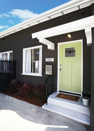
Front door color: It’s time to create your focal point, the front door. This is the area you want guests to find when they pull in the driveway. Color is the way to do it although a shiny black door with a brass kickplate, brass door handle, and big colorful wreath is a classic. If you don’t want black, consider a rich dark red in a semi-gloss finish. Dark red (not cherry) seems to work with almost all house colors.
Here are a few other ideas:
- Light green house. Traditional: Dark purple door (especially nice if you have lilacs and other purple flowers in your landscape) and white door trim. For a modern look: Rusty red.
- Dark green house. Traditional: Rusty red door or natural wood and cream door trim. Modern: Turquoise.
- Light blue house. Traditional: Dark red door or navy blue door with white door trim. Modern: Dark olive green.
- Dark blue house. Traditional: Maroon door (play up the nautical look) with cream door trim. Modern: Lime green.
- Red house (or brick). Traditional: Black door with brass accents (classic) and white door trim. Modern: Grass green.
- Brick house. Traditional: Mahogany door with light grout color door trim. Modern: Dark purple.
- Pink house. In the North, a charcoal or black door. In the South, anything punchy. White door trim.
- Gray house. Traditional: Navy blue or red door with white door trim. Modern: Bright lemon yellow.
- Brown or tan house. Traditional: Dark green door with white door trim. Modern: Robin’s Egg Blue.
- Yellow house. Black door, black shutters, white door trim (a classic look). Modern: Dark red.
- White house. Traditional: Black, red or other dark rich color. Modern (or in warmer climates): Any bright, cheerful color that works with your landscape plantings. White trim everywhere.
One woman I read about paints her front door for every season. It might be cranberry red during the winter, purple in the spring, raspberry during the summer, and rust during the fall. Every year it’s different.
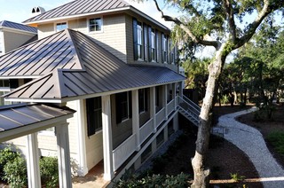
Don’t forget the roof: Consider the roof color when you’re making your house color choices and if you’re getting a new roof, choose something that coordinates with your house color. There are many choices in roof colors these days particularly in the brown family– many more choices than just slate gray or black. Don’t pass up the opportunity to finish the job with a well-coordinated roof.
Which Came First? The house color or the foundation plantings?
October 1, 2012 § 2 Comments
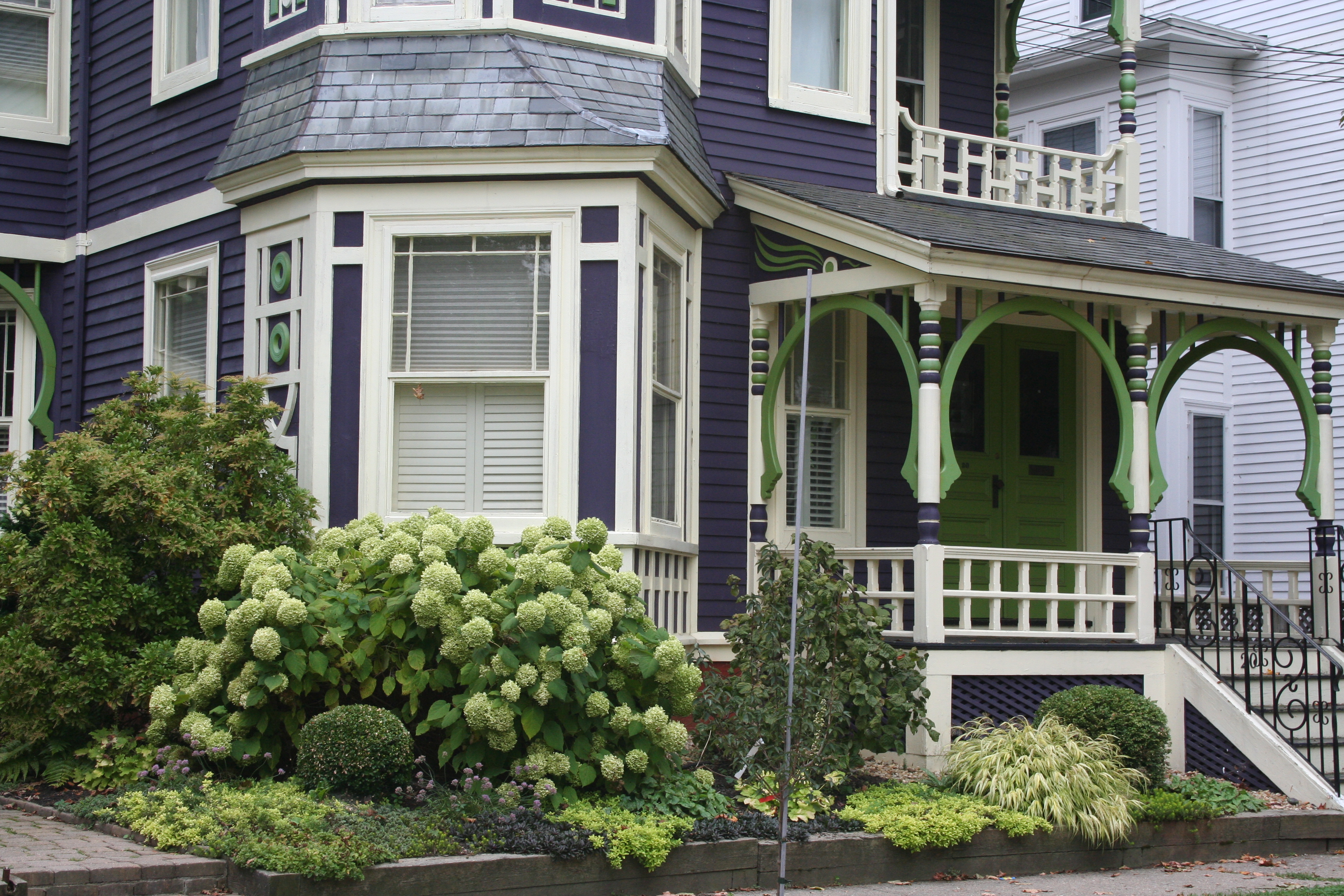 My guess? Neither. Take a close look at the roof, and the house color palette is revealed. The deep purples and greens of that slate roof present a palette the homeowners can use for their house: rich grape for the siding color tempered by a neutral cream trim and lime green for the accent color to highlight the Victorian embellishments.
But the homeowners did not stop there. To enhance the palette and spread the accent color out onto the landscape, they planted a gorgeous lime green Hydrangea coupled with other lime green plants, shrubs, and ground-cover species. Peeking out from under all that greenery is a purple flowering ground color pulling the whole look together.
Not to be matchy-matchy or anything, but this house rocks. There’s just enough contrast to keep our interest and show off the house detail without introducing new colors that might make the house too busy. Afterall, the house itself has so much detail that you wouldn’t want it to get lost in a rainbow of foundation plantings and annuals.
Before and After Ranch Re-do: Working with the Roof Color
September 4, 2012 § 4 Comments
 Perplexed homeowners posted a dilemma on the blog. After deciding to keep the Desert Tan roof and aluminum windows on their newly remodeled 1960s atomic ranch, they struggled to come up with colors for the siding, trim and front door.
Making matters a little more complicated, they panicked (well, you know) when they saw the newly installed aluminum and glass garage doors they had selected and felt they overpowered the house.
Knowing the homeowners did not really like their roof (chosen by previous owners), I offered a couple of paint color options that would coordinate the siding with the roof. Contrasting the siding color with the roof would have made the roof pop off the house– not something the homeowners wanted. (When you’re trying to camouflage something, think blending.) I gave them Mayflower Red (Benjamin Moore HC-49) and Maryville Brown HC-75.
For trim, I suggested they match the paint color to the aluminum windows and garage door. The homeowners did the leg work — Metro Gray 1459. Then to draw the eye along the wonderful curved pathway and over to the front door, we needed color. I suggested something like Charlotte Slate AC-24
or Amethyst Shadow 1441? They went with the Amethyst. I don’t think you’ll see another house just like this one, and that, in the world of curb appeal, is refreshing!
Homeowner: The Mayflower Red pulls the red out of the roofing, makes the aluminum pop and has the added attraction of being different from anything else in the neighborhood without screaming “look at me.”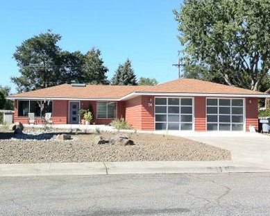
Choosing a Paint Color for the Cottage
May 31, 2012 § 3 Comments
It’s time to repaint the cottage — it has been that shade of grassy olive green since about 1970 and I think we’re ready for a chang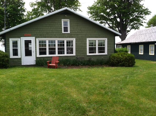 e especially since the cottage next door is also green, just a darker shade. You might think that choosing a color for my own place would be easy for me since I work with color all the time. But just like you struggle with paint color schemes, I have to go through that process too.
First of all, what colors are already in the neighborhood? We have dark green on one side, beige siding on the other, and brown and beige two doors away on either side. So that leaves quite a few options.
Next, what color is the roof? It’s a gray metal roof with a white fascia piece in front. The roof doesn’t show from the front, but it’s quite prominent on the sides so roof color is a consideration.
What color are the windows and other non-changing elements? The windows are all white vinyl (I know, but they’re easy maintenance for a cottage). We had the chimney removed (that had been the inspiration for the brick orange Adirondack chair).
So with fandeck in hand, I spun through the color possibilities. I eliminated yellow and white because they would take too many coats to cover the green. Red was thrown around as a possibility but I didn’t like the idea of red next to the dark green. Not summery enough. Orange is a great accent color but our cottage is not interesting enough architecturally to draw that much attention from a wild paint color. That brought me to gray and blue.
I tried some grays, both dark and light, on the Sherwin-Williams paint site and liked several with the gray roof. My reservation was that the cottage would need color added somewhere — otherwise it would look kind of blah. (Note: I LOVE the Nantucket weathered cedar look, but you need salt air to pull that off.)
 Finally, I tried blue. Hmmm… not a bad idea. I ended up with a WoodScapes opaque stain in a color called Chesapeake (SW3051) with a cool white trim (Rhinestone– it’s on the blue side of white) and my Adirondack chair color for the accent. I like a dark blue cottage color — it speaks to the lake water in the background and does not attract too much attention from passersby. I also like the contrast with the windows especially for a summer cottage. I used the Adirondack chair color (a custom red-orange) for the doors including the big garage door facing the road. Now it’s easy to find the party.
Spring Spruce-Up-Your-Front Door Campaign
March 1, 2012 § 3 Comments
 Your front door says more about you than you know. Who lives behind this front door?
Someone who appreciates simplicity (look at the actual door –besides the wreath, there is not one embellishment) and architectural drama (check out the Corinthian columns and the heavy layers of molding on the portico).
The person who lives here also has ties to culture (a Moravian star pendant hangs above the door) and a sense of humor (the three little silver starfish on the wreath are so cute!).
The homeowner’s color sensibilities are subtle and elegant (the understated cream siding blends effortlessly with the soft, light sage door color).
The overall impression is eye-popping as you drive by. This house is tiny (I assure you) but the entry speaks volumes.
What does your front door say about YOU?
