Enough about Neutral–I’m Craving Color
May 13, 2013 § Leave a comment
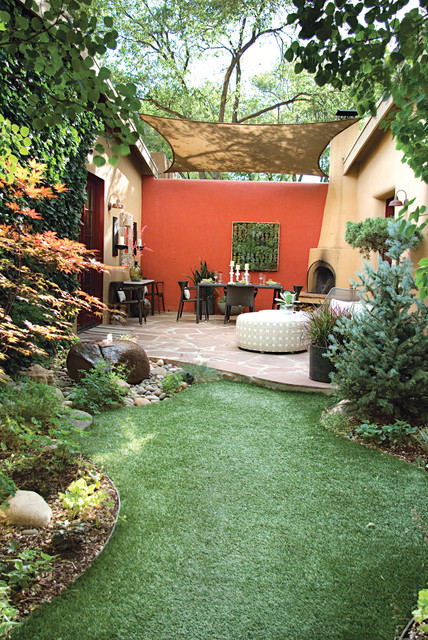
Who says accent walls are so last decade? Not me. I love how a carefully chosen wall or piece of architectural interest can be highlighted dramatically by color.
Here we see how bold color creates a defined outside eating area with all the drama of an interior dining room. Why not! It’s okay to use accent color on the outside of the house to warm up a patio, jazz up a porch wall, or provide a colorful backdrop to a garden. It’s spring. Get out there and do some color!
Black Brings It
March 20, 2013 § Leave a comment
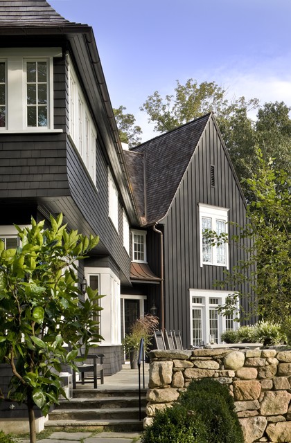
Who says black is not a house color? Certainly not me. Black is to houses what a little black dress is to a stylish woman. A great way to show your stuff.
Black is both dramatic and neutral. It attracts attention and shies away from it. Black blends with almost any environment, yet it makes all other features stand out, like the crisp white windows on this house. Since the trim on the rest of the house is also black, the white windows and window trim take center stage. The natural cedar roof creates warmth and texture. And the bronze gutters look like jewelry.
Another feature that stands out is the rock wall. The backdrop of black allows the depth of color on the rock wall to come forward — much more effectively than if the house were another more typical earth tone.
The mix of siding materials adds an additional layer of texture. The tall board and batten siding on the high gabled section makes a tower of that end of the house. The shakes on the rest bring it on home.
Yes, black maintains its reputation as the color of sophistication. Even for siding.
Do You Have Two Front Doors?
March 13, 2013 § Leave a comment
 Many of us have more than one entrance on the front of the house, and sometimes one is rarely used. How do you indicate which door you want visitors to enter? Do you paint both doors an accent color or just one?
If you use the main front door as your guest entrance — if you’re having a party, say, and don’t want people traipsing through the kitchen — then paint that front door an accent color (red in this case) and all other doors a color that coordinates with your siding (maybe a shade or two darker or just the trim color). If you paint both front doors red, we are not only left with two focal points but we’re confused as to which door is preferable. Painting only one red door will announce which one is open for guests. In this photo example, the homeowners painted both doors red but distinguished the front door from the porch entrance with a wreath. Not quite as clear as using color, but it works.
Now here is where it gets tricky. If you NEVER want anyone to go to the front door, then paint that door a neutral color that coordinates with the siding and paint the porch door red. It’s okay. The same applies to all the various side doors, garage doors, and shed doors. Paint them all a coordinating color but not the same as your main door. That guest entrance is special.
Just a guideline if you’re struggling with too many doors and what to paint them.
Choosing a Siding Color to Coordinate with Brick
March 5, 2013 § Leave a comment
 Where a particular hue sits on the color wheel can make a world of difference when it comes to choosing house colors. Especially if you’re trying to coordinate the color with another material, like brick.
In this example, one yellow leans toward orange. The other one leans toward green.

I don’t think I need to say any more.
It’s the House Color, Not Your Dining Room Curtains
February 28, 2013 § 2 Comments
 Sometimes the best house color is one you might skip right over in the fan deck. Like this one: most likely Ben Moore’s Livingston Gold HC-16, a dark mustard-like brown with a definite green undertone. The kind of color you don’t want to see if you’re feeling queazy.
Although you probably would not choose this color for an interior room (for the reasons mentioned above), what a great house color for this old farmhouse with attached garage in natural cedar shakes. The combo is terrific — earthy, aged, and plucked from nature’s rock and wood palette of colors.
I slammed on the brakes to take a photo.
What Makes a Great Master Bedroom?
February 5, 2013 § 2 Comments
Ahhhh… the master bedroom — a retreat, a haven, a place to get away from it all. Of course, in practical terms, the master bedroom often houses exercise equipment, an office space, baskets of laundry, and piles of unread newspapers. But what makes a great master bedroom? Here’s my take:
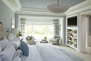
1. A large enough bed to house two people comfortably. Queen size is great because it’s usually big enough but not too big. To me, a king invites the whole family to sleep there including multiple pets. (‘nuf said)
2. A padded headboard. Not only is a padded headboard attractive, but also it’s functional. It sure beats wood when you’re reading in bed.
3. No footboard. Leaving off the footboard allows for more visual space in the room, and it makes the bed look like you can run and jump onto it. Inviting, welcoming, all those things.
4. Good lighting on both sides of the bed. I don’t always call for symmetry in design, but both parties need good lighting so two of the same kind seems fair to me.
5. Really comfy bedding with a cozy throw on top. You’ll be amazed at how handy a throw can be when you’re hanging out on the bed watching TV.
6. A “wallflower” TV. If you must have one in the master bedroom, at least put it over in a corner where it is not the focal point of the room.
7. Two comfortable chairs. If you have a TV and enough space, put at least one or preferably two comfortable chairs in front of it. That way you’re not always lying in bed watching TV. (You’ll sleep better. Trust me on that one.)
8. A wall color that pleases both parties. Something soothing that does not promote controversy. You might avoid red, bright acidic yellow, and girlie pink. Just an observation.
9. Privacy. Locks on doors, shades on windows, and anything else that will shield you from the outside world. This is your haven — a place to regroup and refresh.
10. And what NOT to have. (optimally, of course) A desk, treadmill, laundry folding station, newspaper repository, and holiday decoration storage. It should not be a graveyard of unmatched socks, moldy towels, and unsorted paperwork. How practical is that? Well? These are guidelines…
Spend some time on your master bedroom. You’ll feel better in the morning.
Kitchen Cabinet Color: Move over Back Splash
January 30, 2013 § Leave a comment
Kitchen cabinet color is in. From yellow to navy to this refreshing mint, cabinets and kitchen islands are getting a paint job. And it’s not just old cabinets that are being refreshed. New kitchen designs are showing painted cabinets in colors that were once reserved for bathrooms and laundry areas. And it’s a bold move because, unlike wall color, you are unlikely to re-do cabinet paint color anytime soon. Call it confidence or general optimism (or a craving for it) but cabinet color will be here to stay for some time.
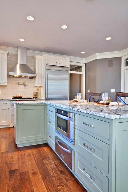
If you’re a little unsure of painting all your cabinets a particular color, try painting the back of an open cabinet or the center island first. That’s what I did. And I was hooked from that point on. (My cabinets have had two color transformations since discovering color in the kitchen.)
One suggstion for choosing a paint color for your cabinets: take a look at the colors in adjoining rooms and pick a color that will pull the public areas together. A pillow color in the adjoining family room might make a terrific cabinet color in the kitchen. You are limited only by…hmmmm… nothing really. Enjoy!
Choosing a Color Palette for Your House: It’s a Natural
January 29, 2013 § Leave a comment
 Another drive-by sighting of some curb appeal. This time, the stone wall pops out partly because of its mix of natural stones (and not just one kind) but also because the house color is drawn from the wall’s palette of natural hues. Even the front steps coordinate nicely with the wall.
Any of the wall’s creams, beiges, browns, and grays would have worked for a paint color, but the builders chose a light creamy yellow for the siding with a beige shingle on the portico. White trim pulls the house together and the black door makes the dramatic statement.
It’s so easy to choose your house color from nature. You cannot make a mistake.
Stone and Brick Reveal Your Exterior Color Palette
January 25, 2013 § Leave a comment
 Yes, it’s winter and the roof in this photo is covered with snow, but now we can focus on the rest of the house, particularly the stone. What works on this house is the color palette that is taken directly from the numerous available hues in the stonework itself.
The bricks are a monochromatic rusty red color that complements the stone without competing with it — a challenge when you have multiple materials on the house. The siding is a gray neutral, also in the stone. The trim is pulled from some of the darker taupe stones. How easy is that? Job done.
If you are building a home with different materials, use the busy one with the most colors (stone or brick) to make the rest of your color decisions. That way, the whole house will come together in a harmonious cornucopia of color.
The alternative? Choosing a color that is not in the palette at all. The result? A disjointed effect that divides the house into sections and makes it seem smaller. Can be done, but it’s tricky and needs a professional colorist to pull off. Do yourself a favor and stick with the natural palette that presents itself to you from your building materials.
The Best and Worst House Colors for Cold Snowy Winters
January 24, 2013 § 1 Comment
 As we get more and more snow this winter, I notice what house colors look good in snow and which ones look awful. I’ll start with the thumbs down. White. It either blends away completely except for any contrasting colored shutters or it looks downright dirty. It’s also cold-looking. If you have a white house and a long winter, make sure you have lots of greenery in the foundation plantings, trees in the yard, and a wreath with a big red bow on the front door.
My favorite color for long, cold, white winters is a sunny yellow. Wow, does that color look terrific against the white snow. Try Benjamin Moore’s Concord Ivory http://www.benjaminmoore.com/en-us/paint-color/concordivory. Paired with a black roof, black shutters, and white trim, you’ve got a knock-out house year round.
