A New Look… in process
May 12, 2011 § Leave a comment
You may notice a few changes to the blog today. I’m experimenting with another format. Not to worry though as the content will not change and I am still available to answer your decorating questions. See the sidebar on the left for payment information and where to post a question.
Also, I have been busy this spring working on new projects and I have lots to show you. Please stop back in the coming weeks and see some new before and after photos.
Thanks for visiting!!
-Barbara, Your Home & Color Coach
Staging a Vacant Home: Three Must-Do Items
January 29, 2011 § Leave a comment
 If you are faced with trying to sell a vacant house, here are three staging must-do items before the open house:

1. Put a table and chairs under each dangling chandelier. Creating a dining area where there should be one will a) help your buyers see what the function of the room is; and b) protect both the chandelier and the potential buyers’ heads.
2. Highlight the selling feature of the room. This living room has a fir eplace but with no furniture, the room still looks cold. Adding a couple of simple chairs, an ottoman and a standing lamp (remember in vacant homes that there may not be adequate lighting for night showings) helps to cozy up the space and allow buyers to see themselves reading the paper by the roaring fire.


3. Warm up the kitchen. Usually the kitchen requires a de-cluttering of the counter tops, but in a vacant house, that’s not an issue. To warm up the sterile look of the bare kitchen, create a breakfast nook with a small table and two chairs. Add some placemats and napkins and just a few accessories to make the kitchen look lived-in and you’ve given buyers a kitchen they’ll remember.


How Bold House Colors Can Work
September 30, 2010 § 2 Comments

 What is more refreshing than a creamsicle — that delicious pairing of tangy orange with smooth creamy vanilla! That’s just how I would describe these two houses — absolutely luscious!
Although we don’t often see orange as a house color, the addition of creamy gray-white either as trim color or as part of the architecture makes the combo work. The result is warm and happy without going off the color charts of good taste.
The stucco example here is a house turned patisserie on the grounds of Versailles in France. The other example is a modern home, one of the creative designs by Victoria Mohar of MoharDesign in Somerville, Massachusetts. It is so refreshing to see creative color combinations that work and that push the house color envelope a bit.
If you’re introducing a bold color into your exterior color scheme, pair it with a well-respected neutral, like creamy vanilla. The result will be refreshment for your neighborhood.
Sew a Simple Window Topper
August 9, 2010 § Leave a comment
 I do own a sewing machine (a hand-me-down), but I would not call myself much of a seamstress. I sew when I feel inspired or I find a fabric I cannot live without. These window toppers were so easy that I had to share. If you cannot sew a straight line, pick stripes for your fabric. Infinitely easier than everything else.
Cut rectangles of fabric and lining, allowing enough extra for your seams and your rod pocket at the top. Then with right sides together, sew along the edges of your rectangle leaving a little space at the end to turn the fabric right side out. Press the box, turn over one edge and hand-stitch a rod pocket. You’re almost done.
Once you’ve hung your new valances, then you can add a little style by cinching up the fabric in a couple of places (maybe along either edge and in the middle if your valances are wide enough). Use a needle and thread to tack in place. Voila!! Little custom valances in an afternoon!
Choosing a Roof Color for a White House
May 7, 2010 § Leave a comment
 Choosing a roof color these days can be overwhelming with all the choices available to us. We’ve gone from classic black and charcoal to every shade of brown, red, green, and even blue. This white house with navy blue shutters looks spectacular with its multi-hued, architectural style blue roof. It really stands out in the neighborhood lined with browns and charcoals. And with a white house, adding a little color to the roof (at least on this house) certainly adds interest without going overboard.
If you have a white colonial and want to replace your roof with a metal style, I suggest sticking to the darker, more traditional colors. A metal roof adds an air of informality (and a touch country) to the house itself so keep that in mind when you’re selecting a roof style. Nothing wrong with metal, but you won’t want to attract too much attention to it if you have a traditional metropolitan house. If you live in the country or the mountains, anything goes!
Details Make the Difference at the Front Door
April 26, 2010 § Leave a comment
 Say nothing of the new Arts & Crafts windows, textured roof, earthy natural taupe siding color, crisp white trim, and fresh landscaping, the entryway of this renovated colonial is a knock-out.
The homeowners took their time to get all the details right. The enlarged portico with dry-stacked stone porch and columns, the tapered pillars above, the arched wood ceiling, wide chunk white contrasting trim, a period pendant light fixture, and the solid wood door with period wrought-iron hardware. There’s even a little black door-bell (with undoubtedly a charming ring on the inside).
What can I say… there goes the neighborhood…
Blond Brick Siding Color and Trim
April 25, 2010 § Leave a comment
 Blond brick and light-colored stone seem to pose challenges when it comes to picking coordinating paint colors for siding and trim. This house does it right. The taupe siding color comes right out of the aging blond brick, giving the house an updated look. Taupe allows the brick to show off its depth of color, including other shades of browns and peaches, without adding another hue to the mix. You cannot go wrong with neutrals, especially when you’re dealing with stone and brick.
White trim offers a crisp contrast between the siding and brick and ties in the white windows, also original to the house. The homeowners took what used to be a tired ordinary blond brick and made it look fresh and contemporary.
House Color, Trim, Shutters: Gold Medal Combo
April 7, 2010 § 2 Comments
 The unexpected color combination on this historic home (now a B&B in Sackets Harbor, NY) really pops off the street. Whether it’s the hint of green in the gold siding, the Jamaican rum-like warmth of the shutters, or simply the combination, I’m not sure. But coupled with cream trim and accents of black, this combination is a winner.
The house color looks like Ben Moore’s Marblehead Gold (HC-11), and the shutters look like a slightly darker version of Copper Kettle (1218). I should have rung the doorbell to ask (I’ve been known to do that).
The stone steps unfold seamlessly from the foundation right onto the sidewalk and the delicate scrollwork in the iron railing ties in beautifully with the sign and even the shutter “dogs.” And for those of you who have asked about using cream window trim with white windows, here’s a great example of how nicely it works.
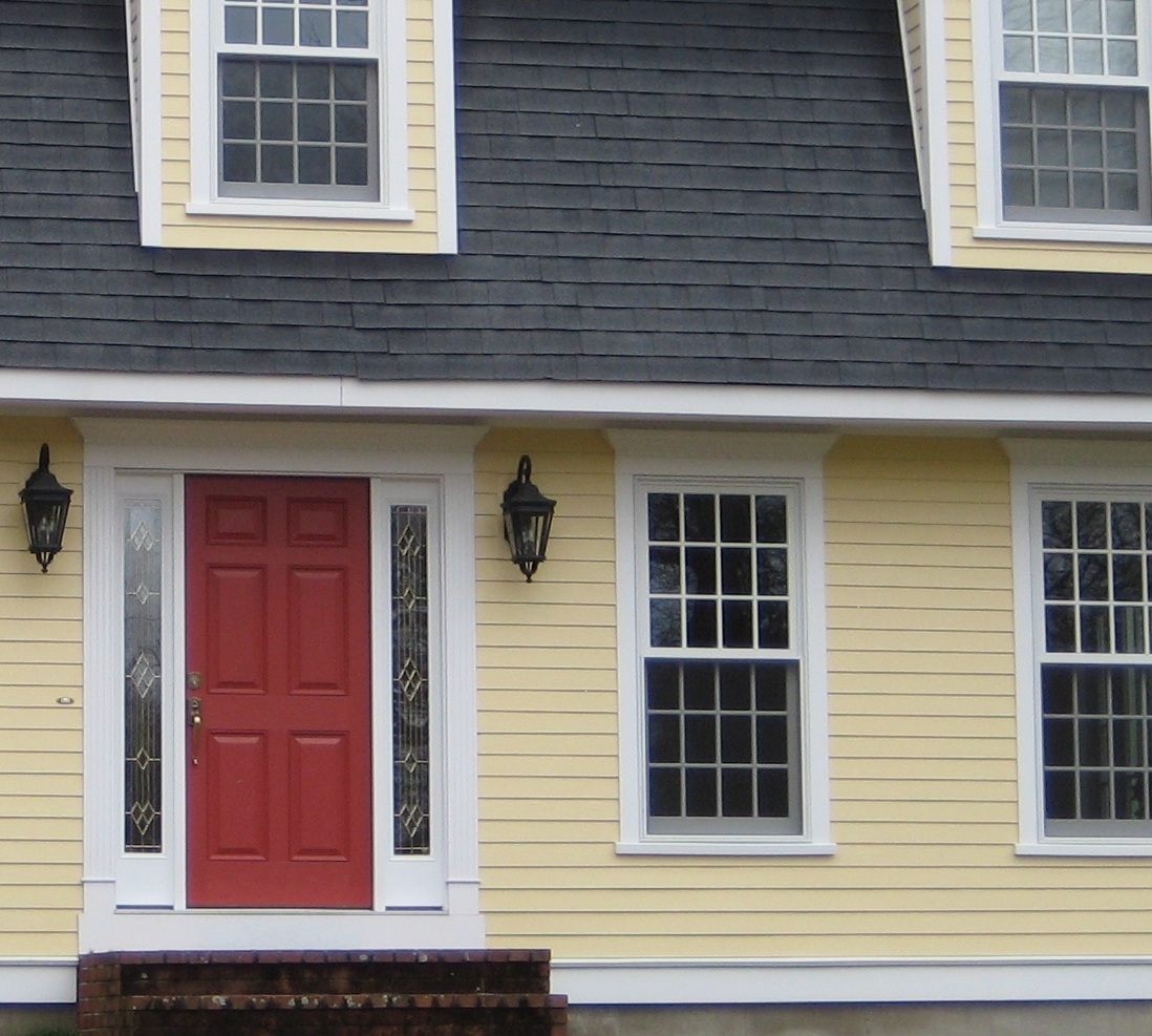
Choosing a Yellow for Your House Color
March 25, 2010 § 6 Comments
 Yellow can be a tough color, ranging from almost orange to acidic green. This one, Traditional Yellow (170) by Benjamin Moore, gives the house a cheerful, welcoming look. It’s terrific with crisp white trim, a dark charcoal/black roof, wrought iron metal for lights, and a striking red door. The yellow has just enough orange in it to be warm without turning peach.
Yellows that have green undertones tend to look cold on traditional homes. What we commonly refer to as lemon yellow has a touch of green in it, enough to make you pucker when you see a big house that color. Having said that, if you love the green side of yellow, consider pairing it with dark eggplant purple. The combination is a bit edgey and modern but can work, again with a black roof and white trim.
Good Design Learns from History
February 4, 2010 § 2 Comments
 This historic New England barn is original to the property, and its characteristic beauty helps to define the classic regional style. Owning an historic property can be a real joy for those whose passion is preserving the beauty of the past, but don’t think you have to own a historic treasure to enjoy the pleasures of a striking outbuilding.
If you need more space for a workroom or your vehicles, you can add a lot of character to your property by incorporating the unmatched elements, colors, and materials used in previous centuries to make your own history, whether it’s a barn, a large work shed, or simply your garage.
I get lots of questions about how to match exterior colors and blend materials between house and garage, but as you can see from this photo, there’s absolutely nothing matching between this barn and the accompanying house. From the unpainted board-and-batten style siding, brass lighting, and farm-style scale, this barn stands on its own. The colonial house has traditional, painted, horizontal lap siding and white windows. The bridge color between house and barn is black — the black windows on the barn carry over to the accent color on the house (note the black shutters and lighting as well as the black pergola and fence next to the driveway). By painting the wood accessories on the house black instead of leaving them natural, the unpainted barn takes center stage.
Even if you have no plans to build a major additional structure in your yard, keep this basic design principle in mind when you’re working on your exterior. Colors and materials do not have to match.
