Is Your Wall Color Anxious?
March 7, 2023 § 2 Comments
Color psychologists will tell you that colors evoke certain emotions. For example, the warm colors (red, orange, yellow) can generate happiness, stimulation, and excitement (both good and bad). And cool colors (blue, green, purple) can promote calm, relaxation and sleep. In general, we do have a psychological reaction to certain colors, and we associate them with different things. Sometimes they look tasty enough to eat.
Too much of a good thing?
When it comes to creating an end-of-the-day sanctuary for rest and recovery, we need calm, and the cool side of the color wheel is a good place to start. Blue, green, and purple are very popular bedroom colors, for all age groups, but choosing the right version from the fan deck can be tricky. What sometimes happens is that we pick a paint color from the vast display at the store only to roll the actual paint up on the wall and suddenly feel a bit agitated. Partly at not liking the color and partly at the thought of painting it over.
What happened? I thought I was picking a calm color.
Selecting a blue, green, or purple that pops out at you in the store will not necessarily give you a serene room where your toddler can take a nap. Because it’s not the color per se. It’s the saturation that is keeping the room on edge.
So even my wall color needs a therapist?
Maybe. How saturated is it?
Saturation measures how clear or true a color is. It is the strength of the color often described with words, as Leatrice Eiseman writes in her book The Complete Color Harmony, like “clarity, purity, brilliance, richness, boldness, vividness, and intensity.” You get the picture. Maybe not great for a restful bedroom. For example, royal blue is more saturated than powder blue. In a bedroom, royal blue will shout for attention. The more grayed-down the color, the less saturated it is. In a bedroom painted powder blue, you might not even notice the color.


Bedroom wall color needs to chill.
Again Eiseman describes colors with lower saturation as “subdued, diffused, misty, dusted, subtle, soft, toned-down, muted, restrained, hushed, understated, and quiet.” Perfect for a bedroom. So back to the paint store to find colors with lower saturation that will be restful on the walls of the bedroom.
Can’t I paint the room lighter?
Yes, but going lighter will not make the room calmer — just a lighter value and yes, a little easier on the eyes.
Value measures how light or dark a color is. When you add white to a color you make a tint. The hue (color) gets lighter, and the perception of the intensity changes. It may appear less intense. And that’s important when you are picking a relaxing wall color. Lighter tints are more restful to the eye. To find a tint of a color you move up the fan deck color strip toward the lighter end.


If you add black to a color, you get a shade. It’s darker and perceived as more intense than its lighter version. A dark shade of a color can be very dramatic, and that will influence your color choice. To find a shade of a particular color, you move toward the darker end of the paint color strip in the fan deck.


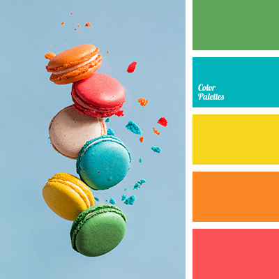
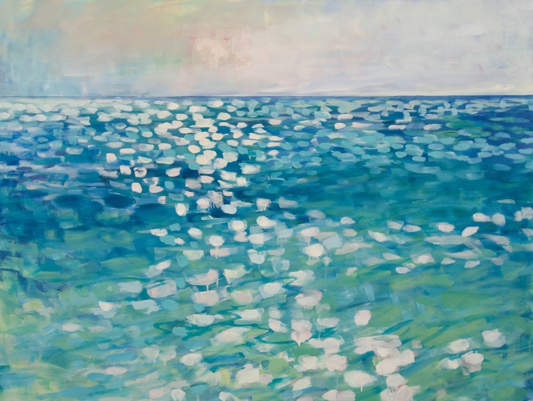
So when you’re picking a wall color for a bedroom, both the Saturation and the Value are important. If the color is too saturated, and there are other colors in the room, it can feel like the walls are vibrating. And that’s okay if you’re going for a room with lots of energy and vitality, like this one.
:max_bytes(150000):strip_icc():format(webp)/225811303_2351425294990524_4394162365566741163_n1-17bd60b7998c436d813211cbca0c5a66.jpg)
Likewise, if the color value is dark, it may feel more intense than a lighter value of the same color.
Okay, my child wants a bedroom makeover. Now what?
As a mom, I think it’s important to let children pick their own bedroom colors. But having said that… if you are concerned about having to prime over a loud or dark color in a few years when they change their mind or go off to college, you can take the hue (color) that they chose and then move a little toward the gray end of the fan deck. Muting that electric blue just a little will give the walls some longevity and allow your child to live with the color longer.
Here are some pairs of examples. The first color is a pure saturated color. The second related color is an alternative that is slightly muted (less saturated) and lighter (in value) as well. The alternative wall color will give you a calmer and perhaps a slightly more sophisticated feeling when you walk in the room. No more anxiety.


When in doubt? It’s only paint. Sleep well!
If you need help with color, feel free to comment below, hit the button for a Color Consultation, or shoot me an email at yourcolorcoach@gmail.com.
I would be happy to help you.
Hope you have a Colorful Day!
Barbara, Your Home & Color Coach
The World’s Favorite Color? Where Have I Been?
February 22, 2018 § Leave a comment

Late to the party here, but better late than never. At least that’s what I said to myself yesterday when I scrolled onto THIS beautiful hue and found out that it was crowned The World’s Favourite Colour. No great surprise since it represents some of the world’s most exquisitely beautiful treasures like Bali — an island so gorgeous its name alone sounds relaxing.
Last summer there was a questionnaire sent out — ’round the globe, as it were — to find out which color appealed to the most people. (I totally missed it! Arrrgh!)

“The competition organised by Hull 2017 UK City of Culture and paper merchant GF Smith invited people to select their favourite shade online by hovering over an infinite palette of shades with their mouse until they landed on the colour they found most appealing.”
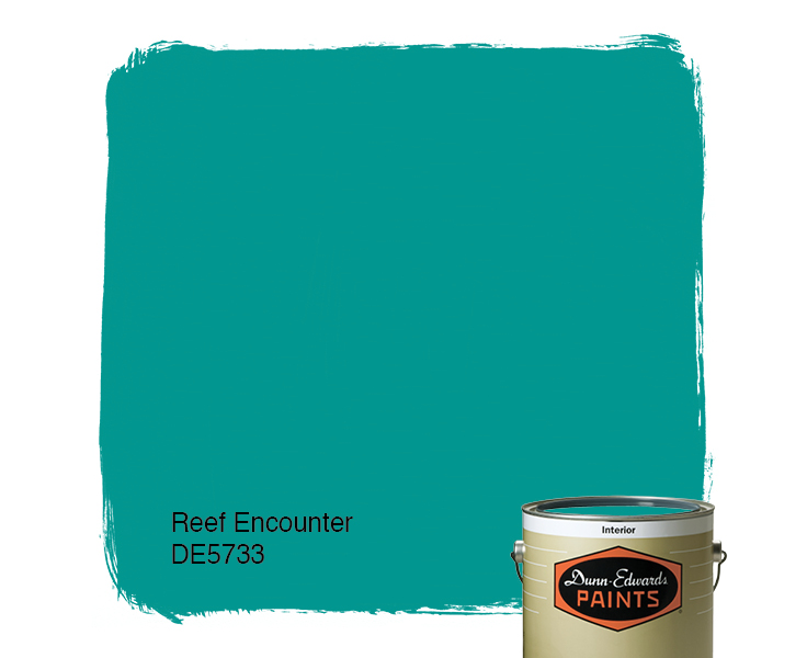
The winner was this rich teal that nature inspires and artists incorporate to capture the beauty that surrounds us.
The closest paint color approximation I could find was a Duron Paints shade, Sea Sphinx. 
But there were others:

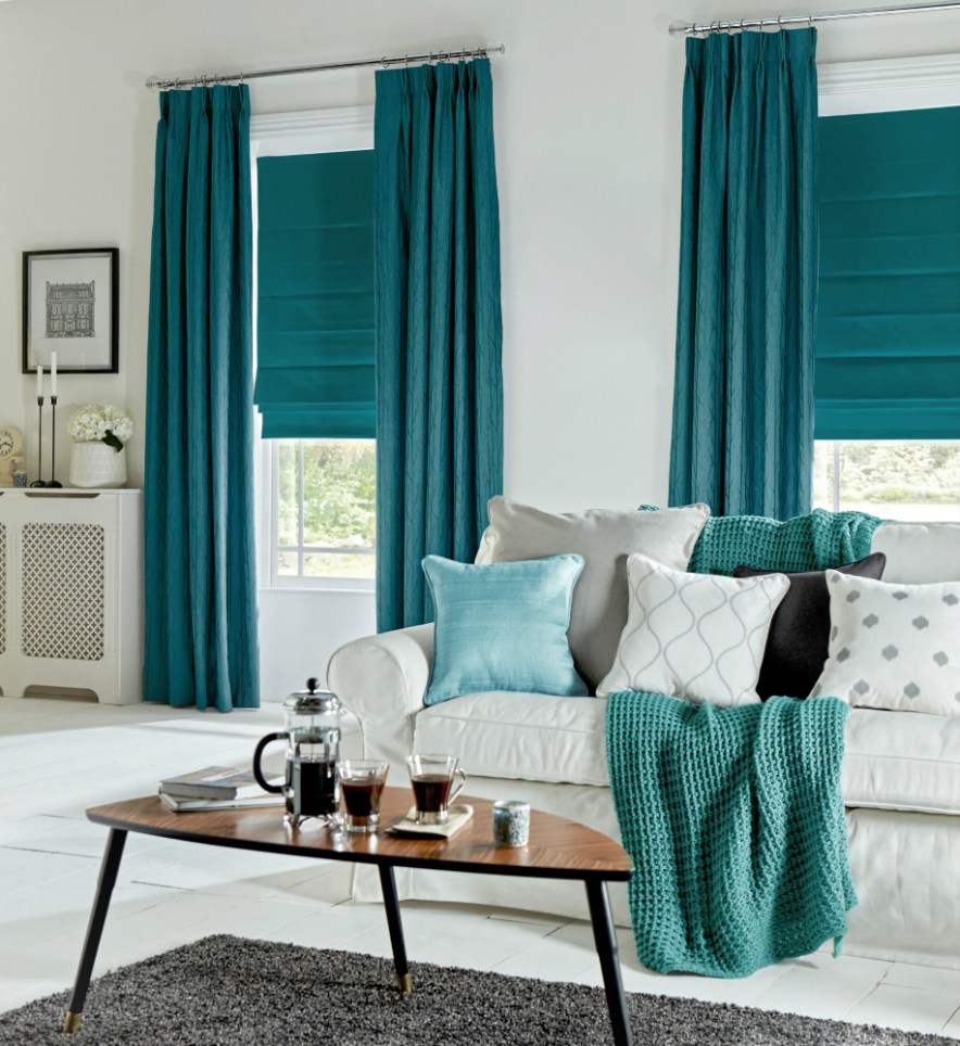
There are plenty of other ways to introduce the color into your decor — window treatments, accessories, and more art, of course.
On an accent wall of Marrs Green, this art pops!

And so does this one!
Though I have blogged about “teal” before, I guess there’s a reason. It appeals to vast numbers of people worldwide. It is a little bit blue, yet a little bit green. It’s the warmest ocean color and a color that appears in natural gems and plant life. It is rejuvenating in all its forms.


")
It looks great with the full green/blue spectrum and all its values, and it forms a calm backdrop to pops of heat. Marrs Green — The World’s Favorite Color.
Green Decorating: The Soothing Hue
March 17, 2016 § Leave a comment
St. Patrick’s Day brings us to thoughts of green. Whether it’s kelly green or any of the variations thereof, green is a versatile, natural hue that brings life and comfort to any room. It is particularly nice in rooms where you spend time revitalizing your mind and body.


Waking up in a green room warms a cold, white, snowy day and cools a hot, humid summer morning. It can bring the color of lush plants and trees to a city skyline view. And it can calm an agitated, overextended lifestyle at the end of another hectic day.


Green can be either warm (yellow-green) or cool (blue-green), and both pair beautifully with white. Coordinating accent colors can add energy (the complementary reds and pinks, opposites to green on the color wheel) or quiet blending (the analogous yellows and blues on either side of green on the color wheel).
I highly recommend adding green, even a mixture of greens, to your home to quiet and soothe your soul. Wherever you need a few moments of ahhhhhhh.
Paint colors above: Top left to right: Waterscape SW 6470, Topiary Tint SW 6449, Honeydew SW 6428, Breaktime SW 6463. Bottom left to right: BM Guilford Green HC-116, Palisades Park BM 439, High Park BM 467, Dartsmouth Green BM 691.
In a Teen’s Bedroom, It’s Just Paint
February 24, 2014 § 2 Comments
 Letting your child express herself in her bedroom is a wonderful way to uncork inner creativity. You may bristle at the color scheme and opt to keep the door closed most of the time, but allowing your child to have a room of his or her own design is so important to creative development.
In this room, the young client chose a Pottery Barn Teen bed cover as her inspiration piece. After we selected a new wall color together (a soft purple — and a departure from the previous bubblegum pink), we brought in white accessories and a purple polka dot rug.
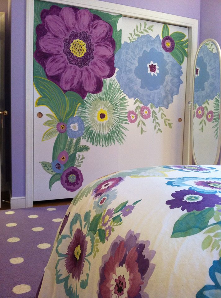
I mentioned that sometimes it’s fun to get a little crazy with the closet doors in the bedroom because they present a blank white canvas just begging for color. So guess what … hey, it’s just paint!
What Color Should I Paint My Ceiling?
November 29, 2012 § 266 Comments
The ceiling is the fifth wall and many decorators and designers feel that keeping the ceiling white is like “throwing a sheet over the room” (Christopher Lowell said that years ago). But there are a few conditions to consider before painting the ceiling anything other than white:
1) Is your ceiling heavily textured? In many old houses, the ceiling is patterned (and God forbid, “popcorned”) and therefore very difficult to paint well. Also, painting it anything other than white will call attention to it and maybe that’s not what you want. One solution is to have your ceilings replastered to match your walls and painted, but if that’s out of the question, I would stick with white.
2) Is your ceiling a smooth plaster? If so, you should definitely paint it. How lucky you are! See below for what color.
2A) Is your ceiling really high? If so, you can paint it virtually any color that goes with the rest of the room. If you’d like to bring the ceiling down visually, consider a color darker than your wall color or a warm color (both will advance and appear to bring the ceiling down to a level that’s more in scale with your room). Also consider adding crown moulding if it’s not already there. The moulding will also bring the ceiling down by calling your eye’s attention to it. And it really finishes the room.
|
|
|


2B) Is your ceiling low or average height? Consider painting it a tint of the wall color. If your walls are a medium blue, then your ceiling would be the very lightest blue on the color swatch or even lighter (white with a dash of blue). This will help to round out the room and make the ceiling part of the overall decor — not just that white sheet over the top.
3) Does your room have enough light? Bright white ceilings do help bounce light back into the room so if your room is already dark, pay special attention to the ceiling color. White can be used effectively, but light tints on the ceiling will also reflect light. Just avoid a ceiling color that is going to absorb all the light and leave the room dark.
4) Are you painting a guest bath? I like to paint the wall color right up over the ceiling in a guest bathroom. Doing that makes the room feel larger by blending the walls and ceiling together and avoiding sharp lines and corners. Or do something kind of exotic on the ceiling, like the Moroccan tent (see photo above).
5) Are you painting a bedroom? In what other room do we lie around and stare at the ceiling? Why not paint it something interesting. In a bedroom, the sky’s the limit (literally) — from puffy blue clouds on a backdrop of sky blue to a quilt of squares in different colors (Candice Olson did a fabulous multi-colored geometric ceiling in a master bedroom). And in kids’ rooms, the ceiling is just one more space to use your creativity.
Hope this helps the “Do I paint the ceiling?” dilemma.
The Renaissance of Wallpaper: With a twist
September 17, 2012 § Leave a comment
 The first thing my husband did when we moved into our house many years ago was rip a long piece of wallpaper off the bathroom wall. “We won’t be keeping this,” he proclaimed. Well, I wasn’t planning to start a bathroom renovation that afternoon (I had to hide the ugly blemish with towels for months), but he certainly had the right idea. All the wallpaper came down eventually and was replaced with paint.
Many of us have visions of homes with old faded wallpaper and knick-knacks everywhere or rooms where every available inch of real estate was covered: ceiling, switch plates, wastebaskets– even the window treatments matched the wallpaper.
The rebirth of wallpaper that we’re experiencing, however, is far different from what you lived through in your grandmother’s parlor.
1) Contemporary wallpaper makes a bold statement either with color, texture, large graphic design, or all three.
2) The wallpaper is a feature of the room, like a piece of art, and not simply a wall covering upon which to layer a hodgepodge of family photos, diplomas, and other objects of interest.
And that’s the major difference. It’s more about what else is going on (or not) in the room and less about the wallpaper itself. Contemporary use of wallpaper involves a more judicious placement in areas like the focal wall in a foyer (as in the photo), the walls in a guest bath, the headboard wall in the master bedroom, and the walls above wainscoting in the dining room. The wallpaper is also selected to be the appropriate scale in the room (you won’t see so many little tiny pink flowers anymore). And the furnishings in a room with bold, contemporary wallpaper harmonize with it, both through color and fabric design and scale.
So be adventuresome. If you’re feeling like your room is just a little too blah, even after you’ve painted a fresh new color, try wallpapering an accent wall. Just for fun. Your grandmother would be proud.
From a Little Girl’s Room to a Teen Girl’s Haven: Navigating the Transformation
September 6, 2012 § Leave a comment
Decorating a teen’s room is way different from decorating a young child’s room, and I’m not just talking about the comforter and the curtains. When you’re decorating a little girl’s room for the first time (when they’re really little), there’s not much push-back from her. She loves flowers, polka dots, pinks and purples. But as she grows older, she develops her own style and wants to do things her own way. As a decorator, we have to take that into account when we’re called upon to work on a young teen’s room. How to take her very strong requirements for her room and mesh them with the aesthetic sensibilities of mom and dad.
 This project is a prime example. The Before Photo shows a bedroom of many colors, stripes and dots in a fairly white room. As you can see from the swaths of color that she painted next to her bed, the teen living there was pretty much done with white walls. So that’s where we started. She picked a cool, vibrant blue-green that was a reflection of her personality (not her mom’s). From there, we found cornflower blue bedding (Pottery Barn) as well as some accent pillows and accessories to pull the colors together.
My major role in this project? To prevent color overload. The remedy? Adding white to the room to offer some visual relief from the intense hues. I found white tone-on-tone polka dot fabric for the window panels (custom-made), a white lamp with a lamp shade that pulled all the colors together (Pottery Barn), and a white fuzzy pillow for the bed (Pier 1). I also added the floral light fixture on the ceiling (Lamps Plus) — a great find for a teen room. The result was a room that all three of us (teen, mom, and decorator) could love.
