Making Sense of Color Trends
January 8, 2013 § 1 Comment
 Is anybody else’s head spinning as you look at the color trends for 2013 or is it just me?
When we look at the Benjamin Moore Color forecast, we clearly see pastels — a look refreshingly optimistic every few years after we finish huddling in our dark, cozy dens and want out. Here we see a pale yellow added tastefully to warm gray walls — a really soft, uplifting combo. (Lemon Sorbet 2019-60 is the Ben Moore paint color of the year if you haven’t already heard.)
The other color combos from Ben Moore introduce Dusty Mauve (2174-40) back into the mix (been a few years, like 30), in combination with Golden Straw (2152-50) and a soft navy (Evening Dove (2128-30). The other trends from Ben Moore show us more Coastal blues and greens (never out of fashion in my book), and more taupes and grays, a trend we have been in for a few years now. Here is a link to the Ben Moore colors and combos: http://www.benjaminmoore.com/en-us/for-your-home/trends-2013
And then there’s Sherwin-Williams. Talk about something for everybody…I’ll say. I wouldn’t call this a color trend. It’s more like a smorgasbord. 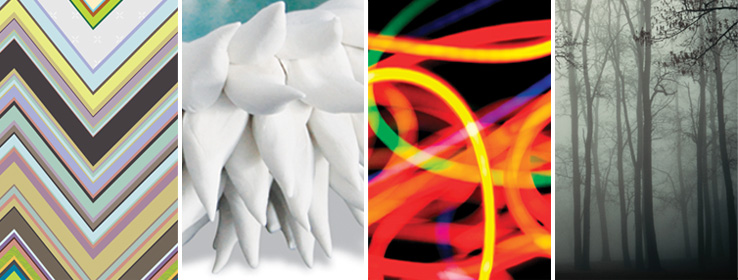
We have the Vintage Moxie Collection, an Easter basket of colors to choose from including Radiant Lilac (SW0074) and Aloe (SW6464, the Sherwin-Williams Color of the Year).
Then if you’re still in a chalky-earthy color mood, there’s the Honed Vitality Collection including all colors we’ve been using already like Unusual Gray (SW7059) and Roycroft Suede (SW2842), both terrific exterior colors. http://www.sherwin-williams.com/architects-specifiers-designers/inspiration/color-forecast/2013-color-forecast/honed-vitality/
Sherwin-Williams went Peter Max with its High Voltage collection — Electric Lime (SW6921) and Feverish Pink (SW6859) are colors I would reserve for a pillow or a picture frame. Maybe a front door color if you’re so inclined. Yikes! http://www.sherwin-williams.com/architects-specifiers-designers/inspiration/color-forecast/2013-color-forecast/high-voltage/
Finally Sherwin-Williams offers the dark, moody, masculine colors for anybody who’s left. The Olde World Gold (SW7700) and Plum Brown (SW6272) are both terrific exterior colors as are most of this Midnight Mystery collection. http://www.sherwin-williams.com/architects-specifiers-designers/inspiration/color-forecast/2013-color-forecast/midnight-mystery/
What Sherwin-Williams has shown us with their lack of consensus when it comes to color trends for 2013 is that we are more diverse in our color likes and personalities than ever before. Pretty much anything goes. So paint what you love. If you are caught up in color trends, then stick to whites and neutrals for your walls and add pops of trendy colors in things like pillows, accessories of all kinds, and even front door colors. Things you can switch out easily when the next hot new trend comes along because who knows what the color experts will throw at us next year.
Black: Sophisticated, Modern, House Color?
January 2, 2013 § Leave a comment
Just like the LBD (little black dress), black houses are popping up all over and with predictably dramatic effect. The trend seems to be particularly hot in Southern California although I’ve seen it in Massachusetts too. Why black? Well, why not.
-Black as a house color fits into any neighborhood and certainly stands out from the myriad white, yellow, and beige houses already out there.
-Black looks terrific in the winter if you have snow in your area. We all know how dirty white houses can look even after a fresh snowfall.
-Black can make a small, insignificant ranch look modern and even spacious. Add a pop of bright color to the door and you have a stand-out in the neighborhood instead of a ho-hum been-done-before.
-Black, like white, makes any color look good. Imagine the opportunities for vibrant landscape color along the foundation of a black house.
-Black is a color to consider if you plan to paint your red brick rambler. If you’re tired of the tract house vibe, why not make a major statement.
When does black on the house NOT work? When it starts to fade unevenly and make the house look like charred remains of a terrible event.
If you decide to paint your house black, you must prepare to keep the paint fresh, the lawn mowed, the weeds pulled, the clutter corralled, and the driveway plowed because your house will create quite a sensation on the block. Nobody will drive by without noticing. And that’s kind of fun.
Bored with beige yet? Consider black.
Painting Your House Red
December 3, 2012 § Leave a comment
Which Came First? The house color or the foundation plantings?
October 1, 2012 § 2 Comments
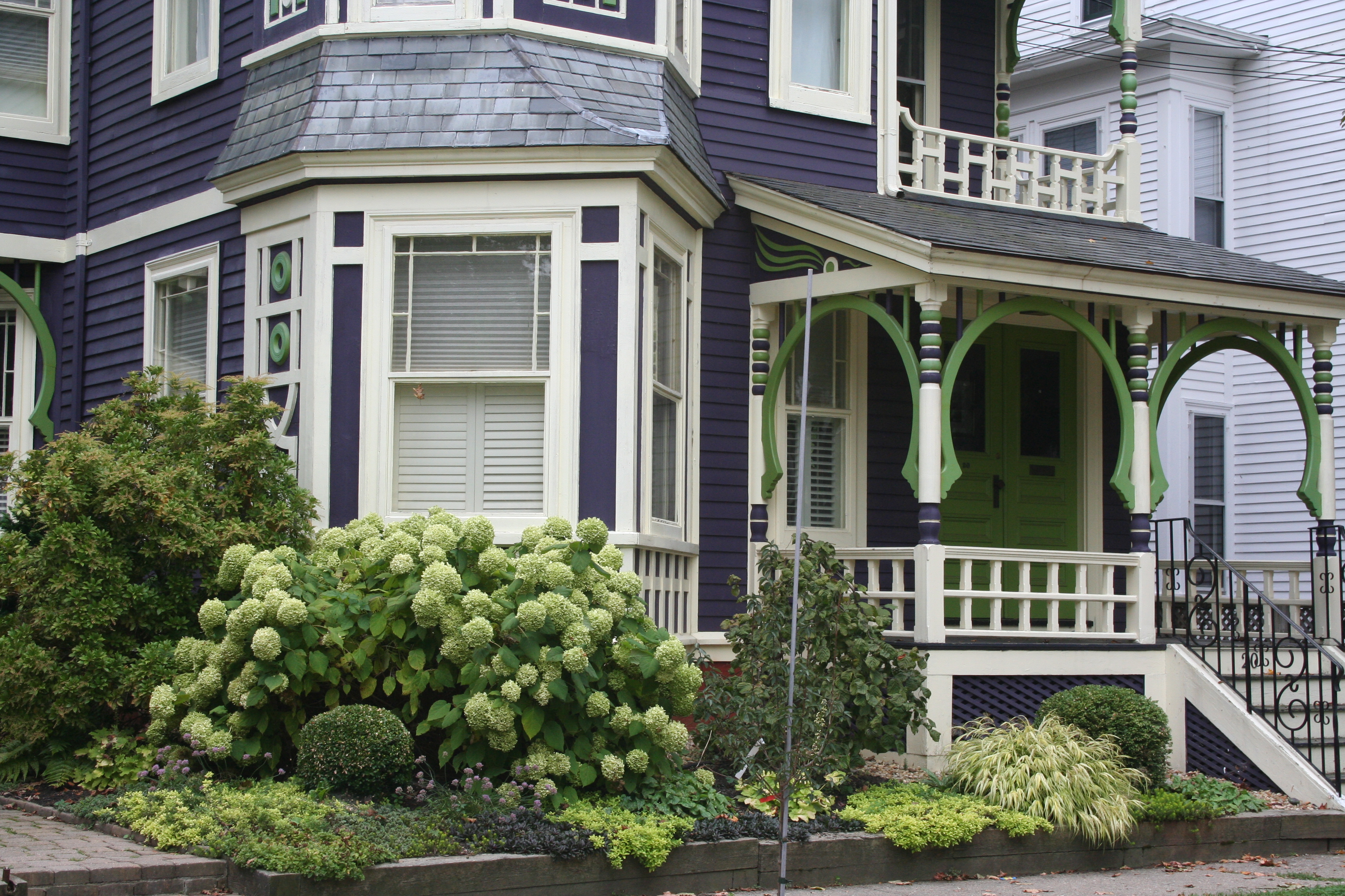 My guess? Neither. Take a close look at the roof, and the house color palette is revealed. The deep purples and greens of that slate roof present a palette the homeowners can use for their house: rich grape for the siding color tempered by a neutral cream trim and lime green for the accent color to highlight the Victorian embellishments.
But the homeowners did not stop there. To enhance the palette and spread the accent color out onto the landscape, they planted a gorgeous lime green Hydrangea coupled with other lime green plants, shrubs, and ground-cover species. Peeking out from under all that greenery is a purple flowering ground color pulling the whole look together.
Not to be matchy-matchy or anything, but this house rocks. There’s just enough contrast to keep our interest and show off the house detail without introducing new colors that might make the house too busy. Afterall, the house itself has so much detail that you wouldn’t want it to get lost in a rainbow of foundation plantings and annuals.
Choosing a Paint Color for the Cottage
May 31, 2012 § 3 Comments
It’s time to repaint the cottage — it has been that shade of grassy olive green since about 1970 and I think we’re ready for a chang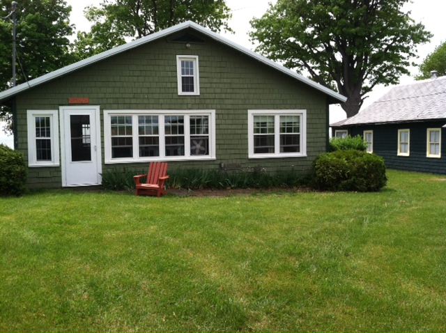 e especially since the cottage next door is also green, just a darker shade. You might think that choosing a color for my own place would be easy for me since I work with color all the time. But just like you struggle with paint color schemes, I have to go through that process too.
First of all, what colors are already in the neighborhood? We have dark green on one side, beige siding on the other, and brown and beige two doors away on either side. So that leaves quite a few options.
Next, what color is the roof? It’s a gray metal roof with a white fascia piece in front. The roof doesn’t show from the front, but it’s quite prominent on the sides so roof color is a consideration.
What color are the windows and other non-changing elements? The windows are all white vinyl (I know, but they’re easy maintenance for a cottage). We had the chimney removed (that had been the inspiration for the brick orange Adirondack chair).
So with fandeck in hand, I spun through the color possibilities. I eliminated yellow and white because they would take too many coats to cover the green. Red was thrown around as a possibility but I didn’t like the idea of red next to the dark green. Not summery enough. Orange is a great accent color but our cottage is not interesting enough architecturally to draw that much attention from a wild paint color. That brought me to gray and blue.
I tried some grays, both dark and light, on the Sherwin-Williams paint site and liked several with the gray roof. My reservation was that the cottage would need color added somewhere — otherwise it would look kind of blah. (Note: I LOVE the Nantucket weathered cedar look, but you need salt air to pull that off.)
 Finally, I tried blue. Hmmm… not a bad idea. I ended up with a WoodScapes opaque stain in a color called Chesapeake (SW3051) with a cool white trim (Rhinestone– it’s on the blue side of white) and my Adirondack chair color for the accent. I like a dark blue cottage color — it speaks to the lake water in the background and does not attract too much attention from passersby. I also like the contrast with the windows especially for a summer cottage. I used the Adirondack chair color (a custom red-orange) for the doors including the big garage door facing the road. Now it’s easy to find the party.
Choosing House Colors: Bark Brown?
February 28, 2012 § Leave a comment
 Talk about fitting in! Dark, rich tree-bark brown is about as close to nature as you can get for a house color that will fit unapologetically into almost any landscape.
What I love about this brown house, however, is how creative the homeowners were when it came time to choose a new roof color. Instead of opting for a light brown, gray, or dark forest green (all great options, by the way), they chose a light sage dimensional roof that looks spectacular. Then they pulled the trim color from the lightest shingle tone and used that for trim around the dark brown windows (also a nice touch), the corner trim, and the garage doors.
The result? Something different! How refreshing! Are they locked into a green roof? Yes. But who cares…
Choosing House Colors: Pine-Green?
February 8, 2012 § Leave a comment
 Dark blue-green pine needles and rich cedar mulch present a warm house color palette perfect for homes that want to sit quietly in a wooded environment or at least conjure up the same.
Although much of the leafy countryside in many landscapes is a mixture of greens, notice that most have a yellow undertone. But not pine green. It leans more toward blue and for that reason can really stand out in a grove of maple trees.
To warm up the cool green shade, add brown and no better place than the roof (a gray roof is fine too but it will keep the house cool). Creamy trim provides contrast between the two darker shades and serves to outline the architectural detail (dark trim will get lost but use it if you are seeking camouflage).
For the front door, why not splurge and get solid wood stained a darker version of the roof color or choose a similar paint hue like Maple Syrup (Ben Moore 1105).  Black wrought iron is the best metal for hardware, lighting and accessories.
Once again, nature’s palette does all the work.
Choosing House Colors: Gray-Blue?
January 24, 2012 § Leave a comment
 You do not have to look very far in nature to find a palette of coordinating colors from which to pluck your house paint chips. This time we’re looking at a glassy pond reflecting the blue of the sky. This blue, however, is not a primary saturated hue but rather a complex shade that has grays and greens in it as well.
 So going to the paint store, you’ll want to move toward the muddy gray part of the fan deck and find your blue there. Stay away from the clear Crayola blues or you will end up with a house color that may in fact glow in the dark.
Look carefully at the colors around the pond and you will find your accent colors. Autumn red for the door, dark woody brown for the front step treads, crisp cloud white for the trim, and pops of golden yellow for your flower pots.
With nature as your color palette, you cannot make a mistake.
Choosing House Colors: Gray-Green?
January 20, 2012 § Leave a comment
 Look all around your environment for color inspiration. Sometimes the most complex color palettes come from places we might least expect, like a kayaking trip, for example. Look at the different shades and tones in the water and sky. They evoke a calmness that’s relaxing to look at. Then the red kayak pops out of the photo — we know it doesn’t belong there but it grabs our attention.
What if we use this scenic palette for a house exterior! The gray-green of that  water is not a color you would necessarily pick out of a paint store color chip lineup, but it’s a great house color. It’s muddy and dark and has a little bit of brown mixed with green and gray. Very complex — not a Crayola color, that’s for sure!! But paired with cream trim, a brown roof and pops of red accents, the combination fits right into its environment just like the house was plucked from the shores of Maine.
Choosing House Colors: Taupe?
January 10, 2012 § 3 Comments
 When selecting the palette of colors for your exterior, use natural materials in the environment as your inspiration. This stonework has all the colors you need for your entire house, from the dark charcoal of the roof to the taupey gray siding and even the orangey brick walkway.
Tying your house color in with its surroundings “grounds” the house — it looks like it belongs there. A house that strays too far from the natural palette looks more like a spaceship that has landed on a foreign planet. Don’t do that to your neighborhood. Save your taste-specific color applications for inside the house.
