Coordinating Brick House, Siding, and Roof Colors
January 9, 2013 § 652 Comments

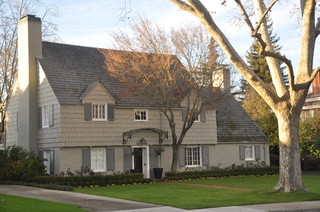
In this brick house example, the dark sandy grout color was used as a siding color, and it coordinates beautifully with the earthy shades in the brick. Even the roof is tied in although black would have worked just as well. Contrast that with the pink brick and lemon yellow siding example below right. Yikes.

Sometimes there’s just no way around ugly brick except to paint it. And the results can be stunning. Not only have you made your house bigger visually by blending in the brick with the siding color, but also you have added texture to the house without the busy look that highly variegated brickwork can create. A great compromise and an updated house.
Tired Brick Fireplace Takes Cover
January 9, 2013 § 4 Comments
 Sometimes the “bones” of an old house fall under the category of “What were they thinking?” You could say that about this brick fireplace with its random placement of dark bricks and the outdated brass enclosure. But not to worry. Your family room is not doomed to the styles of 1972 — you have options. One of the best ones is to paint the brick as shown in the after photo (from Southern Living Magazine’s Makeovers).
The homeowners covered the offensive brick with a flat, textured paint in the green wall color. They painted the hearth in a natural stone color. Then they added two bookshelves for a built-in look and painted them the same green. The new fireplace insert in a bronze color blends nicely. A narrower mantel and corbels painted cream pop off the green — art finishes the focal point.
The overall result is a fireplace wall with emphasis on everything but the original dated fireplace. When faced with old brick or other outdated hardscape in your home, consider painting it for an almost instant update without the expense of covering it or replacing it. This makeover was a huge success. No more ugly brick.
Making Sense of Color Trends
January 8, 2013 § 1 Comment
 Is anybody else’s head spinning as you look at the color trends for 2013 or is it just me?
When we look at the Benjamin Moore Color forecast, we clearly see pastels — a look refreshingly optimistic every few years after we finish huddling in our dark, cozy dens and want out. Here we see a pale yellow added tastefully to warm gray walls — a really soft, uplifting combo. (Lemon Sorbet 2019-60 is the Ben Moore paint color of the year if you haven’t already heard.)
The other color combos from Ben Moore introduce Dusty Mauve (2174-40) back into the mix (been a few years, like 30), in combination with Golden Straw (2152-50) and a soft navy (Evening Dove (2128-30). The other trends from Ben Moore show us more Coastal blues and greens (never out of fashion in my book), and more taupes and grays, a trend we have been in for a few years now. Here is a link to the Ben Moore colors and combos: http://www.benjaminmoore.com/en-us/for-your-home/trends-2013
And then there’s Sherwin-Williams. Talk about something for everybody…I’ll say. I wouldn’t call this a color trend. It’s more like a smorgasbord. 
We have the Vintage Moxie Collection, an Easter basket of colors to choose from including Radiant Lilac (SW0074) and Aloe (SW6464, the Sherwin-Williams Color of the Year).
Then if you’re still in a chalky-earthy color mood, there’s the Honed Vitality Collection including all colors we’ve been using already like Unusual Gray (SW7059) and Roycroft Suede (SW2842), both terrific exterior colors. http://www.sherwin-williams.com/architects-specifiers-designers/inspiration/color-forecast/2013-color-forecast/honed-vitality/
Sherwin-Williams went Peter Max with its High Voltage collection — Electric Lime (SW6921) and Feverish Pink (SW6859) are colors I would reserve for a pillow or a picture frame. Maybe a front door color if you’re so inclined. Yikes! http://www.sherwin-williams.com/architects-specifiers-designers/inspiration/color-forecast/2013-color-forecast/high-voltage/
Finally Sherwin-Williams offers the dark, moody, masculine colors for anybody who’s left. The Olde World Gold (SW7700) and Plum Brown (SW6272) are both terrific exterior colors as are most of this Midnight Mystery collection. http://www.sherwin-williams.com/architects-specifiers-designers/inspiration/color-forecast/2013-color-forecast/midnight-mystery/
What Sherwin-Williams has shown us with their lack of consensus when it comes to color trends for 2013 is that we are more diverse in our color likes and personalities than ever before. Pretty much anything goes. So paint what you love. If you are caught up in color trends, then stick to whites and neutrals for your walls and add pops of trendy colors in things like pillows, accessories of all kinds, and even front door colors. Things you can switch out easily when the next hot new trend comes along because who knows what the color experts will throw at us next year.
Everybody’s Favorite Neutral: Revere Pewter
January 4, 2013 § 2 Comments
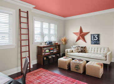
As our design aesthetic moved steadily from beige to gray over the past several years, one warm gray popped up as the perfect transitional color. Benjamin Moore’s Revere Pewter HC-172 is currently the number one all-around neutral as it is not too light, not too dark, not too yellow, not too green, not an ounce of pink, and even not too gray. Perfect with all kinds of complementary colors including this luscious Persimmon 2088-40 on the ceiling.
I like Revere Pewter in public areas like the dining room as it looks spectacular with warm golds and crystal. In the kitchen, it highlights the stainless steel appliances. In the hallway, it even makes a golden oak bannister look terrific.
As one fan describes it, the color “calms and restores, like driftwood found on the beach.” Yup. Kind of makes me want to dunk the whole house in it.
Return of the Gilded Age, Well Not Exactly
January 3, 2013 § 1 Comment

We have Downton Abbey, Princess Kate, and the popularity of all things English to thank for the resurgence of gold in interior design right now. At least that’s my opinion… And what a welcome sight it is.
After too many years degilding homes of anything that even hinted of gold, brass or yellow, the hue of royalty has returned.
The new interpretation, however, is decidedly fresh as we see in this living room from Traditional Home magazine. The wall color is so subtle that it accentuates even the creamy tan stripe on the window panel and the moldings on the ceiling. The gold demilune table and classic gold-framed art above it pop. As does the Chinese porcelain, as if pulled directly from the painting. Even the floor color is perfect, establishing a solid grounding upon which to layer all those beautiful blues and wheat tones.
The look is not your grandmother’s living room, with all due respect to your grandmother. Gold is nolonger shunned from updated decor.
Welcome back, gold.
Interior designer: Joseph Minton, with Paula Lowes and Michelle M. Wade
Black: Sophisticated, Modern, House Color?
January 2, 2013 § Leave a comment
Just like the LBD (little black dress), black houses are popping up all over and with predictably dramatic effect. The trend seems to be particularly hot in Southern California although I’ve seen it in Massachusetts too. Why black? Well, why not.
-Black as a house color fits into any neighborhood and certainly stands out from the myriad white, yellow, and beige houses already out there.
-Black looks terrific in the winter if you have snow in your area. We all know how dirty white houses can look even after a fresh snowfall.
-Black can make a small, insignificant ranch look modern and even spacious. Add a pop of bright color to the door and you have a stand-out in the neighborhood instead of a ho-hum been-done-before.
-Black, like white, makes any color look good. Imagine the opportunities for vibrant landscape color along the foundation of a black house.
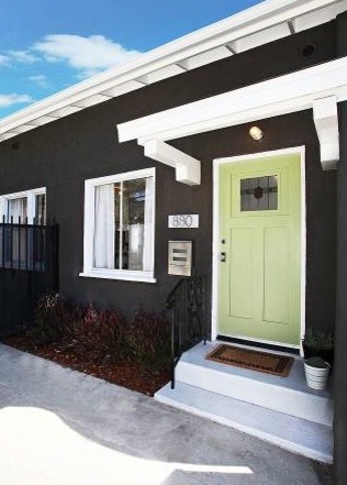
-Black is a color to consider if you plan to paint your red brick rambler. If you’re tired of the tract house vibe, why not make a major statement.
When does black on the house NOT work? When it starts to fade unevenly and make the house look like charred remains of a terrible event.
If you decide to paint your house black, you must prepare to keep the paint fresh, the lawn mowed, the weeds pulled, the clutter corralled, and the driveway plowed because your house will create quite a sensation on the block. Nobody will drive by without noticing. And that’s kind of fun.
Bored with beige yet? Consider black.
What’s All the Buzz about Undertones?
December 28, 2012 § 5 Comments
Determining a beige color undertone (defined by color expert Maria Killam as “a colour applied under or seen through another colour”) can be tricky. Beige can have one of several undertones: pink, yellow, or green are the basics. If you have dining room furniture with a decidedly yellow/orange hue and walls with a pink undertone like Benjamin Moore’s Georgetown Pink Beige HC-56, then yikes, you have a problem. Off to the paint store.
Bottom Line: Mixing pink-beige with yellow-beige (or yellow/orange) is a big no-no. Fix: Choose a paint with a different (non-pink) undertone like Benjamin Moore’s Monroe Bisque HC-26 that has a yellow undertone and looks great with the golden oak.


If you avoid the mistake of mixing pink and yellow undertones, you’re on your way to understanding them. The other nuances of what undertones to mix and not to mix will come much easier. Note: Mixing pink and yellow vibrant hues is perfectly okay. It’s just the dreaded undertones that can trip you up. Beware.
Choosing a Wall Color: Light and Lighting Help
December 27, 2012 § Leave a comment
Have you ever entered somebody’s home in the summer with the hot afternoon sun streaming into their bright yellow living room and felt like you’re drowning in a container of lemon curd? Perhaps a bit too much sunshine! The message? Light matters.
When you’re choosing a paint color for a room in your home, pay attention to which direction the light is coming from, how big the windows are, what the function or desired feel of the room is, and the shade or tone of the color you’ve selected. Here are some things to think about — not rules — just guidelines.
LIVING ROOMS
Function: Gathering, conversation, reading, and TV.
Direction of light coming in: Important as the living room is often the first room you see when you enter your home and where you receive guests, day and night.
Desired feel for the room: Warm and welcoming
Color choice: If your living room faces North, choose a paint color with a slight yellow undertone (as opposed to blue/gray) to add warmth to that North-facing room. If your living room faces South or West, you may want a cool color with the warmer hues reserved for pillows and accessories that can be moved in or out with the seasons. Easy solution? A medium-toned neutral (not necessarily beige) will allow you to bring in any furniture, window coverings and accessories without changing the wall color in the future. Another option: a rich hue on the focal wall (the one you see as soon as you enter the room — it may have a fireplace) and the other walls lighter and more neutral. Canadian designer Sarah Richardson loves this effect– that is one of her designs pictured above. Notice how the black TV disappears in front of the chocolate accent wall? Clever! (http://www.sarahrichardsondesign.com)
BEDROOMS
 Function: Primarily sleeping. Exception: Kids’ rooms. Since kids often play in their rooms, you can ramp up the palette to please them (a topic for another post!).
Direction of light coming in: Not a huge factor since you’re in there primarily at night anyway.
Desired feel for the room: Spacious if the room has little square footage and relaxing for a good night’s sleep.
Color choice: You can go in one of several directions. For the spa feel, look at light grays, gray-beiges, and calm gray-blues/greens. For a cheerful awakening every day, include pops of color like orange, yellow or shell pink like in this bedroom by Nicole Sassaman Designs (http://www.nicolesassaman.com). Luxurious with cream bedding!
DINING ROOMS
Function: Eating and conversation.
Direction of light coming in: Again, not a huge factor since you use the dining room primarily at night. (Exception: dining areas that are in an open-concept layout do have some light considerations.)
Desired feel for the room: Stimulating and dramatic.
Color choice: If you like deep, rich colors, this is your opportunity to use them for maximum effect. But you do not have to go dark with the wall color to be dramatic. Beautiful furniture, artwork, and lighting will make the room dramatic even if paler or more neutral colors are used. And don’t neglect the ceiling in the dining room. You may want something dramatic above the table — designer Troy Beasley’s handpainted canvas on the ceiling certainly gives a dramatic European flair to this dining room! (www.beasleyandhenley.com)
KITCHENS
Function: Cooking, eating, entertaining, and sometimes studying.
Direction of light coming in: Vital since you’re in the kitchen at all times of the day and night!
Desired feel for the room: Warm and welcoming.
 Color choice: Okay, now this is where it gets tricky. Start with your cabinets. Are they dark? What color is the counter top? You’ll want to introduce some contrast in the room either by choosing a lighter tone for the walls or bringing in a complementary color. Are your cabinets light? As long as there is some contrast somewhere in the kitchen, you can choose a light wall color for a light and airy feel to the kitchen like this one by designer Lori Dennis (www.loridennis.com). Lori uses the warmth of the wood floor and different tones of whites and warm grays to warm up this light, open kitchen and adds pops of color on the counters as well.
MEDIA ROOMS
If you have a separate area for watching movies on the big-screen TV, then go medium to dark with the walls and even the ceiling. The idea is to recreate that movie theater feel and eliminate glare at the same time. Gray, navy, eggplant, chocolate and rich red — all great wall colors for the “man cave” like this one by designer Phyllis Harbinger (http://www.dcistudio.com). 
Brick House Trim Colors
December 26, 2012 § 338 Comments

Creamy white trim with black shutters (and door) give brick houses like these on historic Nantucket Island in Massachusetts a classic traditional look that is timeless. But for a more contemporary look, use the brick itself for your trim color inspiration. Choose a color that you see in the brick or the grout– tan or taupe or another earthen color. If you select a color from the brick, it will blend with the brick and provide less contrast than the white. The overall effect will be soothing and contemporary but it will call less attention to the architectural details. The Boston building below is hardly contemporary, but the color scheme is taken from the brick and grout and is one example of using coordinating trim colors instead of contrasting trim.

Neutral but Never Boring
December 10, 2012 § 2 Comments
Does your home scream 1972 when you enter the front door? Are you stuck with metallic wallpaper on the ceiling in the guest bath, orange shag carpet in the basement, or an avocado bathtub? Then maybe it’s time to update. But this time, instead of hopping on the latest hot new trend (I could name a few here, but I’ll resist), how about giving your home a classic re-do. Something that will stand the test of time, or at least a decade or two, without branding your home with a particular year. For that kind of longevity, we turn to a neutral palette, but neutral does not have to mean beige and it’s hardly ever boring.
-The key to a neutral palette is texture. You could have an all-white living room but if that white includes fuzzy white pillows, a shiny white marble table top, and some warm white chenille upholstery, then the room will have plenty of interest.
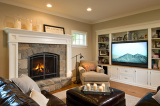
-Neutral does not have to mean just one color either. In this room, the walls are a latte color, the sofa is dark brown leather, and there is plenty of color in the books and objects on the white bookshelves. What makes this room work so well is that the stonework on the fireplace is a feature and because the other furnishings do not stomp all over the subtle colors in the stones, the room’s palette includes peaches and golds and grays and tans and taupes — more than enough colors.
-Neutral allows you to bring in color in the art, pillows, and other more temporary furnishings and accessories without clashing with a strong wall color and a brightly colored sofa.
-Neutral allows you to change your accessories with the seasons and the holidays without overpowering the existing color palette or the holiday decorations.
-And when you’re selling your house, neutral allows potential buyers to see themselves in your home and that is critical for a successful sale.
So as you choose tile and furnishings and paint for your newly updated space, consider neutral because neutral does not have to be boring.
