Black Brings It
March 20, 2013 § Leave a comment
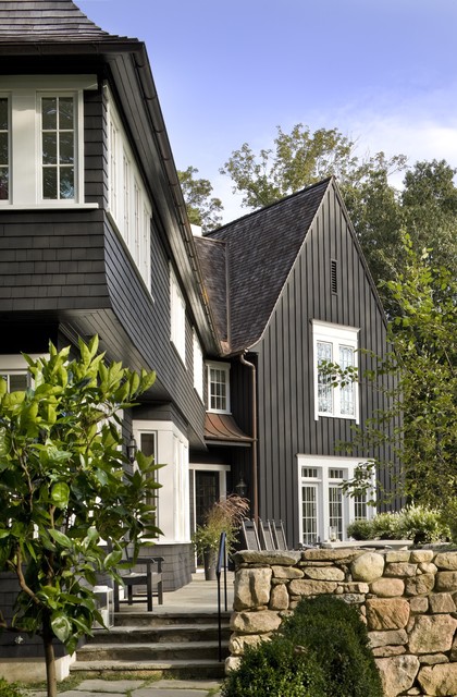
Who says black is not a house color? Certainly not me. Black is to houses what a little black dress is to a stylish woman. A great way to show your stuff.
Black is both dramatic and neutral. It attracts attention and shies away from it. Black blends with almost any environment, yet it makes all other features stand out, like the crisp white windows on this house. Since the trim on the rest of the house is also black, the white windows and window trim take center stage. The natural cedar roof creates warmth and texture. And the bronze gutters look like jewelry.
Another feature that stands out is the rock wall. The backdrop of black allows the depth of color on the rock wall to come forward — much more effectively than if the house were another more typical earth tone.
The mix of siding materials adds an additional layer of texture. The tall board and batten siding on the high gabled section makes a tower of that end of the house. The shakes on the rest bring it on home.
Yes, black maintains its reputation as the color of sophistication. Even for siding.
Choosing a Siding Color to Coordinate with Brick
March 5, 2013 § Leave a comment
 Where a particular hue sits on the color wheel can make a world of difference when it comes to choosing house colors. Especially if you’re trying to coordinate the color with another material, like brick.
In this example, one yellow leans toward orange. The other one leans toward green.
I don’t think I need to say any more.
It’s the House Color, Not Your Dining Room Curtains
February 28, 2013 § 2 Comments
 Sometimes the best house color is one you might skip right over in the fan deck. Like this one: most likely Ben Moore’s Livingston Gold HC-16, a dark mustard-like brown with a definite green undertone. The kind of color you don’t want to see if you’re feeling queazy.
Although you probably would not choose this color for an interior room (for the reasons mentioned above), what a great house color for this old farmhouse with attached garage in natural cedar shakes. The combo is terrific — earthy, aged, and plucked from nature’s rock and wood palette of colors.
I slammed on the brakes to take a photo.
Stone and Brick Reveal Your Exterior Color Palette
January 25, 2013 § Leave a comment
 Yes, it’s winter and the roof in this photo is covered with snow, but now we can focus on the rest of the house, particularly the stone. What works on this house is the color palette that is taken directly from the numerous available hues in the stonework itself.
The bricks are a monochromatic rusty red color that complements the stone without competing with it — a challenge when you have multiple materials on the house. The siding is a gray neutral, also in the stone. The trim is pulled from some of the darker taupe stones. How easy is that? Job done.
If you are building a home with different materials, use the busy one with the most colors (stone or brick) to make the rest of your color decisions. That way, the whole house will come together in a harmonious cornucopia of color.
The alternative? Choosing a color that is not in the palette at all. The result? A disjointed effect that divides the house into sections and makes it seem smaller. Can be done, but it’s tricky and needs a professional colorist to pull off. Do yourself a favor and stick with the natural palette that presents itself to you from your building materials.
The Best and Worst House Colors for Cold Snowy Winters
January 24, 2013 § 1 Comment
 As we get more and more snow this winter, I notice what house colors look good in snow and which ones look awful. I’ll start with the thumbs down. White. It either blends away completely except for any contrasting colored shutters or it looks downright dirty. It’s also cold-looking. If you have a white house and a long winter, make sure you have lots of greenery in the foundation plantings, trees in the yard, and a wreath with a big red bow on the front door.
My favorite color for long, cold, white winters is a sunny yellow. Wow, does that color look terrific against the white snow. Try Benjamin Moore’s Concord Ivory http://www.benjaminmoore.com/en-us/paint-color/concordivory. Paired with a black roof, black shutters, and white trim, you’ve got a knock-out house year round.
Shutter Color Inspiration for Stone and Brick Houses
January 10, 2013 § 6 Comments
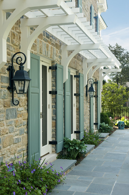
One approach to choosing an accent color for your stone or brick home is to let the stone or brickwork dictate the color. How easy is that. The stonework on this house and walkway revealed a whole palette of dusty blue-gray greens from which the shutter paint was then custom-mixed to a perfectly coordinated color.
In the brick example, this Old Town red brick contains a lot more colors than just red. Purple is what pops out and that gorgeous shade was the inspiration for a dark purple shutter color: Ben Moore’s Caponata AF-650. Dark purple shutters are a wonderful option for other homes as well, not just red brick.
Natural wood tones always work for shutters, especially on stone or brick and especially if the shutters are actually wood and not vinyl. Old World wonderful.
When selecting a shutter color, take your color cues from your house. Chances are pretty good that if you have a stone or brick house, you have quite a palette of colors to choose from already.

