Green Decorating: The Soothing Hue
March 17, 2016 § Leave a comment
St. Patrick’s Day brings us to thoughts of green. Whether it’s kelly green or any of the variations thereof, green is a versatile, natural hue that brings life and comfort to any room. It is particularly nice in rooms where you spend time revitalizing your mind and body.


Waking up in a green room warms a cold, white, snowy day and cools a hot, humid summer morning. It can bring the color of lush plants and trees to a city skyline view. And it can calm an agitated, overextended lifestyle at the end of another hectic day.


Green can be either warm (yellow-green) or cool (blue-green), and both pair beautifully with white. Coordinating accent colors can add energy (the complementary reds and pinks, opposites to green on the color wheel) or quiet blending (the analogous yellows and blues on either side of green on the color wheel).
I highly recommend adding green, even a mixture of greens, to your home to quiet and soothe your soul. Wherever you need a few moments of ahhhhhhh.
Paint colors above: Top left to right: Waterscape SW 6470, Topiary Tint SW 6449, Honeydew SW 6428, Breaktime SW 6463. Bottom left to right: BM Guilford Green HC-116, Palisades Park BM 439, High Park BM 467, Dartsmouth Green BM 691.
Change Your Front Door Color
February 8, 2016 § 2 Comments
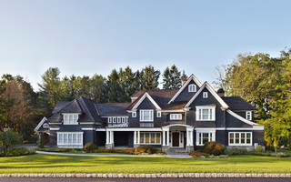
 Driving through a little town recently, I glanced around as usual, admiring architecture, making a mental note about what color combinations to try and which ones really do not work, and generally looking for color and design inspiration. One house called out to me as I cruised by — quickly I made a U-turn and headed back for a closer look. Like a beacon of happiness, the bright, sunny, yellow door popped off the crisp, white house with black roof and shutters. What a stunning house to drive home to every day.
February seems to bring thoughts of Spring and those quick and easy, yet big-bang-for-the-buck house projects. And the front door color is one of them. If you’re tired of black or red for the front door, and particularly if you have a white house, there is no reason to keep the status quo. Shake it up. What is your favorite color? What color are your spring flowering shrubs? What color does your front door want to be? (Okay, that last one may be a bit weird, but you get it.)
Guidelines for choosing a new front door color:
- Make sure that new color shows up at least two other places in the front yard, for example, in the landscape plants, flower pots, patio umbrella, or other accessories.
- Consider a brighter sheen for a softer paint color. That will add life and a little pizzazz to a color that doesn’t stand out too much on its own.
- Realize that if your front door is under a porch overhang, the color of the door will darken. Go a bit brighter unless, of course, you get full afternoon sun shining on the door. In that case, go a bit darker.
- Give yourself choices. Try three different colors and look at them at different times of the day and in different weather conditions. Don’t rush the decision.
So this year, while you’re skimming through seed catalogues and planning your Spring garden colors, choose a new front door color too. You’ll love how it brightens your spirits.
From Color Inspirations to Paint
February 4, 2016 § Leave a comment
Walking into a pottery shop is like immersing yourself in a box of crayons, all pristine and unbroken with endless possibilities of combinations.
 This set of dazzling bowls caught my eye. Mesmerizing is how I’d describe them with an array of blues from turquoise to cornflower. (The dishes are mine now.)
Whatever the inspiration, there is a paint project waiting. In my mind’s eye driving home, I see these dishes in a dining room painted any one of the colors with crisp white trim. Maybe even a shiny white bead board around the wainscoting to bring out the hues in the room. I can also see any one of these colors on the walls in a kitchen with white cabinets and a white subway tile backsplash. Or maybe one of these colors for the backsplash! (Head is spinning with ideas.)


Accent walls give us a way to add a small amount of color drama to the focal area of a room without painting everything. Especially nice in open-floor-plan spaces where walls may incorporate several rooms. How about one of these rich hues for your front door? Spring painting is right around the corner. (Ben Moore’s Calypso Blue, Bermuda Blue, and Deep Mulberry)
Let the color in front of you and surrounding you inspire you. Wrap yourself up in it. Do something for yourself and create a happy house. It’s just paint!
It’s Time for Faux to Gaux
June 22, 2015 § 2 Comments
 Drop the sponges, folks. Honestly, without trying to offend anyone or stomp on creativity, I have never seen such awful faux finishes in my life! It’s high time we roll over those ugly paint jobs and simplify our visual lives a bit. And if you plan to sell your house anytime soon, please listen up.
Faux is out. It was hard to perfect from the beginning but as of now, it has been totally overdone. From walls to kitchen cabinets to dressers and dining room ceilings, enough!
What’s in? Paint. Just plain paint. And in some applications, wallpaper. But not too much! No need to match the curtains to the wallpaper to the bed linens. As one who tends to find a  good thing and overdo it, I can certainly sympathize. But the next time you have the urge to spend hours dabbing wet sponges on the wall or cabinet door, take a deep breath and stop.
Ready to Immerse Your Home in Color?
November 25, 2014 § Leave a comment
 As with haute couture in the fashion world, we often look to hotels and other public spaces for trends in home color and design. Look no further than The William, a boutique hotel in New York, where each room immerses its guests in a paint bucket of saturated color punctuated by droplets of white for chroma relief. I am not sure if you can order up a particular color to match your luggage, but nevertheless, your experience there will be unforgettable.
Are we ready to move this color trend into the home? Some already have, but many of us will take a little while to move back into the rich dark hues of a decade ago. I’m just getting used to the freshness and brightness of white walls. But who knows.
 If you are contemplating a project that involves intense color, start with a small space like a guest bath or a guest room where the color will make a huge impact and the cost of painting over it will be minimal. Make sure you have adequate lighting so the color will show “true” and you will not end up in a cave. And remember to punctuate your color with white or cream to make the color “pop” and add bits of black not only to avoid the I-got-lost-in-a-box-of-crayons look but also to add an air of sophistication to the project.
Full color on!
(photos from Dwell magazine)
What Color to Paint Your Big House
February 13, 2014 § Leave a comment
Building a new house or a large addition but beginning to worry that it might look too big in your neighborhood? Maybe a lot of people don’t worry about their neighbors, but some people do. If you think your house might appear overly large-scaled, then avoid painting it white. The contrast against the setting makes white stand out even more than other light colors.
To bring the house down to scale and accent the architecture at the same time, consider a dark color like a dark charcoal or dark green for the siding. Dark trim, of course, will camouflage the house even more, whereas white trim will highlight windows, doors, and roof trim.
Your choice — but becoming the McMansion in the modest neighborhood will not endear yourself to your neighbors. And my how they talk…
Fair warning.
Warm Your Soul with Color
January 29, 2014 § Leave a comment
 Those of us with light airy neutral homes are feeling the chill this winter. Whether it’s the frigid temperatures outside or the cabin fever inside, the light, low-contrasting palette we enjoy so much of the year for its calm and cool comfort just isn’t cutting it.
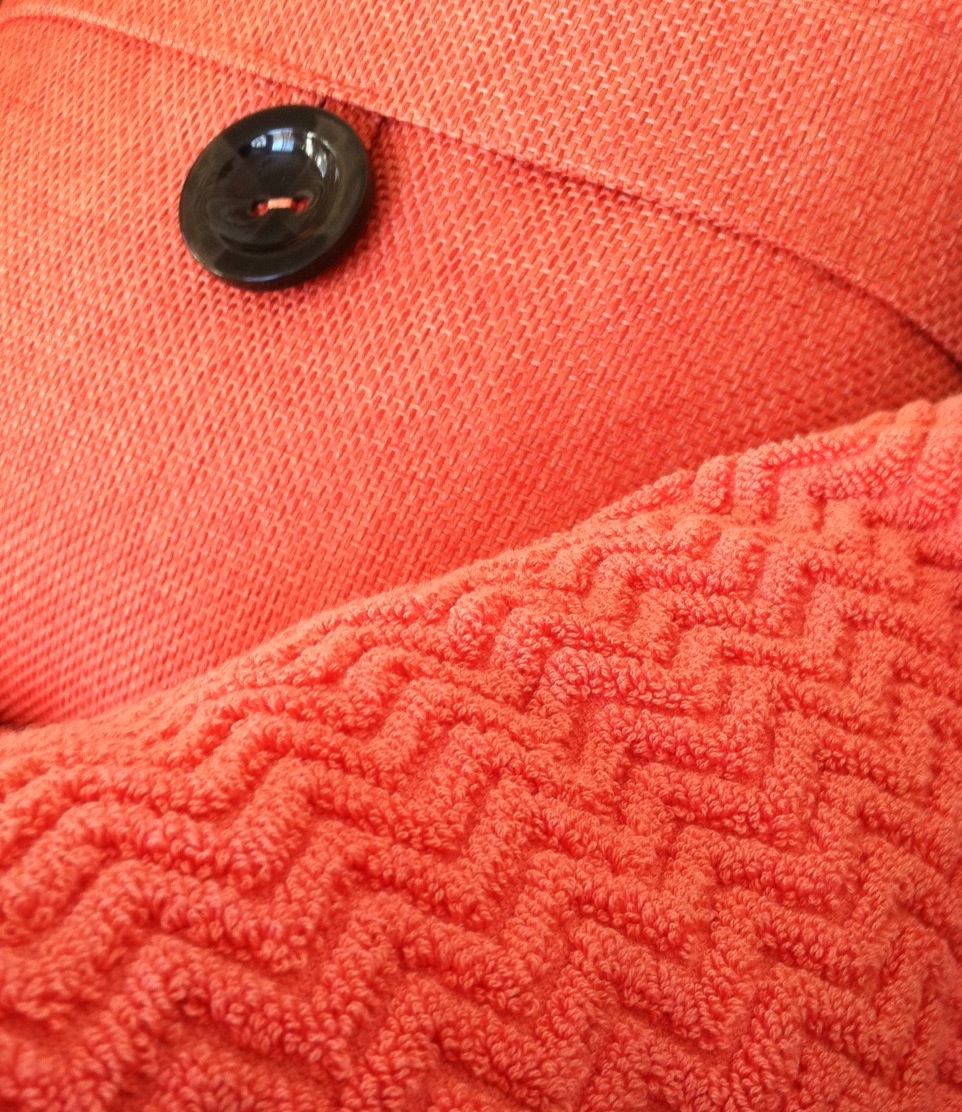
A recent trip to a home goods store had me craving color. On two separate occasions, my eye scoured the store’s palette of spring selections and landed on the same warm vibrant coral. I had to have it. First the pillow. And next time, two towels (for me only, I might add).
Color makes us feel good. Color cheers us up and calms us down. And the right color can make our homes feel cozy and welcoming any time of year. Welcome home, my new coral accents. And if the temps don’t rise soon, I’ll be off to the paint store for a gallon of, you guessed it, coral.
Stay warm, my friends!
Spring Into Unexpected Color
January 22, 2014 § Leave a comment
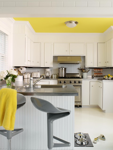
Designers are adding pops of color to the previous year’s light neutral color palette and in the most unexpected places. Look up for an opportunity to add color to your white kitchen. Pull some of that ceiling color down into the room with dishes, placemats, and other accessories. And create “flow” between rooms by adding a touch of your ceiling color to the adjoining room.
Color trends like this year’s fuschia are fun when you can add the color with inexpensive pillows or a single upholstered chair (http://www.worldmarket.com/product/fuchsia-nina-chair.do). Keeping the base of the room neutral lets you change your color palette when fresh new opportunities arise. Or with the seasons.
Pick Paint Colors Last — yes, Last
January 15, 2014 § Leave a comment
 So often I am called to a freshly painted room and asked to help the homeowners find a rug and window treatments to go with the new wall color. As much as I appreciate the homeowners’ enthusiasm for tackling the paint project first, it makes finishing the room much harder to start with the paint.
If you’re planning a room re-do and anticipate purchasing new furniture, window treatments, and a rug, here’s the most efficient order of purchases:
- Pick the biggest-ticket item first, perhaps the new upholstered or leather sectional sofa.
- Then pick the other furniture, like upholstered chairs and a leather ottoman.
- Then pick the rug. There are fewer options at that point, but the rug will introduce additional colors into the palette and you can bring those other colors into the room with art and accessories.
- Then if you want fabric window treatments, pick the fabric next that will complement the other elements.
- After ALL those decisions are made, THEN it’s time to pick the wall color.
There is a multitude of paint colors, shades, and tones from which to choose, but the paint decision will actually present itself more clearly once all the other major decisions are made. And the paint color will then pull the whole room together.
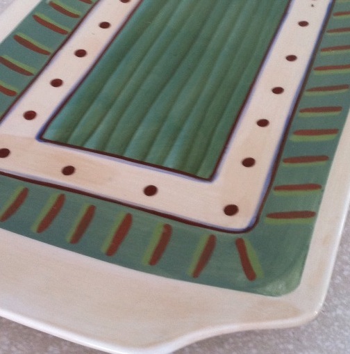
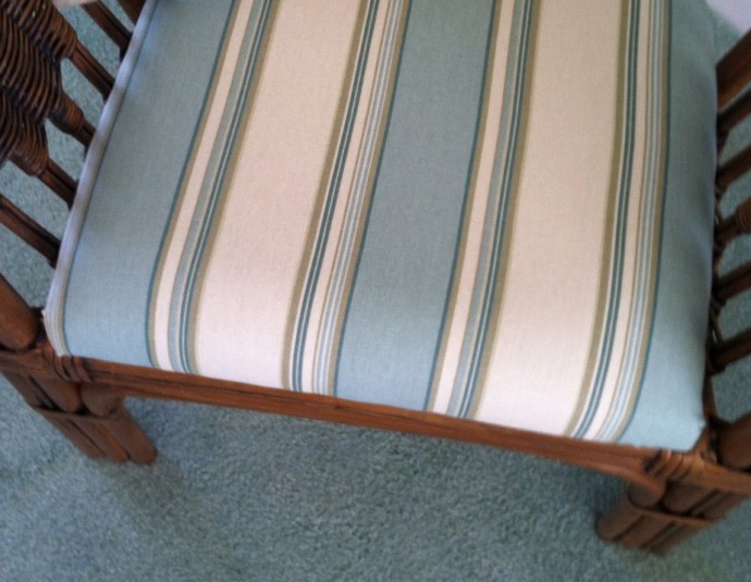 If your furniture and rugs a
 re neutral, you can find your color inspiration from almost anywhere, including in this case, a hand-painted platter. From that inspiration piece, we pulled in a striped fabric to cover some rattan chairs, and pulled the soft, gray-green paint color out at the end to complement the blues.
Painting Over Tradition But Maintaining the Soul
August 26, 2013 § Leave a comment
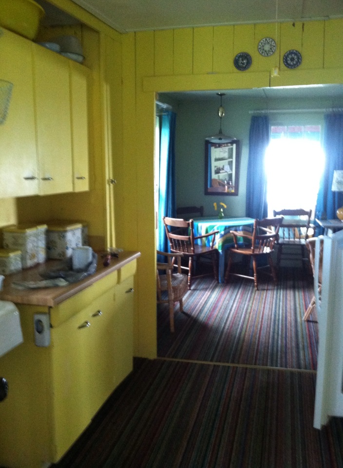 Make no mistake. This is my mother’s kitchen. She painted it this bright yellow probably 60 years ago, and up until this past summer, it stayed that way.
With my mother’s passing and the rebirth of the cottage as a rental property, I decided to tone down the walls in the kitchen a bit. I considered sea foam greens, light ocean blues, and beach sand beiges, but I ended up with a light peachy cream-yellow (Windham Cream HC-6, Ben Moore) as it kept the cheerful sunny aura of the space but took some of the harshness away.
I brought the blue in with the window treatment, kept all the old furnishings like the metal paper towel dispenser and bottle opener, and the yellow tub that we all took baths in as kids. I think Mother would be pleased. And that’s important to me.

