Curb Appeal: Porches, Columns, and Color
August 20, 2007 § 15 Comments
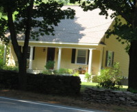 Many farmer’s porches and entryways have supporting columns (or pillars). Some are structural and some are decorative. But even if the builder assures you that those skinny little pillars will hold up the porch and conform to code, the finished look may not appear balanced from the street. I’ve seen many examples of houses where the scale of the column is out of scale with the porch– a big wide porch with dinky little columns (or pillars), one on each end. They look more like toothpicks than architectural elements.
If you have columns or pillars along a farmer’s porch or on either side of an entryway overhang, make sure those columns are substantial. If you have skinny columns, consider adding another to each end so you have two columns on each side of the door. That will provide better balance without any demolition.
For color, paint the columns white or whatever the trim color is on your house. Painting the columns the same color as the front door detracts from both the columns and the door.
Columns can really dress up an entryway. Just make sure they add curb appeal too.
Does Your House Need Shutters?
July 23, 2007 § 163 Comments
If light fixtures are the cuff links of the house, shutters must be a nice silk tie– a great way to add a little more coordinating color to the “outfit.” But sometimes a tie is not necessary and the same goes for shutters.
If your house is a classic colonial with six-over-six, double-hung windows, it is very typical to use shutters, often black. However, if you have a very dark-colored house with cream trim, you may want to skip shutters altogether. Also true for homes that have a lot of stonework or other architectural elements that take the focus off the windows. And contemporary homes with casement windows or odd-sized, mismatched windows usually have no shutters.
One more thing about shutters: If your house has windows with odd placement — too close to the corners, etc. — then forget the shutters. It doesn’t make any sense to use one shutter on one side of the window and none on the other side (I’ve seen it!).
Take a look at your house and look around the neighborhood. Does your house need shutters? Maybe not.
Stained Solid Wood Doors
July 23, 2007 § 2 Comments
Many of you, after reading about how garage doors are painted the house color and how front doors should be a stand-out color, have written in about using stained solid wood doors. My comment to that is, whenever your budget allows for solid wood doors, go for it. There’s nothing like the richness of wood, whether it’s a mahogany stained front door or garage doors, to dress up your home.
Color Your Walls
July 19, 2007 § 81 Comments
Color is hot. Whether it’s chocolate brown for your bedroom walls, spice for your kitchen, or lime green for your guest bath, color is going up on the walls all over. People move into wonderful new homes with painter’s white walls and wonder why their homes feel so cold. Remedy? Add color.
Sometimes people are hard to convince that a hint of yellow on the walls will add a dash of sunshine to their lives. White walls tend to pick up the other colors in the room and if you stand back and really look at the “white” walls, they appear grey. Recognizing that really makes you want at least a little color on your walls.
For people with real fear of color, it’s usually that they’re afraid the room will be too dark. Solution? Check the lighting first. In one home, after determining that a velvety navy blue was the best color for this room, we called the electrician and added more recessed cans first. What a difference. Between the additional lighting and the rich color on the walls, the room was transformed from boring to bellissimo.
Sometimes people want what they see in a magazine but upon further conversation and a tour through the home, we discover what colors they really love. Color inspiration can come from furnishings, dishes, a painting, cabinet color, or just about anything. A beautiful backdrop color pulls the whole look together.
Consider all adjoining rooms when making wall color selections to achieve “flow” throughout the home. Color can really transform people’s lives. And paint is relatively cheap!
Color Subtleties: What I learned about green from a cactus
July 10, 2007 § 2 Comments
There are times when I catch myself staring at the cactus sitting on the kitchen windowsill. It’s one of those tall cacti, about 30 inches, whose growth shows up in rings of color moving up the long stalk. If you stare at the cactus long enough, you can appreciate the gradation of greens from the olivey older growth to the bluer-green new growth. The colors also have kind of a muted, dusty quality that’s hard to find on a paint chip.

Studying the combination of greens really makes me appreciate how many greens are mixed together in nature. And how you can copy some of those combinations in your own decorating to achieve a refreshing color palette. Whether it’s in your home or on the exterior, feel free to mix some greens and see what you get. Next time you’re killing time in a paint store, check out Benjamin Moore’s apple blossom 479 with corn stalk 542. Or garland green 429 with desert green 443.
You don’t have to mix paint colors to get the effect. Mix up the greens in your landscaping. Add some yellow-green shrubs to a garden of blue-green hosta. Look more closely at the color combinations in the countryside as you drive by. With all its variety within the family, green is a fabulous hue. And if you have a cactus nearby, check it out. Really look at the color green.
Cottage Colors: Back from the Lake
July 5, 2007 § 17 Comments
 My apologies to anyone who surfed over this way only to find empty posts and no comments for two weeks. I’ve been at my dad’s cottage away from all civilization (including my trusty computer) for two weeks. Although it was restful, the pile of emails and assorted communications that went unanswered is daunting. But I’m back.
While I was there, Dad decided to have the outside of the cottage painted. Or at least talk about it. And I had left all my color wheels at home. Why would I need them, I reasoned. Well, boy was I lost without them. I took a jaunt to the closest Home Depot and stood there in front of all the color swatches, just like many of you have been doing. I too was overwhelmed by the choices. Somehow with my own color wheels from all the various paint companies, I can maneuver through the myriad choices landing on the ones that I know will work. But in front of this maze of marketing displays, it was color overload. I grabbed a handful of paint chips and bolted for the door.
Back at the cottage, the process took shape. We decided on dark green trim for practical reasons. The spider droppings are black and show up on light trim. With a dark color, you don’t have to scrape the black spots off as often. Terrific. (I verified this by wandering over to a neighbor’s cottage that had white trim. Yup. Black spots.) Then we decided to go with a medium green for the body. Again for practical reasons. It will blend with the dark trim and not stand out very much. The surroundings are all green, of course, and the cottage will blend in. Just as Dad wants. Nothing flashy for this cottage. It’s pretty rustic. And the orange daylillies will really look sharp against the green backdrop.
When you’re choosing cottage colors (or colors for any dwelling that’s buried deep in nature’s colors), stick with colors that appear in nature. They don’t have to be greens, but taupes and tans and natural stone colors work great. As do darker blues and browns. Keeping to colors you find in your landscape will leave the vista uninterrupted to the eye. The cottage will look like it belongs right where it is.
