Paint Your Old Golden Oak Cabinets!
October 19, 2009 § 10 Comments

 Saddled with old golden oak cabinets? Why not paint them. I did and it was very easy (though time consuming). I started by removing the doors from the cabinet base and unscrewing all the hardware. Then I lightly sanded all the surfaces. A good primer like Zinsser’s Bulls Eye 123 covered easily and provided a great base for the finish coat.
I used Valspar’s Kitchen and Bath Enamel in a Ben Moore color called Antique Parchment on the top cabinets and a Valspar color called Jekyll Club’s Cherokee Rust on the bottom cabinets (there, I plugged both companies). The cabinets looked great but I wasn’t done. In our house with kids, etc, etc, we tend to bang things up a bit so I mixed up a glaze that included some Cognac Snifter 1148 (a Ben Moore color used in an adjoining room) for the top cabinets and Branchport Brown HC-72 for the bottom. I painted the glaze into the seams and cracks in the doors and wiped it off with a rag. The look is rustic but cheerful and allows the new oil-rubbed bronze hardware to finish the room. And any future little scratches will not show. I love it!!
I tiled the backsplash (white primer in the before photo) with simple white subway tiles from Lowe’s. Not an expensive project, but I did purchase a wet saw for cutting the tile. (Looks like I have more tile projects in my future or maybe I can rent the saw out to my neighbors!) I am very happy with the end result, imperfections and all, and I do not miss my golden oak cabinets! I would highly recommend painting cabinets if a total kitchen re-do is not in the budget or if you’re planning to sell your house and you have ugly kitchen cabinets. The project will be worth it!
When Roof Selection Becomes a Headache
October 18, 2009 § Leave a comment
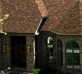
 Whoa! Does anybody else get a headache from this dizzying roof and brick combo? Although selected for the brochure of one of the major roof manufacturers, I find this photo to represent all too many not-so-great roof decisions. The brick in this home is very busy since it has a lot of color variation. Adding the color variation from the architectural shingles takes the house (and it’s big!) way over the top. An alternative might have been a more traditional roof with less color variation that would complement the brick and not clash with it. And that alternative would have been cheaper too!
If you have a brick home with a lot of color variation and you’re trying to decide on a roof, consider the whole look before making your selection. Avoid going with a trendy roof style just because the neighbors are doing it. Consider your house style and the effect that the new roof will have on it. If you need help, click on the If I Can Help You page and we’ll work on it together.
Do My Windows Need Shutters? What color?
October 5, 2009 § Leave a comment
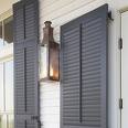
 Most of our homes do not have as many windows as this beautiful historic Federal style house, but some windows just call out for shutters. If your house is a colonial or ranch style with double-hung windows (“six-over-six” panes of glass separated by “grids” or mullions), then you should consider investing in shutters to add a finishing touch to your house. Of course, if you live in an area threatened by periodic hurricanes, then shutters are required for protection. But I’m speaking to those of you who, just like putting up curtains in the living room, might add shutters to “dress” the windows.
If you have a modern or contemporary home with a variety of window styles, shapes, and sizes including casement (“open-out”) windows, then shutters might be more of a distraction than an asset to your curb appeal. Also, if there is no room to put in properly sized shutters, then forget it. Don’t opt for the mini-sized version just to cram the shutters into the facade. It’s not worth it.
As for color, white works in only limited palettes; it is best to pick an accent color. I prefer dark shutters with a dark roof; however, there’s more to dark than just your standard black shutters. Various shades of Midnight blue and  Charleston green can add enough color to make the house interesting yet enough contrast to make the house stunning from the street. Adding dark shutters is like adding a touch of black to your interior palette. It just dresses up the house.
For those of you choosing from standard off-the-shelf shutter colors, your options are more limited, but remember that black always works. One note: if the shutter color is in your house somewhere (in the brick tones, for example), then that shutter color will work. However, if you have a rusty red brick, beware of clashing red-maroon shutters. I see them everywhere, just slightly off.
There are so many shutter styles to choose from these days that you can make a real design statement just by adding shutters. If you have a question about your own house and whether or not to add shutters (or what color), just click on the If I Can Help You page and we’ll work together.
My Old House is Just Not Me
August 20, 2008 § 25 Comments
Many of you have a modern aesthetic. You like clean lines, unfussy details, neutral colors, and minimal furnishings. You probably should have moved to a downtown loft space, but you are now part of suburbia. You write in that you’ve decorated the inside of your new home to reflect your taste, but the outside is a disaster.
If you are stuck in an exterior from another era when brick facades were popular and split levels were all the rage, or if some weird architectural detail haunts your house, the easiest and cheapest solution is to paint. For example, if you now own a split level with one-half brick and the other half siding, it’s okay to paint the house all one neutral color to modernize the appearance from the street and actually make the house look bigger since it’s no longer broken up visually.
NOTE: If you own a home that is either listed on your town’s historic register or is in an area of period homes, then do not alter the exterior except to maintain its historic value. Chances are that if you live on the main street in your town and have purchased an older home, the town’s historic commission has already contacted you — they will tell you exactly what you can and more importantly cannot do to your home. Before you renovate the exterior, be careful of “upgrading” to cheaper materials, styleless features, and “modernizations” that will come back to haunt you when you try to sell.
Changing a color palette, however, may be a relatively safe way to modernize without destroying the home’s history. If you live in a colonial but have modern tendencies, you can reflect your modern taste in your house color palette. Choosing three or even four colors off the same paint chip for your siding and trims or painting your house and trim all one color reserving a vibrant shocker for the front door can give even a “boring” (to some) old colonial a modern personality.


 This cork board from the Pottery Barn Kids catalogue was the inspiration for Hannah’s bedroom renovation. We decided to open up her rather small room by painting wide horizontal stripes all the way around the room in three different tones of blue-green with a white stripe between them. The treatment conjured up, at least in my mind, waves on the beach.

 or sure. Now we have choices from black to almond to green and even red. And whatever the shape of your space, we have a window to fit into it. Awhile back the trend was to update the interior lighting plan with recessed cans and spotlights, uplights, downspots, and all the specialized lamps you could imagine for your space. Now we’ve moved on to creating unique window plans to suit the house: clerestory, stained glass, enormous picture windows, and different styles of window mullions to fit the style of your house, from Colonial to Victorian to Mission. Even new homes can be made to look old — well sort of.


