The “Accent Wall” is Back!
July 7, 2011 § 2 Comments
 Maybe it never really went away for some people, but for others the thought of an “accent wall” just screams ’80s. But you know, honestly, they’re not a bad idea… in some cases. Accent walls (I should dream up another name!) can take a large room and create a cozy nook, or a di
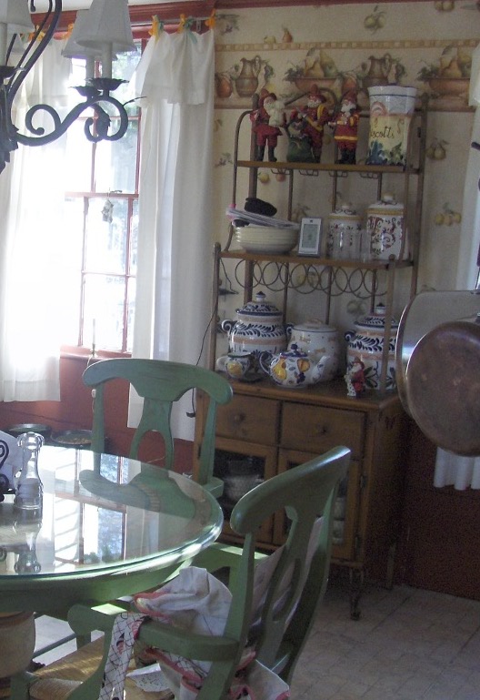
 ning area. Like this kitchen. The walls were a gray blue, and half of the large space was dominated by white cabinets and a slate tile backsplash. So we pulled some of the orange out of the tile and created an “area of interest” on the other end of the room. The color is Tucson Red (1300).
Using an accent color on one wall is also a great way to warm up a loft or other modern, non-descript space that needs instant architecture. We call it “color blocking” — yes another term from the high-fashion ’80s (I’m dating myself) — but it’s a terrific way to take a neutral, often white, space and add large pops of color. Instant focal point!
When an accent wall doesn’t work is when the room is too small or too square. Painting one wall a different color might just chop up the room too much. But if you have a long narrow room, painting the far wall a warm color will bring it forward visually and make the room feel less like a bowling alley and more like a well-designed, pulled-together space created by you.
Update Your Backsplash to Sell
June 17, 2011 § 3 Comments
 Honey onyx mosaic tiles — love ’em! We switched out the old ceramic backsplash in a “modern” kitchen (still had Formica counters with oak trim) and updated the look of the whole room (okay, we changed the cabinet knobs too). The white melamine cabinets, Formica counter tops, and linoleum floor all stayed! It was a wonderful transformation for a minimal cost to the homeowners who were updating to sell.

We chose the onyx for its variety of warm colors (would blend the oak trim nicely), its scale (the small tiles would add interest to the plain white cabinets), and its ease of installation (mosaics require fewer cuts!). The biggest benefit? These tiles came from one of our prominent “big box” stores so the homeowners did not pay a lot for materials. A bonus when you’re preparing your home for the market!

Kitchen Decisions
June 15, 2011 § Leave a comment
 And you thought picking a paint color was hard? Try a kitchen renovation. The number of decisions that have to be made seemingly all at the same time is daunting to even a seasoned renovator. What kind of cabinets? What color? What style? How many? Where to put them? What stain? What knobs? And that’s just the cabinets! Okay… before I get carried away, here’s an example of how the homeowners and I managed the decisions on their renovated kitchen.
The first decision was to pick the cabinets: white painted wood with a shaker-style door. They knew they wanted white because it was classic and would brighten up their small kitchen. Pewter knobs would be the jewelry. They also picked out their appliances: stainless steel. Next came the counter top and that’s when they called me into the project. We discussed concrete, honed granite, and soapstone and settled on soapstone as it had a nice finish and seemed appropriate to the age and style of the home. Shiny granite was out!
The next decision was what to do with the floor. They had hardwood in the adjoining living room but considered tile for the kitchen area because they had heard that it was easier to clean and was okay in wet areas. All true. But I convinced them that carrying the wood all the way through from living room to kitchen would widen the entire space and give the area a more continuous feel.
The backsplash was the next item and both homeowners wanted color. They just could not agree on what color and which material to use. I warned them that glass might be a little trendy for their brick-fireplaced kitchen and suggested they look at slate. The colors are natural and earthy and very appropriate for a slightly more rustic look in the kitchen. At the same time, the white cabinets really make the wonderful palette of earthy colors pop off the counter! The slate also looks terrific with both counter top and stainless!
Lighting was next with some recessed cans with LED fixtures around the perimeter and under-cabinet strips for task lighting, a couple of pendants over the eating areas, and a creative track system of lighting above the island. Track lighting is back! In a big way! And its flexibility makes it appealing — you can maneuver the spots anywhere you’d like them and you can change them too!
 Wall color was last on the list of decisions. We went with a rich red-orange accent wall on the other end of the kitchen by the dining area — to create a warm dining space and give the homeowner the red she craved. The rest of the walls are a gray blue that picks up on the tile and coordinates well with stainless and white.
Kitchen done. Just in time for a relaxing summer!
Thinking about Marble for Your Kitchen Counters?
December 10, 2010 § 1 Comment

Doesn’t a marble countertop look just terrific in the magazine? There’s something about that smooth creamy finish that really appeals to our desire for a clean, uncluttered look. But looks are deceiving. If you are at the countertop decision stage of your kitchen renovation, think twice about selecting marble. Before you get too caught up in its beauty, take a close look at a sample that has been passed around a bit. Anything catch your eye and send up a red flag?? Those not-so-little dings and scratches on the sample might end up on your countertop. Just so you know… there are more durable options out there if maintenance is an issue.
Having said that, if your vision for your dream kitchen is something out of the French countryside, then by all means, marble is the way to go. It screams fresh baguettes and croissants! The dings and scratches acquired over time become part of the patina of the kitchen — and really part of the overall French country kitchen design. If you are a baker, you might include (as one of my clients did) a marble bake station only (the rest of the countertop was soapstone). Or consider a marble vanity top for your guest half-bath.
A little bit of marble in the right place is a wonderful thing.
Paint Color and Home Staging
September 7, 2010 § Leave a comment
 Decorating a house and selling it are two different things. Although the original rich yellow paint color created a warm and cozy kitchen feeling, warm and cozy in real estate jargon translates into small. And when it comes to kitchens, it seems, the bigger the better.
To show this kitchen to better advantage, we chose a calmer paint color that created less contrast with the ceiling color. That little trick raised the ceiling in the room and created a more open feeling — translated: bigger. Other than removing a piece of art from the wall and replacing a couple of light bulbs, no additional changes were made to the room.
So although you may feel that the kitchen lost its personality when the paint was neutralized (and neutral doesn’t mean beige — more on that in another post), creating a neutral palette allowed the actual selling features of the room to come forward: shiny hardwood floors, solid wood cabinets, large decorative window, center island with cooktop, updated lighting. You get the picture…
Farmhouse Kitchen Renovation
August 3, 2010 § Leave a comment
 This historic New England farmhouse kitchen posed a challenge to the homeowner when it came time for a remodel. How do you update your kitchen while keeping with the age and style of your home? You cannot simply drop a slick granite countertop into a kitchen whose bones date back to the mid-18th century.
With its layers upon layers of early architecture and more recent updates, the de-construction was bound to expose some surprises, but plans for the new kitchen proceeded. Since the homeowners are gourmet cooks, the appliances were purchased first. Form follows function in a busy kitchen where every weekend welcomes a different group of dinner guests.
The design team, which also included a local kitchen designer and the homeowner who is an artist, went through the wish list and created a floorplan that incorporated everything. The gas range took center stage followed by a bake station, double ovens and a large farmhouse sink. The round table and chairs were replaced by a sizeable peninsula with food prep station and leather-seated bar stools for guests. We chose soapstone for the countertops in keeping with the period and kept the woods and tile in natural tones with minimal contrast to make the rather small kitchen appear larger.
 We brought the forest green and grape accent colors in from the wallpaper in the adjoining family room to create flow between the back-to-back rooms, and we added a built-in cabinet to replace the free-standing piece that housed collections and other kitchen clutter. The clean lines of the new cabinet also helped to enlarge the space.

 The updated kitchen, even with all its bells and whistles, manages to maintain the old early American character found in the rest of the house and provide its homeowners with a much more efficient and workable space for cooking and entertaining.
Three Tips for Staging your Empty Condo
August 2, 2010 § 1 Comment
 Selling a condo is hard enough, but in a buyer’s market, it’s a challenge to distinguish yours from all the others out there, some even in the same building. And if you’ve already moved out? Oh, forget it! There’s nothing worse than a vacant unit where the fingerprints on the walls and the spots on the carpet become the selling features that buyers remember.
If you are trying to sell your condo, here are three basic tips to get you started. This is not an exhaustive list of “to-do’s” for your space but if you do nothing else, do these.
1) Play up the saleable features. This condo has a fireplace and it happens to be the focal point of the room. But without drawing the buyer’s eye to it with art and chairs, the eye wanders from window to window and aimlessly around the vacuous space. With a couple of chairs, an ottoman, a piece of art hung on the wall (with no nails), and some accessories to warm up the area, potential buyers can picture themselves sitting there reading a book and enjoying their home. And that’s what we want.
 2) Pay attention to the kitchen. The sellers were unwilling to upgrade cabinets or countertops so we picked a warm wall color that would blend the old-style cabinets and formica countertop. Doing that took the focus off the dated features highlighted by the white walls and made the kitchen look bigger — a selling bonus. The sellers had also painted a burnt orange accent wall that would not appeal to all buyers so we toned that down to a warm cognac brown that coordinated with the woven shade in the window and the wood trim on the cabinets. With a table and two chairs, the kitchen turned into a move-in ready space, despite its vintage.
 3) Define your living spaces. The only way to tell where the dining area was in this condo was the lonely light fixture hanging in the middle of the room. So we added a table and chairs and set the table with a contemporary color scheme that tied in with the art and furniture in the adjoining living room. The dining area was defined and set up for guests — again, allowing buyers to picture themselves entertaining in their new condo.

Don’t leave your condo vacant and expect it to sell unless you live in a penthouse in Manhattan. Most cookie-cutter condos need some personality injected into them to attract serious buyers, but a little paint, a few pieces of furniture, and some well-placed accessories will help you create the atmosphere you’re trying to sell.
Paint Your Old Golden Oak Cabinets!
October 19, 2009 § 10 Comments

 Saddled with old golden oak cabinets? Why not paint them. I did and it was very easy (though time consuming). I started by removing the doors from the cabinet base and unscrewing all the hardware. Then I lightly sanded all the surfaces. A good primer like Zinsser’s Bulls Eye 123 covered easily and provided a great base for the finish coat.
I used Valspar’s Kitchen and Bath Enamel in a Ben Moore color called Antique Parchment on the top cabinets and a Valspar color called Jekyll Club’s Cherokee Rust on the bottom cabinets (there, I plugged both companies). The cabinets looked great but I wasn’t done. In our house with kids, etc, etc, we tend to bang things up a bit so I mixed up a glaze that included some Cognac Snifter 1148 (a Ben Moore color used in an adjoining room) for the top cabinets and Branchport Brown HC-72 for the bottom. I painted the glaze into the seams and cracks in the doors and wiped it off with a rag. The look is rustic but cheerful and allows the new oil-rubbed bronze hardware to finish the room. And any future little scratches will not show. I love it!!
I tiled the backsplash (white primer in the before photo) with simple white subway tiles from Lowe’s. Not an expensive project, but I did purchase a wet saw for cutting the tile. (Looks like I have more tile projects in my future or maybe I can rent the saw out to my neighbors!) I am very happy with the end result, imperfections and all, and I do not miss my golden oak cabinets! I would highly recommend painting cabinets if a total kitchen re-do is not in the budget or if you’re planning to sell your house and you have ugly kitchen cabinets. The project will be worth it!
