From a Little Girl’s Room to a Teen Girl’s Haven: Navigating the Transformation
September 6, 2012 § Leave a comment
Decorating a teen’s room is way different from decorating a young child’s room, and I’m not just talking about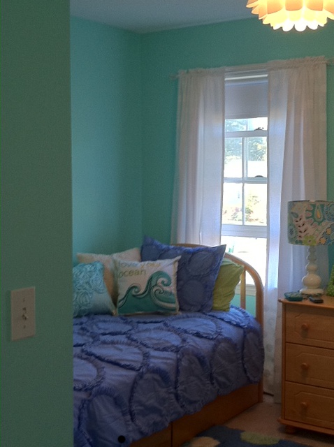 the comforter and the curtains. When you’re decorating a little girl’s room for the first time (when they’re really little), there’s not much push-back from her. She loves flowers, polka dots, pinks and purples. But as she grows older, she develops her own style and wants to do things her own way. As a decorator, we have to take that into account when we’re called upon to work on a young teen’s room. How to take her very strong requirements for her room and mesh them with the aesthetic sensibilities of mom and dad.
 This project is a prime example. The Before Photo shows a bedroom of many colors, stripes and dots in a fairly white room. As you can see from the swaths of color that she painted next to her bed, the teen living there was pretty much done with white walls. So that’s where we started. She picked a cool, vibrant blue-green that was a reflection of her personality (not her mom’s). From there, we found cornflower blue bedding (Pottery Barn) as well as some accent pillows and accessories to pull the colors together.
My major role in this project? To prevent color overload. The remedy? Adding white to the room to offer some visual relief from the intense hues. I found white tone-on-tone polka dot fabric for the window panels (custom-made), a white lamp with a lamp shade that pulled all the colors together (Pottery Barn), and a white fuzzy pillow for the bed (Pier 1). I also added the floral light fixture on the ceiling (Lamps Plus) — a great find for a teen room. The result was a room that all three of us (teen, mom, and decorator) could love.
Design Star 2011 Finale
September 12, 2011 § 1 Comment
 Okay HGTV fans. This is it! The finale between Meg and Karl is on tonight. For those who don’t follow Design Star, it’s not too late to check in. Design Star has spun off several excellent designers (David Bromstad, Kim Myles) and like them or not, these designers influence TV viewers and their expectations. I see that all the time.
So who is it going to be? Meg has a lovely fresh preppy style and a bubbly on-air personality. Karl’s architectural background gives him a very professional, big-picture design. He nailed the small-cottage challenge!
Move over Candice. Here comes a new face on HGTV!

The “Accent Wall” is Back!
July 7, 2011 § 2 Comments
 Maybe it never really went away for some people, but for others the thought of an “accent wall” just screams ’80s. But you know, honestly, they’re not a bad idea… in some cases. Accent walls (I should dream up another name!) can take a large room and create a cozy nook, or a di
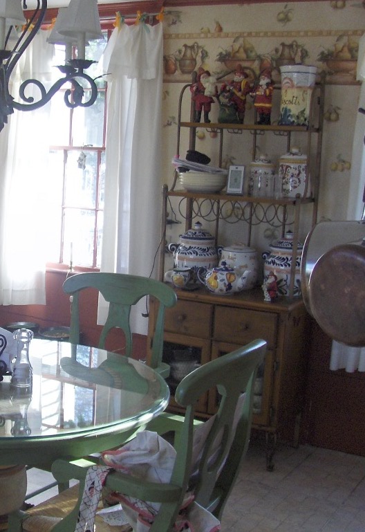
 ning area. Like this kitchen. The walls were a gray blue, and half of the large space was dominated by white cabinets and a slate tile backsplash. So we pulled some of the orange out of the tile and created an “area of interest” on the other end of the room. The color is Tucson Red (1300).
Using an accent color on one wall is also a great way to warm up a loft or other modern, non-descript space that needs instant architecture. We call it “color blocking” — yes another term from the high-fashion ’80s (I’m dating myself) — but it’s a terrific way to take a neutral, often white, space and add large pops of color. Instant focal point!
When an accent wall doesn’t work is when the room is too small or too square. Painting one wall a different color might just chop up the room too much. But if you have a long narrow room, painting the far wall a warm color will bring it forward visually and make the room feel less like a bowling alley and more like a well-designed, pulled-together space created by you.
Kitchen Decisions
June 15, 2011 § Leave a comment
 And you thought picking a paint color was hard? Try a kitchen renovation. The number of decisions that have to be made seemingly all at the same time is daunting to even a seasoned renovator. What kind of cabinets? What color? What style? How many? Where to put them? What stain? What knobs? And that’s just the cabinets! Okay… before I get carried away, here’s an example of how the homeowners and I managed the decisions on their renovated kitchen.
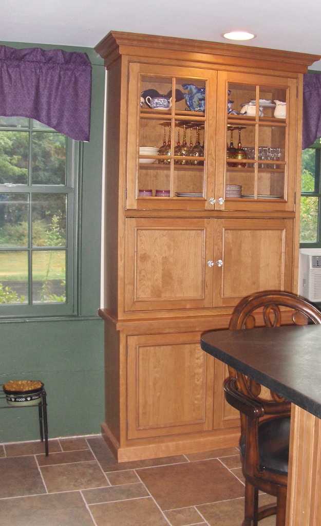
The first decision was to pick the cabinets: white painted wood with a shaker-style door. They knew they wanted white because it was classic and would brighten up their small kitchen. Pewter knobs would be the jewelry. They also picked out their appliances: stainless steel. Next came the counter top and that’s when they called me into the project. We discussed concrete, honed granite, and soapstone and settled on soapstone as it had a nice finish and seemed appropriate to the age and style of the home. Shiny granite was out!
The next decision was what to do with the floor. They had hardwood in the adjoining living room but considered tile for the kitchen area because they had heard that it was easier to clean and was okay in wet areas. All true. But I convinced them that carrying the wood all the way through from living room to kitchen would widen the entire space and give the area a more continuous feel.
The backsplash was the next item and both homeowners wanted color. They just could not agree on what color and which material to use. I warned them that glass might be a little trendy for their brick-fireplaced kitchen and suggested they look at slate. The colors are natural and earthy and very appropriate for a slightly more rustic look in the kitchen. At the same time, the white cabinets really make the wonderful palette of earthy colors pop off the counter! The slate also looks terrific with both counter top and stainless!
Lighting was next with some recessed cans with LED fixtures around the perimeter and under-cabinet strips for task lighting, a couple of pendants over the eating areas, and a creative track system of lighting above the island. Track lighting is back! In a big way! And its flexibility makes it appealing — you can maneuver the spots anywhere you’d like them and you can change them too!
 Wall color was last on the list of decisions. We went with a rich red-orange accent wall on the other end of the kitchen by the dining area — to create a warm dining space and give the homeowner the red she craved. The rest of the walls are a gray blue that picks up on the tile and coordinates well with stainless and white.
Kitchen done. Just in time for a relaxing summer!
Paint Color and Home Staging
September 7, 2010 § Leave a comment
 Decorating a house and selling it are two different things. Although the original rich yellow paint color created a warm and cozy kitchen feeling, warm and cozy in real estate jargon translates into small. And when it comes to kitchens, it seems, the bigger the better.
To show this kitchen to better advantage, we chose a calmer paint color that created less contrast with the ceiling color. That little trick raised the ceiling in the room and created a more open feeling — translated: bigger. Other than removing a piece of art from the wall and replacing a couple of light bulbs, no additional changes were made to the room.
So although you may feel that the kitchen lost its personality when the paint was neutralized (and neutral doesn’t mean beige — more on that in another post), creating a neutral palette allowed the actual selling features of the room to come forward: shiny hardwood floors, solid wood cabinets, large decorative window, center island with cooktop, updated lighting. You get the picture…
Top Three Tips for Selling Your House Fast
August 4, 2010 § 1 Comment
 This house sold with multiple offers at the Open House. (Incredible in this picky buyer’s market.) What made this house stand out and what can we all take home from this experience? Here are three top tips:
1. When in doubt, move it out. Although this property had some big things going for it (location, location, location), the family had lived in the house for twenty-plus years and had accumulated not only their own trappings but also lots of odd furniture and artifacts from deceased relatives. This happens to many of us. What do we do with all that stuff? The answer is clear when you’re trying to sell your house: move it all out.
At the first visit, we tagged items that needed to go — things like extra side chairs and small tables, worn furniture, family photos, large area rugs, antiques and breakables — and we left each room with furniture that would identify the room’s function to buyers. The reasonable and highly motivated homeowners then made many trips to a storage facility to clear the decks and let the house “breathe.”
2. Open the door, fix your floor. Remember that old adage, something like, if you want to know if a fellow is well-dressed, look down? Well just like polished shoes, the first thing buyers notice when they open the front door is the floor, and if yours is covered by old, worn or stained carpeting, uh-oh. In general, carpeting is out. Buyers are looking for hardwood floors and tile, both of which provide easy maintenance and no safe haven for dust allergens. If you have hardwoods covered by large area rugs (like these homeowners did), congratulations! Simply roll up the rugs, buff up the floors and go “Cha-ching!” If you have wall-to-wall carpeting, don’t panic. Have it professionally cleaned, and that will help.
3. Make it sunny, welcome the money. You’ve undoubtedly heard this before, but it’s worth mentioning again. The message here is lighten and brighten. This house had dark rooms with rich wall color and heavy window treatments. We lightened the wall color and opened up the windows by removing the heavy drapes and replacing them with airy sheer panels that framed the windows but did not block the light. The result in this family room? An ahhhh feeling.
If you are overwhelmed by the prospects of preparing your house for the market, talk to your realtor. He or she will find you the help you need to get the job done quickly so you can have that “Ahhhh feeling” too!
Farmhouse Kitchen Renovation
August 3, 2010 § Leave a comment
 This historic New England farmhouse kitchen posed a challenge to the homeowner when it came time for a remodel. How do you update your kitchen while keeping with the age and style of your home? You cannot simply drop a slick granite countertop into a kitchen whose bones date back to the mid-18th century.
With its layers upon layers of early architecture and more recent updates, the de-construction was bound to expose some surprises, but plans for the new kitchen proceeded. Since the homeowners are gourmet cooks, the appliances were purchased first. Form follows function in a busy kitchen where every weekend welcomes a different group of dinner guests.
The design team, which also included a local kitchen designer and the homeowner who is an artist, went through the wish list and created a floorplan that incorporated everything. The gas range took center stage followed by a bake station, double ovens and a large farmhouse sink. The round table and chairs were replaced by a sizeable peninsula with food prep station and leather-seated bar stools for guests. We chose soapstone for the countertops in keeping with the period and kept the woods and tile in natural tones with minimal contrast to make the rather small kitchen appear larger.
 We brought the forest green and grape accent colors in from the wallpaper in the adjoining family room to create flow between the back-to-back rooms, and we added a built-in cabinet to replace the free-standing piece that housed collections and other kitchen clutter. The clean lines of the new cabinet also helped to enlarge the space.

 The updated kitchen, even with all its bells and whistles, manages to maintain the old early American character found in the rest of the house and provide its homeowners with a much more efficient and workable space for cooking and entertaining.
Quick Headboard or Wall Panel for Art Display
March 21, 2010 § 2 Comments
Is your artwork getting lost? One of my favorite pieces just seemed to float above the sofa in a sea of beige until I rolled out a piece of fabric and found my solution. I stapled the fabric right to the wall and trimmed it out with three pieces of painted moulding cut on a 45-degree angle with my miter box (handy little gadget!). Voila! Some drama, instant matting, and a terrific way to add color and contrast to an otherwise quiet palette. Especially good if your furniture and wall color are the same!
This technique is also a great way to create a headboard over a bed. The fabric adds height to the room and texture to the wall, and it is more interesting than a square of paint (although that will work too).
Once I decided what I was going to do, purchased the moulding and painted it, the whole project took about an hour to install.
Pre-Teen Bedroom Makeover
November 6, 2009 § Leave a comment
 This cork board from the Pottery Barn Kids catalogue was the inspiration for Hannah’s bedroom renovation. We decided to open up her rather small room by painting wide horizontal stripes all the way around the room in three different tones of blue-green with a white stripe between them. The treatment conjured up, at least in my mind, waves on the beach.


Then we punctuated the stripes with random placement of bright pink dot appliques, a perfect way to accessorize without adding anything permanent. White furniture, grass green/blue/white bedding with pink polka dotted pillows, and multi-colored awning stripes on the window completed the room. She was thrilled — so was I. What a fun project!
