Choosing a Color Palette for Your House: It’s a Natural
January 29, 2013 § Leave a comment
 Another drive-by sighting of some curb appeal. This time, the stone wall pops out partly because of its mix of natural stones (and not just one kind) but also because the house color is drawn from the wall’s palette of natural hues. Even the front steps coordinate nicely with the wall.
Any of the wall’s creams, beiges, browns, and grays would have worked for a paint color, but the builders chose a light creamy yellow for the siding with a beige shingle on the portico. White trim pulls the house together and the black door makes the dramatic statement.
It’s so easy to choose your house color from nature. You cannot make a mistake.
Making Sense of Color Trends
January 8, 2013 § 1 Comment
 Is anybody else’s head spinning as you look at the color trends for 2013 or is it just me?
When we look at the Benjamin Moore Color forecast, we clearly see pastels — a look refreshingly optimistic every few years after we finish huddling in our dark, cozy dens and want out. Here we see a pale yellow added tastefully to warm gray walls — a really soft, uplifting combo. (Lemon Sorbet 2019-60 is the Ben Moore paint color of the year if you haven’t already heard.)
The other color combos from Ben Moore introduce Dusty Mauve (2174-40) back into the mix (been a few years, like 30), in combination with Golden Straw (2152-50) and a soft navy (Evening Dove (2128-30). The other trends from Ben Moore show us more Coastal blues and greens (never out of fashion in my book), and more taupes and grays, a trend we have been in for a few years now. Here is a link to the Ben Moore colors and combos: http://www.benjaminmoore.com/en-us/for-your-home/trends-2013
And then there’s Sherwin-Williams. Talk about something for everybody…I’ll say. I wouldn’t call this a color trend. It’s more like a smorgasbord. 
We have the Vintage Moxie Collection, an Easter basket of colors to choose from including Radiant Lilac (SW0074) and Aloe (SW6464, the Sherwin-Williams Color of the Year).
Then if you’re still in a chalky-earthy color mood, there’s the Honed Vitality Collection including all colors we’ve been using already like Unusual Gray (SW7059) and Roycroft Suede (SW2842), both terrific exterior colors. http://www.sherwin-williams.com/architects-specifiers-designers/inspiration/color-forecast/2013-color-forecast/honed-vitality/
Sherwin-Williams went Peter Max with its High Voltage collection — Electric Lime (SW6921) and Feverish Pink (SW6859) are colors I would reserve for a pillow or a picture frame. Maybe a front door color if you’re so inclined. Yikes! http://www.sherwin-williams.com/architects-specifiers-designers/inspiration/color-forecast/2013-color-forecast/high-voltage/
Finally Sherwin-Williams offers the dark, moody, masculine colors for anybody who’s left. The Olde World Gold (SW7700) and Plum Brown (SW6272) are both terrific exterior colors as are most of this Midnight Mystery collection. http://www.sherwin-williams.com/architects-specifiers-designers/inspiration/color-forecast/2013-color-forecast/midnight-mystery/
What Sherwin-Williams has shown us with their lack of consensus when it comes to color trends for 2013 is that we are more diverse in our color likes and personalities than ever before. Pretty much anything goes. So paint what you love. If you are caught up in color trends, then stick to whites and neutrals for your walls and add pops of trendy colors in things like pillows, accessories of all kinds, and even front door colors. Things you can switch out easily when the next hot new trend comes along because who knows what the color experts will throw at us next year.
Black: Sophisticated, Modern, House Color?
January 2, 2013 § Leave a comment
Just like the LBD (little black dress), black houses are popping up all over and with predictably dramatic effect. The trend seems to be particularly hot in Southern California although I’ve seen it in Massachusetts too. Why black? Well, why not.
-Black as a house color fits into any neighborhood and certainly stands out from the myriad white, yellow, and beige houses already out there.
-Black looks terrific in the winter if you have snow in your area. We all know how dirty white houses can look even after a fresh snowfall.
-Black can make a small, insignificant ranch look modern and even spacious. Add a pop of bright color to the door and you have a stand-out in the neighborhood instead of a ho-hum been-done-before.
-Black, like white, makes any color look good. Imagine the opportunities for vibrant landscape color along the foundation of a black house.
-Black is a color to consider if you plan to paint your red brick rambler. If you’re tired of the tract house vibe, why not make a major statement.
When does black on the house NOT work? When it starts to fade unevenly and make the house look like charred remains of a terrible event.
If you decide to paint your house black, you must prepare to keep the paint fresh, the lawn mowed, the weeds pulled, the clutter corralled, and the driveway plowed because your house will create quite a sensation on the block. Nobody will drive by without noticing. And that’s kind of fun.
Bored with beige yet? Consider black.
Light Up Your Front Door
December 12, 2012 § Leave a comment
Why wait for the holidays to light up your front door? You spent enough time choosing the color — show it off all year with a boost in your exterior lighting.
Choose properly spaced recessed fixtures that will wash light down on the door color and other parts of the porch as in this photo (lighting by Illumination s, Inc.). Or add a large pendant over the door and sconces on either side. Make sure the lighting fixtures are big enough that they don’t look skimpy from the street. Bigger is usually better when it comes to lighting.
While you’re choosing your new light fixtures, take advantage of all the different metal color options you have now. Don’t settle for wrought iron if another color would update your house and make it look fabulous.
So when the holidays are over and you take down the hanging twinkle lights and box up the spot light from the front door, take a close look at what lighting is left. Maybe it’s time for an upgrade.
Let there be light!
Which Came First? The house color or the foundation plantings?
October 1, 2012 § 2 Comments
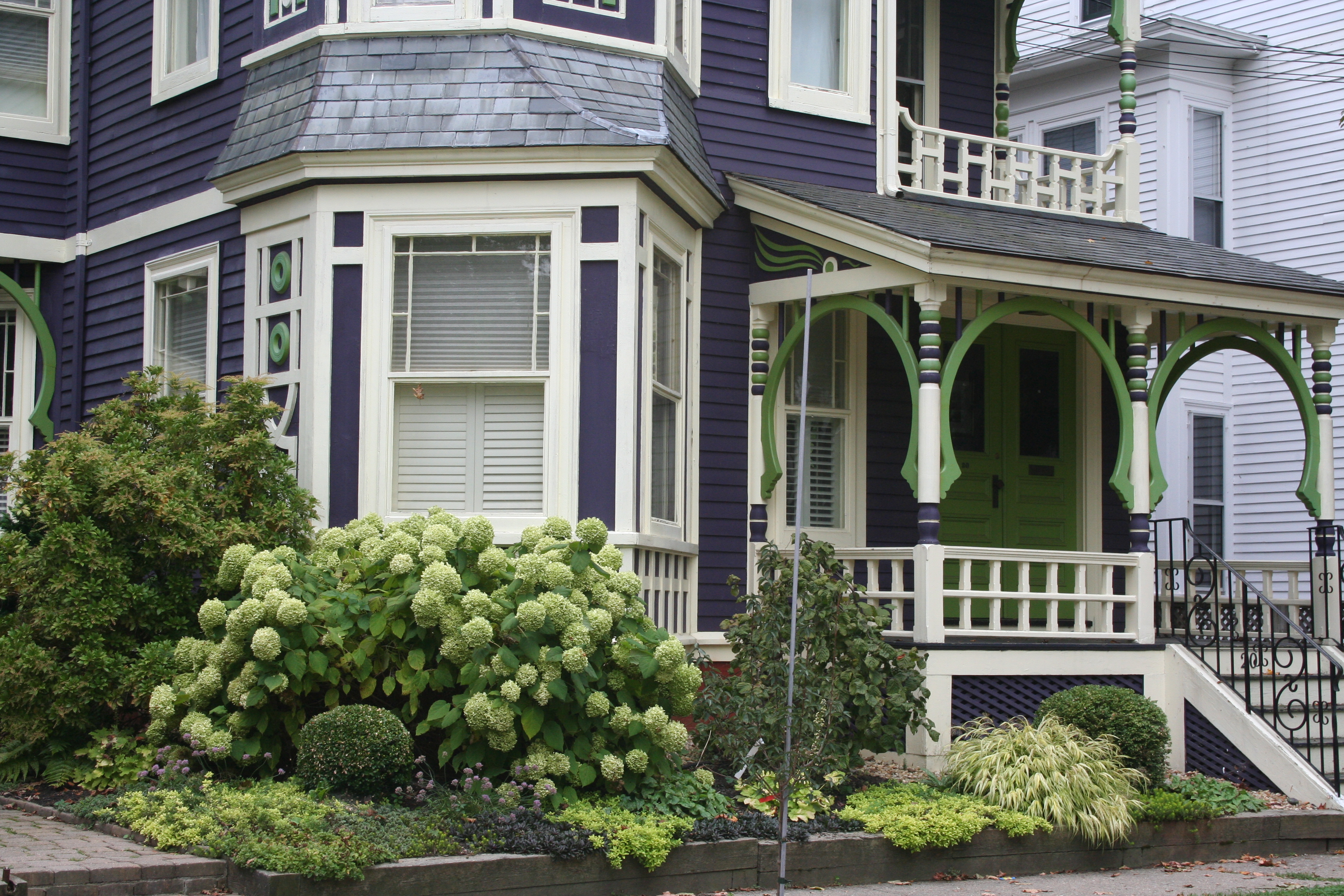 My guess? Neither. Take a close look at the roof, and the house color palette is revealed. The deep purples and greens of that slate roof present a palette the homeowners can use for their house: rich grape for the siding color tempered by a neutral cream trim and lime green for the accent color to highlight the Victorian embellishments.
But the homeowners did not stop there. To enhance the palette and spread the accent color out onto the landscape, they planted a gorgeous lime green Hydrangea coupled with other lime green plants, shrubs, and ground-cover species. Peeking out from under all that greenery is a purple flowering ground color pulling the whole look together.
Not to be matchy-matchy or anything, but this house rocks. There’s just enough contrast to keep our interest and show off the house detail without introducing new colors that might make the house too busy. Afterall, the house itself has so much detail that you wouldn’t want it to get lost in a rainbow of foundation plantings and annuals.
Spring Spruce-Up-Your-Front Door Campaign
March 1, 2012 § 3 Comments
 Your front door says more about you than you know. Who lives behind this front door?
Someone who appreciates simplicity (look at the actual door –besides the wreath, there is not one embellishment) and architectural drama (check out the Corinthian columns and the heavy layers of molding on the portico).
The person who lives here also has ties to culture (a Moravian star pendant hangs above the door) and a sense of humor (the three little silver starfish on the wreath are so cute!).
The homeowner’s color sensibilities are subtle and elegant (the understated cream siding blends effortlessly with the soft, light sage door color).
The overall impression is eye-popping as you drive by. This house is tiny (I assure you) but the entry speaks volumes.
What does your front door say about YOU?
