How Bold House Colors Can Work
September 30, 2010 § 2 Comments

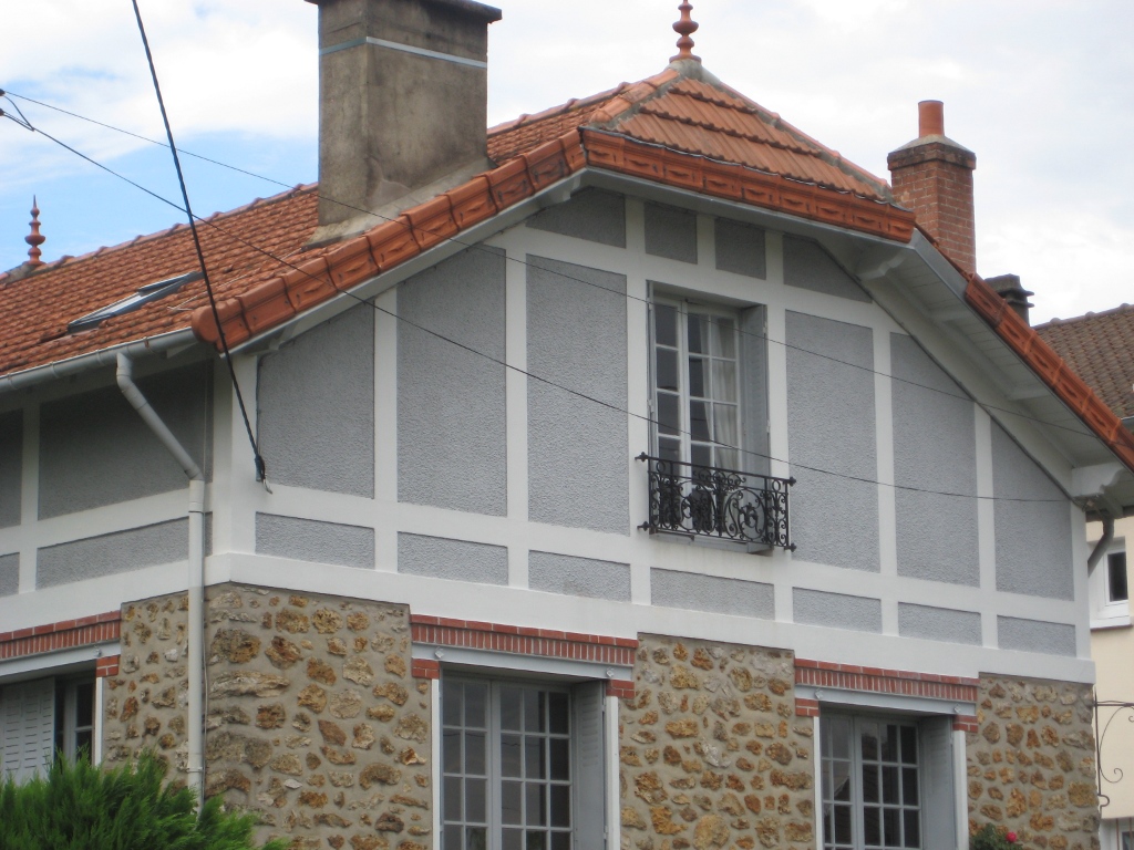
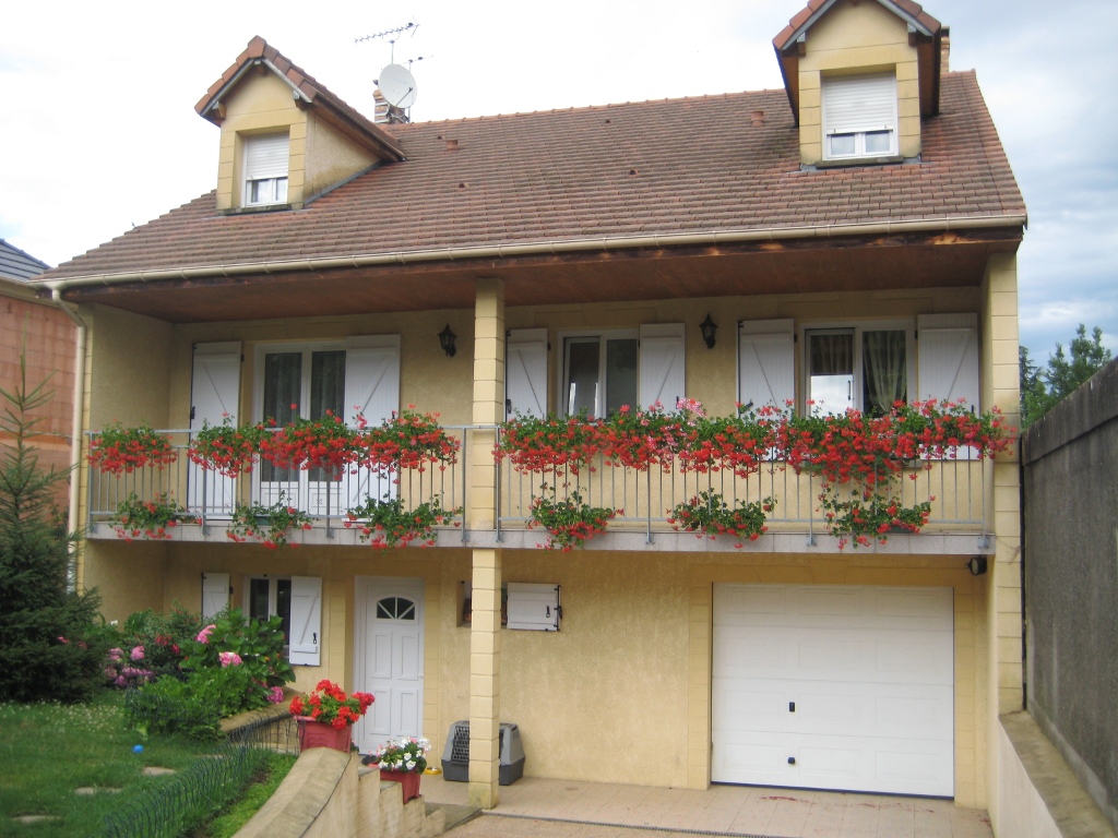
 What is more refreshing than a creamsicle — that delicious pairing of tangy orange with smooth creamy vanilla! That’s just how I would describe these two houses — absolutely luscious!
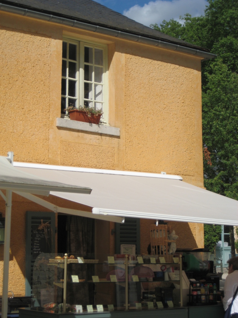
Although we don’t often see orange as a house color, the addition of creamy gray-white either as trim color or as part of the architecture makes the combo work. The result is warm and happy without going off the color charts of good taste.
The stucco example here is a house turned patisserie on the grounds of Versailles in France. The other example is a modern home, one of the creative designs by Victoria Mohar of MoharDesign in Somerville, Massachusetts. It is so refreshing to see creative color combinations that work and that push the house color envelope a bit.
If you’re introducing a bold color into your exterior color scheme, pair it with a well-respected neutral, like creamy vanilla. The result will be refreshment for your neighborhood.
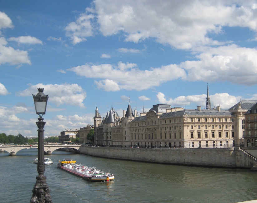
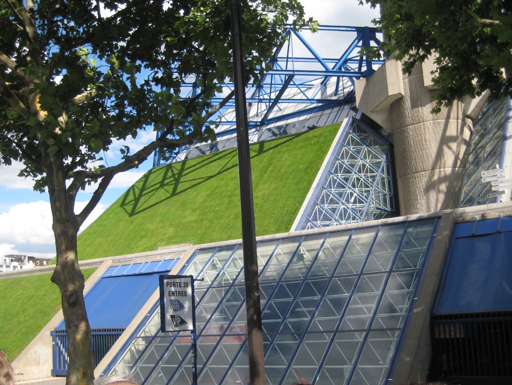
Inspirations from the Top of a Paris Bus
July 28, 2010 § 2 Comments
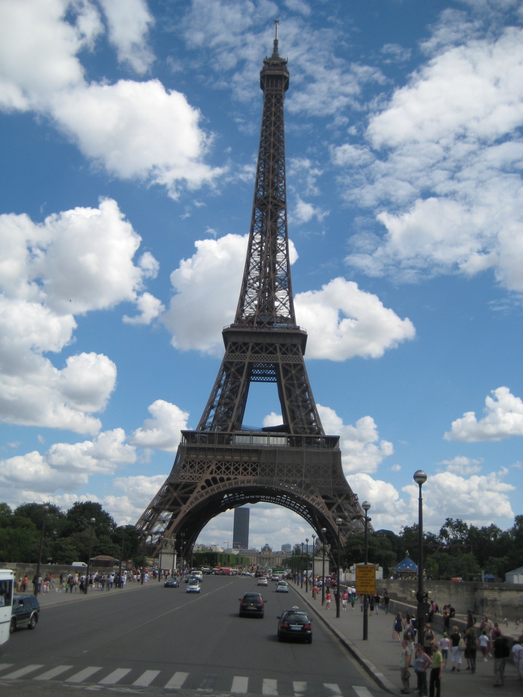
Cruising down the Avenue des Champs-Élysées and under the Arc de Triomphe in a double-decker bus is quite a thrill. Especially the day before Bastille Day in Paris. Tons of people everywhere (and I was glad someone else was doing the driving). Taking a bus tour was a great way to see the city especially on a short timeframe. From the grassy-roofed sports stadium to views down the River Seine, the bus gave us average American tourists a snapshot of Paris highlights without the lines.


Inspirations from the French Countryside
July 26, 2010 § 1 Comment
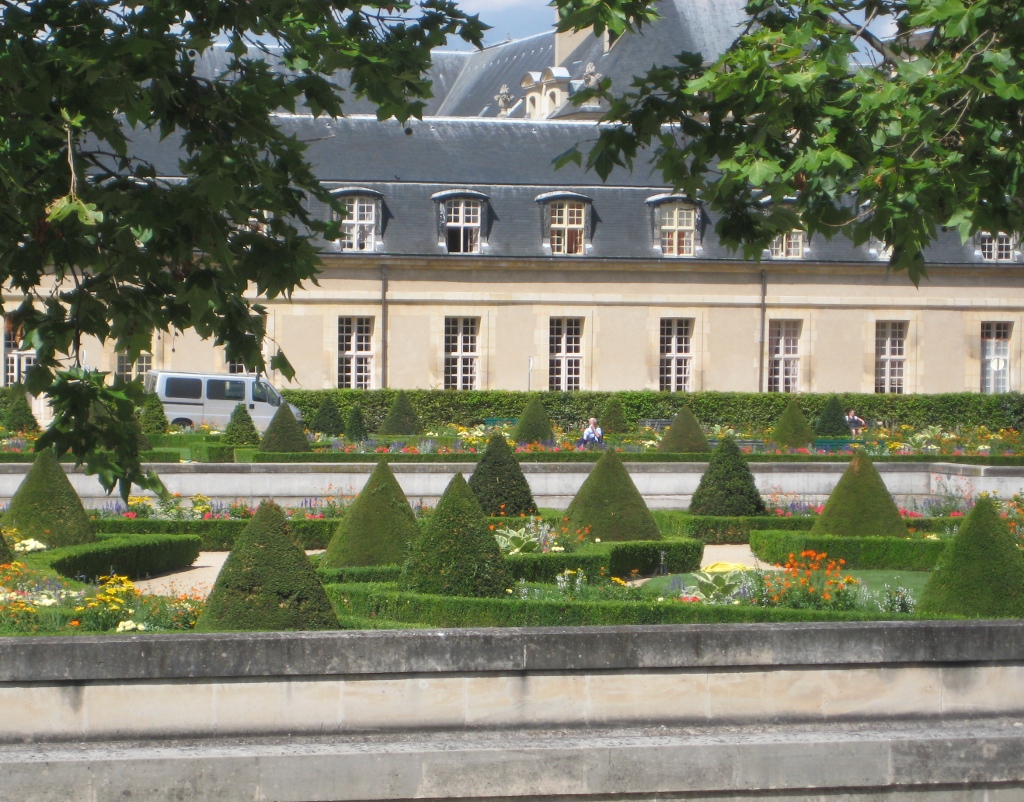
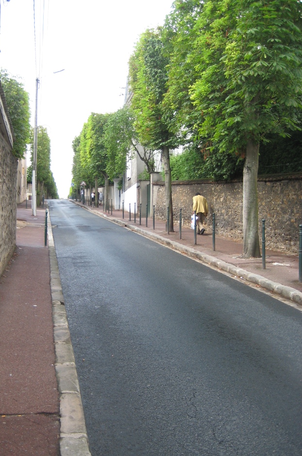
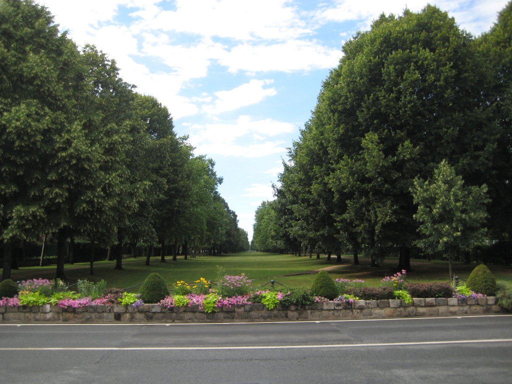
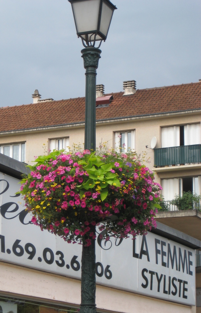
Traveling south of Paris into the French countryside really gives you a feel for how the French live. The quiet little town of Montgeron with its hilly one-way streets, gated driveways, and modest stucco and stone homes, is nestled far enough away from the city to give the town an identity of its own. Gone are the wrought iron railings and the bustling sidewalk cafes of the city. We’re in the quiet part of France where people still buy their daily breads, meats, and vegetables, but tend to live simpler lives tucked safely behind walls.
The public gardens are beautifully tended, kind of a smaller version of the Paris jardins, and the French details like the flowers on the light post are evident. Walking through the neighborhoods conjures up a lifestyle that many of us busy Americans (at least those of us just outside major cities) left all too long ago. It’s no wonder the French live so long!


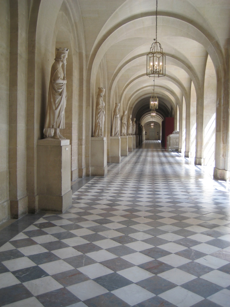
Inspirations from Versailles
July 24, 2010 § Leave a comment
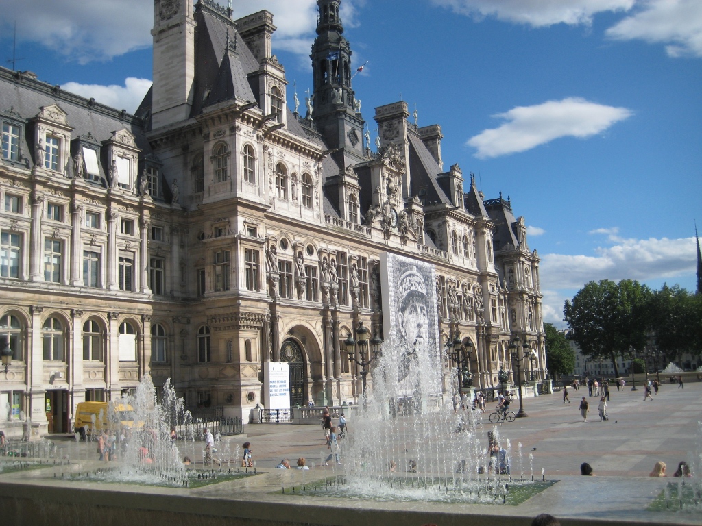
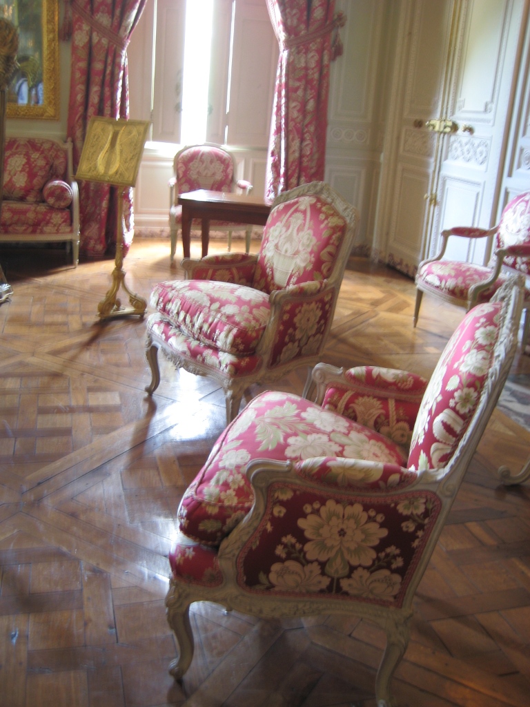
Honestly, I didn’t think I would be that impressed by Versailles. To those of us who are not accustomed to living in such opulence, Versailles is, to coin a much-used phrase, over the top –the gilding, the marble, the flourishes. We all know that. But the French always seem to do things in a tasteful way. So even though everything is on a grand scale, the overall feel seems somehow appropriate for living and entertaining (18th century style).
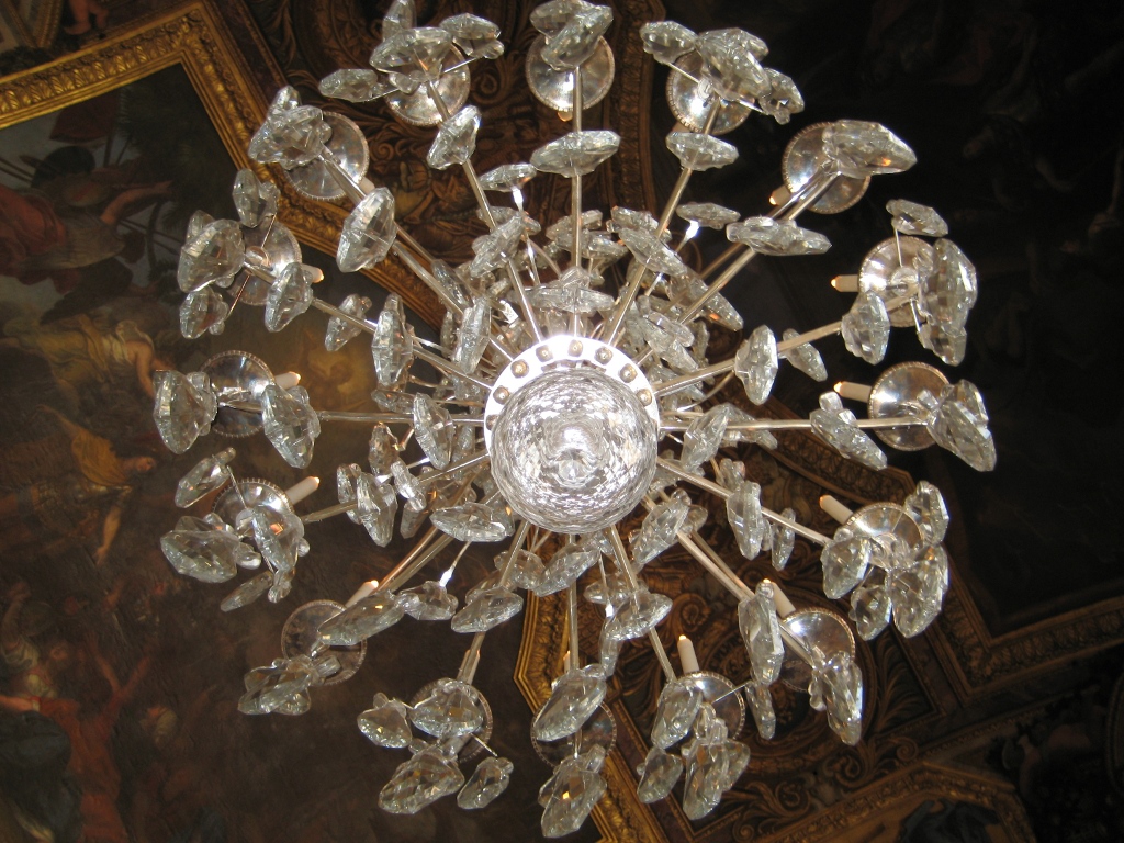
Truly, everywhere you look, it’s a postcard, from the oddly sculpted trees in the gardens to the massive crystal chandeliers overhead to the rowboats ready for afternoon visitors. The trip to Versailles was worth it, and it was a great way to learn some French history — all about Kings Louis, Louis, and … Louis. Vive la France!


A Window to Paris
July 12, 2010 § Leave a comment
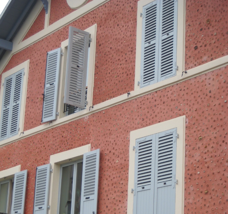
 The windows in Paris are almost as intriguing as the doors! First of all, the shutters actually work, the windows have no screens, and there are no bugs! Plus the shutters are fabulous soft colors of whites and taupes and light blues. The soft colors against the stucco and stone are simply spectacular. Not a black shutter anywhere to be found. I’m thinking that there may be room for more shutter colors in the palette — even on this side of the pond! Why limit ourselves to dark colors!


For stucco and stone homes, consider the subtle sensibilities of French architecture and the superb use of color on shutters. Tres bien!
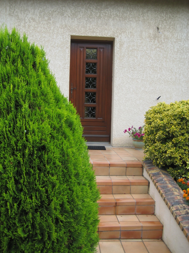
The Doorways to Paris
July 11, 2010 § 1 Comment
 Whether they’re painted a wonderful milk-paint blue or left a natural wood tone, the doors of Paris are spectacular. It helps, of course, that they’re attached to stunning historic residences that have been there hundreds of years. The scale of the doors is big to fit the scale of the buildings, and the embellishments are breathtaking (spoken like a true decorator). The doors stand out as they are truly meant to — as the focal point of the home or business.

France: a Source of Inspiration
July 8, 2010 § 1 Comment
 I cannot think of a better place to indulge the senses than Paris: a font of inspiration for anyone who loves food, wine, and of course, exceptional style. This view from my hotel is just the beginning. I hope to capture what makes Paris so special from a design perspective — not that it hasn’t been chronicled before — but there’s more to Paris than museums and cathedrals and I plan to discover it. I will look at modern Paris and its ancestry.
More to come! Stop back by again!
Details Make the Difference at the Front Door
April 26, 2010 § Leave a comment
 Say nothing of the new Arts & Crafts windows, textured roof, earthy natural taupe siding color, crisp white trim, and fresh landscaping, the entryway of this renovated colonial is a knock-out.
The homeowners took their time to get all the details right. The enlarged portico with dry-stacked stone porch and columns, the tapered pillars above, the arched wood ceiling, wide chunk white contrasting trim, a period pendant light fixture, and the solid wood door with period wrought-iron hardware. There’s even a little black door-bell (with undoubtedly a charming ring on the inside).
What can I say… there goes the neighborhood…
Choosing a Yellow for Your House Color
March 25, 2010 § 6 Comments
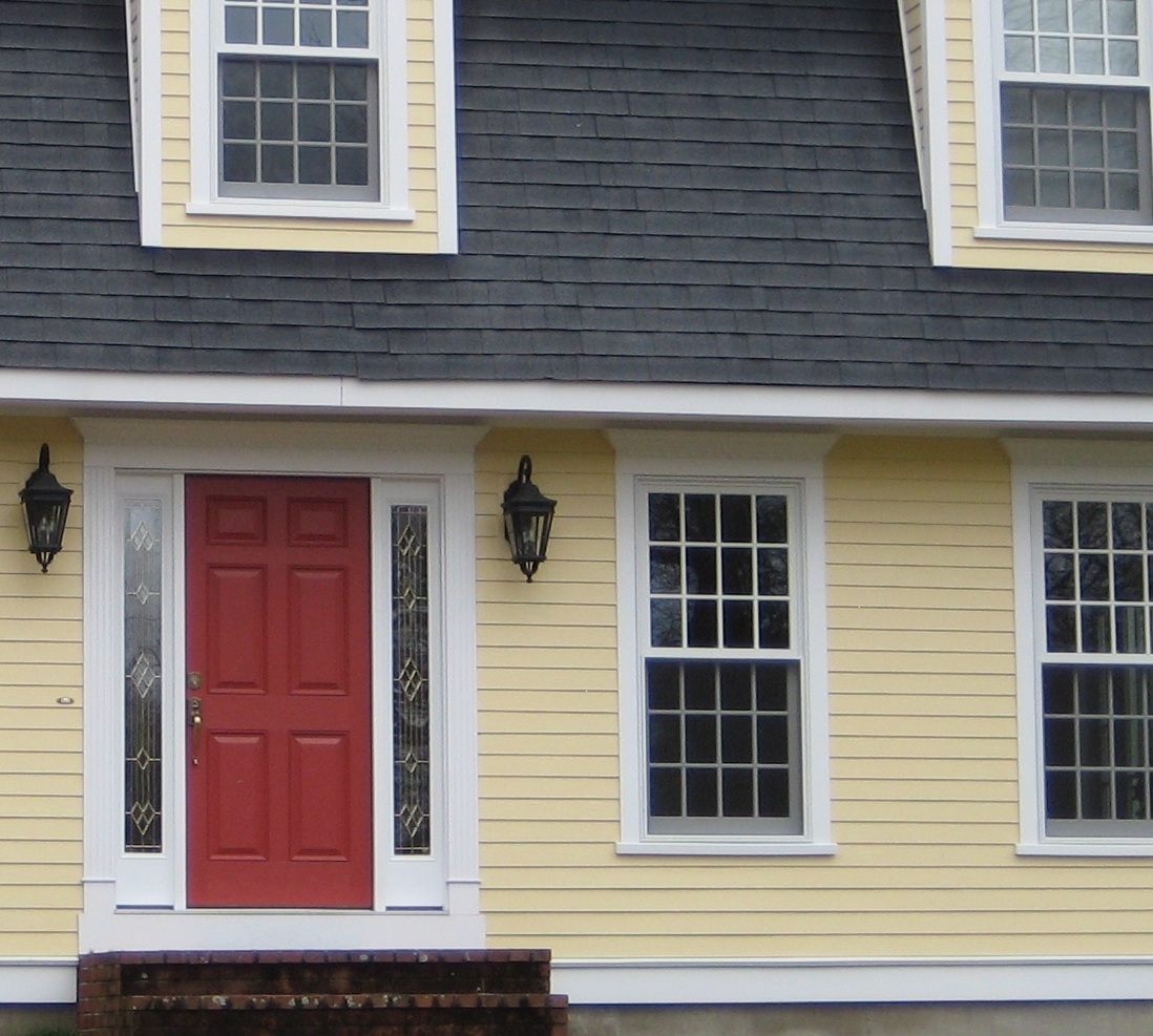
 Yellow can be a tough color, ranging from almost orange to acidic green. This one, Traditional Yellow (170) by Benjamin Moore, gives the house a cheerful, welcoming look. It’s terrific with crisp white trim, a dark charcoal/black roof, wrought iron metal for lights, and a striking red door. The yellow has just enough orange in it to be warm without turning peach.
Yellows that have green undertones tend to look cold on traditional homes. What we commonly refer to as lemon yellow has a touch of green in it, enough to make you pucker when you see a big house that color. Having said that, if you love the green side of yellow, consider pairing it with dark eggplant purple. The combination is a bit edgey and modern but can work, again with a black roof and white trim.
Good Design Learns from History
February 4, 2010 § 2 Comments
 This historic New England barn is original to the property, and its characteristic beauty helps to define the classic regional style. Owning an historic property can be a real joy for those whose passion is preserving the beauty of the past, but don’t think you have to own a historic treasure to enjoy the pleasures of a striking outbuilding.
If you need more space for a workroom or your vehicles, you can add a lot of character to your property by incorporating the unmatched elements, colors, and materials used in previous centuries to make your own history, whether it’s a barn, a large work shed, or simply your garage.
I get lots of questions about how to match exterior colors and blend materials between house and garage, but as you can see from this photo, there’s absolutely nothing matching between this barn and the accompanying house. From the unpainted board-and-batten style siding, brass lighting, and farm-style scale, this barn stands on its own. The colonial house has traditional, painted, horizontal lap siding and white windows. The bridge color between house and barn is black — the black windows on the barn carry over to the accent color on the house (note the black shutters and lighting as well as the black pergola and fence next to the driveway). By painting the wood accessories on the house black instead of leaving them natural, the unpainted barn takes center stage.
Even if you have no plans to build a major additional structure in your yard, keep this basic design principle in mind when you’re working on your exterior. Colors and materials do not have to match.
