Have a Colorful New Year!
December 31, 2012 § Leave a comment
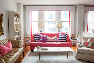
Here’s one New Year’s resolution I just know you can keep. Add one piece of color to your life. Whether it’s a fresh orange pillow on the sofa, a bright red tape dispenser for your desk, a sunny yellow spatula for beside the stove, or one of these fun pops of colorful furniture.
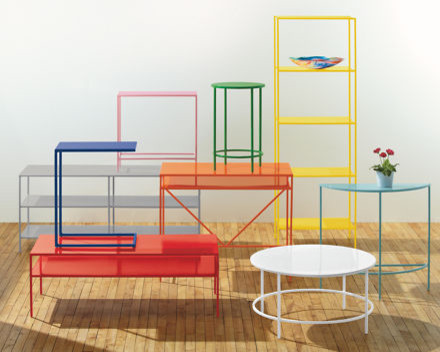
Why add color? So simple. Color can lift your spirits, soothe the beast, fire up the team, warm some hearts, and remind you of being a kid. And what a great way to start out the New Year.
Have a Colorful New Year Everybody!
Hop the Trend: Consignment Stores
December 29, 2012 § Leave a comment
Okay, I admit it. I am a consignment store junkie. And with good reason. Not only is it “green” to furnish your home with items that have been around awhile, it’s amazing what you can find for a fraction of the retail price for a new item. And the consignment bug has started to spread to my clients. During one project, we were looking for a settee of a specific length to fit in a tight spot. Tricky to find new anyway unless we went custom. My client decided to check out the local consignment store, and he found the perfect piece. Even the legs and wood color were perfect. Call it luck or call it karma.

The Cannery Exchange in Newport Beach, CA. (photo credit: Jody Tiongco)
I am convinced that these vintage pieces have a soul — they certainly have a history visible by the lovely worn patina on the arms or the scratches on the tabletop. But every scratch has a story attached to it, and that story comes with the piece to its new home.
You can always paint and recover a chair, for example, if you want a painted furniture look. Again, you’re probably starting with a chair that’s far better constructed than what you can find now so you’re already ahead. It’s like finding a piece of gently worn designer clothing or better yet a piece with the tags still hanging on it. Bonus!
Give your home some character by adding a piece or two of consignment furniture. But beware. You might catch the consignment bug too.
Getting Down to Brass Tacks about Brass
December 11, 2012 § Leave a comment
What a difference a decade makes. What used to be the lighting 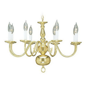 fixture of choice in upscale homes is now (still, even after several years out of favor) being tossed in a dumpster by young home owners who view the shiny yellow metal as the equivalent of how we viewed our grandmother’s dark brown paneling. Of no value.
Instead there are dozens of metal choices and finishes for lighting and other home accessories like light switch covers and doorknobs. So anti-shiny-brass are today’s home buyers that some are just shy of insisting that even all shiny brass door hinges be switched out to something else.
Note: these design trends may be regional and they don’t apply to historic homes so don’t panic if you love your brass chandelier and it fits your home’s decor perfectly. But If you are not happy with your shiny traditional yellow brass chandelier in your dining room or kitchen, you have three options:
1) Thumb your nose at metal color trends and simply wait for shiny yellow brass to come back in style. Kind of like you kept your go-go boots and bell bottoms from junior high. Yes, both trends came back around but not quite the way they looked in the late 60s. But still, doing nothing is always a design option.
2) Paint the shiny brass chandelier a different color. I once stood on a ladder, leaned over the dining table and painted my client’s brass chandelier first with a base coat of matte black to cover all the sheen and then a faux finish of browns and oranges to simulate a rustic bronze finish. It worked. The house sold.
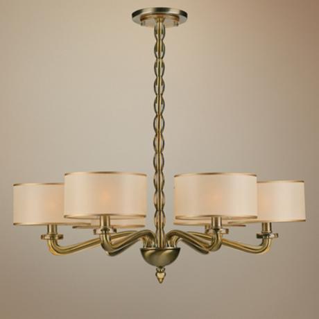
3) Replace the old chandelier with a more current brass option like this one. The metal is toned down (antiqued) and the candelabra bulbs are covered with contemporary silk drum shades — a traditional yet updated look. Honestly, the antique brass has been around forever, and it went through a period of disfavor right around the time the shiny metal took over. But the muted finish, with updated shades, is back and looking good.
Neutral but Never Boring
December 10, 2012 § 2 Comments
Does your home scream 1972 when you enter the front door? Are you stuck with metallic wallpaper on the ceiling in the guest bath, orange shag carpet in the basement, or an avocado bathtub? Then maybe it’s time to update. But this time, instead of hopping on the latest hot new trend (I could name a few here, but I’ll resist), how about giving your home a classic re-do. Something that will stand the test of time, or at least a decade or two, without branding your home with a particular year. For that kind of longevity, we turn to a neutral palette, but neutral does not have to mean beige and it’s hardly ever boring.
-The key to a neutral palette is texture. You could have an all-white living room but if that white includes fuzzy white pillows, a shiny white marble table top, and some warm white chenille upholstery, then the room will have plenty of interest.
-Neutral does not have to mean just one color either. In this room, the walls are a latte color, the sofa is dark brown leather, and there is plenty of color in the books and objects on the white bookshelves. What makes this room work so well is that the stonework on the fireplace is a feature and because the other furnishings do not stomp all over the subtle colors in the stones, the room’s palette includes peaches and golds and grays and tans and taupes — more than enough colors.
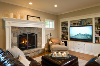
-Neutral allows you to bring in color in the art, pillows, and other more temporary furnishings and accessories without clashing with a strong wall color and a brightly colored sofa.
-Neutral allows you to change your accessories with the seasons and the holidays without overpowering the existing color palette or the holiday decorations.
-And when you’re selling your house, neutral allows potential buyers to see themselves in your home and that is critical for a successful sale.
So as you choose tile and furnishings and paint for your newly updated space, consider neutral because neutral does not have to be boring.
houzz, Pinterest, and the Barrage of Creative Ideas
November 20, 2012 § Leave a comment
At last count, there were 867,525 spaces on houzz.com to feed your quest for inspiration. Hours — days –of poring over photos of beautiful designs. And then there’s Pinterest where, by their account, “millions of new pins are added every week.” Is anybody out there feeling overwhelmed by the sheer volume of ideas??
If you are planning a renovation, big or small, to any part of your house, here are a few tips to avoid creative overload:
-Realize that not every good idea will work in your home. Although that wall color online looks spectacular with the view of the ocean out the window, the same color may look completely different in your room with limited natural light. When you’re choosing wall color, start with your own home, the lighting you have, and the colors, furniture, and artwork in other rooms. A beautiful wall color inspiration is most likely already there.
-Stick with what you love, not something you think you should love because it’s fashionable. As we all know, trends come and go, and unless you want to re-do your home with every new trend, your home will be defined by the period in which the trend was popular. Look at metallic wallpaper from the 70s, for example. If you love it, then go for it. But try to avoid catching a wave only to find yourself tossed up on the beach in a year or two.
-And finally, unless you’re well organized at assigning ideas to a particular project or room as they come cascading into your head via web sites and social media, then focus on one project at a time. Try to avoid mission creep unless you have the budget and time to devote to starting and, most importantly, finishing all your projects. You will be bombarded with ideas and inspiration that may have you ripping up carpet in your family room when you really wanted to work on the bathroom first. Stay focused.
Enjoy the opportunity to see how millions of other creative people have transformed their homes. We are truly living in an age of enlightenment bordering on informational hysteria. Try and stay calm.
Which Came First? The house color or the foundation plantings?
October 1, 2012 § 2 Comments
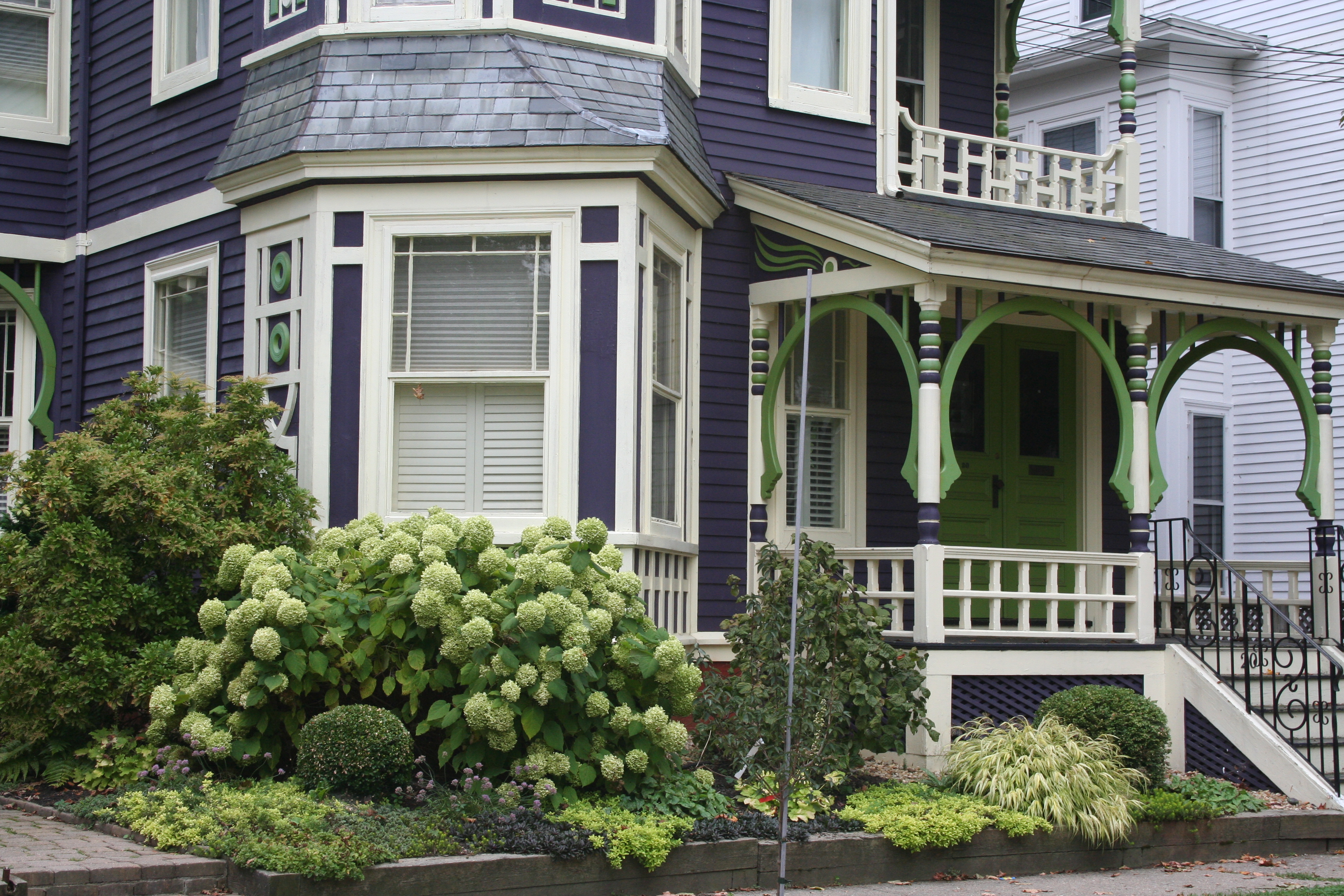 My guess? Neither. Take a close look at the roof, and the house color palette is revealed. The deep purples and greens of that slate roof present a palette the homeowners can use for their house: rich grape for the siding color tempered by a neutral cream trim and lime green for the accent color to highlight the Victorian embellishments.
But the homeowners did not stop there. To enhance the palette and spread the accent color out onto the landscape, they planted a gorgeous lime green Hydrangea coupled with other lime green plants, shrubs, and ground-cover species. Peeking out from under all that greenery is a purple flowering ground color pulling the whole look together.
Not to be matchy-matchy or anything, but this house rocks. There’s just enough contrast to keep our interest and show off the house detail without introducing new colors that might make the house too busy. Afterall, the house itself has so much detail that you wouldn’t want it to get lost in a rainbow of foundation plantings and annuals.
Spring Spruce-Up-Your-Front Door Campaign
March 1, 2012 § 3 Comments
 Your front door says more about you than you know. Who lives behind this front door?
Someone who appreciates simplicity (look at the actual door –besides the wreath, there is not one embellishment) and architectural drama (check out the Corinthian columns and the heavy layers of molding on the portico).
The person who lives here also has ties to culture (a Moravian star pendant hangs above the door) and a sense of humor (the three little silver starfish on the wreath are so cute!).
The homeowner’s color sensibilities are subtle and elegant (the understated cream siding blends effortlessly with the soft, light sage door color).
The overall impression is eye-popping as you drive by. This house is tiny (I assure you) but the entry speaks volumes.
What does your front door say about YOU?
Choosing House Colors: Pine-Green?
February 8, 2012 § Leave a comment
 Dark blue-green pine needles and rich cedar mulch present a warm house color palette perfect for homes that want to sit quietly in a wooded environment or at least conjure up the same.
Although much of the leafy countryside in many landscapes is a mixture of greens, notice that most have a yellow undertone. But not pine green. It leans more toward blue and for that reason can really stand out in a grove of maple trees.
To warm up the cool green shade, add brown and no better place than the roof (a gray roof is fine too but it will keep the house cool). Creamy trim provides contrast between the two darker shades and serves to outline the architectural detail (dark trim will get lost but use it if you are seeking camouflage).
For the front door, why not splurge and get solid wood stained a darker version of the roof color or choose a similar paint hue like Maple Syrup (Ben Moore 1105).  Black wrought iron is the best metal for hardware, lighting and accessories.
Once again, nature’s palette does all the work.
Choosing House Colors: Gray-Green?
January 20, 2012 § Leave a comment
 Look all around your environment for color inspiration. Sometimes the most complex color palettes come from places we might least expect, like a kayaking trip, for example. Look at the different shades and tones in the water and sky. They evoke a calmness that’s relaxing to look at. Then the red kayak pops out of the photo — we know it doesn’t belong there but it grabs our attention.
What if we use this scenic palette for a house exterior! The gray-green of that  water is not a color you would necessarily pick out of a paint store color chip lineup, but it’s a great house color. It’s muddy and dark and has a little bit of brown mixed with green and gray. Very complex — not a Crayola color, that’s for sure!! But paired with cream trim, a brown roof and pops of red accents, the combination fits right into its environment just like the house was plucked from the shores of Maine.
Ceiling Drama
January 17, 2012 § 2 Comments
 If your room has a high ceiling or an interesting shape or slope, paint it for maximum drama! This restaurant has creamy woodwork (molding, columns, and wainscoting) everywhere except the ceiling and the stairwell walls. There, the paint color is a soft gray-blue. The effect is summery, warm, cottagey, and welcoming especially with the dark hardwood floors and accents.
Lighting is bronze, industrial on the ceiling and sconces for warmth along the wood walls. Mirrors double the width of the long and narrow space.
The food? (oh yah, that was excellent too!)

