House Color, Trim, Shutters: Gold Medal Combo
April 7, 2010 § 2 Comments
 The unexpected color combination on this historic home (now a B&B in Sackets Harbor, NY) really pops off the street. Whether it’s the hint of green in the gold siding, the Jamaican rum-like warmth of the shutters, or simply the combination, I’m not sure. But coupled with cream trim and accents of black, this combination is a winner.
The house color looks like Ben Moore’s Marblehead Gold (HC-11), and the shutters look like a slightly darker version of Copper Kettle (1218). I should have rung the doorbell to ask (I’ve been known to do that).
The stone steps unfold seamlessly from the foundation right onto the sidewalk and the delicate scrollwork in the iron railing ties in beautifully with the sign and even the shutter “dogs.” And for those of you who have asked about using cream window trim with white windows, here’s a great example of how nicely it works.
Choosing a Yellow for Your House Color
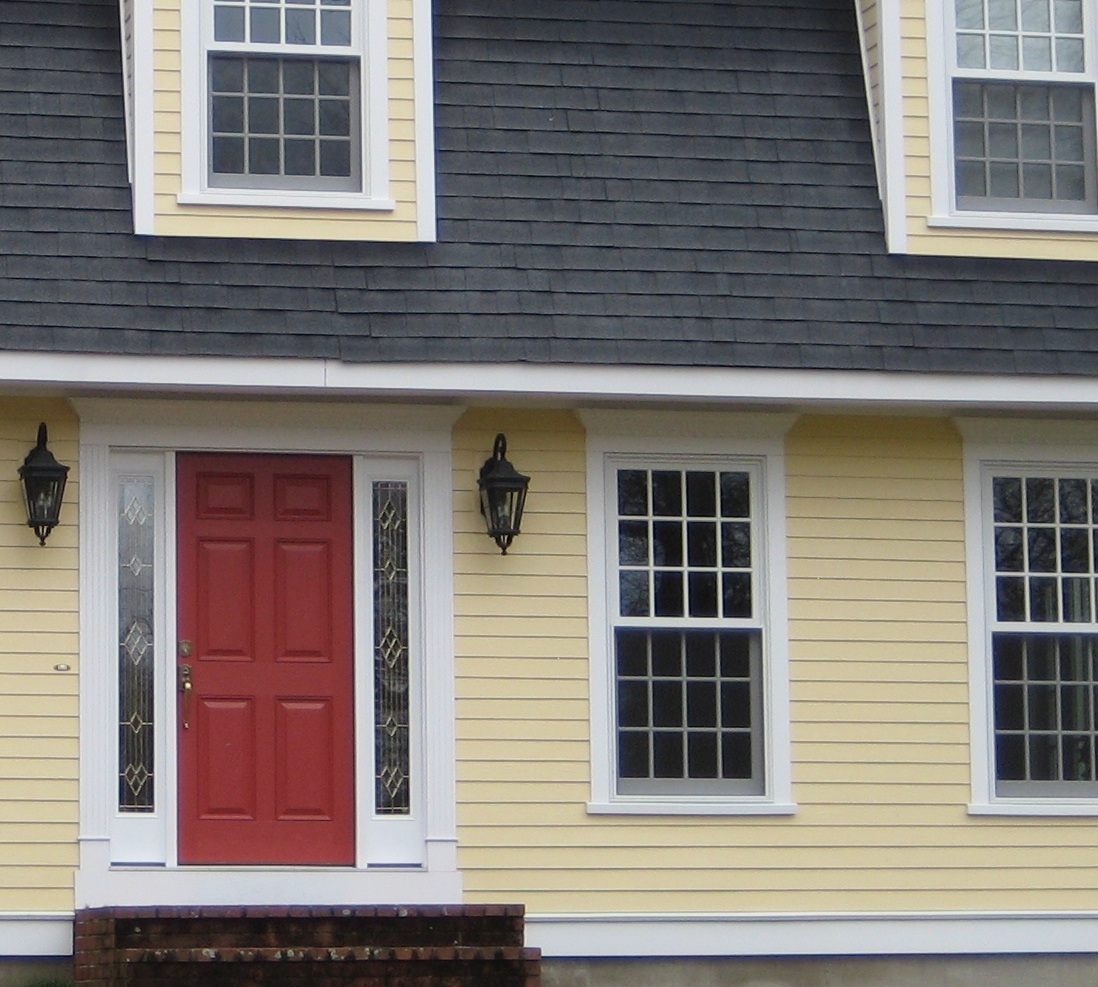
March 25, 2010 § 6 Comments
 Yellow can be a tough color, ranging from almost orange to acidic green. This one, Traditional Yellow (170) by Benjamin Moore, gives the house a cheerful, welcoming look. It’s terrific with crisp white trim, a dark charcoal/black roof, wrought iron metal for lights, and a striking red door. The yellow has just enough orange in it to be warm without turning peach.
Yellows that have green undertones tend to look cold on traditional homes. What we commonly refer to as lemon yellow has a touch of green in it, enough to make you pucker when you see a big house that color. Having said that, if you love the green side of yellow, consider pairing it with dark eggplant purple. The combination is a bit edgey and modern but can work, again with a black roof and white trim.
Lighting Makes All the Difference
March 11, 2010 § Leave a comment
 This yellow historic New England barn has lots of terrific architectural elements — cupula, weathervane, clerestory windows over the door, even a windmill in the back — but find the light fixture on this massive building! It’s the tiny white squiggle right above the big green barn door. Rats! A missed opportunity to finish this grand piece of history in style.
Here’s another example of a big barn (it also has a cupula out of view), but it has an appropriately scaled light fixture above the door. This blue barn has my vote. Nice!

Choosing Exterior Lighting
March 6, 2010 § Leave a comment
 Stand at the curb and take a look at your lights on the porch and garage. Do they stand out or can you barely see them unless they’re turned on? Most exterior lights are too small for the scale of the house. In many cases, they look absolutely puny from the street. Not good…
The light fixture pictured here is a Medieval Dragon Lantern from www.artisancraftedlighting.com and it really makes a statement. The scale of this lantern (it’s 51″ high and 32″ wide) fits its grand home. But even if you don’t live in a castle, your lights should be large enough to fit the scale of your door. Here’s the guideline:
A light next to the front door should be about 1/3 the height of the door and placed at least 66″ from the floor. If you have two lights, one on either side of the door, they can be a little smaller (1/4 the height of the door).
When in doubt, keep searching for the right lights. You may not find them at your typical big box stores, but they’re worth hunting for! You’ll add a real touch of class to your exterior with appropriately sized lighting.
Good Design Learns from History
February 4, 2010 § 2 Comments
 This historic New England barn is original to the property, and its characteristic beauty helps to define the classic regional style. Owning an historic property can be a real joy for those whose passion is preserving the beauty of the past, but don’t think you have to own a historic treasure to enjoy the pleasures of a striking outbuilding.
If you need more space for a workroom or your vehicles, you can add a lot of character to your property by incorporating the unmatched elements, colors, and materials used in previous centuries to make your own history, whether it’s a barn, a large work shed, or simply your garage.
I get lots of questions about how to match exterior colors and blend materials between house and garage, but as you can see from this photo, there’s absolutely nothing matching between this barn and the accompanying house. From the unpainted board-and-batten style siding, brass lighting, and farm-style scale, this barn stands on its own. The colonial house has traditional, painted, horizontal lap siding and white windows. The bridge color between house and barn is black — the black windows on the barn carry over to the accent color on the house (note the black shutters and lighting as well as the black pergola and fence next to the driveway). By painting the wood accessories on the house black instead of leaving them natural, the unpainted barn takes center stage.
Even if you have no plans to build a major additional structure in your yard, keep this basic design principle in mind when you’re working on your exterior. Colors and materials do not have to match.
Contemporary Color Scheme
January 7, 2010 § 5 Comments
 This contemporary home maintains its warm curb appeal even in the snowy winter months. It looks like the homeowner started with the fabulous stonework on the chimney and gable area and selected the siding and trim colors out of that. The dark rich chestnut shade is perfect for the body of this large contemporary home. When you are selecting a color for your home, don’t shy away from strong colors, especially if your home is large. Just make sure you choose a color that appears somewhere in nature so that the house fits into the neighborhood. With new construction, you can also work in the window color and the deck stain so that everything coordinates. Even the post light style picks up the pattern in the windows. Nice job! Let’s hope these homeowners have a sizeable snowblower! Yikes.
Traditional Colonial Explodes with Color
October 23, 2009 § Leave a comment
 Picking a house color is a little tricky for some people. I realize that. And because I cannot bear to show you a photo of the real house I drove by the other day (to protect the innocent), I have pasted in a paint swatch from www.myperfectcolor.com just to illustrate my point. The color was used on the siding, trim, front door, AND garage doors.
When choosing a house color, paint a fairly large swath of the color on your house before purchasing a 10-gallon container of it. Also, make sure to pick some coordinating trim and door colors to avoid the “this color was on sale” monochromatic look. Ask your neighbors to throw in their two cents before you settle on a color. What you paint on your house can affect the entire neighborhood. And lastly, if the paint you selected does not seem to be what’s going on the house, stop the painter and make sure they have the right color. Don’t just let them keep going with something you didn’t order.
The name of this color is Sunflower Fields (174). Although it has a nice name and it sounds cheerful enough, sunflowers really belong on the front door (perhaps) or in the garden. What is the bright side for these homeowners (no pun intended)? Guests can find the house with no problem.
Fall Curb Appeal??
October 20, 2009 § 2 Comments
 Ahhh, how picturesque, like this photo from Southern Living Magazine. Maybe your Fall floral vignette on the front porch features a few pumpkins in various sizes, perhaps some statuary mixed in with beautiful volumes of rust and yellow and lavendar and cream mums in big heavy terra cotta pots with … the PRICETAGS showing?? Ouch.
I wasn’t going to say anything, but after noticing this blooper two days in a row on two different doorsteps around town, I couldn’t resist. Just like removing those big tags (that say do not remove) from your sofa pillows, kindly remember to remove the big price stickers from your pots (or at least turn the pots around so we can’t see the stickers as we drive by). Curb appeal. It’s all in the details.
Do My Windows Need Shutters? What color?
October 5, 2009 § Leave a comment
 Most of our homes do not have as many windows as this beautiful historic Federal style house, but some windows just call out for shutters. If your house is a colonial or ranch style with double-hung windows (“six-over-six” panes of glass separated by “grids” or mullions), then you should consider investing in shutters to add a finishing touch to your house. Of course, if you live in an area threatened by periodic hurricanes, then shutters are required for protection. But I’m speaking to those of you who, just like putting up curtains in the living room, might add shutters to “dress” the windows.
If you have a modern or contemporary home with a variety of window styles, shapes, and sizes including casement (“open-out”) windows, then shutters might be more of a distraction than an asset to your curb appeal. Also, if there is no room to put in properly sized shutters, then forget it. Don’t opt for the mini-sized version just to cram the shutters into the facade. It’s not worth it.
As for color, white works in only limited palettes; it is best to pick an accent color. I prefer dark shutters with a dark roof; however, there’s more to dark than just your standard black shutters. Various shades of Midnight blue and  Charleston green can add enough color to make the house interesting yet enough contrast to make the house stunning from the street. Adding dark shutters is like adding a touch of black to your interior palette. It just dresses up the house.
For those of you choosing from standard off-the-shelf shutter colors, your options are more limited, but remember that black always works. One note: if the shutter color is in your house somewhere (in the brick tones, for example), then that shutter color will work. However, if you have a rusty red brick, beware of clashing red-maroon shutters. I see them everywhere, just slightly off.
There are so many shutter styles to choose from these days that you can make a real design statement just by adding shutters. If you have a question about your own house and whether or not to add shutters (or what color), just click on the If I Can Help You page and we’ll work together.
Brick House Trim, Door, and Roof Colors: What works
October 2, 2009 § 16 Comments
 The color scheme on this brick house started with, alas, the bricks (one of our bloggers sent this in). From the variegation in the pile of burgundy bricks, the homeowners picked a medium charcoal roof color (it’s in there), a burgundy front door color (it’s definitely in there), a bright white for trim to optimize the contrast against the brick and accentuate the beautiful architectural features, a coordinating specimen tree for the entryway (very nice touch), brass metal for the front door (it picks up the grout color and adds depth) and wrought iron for the lights (the dressy jewelry of the house).
If you have a brick house and are stumped by what colors to use for the trim, roof, front door, and any other siding around the house, start with your brick color(s). If you pull the color scheme out of the bricks, the whole house will come together.
A note of caution: Since many brick styles have a variety of colors in them, you may start with quite a large palette of colors. In that case, I suggest sticking only to that palette. But if your brick is monochromatic (for example, all the bricks are exactly the same one color), then you can introduce one or two other coordinating colors into your palette and avoid looking too busy. Click on the If I Can Help You page if you need help and we’ll work together.
