What Color to Paint Your Big House
February 13, 2014 § Leave a comment
Building a new house or a large addition but beginning to worry that it might look too big in your neighborhood? Maybe a lot of people don’t worry about their neighbors, but some people do. If you think your house might appear overly large-scaled, then avoid painting it white. The contrast against the setting makes white stand out even more than other light colors.
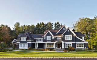
To bring the house down to scale and accent the architecture at the same time, consider a dark color like a dark charcoal or dark green for the siding. Dark trim, of course, will camouflage the house even more, whereas white trim will highlight windows, doors, and roof trim.
Your choice — but becoming the McMansion in the modest neighborhood will not endear yourself to your neighbors. And my how they talk…
Fair warning.
Surprising House Color Trend — White
February 12, 2014 § Leave a comment
Classic but always with a modern twist, white is trending now as a house color on new construction. Whether we’re craving our grandparents’ old homestead, or we like a crisp, uncomplicated look, white is in. White siding with white trim. But the surprise element lies in the accessories. Fresh options include silver for the metal color (not the traditional black), white or pastel door colors (nolonger black or red), medium-toned metal roof colors (not just charcoal shingle anymore), mismatched out-buildings (that old classic farm look is coming back in a big way), and even (gasp!) white shutters on a white house.
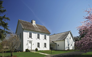
The beauty of white is that it really is timeless. Not only that, but it shows off your colorful flowers and the greenery of your landscaping, the orange patio umbrella and Adirondack chairs, and the turquoise of your backyard pool (okay maybe I’m going a little overboard).
See if a fresh pop of white brings out the character in your house.
Front Door Personality
August 28, 2013 § 6 Comments
 As much as I love eggplant, both as a vegetable and a paint color, it just didn’t work on my house. With the eave creating a shadow, the beautiful, rich purple color only lit up in the late afternoon when the sun hit it just right. For those few moments, the Caponata (Ben Moore AF-650) looked spectacular. Then it went back to black.
So… inspired by some fabric I saw awhile ago with golds and light blues, I ventured into a rarely seen color combination — hey, why not, it’s just paint! The new door and bench are Yarmouth Blue (Ben Moore HC- 150) and although the neighbors have not commented yet, I love it. The house color is Richmond Gold (HC-41) and the trim is Cameo White. I may paint the trim a less-yellow hue in the spring, but for now, it’s fine.
If your front door is in the shadow of a porch or a big tree in the front yard, consider a light front door color, something even (dare I say?) pastel. You may be really pleased with how the lighter door color can change the personality of the house from stodgy traditional to young and perky. See what you think!
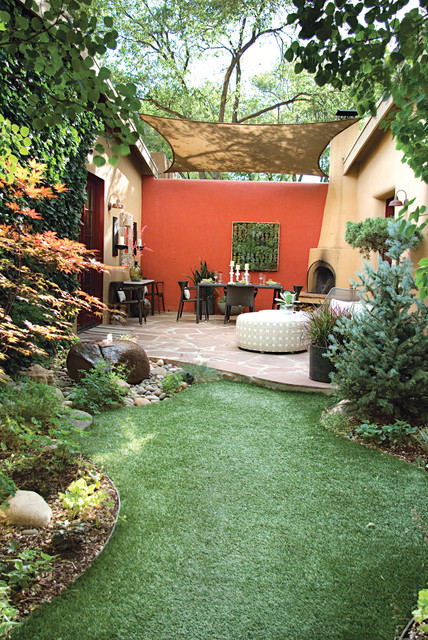
Enough about Neutral–I’m Craving Color
May 13, 2013 § Leave a comment
Who says accent walls are so last decade? Not me. I love how a carefully chosen wall or piece of architectural interest can be highlighted dramatically by color.
Here we see how bold color creates a defined outside eating area with all the drama of an interior dining room. Why not! It’s okay to use accent color on the outside of the house to warm up a patio, jazz up a porch wall, or provide a colorful backdrop to a garden. It’s spring. Get out there and do some color!
Is Your Home Ready for its Close-Up Shot?
May 1, 2013 § Leave a comment
 In real estate, a picture is worth a hundred home visits — at least to many potential buyers who cast off rejects as fast as they can hit the Next button.
If you’re preparing your home for the market (or if your home is already on and just sitting), here’s a tip that might get your home ready for its close-up shot and looking good on the big screen (or at least the laptop):
Take photos of your house from the street and then take a shot of every room from the doorway. Then put them on the computer and take a look at what the public is seeing online.
Ask yourselves:
1) Does the photo of the house from the street show that the house is kept up? Is there stuff in the yard? Are there weeds in the garden? Is there peeling paint anywhere? (You can see the to-do list forming, can’t you…)
2) In the photo from the front door, can you see into other parts of the house or is the foyer closed off and dark? Is there old carpeting on the floor or is it tile or hardwood?
3) Inside, are any rooms dark? Do the curtains cover the windows? Is your furniture in sad shape or is there too much of it in a room? (These are the areas to address)
4) And lastly, is there something in the photo that immediately grabs your eye — and not in a good way? It could be a crooked picture or a sloppy bed. That is what the public remembers from that photo.
With to-do list in hand, fix those items that are keeping your house from getting a personal visit from potential buyers. Selling a house is far more than just listing it with an agency and sticking a sign in the front yard. Make sure you value the importance of photos that show your home to its best advantage.
Is Your House Comfortable in its Color?
March 18, 2013 § 4 Comments
 Wherever I go I study house color, trim color, front doors, and overall curb appeal (it’s kind of an obsession). And this house (even with its imperfections) struck me today as a good example of a house that is comfortable in its skin.
The siding color is yellow but not too lemony and not too orange. Kind of pale but not too cream. Buttery but not too saturated. It’s just, in a word, perfect for this little house.
The trim is not white-white but an off-white without being too beige. A whiter white would look too crisp and a little too Cape Cod for this antique. Off-white gives the house an aged, relaxed, comfortable look. No face-lift needed here.
And the accent color, a soft weathered green with just a touch of blue is really not an accent color at all. Instead of interrupting the house color, like black shutters would, the green simply finishes the house like curtain panels finish a room.
The point is, these homeowners let their house speak to them when it was time to pick a house color palette and didn’t try to make the house into something it isn’t.
Choosing a Siding Color to Coordinate with Brick
March 5, 2013 § Leave a comment
 Where a particular hue sits on the color wheel can make a world of difference when it comes to choosing house colors. Especially if you’re trying to coordinate the color with another material, like brick.
In this example, one yellow leans toward orange. The other one leans toward green.

I don’t think I need to say any more.
It’s the House Color, Not Your Dining Room Curtains
February 28, 2013 § 2 Comments
 Sometimes the best house color is one you might skip right over in the fan deck. Like this one: most likely Ben Moore’s Livingston Gold HC-16, a dark mustard-like brown with a definite green undertone. The kind of color you don’t want to see if you’re feeling queazy.
Although you probably would not choose this color for an interior room (for the reasons mentioned above), what a great house color for this old farmhouse with attached garage in natural cedar shakes. The combo is terrific — earthy, aged, and plucked from nature’s rock and wood palette of colors.
I slammed on the brakes to take a photo.
Choosing a Color Palette for Your House: It’s a Natural
January 29, 2013 § Leave a comment
 Another drive-by sighting of some curb appeal. This time, the stone wall pops out partly because of its mix of natural stones (and not just one kind) but also because the house color is drawn from the wall’s palette of natural hues. Even the front steps coordinate nicely with the wall.
Any of the wall’s creams, beiges, browns, and grays would have worked for a paint color, but the builders chose a light creamy yellow for the siding with a beige shingle on the portico. White trim pulls the house together and the black door makes the dramatic statement.
It’s so easy to choose your house color from nature. You cannot make a mistake.
Two Rules for Choosing a Roof for your House
January 28, 2013 § 2 Comments
 The roof — any roof — is a big-ticket item on the house so choosing it can be a little unsettling. There are so many colorful options available that it’s easy to get wowed by the prospect of something other than the traditional charcoal.
When choosing your roof, make sure you follow these two rules to insure a good result you can live with for, say, 40 years:
1) Get large samples of your roof options. Do not choose a roof from a photo on the computer or a little brochure. Make sure you hold the roof sample up against the side of your house to test for color coordination and to see how busy the two are when side-by-side. Stand back at the curb and take a good look. If possible, get the address of a home that has the roof already installed so you can see how the roof looks over a large area. Does it get lighter or darker? Good to know ahead of time.
2) Avoid the clash of the Maximum Definition shingles with the house. If your house is a busy colorful mixture of bricks or stones, avoid the busy “max def” roof as you will create a combination worthy of a major migraine. The photo above (from Owens Corning) is a good example of pairing a busy max def roof style (with its multiple colors) with a house siding that is neutral, painted brick and neutral siding. There is a good balance between the busy roof and the plain, calm siding materials. There’s no doubt that the roof takes center stage. Make sure it doesn’t fight with the siding “understudy.”
If you follow these two rules, you will narrow your options down to two or three reasonable choices and avoid any major, expensive roof mistakes.
