France: a Source of Inspiration
July 8, 2010 § 1 Comment
 I cannot think of a better place to indulge the senses than Paris: a font of inspiration for anyone who loves food, wine, and of course, exceptional style. This view from my hotel is just the beginning. I hope to capture what makes Paris so special from a design perspective — not that it hasn’t been chronicled before — but there’s more to Paris than museums and cathedrals and I plan to discover it. I will look at modern Paris and its ancestry.
More to come! Stop back by again!
Contemporary Color Scheme
January 7, 2010 § 5 Comments
 This contemporary home maintains its warm curb appeal even in the snowy winter months. It looks like the homeowner started with the fabulous stonework on the chimney and gable area and selected the siding and trim colors out of that. The dark rich chestnut shade is perfect for the body of this large contemporary home. When you are selecting a color for your home, don’t shy away from strong colors, especially if your home is large. Just make sure you choose a color that appears somewhere in nature so that the house fits into the neighborhood. With new construction, you can also work in the window color and the deck stain so that everything coordinates. Even the post light style picks up the pattern in the windows. Nice job! Let’s hope these homeowners have a sizeable snowblower! Yikes.
Color Your Holidays
December 2, 2009 § Leave a comment
If you yearn for a fresh holiday look this season and prefer to leave the traditional decorations in the attic, try a more contemporary color scheme: apple green and silver; coral and gold; robin’s egg blue and white. As long as you add sparkle with shiny metals and twinkle lights, almost any color combination will look festive.
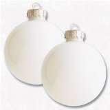
If your neutral or pastel color palette is soft and calming, and bold traditional colors seem to clash with your home’s style, then try using whites for your holiday color scheme:  white candles, white ornaments (like the ones in the photo available from Amazon.com), white dishes, white wrapping paper, and white lights. All the winter whites against your pastel palette will look quite striking.
If holiday memories are most important, then haul out the boxes and baskets of ornaments and figurines and revel in the nostalgia of your own traditions. No picture-perfect holiday décor can replace the fun of reliving childhood experiences and sharing stories from one generation to the next. Who cares if Grandma’s favorite tablecloth is a little worn around the edges. Use it anyway and enjoy this family time.
Happy Holidays from Your Home & Color Coach
Fall Curb Appeal??
October 20, 2009 § 2 Comments
 Ahhh, how picturesque, like this photo from Southern Living Magazine. Maybe your Fall floral vignette on the front porch features a few pumpkins in various sizes, perhaps some statuary mixed in with beautiful volumes of rust and yellow and lavendar and cream mums in big heavy terra cotta pots with … the PRICETAGS showing?? Ouch.
I wasn’t going to say anything, but after noticing this blooper two days in a row on two different doorsteps around town, I couldn’t resist. Just like removing those big tags (that say do not remove) from your sofa pillows, kindly remember to remove the big price stickers from your pots (or at least turn the pots around so we can’t see the stickers as we drive by). Curb appeal. It’s all in the details.
Paint Your Old Golden Oak Cabinets!
October 19, 2009 § 10 Comments

 Saddled with old golden oak cabinets? Why not paint them. I did and it was very easy (though time consuming). I started by removing the doors from the cabinet base and unscrewing all the hardware. Then I lightly sanded all the surfaces. A good primer like Zinsser’s Bulls Eye 123 covered easily and provided a great base for the finish coat.
I used Valspar’s Kitchen and Bath Enamel in a Ben Moore color called Antique Parchment on the top cabinets and a Valspar color called Jekyll Club’s Cherokee Rust on the bottom cabinets (there, I plugged both companies). The cabinets looked great but I wasn’t done. In our house with kids, etc, etc, we tend to bang things up a bit so I mixed up a glaze that included some Cognac Snifter 1148 (a Ben Moore color used in an adjoining room) for the top cabinets and Branchport Brown HC-72 for the bottom. I painted the glaze into the seams and cracks in the doors and wiped it off with a rag. The look is rustic but cheerful and allows the new oil-rubbed bronze hardware to finish the room. And any future little scratches will not show. I love it!!
I tiled the backsplash (white primer in the before photo) with simple white subway tiles from Lowe’s. Not an expensive project, but I did purchase a wet saw for cutting the tile. (Looks like I have more tile projects in my future or maybe I can rent the saw out to my neighbors!) I am very happy with the end result, imperfections and all, and I do not miss my golden oak cabinets! I would highly recommend painting cabinets if a total kitchen re-do is not in the budget or if you’re planning to sell your house and you have ugly kitchen cabinets. The project will be worth it!


 This cork board from the Pottery Barn Kids catalogue was the inspiration for Hannah’s bedroom renovation. We decided to open up her rather small room by painting wide horizontal stripes all the way around the room in three different tones of blue-green with a white stripe between them. The treatment conjured up, at least in my mind, waves on the beach.

 This basement renovation project started with a request for a palette of brown and purple. Coming from a couple with impeccable taste in furnishings upstairs, I knew this would be a fun challenge. We inserted some green into the mix along with a touch of copper and brushed nickel and ended up with more of an upscale version of the typical “man cave” (obviously there had to be two large TVs in the space along with exercise equipment, a bar, a kitchen, and a pool table).
