House and Trim Colors that Make a Statement
October 14, 2010 § 3 Comments
 Every now and then I see an accent color that whacks me over the head, and this bold expression of lemon yellow really does it to me this time! Usually a color that does not translate well onto siding or other large surfaces because it’s just too intense, this clear saturated primary color on a shutter paired with black wrought iron hardware on a subdued and sophisticated dark, gray-blue siding is a knock-out! What a statement!
What makes this combination work is the sharp contrast between the gray tone in the siding color and the bright clear shutter. If the siding were another warm clear color, the combination would scream like a caution light. But the calm understated siding lets the yellow attract all the attention. There’s no competition between the colors, just sheer harmony.
Another key to this combination is the “bridge” color that pulls the look together: white. The white trim makes the colors pop — as they say — and it’s critical whenever you use bright colors, either inside or out. White also gives your eye a chance to rest from the intensity of the palette.
But just like other bold statements, be prepared to attract a lot of buzz. And keep the lawn mowed.
Going from Home to Sold: Working with a Stager
August 10, 2010 § Leave a comment
 I know they have to design, stage, and sell in one hour. But on some of those design shows, the home stager comes sweeping through, insulting the homeowners in every room, as if those poor people should know instinctively that the wall color they chose for the kitchen is the only reason their house won’t sell. A good home stager in real life, of course, will tread delicately through the minefield of personal decorating taste and homeowner attachments and end at a win-win.
If you need to sell your home and your realtor recommends a staging consultation, here’s what to expect.
The stager will arrive and begin looking at your home from the curb. Don’t be alarmed or feel invaded. They are there to help you sell. Try to envision this fairly unwelcomed guest as someone who is on your team.
If you haven’t listed your home yet, the stager will walk through your property and evaluate what changes need to be made to sell the home. It’s nothing personal. The stager is seeing your home from the perspective of the buyers in our current market.
The stager will know how to identify all the selling features that your property has to offer and how best to highlight them to buyers.
The stager may give you tips to enhance your landscape or point out areas that need touch-ups.
The biggest nerve that the stager will hit (delicately we hope) is what is personal to the homeowners and needs to be removed from the home if it is to sell quickly and for top dollar: family photos, children’s art and toys, figurine collections, delicate houseplants, years worth of memorabilia, most of the books, and yes, the homeowners’ personal design style. I quipped with one homeowner the other day that we were turning their well-lived-in home into more of a Ramada Inn (with all due respect to Ramada, of course).
The point is, if you’re selling your home, you will want to appeal to as many buyers in today’s market as possible. That means that lots of things that made your house your home need to be packed up so that the potential buyers can see themselves living there.
At the end of the consultation, the stager will leave you with a rather lengthy to-do list. You can plow through it yourselves or call them back to help you. Your realtor will have access to other service providers as well, like cleaners and organizers. Chances are very good that if you accomplish everything on that list, the home you are trying to sell today will become the house that… SOLD!
Inspirations from the French Countryside
July 26, 2010 § 1 Comment
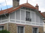
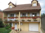
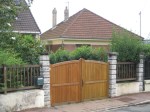
Traveling south of Paris into the French countryside really gives you a feel for how the French live. The quiet little town of Montgeron with its hilly one-way streets, gated driveways, and modest stucco and stone homes, is nestled far enough away from the city to give the town an identity of its own. Gone are the wrought iron railings and the bustling sidewalk cafes of the city. We’re in the quiet part of France where people still buy their daily breads, meats, and vegetables, but tend to live simpler lives tucked safely behind walls.
The public gardens are beautifully tended, kind of a smaller version of the Paris jardins, and the French details like the flowers on the light post are evident. Walking through the neighborhoods conjures up a lifestyle that many of us busy Americans (at least those of us just outside major cities) left all too long ago. It’s no wonder the French live so long!
A Window to Paris
July 12, 2010 § Leave a comment
 The windows in Paris are almost as intriguing as the doors! First of all, the shutters actually work, the windows have no screens, and there are no bugs! Plus the shutters are fabulous soft colors of whites and taupes and light blues. The soft colors against the stucco and stone are simply spectacular. Not a black shutter anywhere to be found. I’m thinking that there may be room for more shutter colors in the palette — even on this side of the pond! Why limit ourselves to dark colors!
For stucco and stone homes, consider the subtle sensibilities of French architecture and the superb use of color on shutters. Tres bien!
The Doorways to Paris
July 11, 2010 § 1 Comment
 Whether they’re painted a wonderful milk-paint blue or left a natural wood tone, the doors of Paris are spectacular. It helps, of course, that they’re attached to stunning historic residences that have been there hundreds of years. The scale of the doors is big to fit the scale of the buildings, and the embellishments are breathtaking (spoken like a true decorator). The doors stand out as they are truly meant to — as the focal point of the home or business.


 The updated kitchen,


