Is Your House Comfortable in its Color?
March 18, 2013 § 4 Comments
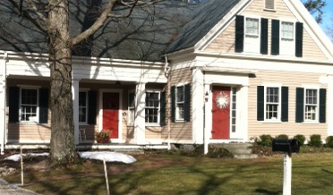
 Wherever I go I study house color, trim color, front doors, and overall curb appeal (it’s kind of an obsession). And this house (even with its imperfections) struck me today as a good example of a house that is comfortable in its skin.
The siding color is yellow but not too lemony and not too orange. Kind of pale but not too cream. Buttery but not too saturated. It’s just, in a word, perfect for this little house.
The trim is not white-white but an off-white without being too beige. A whiter white would look too crisp and a little too Cape Cod for this antique. Off-white gives the house an aged, relaxed, comfortable look. No face-lift needed here.
And the accent color, a soft weathered green with just a touch of blue is really not an accent color at all. Instead of interrupting the house color, like black shutters would, the green simply finishes the house like curtain panels finish a room.
The point is, these homeowners let their house speak to them when it was time to pick a house color palette and didn’t try to make the house into something it isn’t.
Do You Have Two Front Doors?
March 13, 2013 § Leave a comment
 Many of us have more than one entrance on the front of the house, and sometimes one is rarely used. How do you indicate which door you want visitors to enter? Do you paint both doors an accent color or just one?
If you use the main front door as your guest entrance — if you’re having a party, say, and don’t want people traipsing through the kitchen — then paint that front door an accent color (red in this case) and all other doors a color that coordinates with your siding (maybe a shade or two darker or just the trim color). If you paint both front doors red, we are not only left with two focal points but we’re confused as to which door is preferable. Painting only one red door will announce which one is open for guests. In this photo example, the homeowners painted both doors red but distinguished the front door from the porch entrance with a wreath. Not quite as clear as using color, but it works.
Now here is where it gets tricky. If you NEVER want anyone to go to the front door, then paint that door a neutral color that coordinates with the siding and paint the porch door red. It’s okay. The same applies to all the various side doors, garage doors, and shed doors. Paint them all a coordinating color but not the same as your main door. That guest entrance is special.
Just a guideline if you’re struggling with too many doors and what to paint them.
Choosing a Siding Color to Coordinate with Brick
March 5, 2013 § Leave a comment
 Where a particular hue sits on the color wheel can make a world of difference when it comes to choosing house colors. Especially if you’re trying to coordinate the color with another material, like brick.
In this example, one yellow leans toward orange. The other one leans toward green.

I don’t think I need to say any more.
It’s the House Color, Not Your Dining Room Curtains
February 28, 2013 § 2 Comments
 Sometimes the best house color is one you might skip right over in the fan deck. Like this one: most likely Ben Moore’s Livingston Gold HC-16, a dark mustard-like brown with a definite green undertone. The kind of color you don’t want to see if you’re feeling queazy.
Although you probably would not choose this color for an interior room (for the reasons mentioned above), what a great house color for this old farmhouse with attached garage in natural cedar shakes. The combo is terrific — earthy, aged, and plucked from nature’s rock and wood palette of colors.
I slammed on the brakes to take a photo.
Choosing a Color Palette for Your House: It’s a Natural
January 29, 2013 § Leave a comment
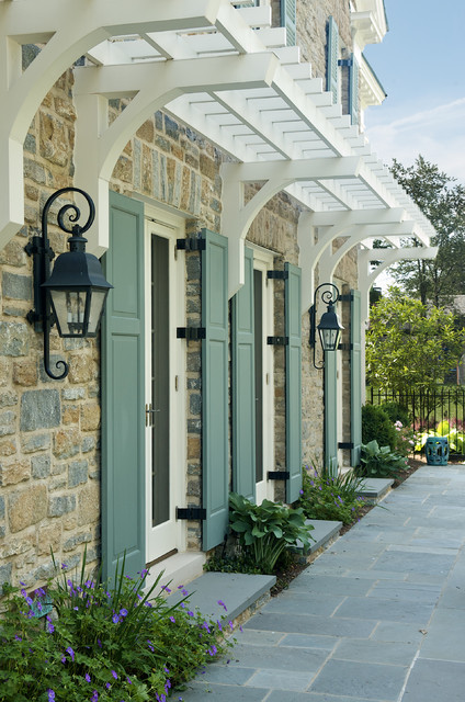
 Another drive-by sighting of some curb appeal. This time, the stone wall pops out partly because of its mix of natural stones (and not just one kind) but also because the house color is drawn from the wall’s palette of natural hues. Even the front steps coordinate nicely with the wall.
Any of the wall’s creams, beiges, browns, and grays would have worked for a paint color, but the builders chose a light creamy yellow for the siding with a beige shingle on the portico. White trim pulls the house together and the black door makes the dramatic statement.
It’s so easy to choose your house color from nature. You cannot make a mistake.
Two Rules for Choosing a Roof for your House
January 28, 2013 § 2 Comments
 The roof — any roof — is a big-ticket item on the house so choosing it can be a little unsettling. There are so many colorful options available that it’s easy to get wowed by the prospect of something other than the traditional charcoal.
When choosing your roof, make sure you follow these two rules to insure a good result you can live with for, say, 40 years:
1) Get large samples of your roof options. Do not choose a roof from a photo on the computer or a little brochure. Make sure you hold the roof sample up against the side of your house to test for color coordination and to see how busy the two are when side-by-side. Stand back at the curb and take a good look. If possible, get the address of a home that has the roof already installed so you can see how the roof looks over a large area. Does it get lighter or darker? Good to know ahead of time.
2) Avoid the clash of the Maximum Definition shingles with the house. If your house is a busy colorful mixture of bricks or stones, avoid the busy “max def” roof as you will create a combination worthy of a major migraine. The photo above (from Owens Corning) is a good example of pairing a busy max def roof style (with its multiple colors) with a house siding that is neutral, painted brick and neutral siding. There is a good balance between the busy roof and the plain, calm siding materials. There’s no doubt that the roof takes center stage. Make sure it doesn’t fight with the siding “understudy.”
If you follow these two rules, you will narrow your options down to two or three reasonable choices and avoid any major, expensive roof mistakes.
Stone and Brick Reveal Your Exterior Color Palette
January 25, 2013 § Leave a comment
 Yes, it’s winter and the roof in this photo is covered with snow, but now we can focus on the rest of the house, particularly the stone. What works on this house is the color palette that is taken directly from the numerous available hues in the stonework itself.
The bricks are a monochromatic rusty red color that complements the stone without competing with it — a challenge when you have multiple materials on the house. The siding is a gray neutral, also in the stone. The trim is pulled from some of the darker taupe stones. How easy is that? Job done.
If you are building a home with different materials, use the busy one with the most colors (stone or brick) to make the rest of your color decisions. That way, the whole house will come together in a harmonious cornucopia of color.
The alternative? Choosing a color that is not in the palette at all. The result? A disjointed effect that divides the house into sections and makes it seem smaller. Can be done, but it’s tricky and needs a professional colorist to pull off. Do yourself a favor and stick with the natural palette that presents itself to you from your building materials.
The Best and Worst House Colors for Cold Snowy Winters
January 24, 2013 § 1 Comment
 As we get more and more snow this winter, I notice what house colors look good in snow and which ones look awful. I’ll start with the thumbs down. White. It either blends away completely except for any contrasting colored shutters or it looks downright dirty. It’s also cold-looking. If you have a white house and a long winter, make sure you have lots of greenery in the foundation plantings, trees in the yard, and a wreath with a big red bow on the front door.
My favorite color for long, cold, white winters is a sunny yellow. Wow, does that color look terrific against the white snow. Try Benjamin Moore’s Concord Ivory http://www.benjaminmoore.com/en-us/paint-color/concordivory. Paired with a black roof, black shutters, and white trim, you’ve got a knock-out house year round.
Shutter Color Inspiration for Stone and Brick Houses
January 10, 2013 § 6 Comments
One approach to choosing an accent color for your stone or brick home is to let the stone or brickwork dictate the color. How easy is that. The stonework on this house and walkway revealed a whole palette of dusty blue-gray greens from which the shutter paint was then custom-mixed to a perfectly coordinated color.
In the brick example, this Old Town red brick contains a lot more colors than just red. Purple is what pops out and that gorgeous shade was the inspiration for a dark purple shutter color: Ben Moore’s Caponata AF-650. Dark purple shutters are a wonderful option for other homes as well, not just red brick.


Natural wood tones always work for shutters, especially on stone or brick and especially if the shutters are actually wood and not vinyl. Old World wonderful.
When selecting a shutter color, take your color cues from your house. Chances are pretty good that if you have a stone or brick house, you have quite a palette of colors to choose from already.
Making Sense of Color Trends
January 8, 2013 § 1 Comment
 Is anybody else’s head spinning as you look at the color trends for 2013 or is it just me?
When we look at the Benjamin Moore Color forecast, we clearly see pastels — a look refreshingly optimistic every few years after we finish huddling in our dark, cozy dens and want out. Here we see a pale yellow added tastefully to warm gray walls — a really soft, uplifting combo. (Lemon Sorbet 2019-60 is the Ben Moore paint color of the year if you haven’t already heard.)
The other color combos from Ben Moore introduce Dusty Mauve (2174-40) back into the mix (been a few years, like 30), in combination with Golden Straw (2152-50) and a soft navy (Evening Dove (2128-30). The other trends from Ben Moore show us more Coastal blues and greens (never out of fashion in my book), and more taupes and grays, a trend we have been in for a few years now. Here is a link to the Ben Moore colors and combos: http://www.benjaminmoore.com/en-us/for-your-home/trends-2013
And then there’s Sherwin-Williams. Talk about something for everybody…I’ll say. I wouldn’t call this a color trend. It’s more like a smorgasbord. 
We have the Vintage Moxie Collection, an Easter basket of colors to choose from including Radiant Lilac (SW0074) and Aloe (SW6464, the Sherwin-Williams Color of the Year).
Then if you’re still in a chalky-earthy color mood, there’s the Honed Vitality Collection including all colors we’ve been using already like Unusual Gray (SW7059) and Roycroft Suede (SW2842), both terrific exterior colors. http://www.sherwin-williams.com/architects-specifiers-designers/inspiration/color-forecast/2013-color-forecast/honed-vitality/
Sherwin-Williams went Peter Max with its High Voltage collection — Electric Lime (SW6921) and Feverish Pink (SW6859) are colors I would reserve for a pillow or a picture frame. Maybe a front door color if you’re so inclined. Yikes! http://www.sherwin-williams.com/architects-specifiers-designers/inspiration/color-forecast/2013-color-forecast/high-voltage/
Finally Sherwin-Williams offers the dark, moody, masculine colors for anybody who’s left. The Olde World Gold (SW7700) and Plum Brown (SW6272) are both terrific exterior colors as are most of this Midnight Mystery collection. http://www.sherwin-williams.com/architects-specifiers-designers/inspiration/color-forecast/2013-color-forecast/midnight-mystery/
What Sherwin-Williams has shown us with their lack of consensus when it comes to color trends for 2013 is that we are more diverse in our color likes and personalities than ever before. Pretty much anything goes. So paint what you love. If you are caught up in color trends, then stick to whites and neutrals for your walls and add pops of trendy colors in things like pillows, accessories of all kinds, and even front door colors. Things you can switch out easily when the next hot new trend comes along because who knows what the color experts will throw at us next year.
