But I Love Grandma’s Furniture
January 20, 2018 § Leave a comment

Furniture that has been in the family for generations (or as long as you can remember, at least) carries memories of sitting around Grandma’s dining room table during holiday dinners and enjoying family and food and all that goes with that. So of course you accept Grandma’s dining room set when presented. Okay, now what.
Designer Stephanie Lees shows us how to marry traditional (whether inherited or acquired some other way) and modern styling. Yes, the two can co-exist nicely together.
Color is the most obvious creative solution. The navy grasscloth walls in that dining room contrast elegantly with the traditional white wainscoting beneath the chair rail. Camouflaged there is a white lacquer cabinet that showcases more family treasures that frame out the modern artwork above.
The green curtain panels in an unfussy simple treatment dress the windows with a pop of color that is carried over to the back of the traditional wingback chair. Wingbacks –whether old or new — are classic. But the modern fabric placement takes what might have been a studious, grownup, wingback chair and made it playful. Those bamboo side chairs — if not your grandmother’s then just like them — can be recovered very DIY with new coordinating fabric by unscrewing the seats, stapling fabric onto the seat bottoms, and screwing the seats back onto the chair. Instant update.
Another key update that sets a modern tone to the room is the contemporary rug, again keeping with the blue & white palette but staying clear of any traditional rug design. Random color placement in the rug keeps the room from looking too formal, and it is key to pulling off this style marriage.
But just short of replacing whatever shiny, old, yellow-brass light fixture might have hung from the ceiling before with a new contemporary brushed nickel version (gasp!), the designer opted for a vintage Italian chandelier in crystal. Dramatic, classic, and oh so stylish.
You’ve given us lots to think about, Stephanie, as we incorporate inherited pieces into our own homes. Thanks for the inspiration!
@StyleatHome, @YourColorCoach, stephanieleesdesign
Escape from the Blues
January 4, 2018 § Leave a comment

Horseshoe Bay, Bermuda
This is a perfect January day in New England. We are completely snowed in, and nothing is more relaxing than hunkering down in a cozy house as the wind howls outside and the snow banks pile up around us. I love winter!
But that doesn’t mean I like the wintery gray, the limited daylight, and the bitter cold that comes with it. The longer winter goes, the more I yearn for an escape to somewhere warm — even if it’s only in my imagination.
Enter the Sherwin Williams Color of the Year for 2018.

It is an opulent teal that conjures up the ocean and all the warmth of summer at the beach. If a midwinter break in Bermuda is not on your calendar, there are other ways to escape the winter cold — visually. Here are some:
Plan Your Spring Projects. It’s never too early to think about Spring projects, and painting your front door is a doable one. Remember to tie the color in with other accessories and furniture around the yard.

Paint the Fifth Wall. Don’t overlook the ceiling when you’re adding color. Since cool colors recede visually, painting the ceiling a medium teal blue will raise it — like rolling a Utah sky onto your porch.

Splash Color Under Foot. Now I’m making it too easy. Add a gorgeous rug and transform your space instantly. There’s something about the combination of blues and greens that soothes and comforts us all. And a rug adds not just color but texture.

Dive into the Pool. Ceramics, art, dishes, pillows, collectibles, throws, lamps… the options for accessories are endless. Be sure when you add a color to your room that you put it in at least three locations to move the eye around the room and create flow.
Enjoy your staycation! With some daydreaming, a little shopping, and a tad bit of rearranging there at home, you can lift your spirits toward Spring and feel warm and cozy at the same time.
Thanks for stopping by!
Orange Twist to the Red Revival
September 18, 2017 § 2 Comments

Apples, pumpkins, falling leaves — there’s something about Autumn in New England that, despite our recent warm temperatures, makes us cozy up to the changing seasons. Maybe that’s why some of us live here.
My newest door color obsession is a revival of the orangey red of another decade, and that may signal the end of the light, neutral, blue and even light lemon yellow door color trend I’ve focused on for the past several years. This red, Million Dollar Red (Benjamin Moore 2003-10) is as perfect on a traditional white colonial as it is on a black modern home. There is no mistaking where the door is — it screams Welcome!
What I love most about it is its “orangeyness.” Orange is a happy color no matter what. So a red on the orange side (versus pink) says this is a happy home. The color also has an updated, contemporary feel as opposed to the more traditional burgundy red (also great, of course, but more serious and refined).

Adding an orangey red as an accent color on the interior is also a great way to torque up the energy. Try it on the back of a white bookshelf, or on a pouf ottoman in the family room, or even on a focal wall in the front entry. A little bit of red warms up a room a lot. So before painting an entire room red, make sure you want to amp up the temperature in there. Using red on items that can be removed in the hot summer makes sense to me: pillows, bedding, throws, and art. Then I look forward to my seasonal exchange when I swap out the cool blue accessories for red.
Enjoy Autumn… whatever it means to you and wherever you are. And love how the color orangey red makes you feel. Warm and Happy.
Balancing Color, Pattern, and Neutral
August 21, 2017 § Leave a comment
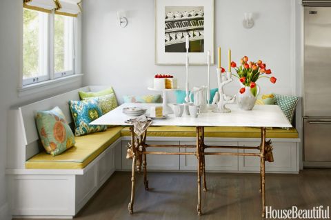
There is so much to love about this breakfast nook (designed by Martha Angus and Katie McCaffrey), I’m going to dive right in.
What’s to Love?
-The light gray walls. By staying with a light cool neutral on the wall color, you allow the pops of warm vibrant color to do just that: pop.
-The simple breakfast nook construction in the same wall color. What happens? The banquette disappears making the room look bigger and less chopped up.
-The wood floor. No doubt it carries throughout the public space making the whole house feel open and unified.
-The table from Paris (yeah, I know). The point is that the table is a unique piece and it’s not only functional but a conversation piece and a memory back to a really nice trip.
-The black and white print. Sure, you can add a vibrant picture there, but the neutral wall hanging allows the colors to take center stage. And they do.
-The yellow leather cushion. It’s yellow but in a fabric that’s easy to wipe up. Essential.
-And those pillows! In colors that coordinate with each other but refuse to look matchy-matchy. (And you just know that the rest of the house pulls colors from that lovely summer palette.)
Take Home Message:
If you want to show off color (or many colors), don’t overdo it. Leave spots empty and devoid of pattern for the eye to rest. And pick a palette of colors (5 is a good number) that you can carry throughout the house in various ways — wall color, furniture, art. The result will be a home that is balanced, unified, has flow from room to room, and that makes you happy every time you open the door.
From Grays to Happy
May 2, 2017 § 1 Comment

Gray has been the wall color of choice for public spaces in the home for a number of years now, and don’t get me wrong, gray is a wonderful neutral to replace the beiges of the previous trend. But you have to admit, gray is not for everybody. And if you live in a dark home with small windows and low ceilings, painting the walls gray might have been a real downer.
Never fear! Color to the rescue! Here are a few ways to make sure your gray room escapes the wrath of a couple of gallons of primer and a roller:
-Make all trim white. That is the best way to keep the gray clear and crisp.
-Make the ceiling bright ultra white. That will reflect the maximum amount of light back into the room.
-Add bright clear color. Bedding, accessories, a rug, and accent furniture (for example, as we see above in the room from Williams Sonoma Home) will help the gray perform its duty as a neutral backdrop instead of becoming the storm cloud in the room.
–Add sparkle. Whether it’s a silver lamp, a crystal chandelier, or some new gold in a brass picture frame, adding metal and glass will provide the finishing touch to the room. Reflective finishes bounce light — like jewelry!
So if your gray walls are bringing you down, don’t despair. Add Color. (You knew I’d say that.)
My Dream Living Room
March 26, 2017 § 2 Comments

What makes a living room dreamy? Here’s what works for me.
- A fireplace mantel that can anchor a beautiful inspirational piece of art. This one, “Wild Orange Sherbet” by J.P. Prior, does it for me. Even the name makes me happy.
- A big comfy sofa. I’ve always wanted a curved sofa (this one from Arhaus) as it invites conversation. People tend to sit down and talk with each other instead of staring at the TV (which, you might note, is absent from my dream living room).

- Neutral major pieces. I chose Taft Pewter for the upholstery color because it goes beautifully with the stone around the fireplace, and the color won’t grow tiring. Even if pillows come and go with new color trends, the sofa’s soft, sophisticated neutrality will endure.
- A rug that
 will further define the conversation area
and be cozy underfoot.
This neutral coordinates with the sofa and doesn’t detract from the focal point of the room. - An ottoman is
 an absolute must as it beckons you to put your feet up and relax. With a tray on top, an ottoman serves as a hard surface for drinks and snacks.
 - A pair of perky chairs (opposite the sofa)
 to round out the conversation area and yell “Surprise!” when somebody enters the room. Everybody needs at least one chair in their favorite color.
 - Pillows
 that pull the whole color palette together and come in different sizes and textures and may be swapped out seasonally if you like.
- Finally, a pretty paint color that provides a backdrop for the room but does not compete with anything for attention. For this room, I chose Benjamin Moore’s Classic Gray, OC23.
The whole idea of my Dream Living Room is to set a happy, relaxed tone for the house in a classic and timeless style that won’t look too dated when the next big trend comes along. Keeping the bones of the room classic (hardwoods, architectural details) and the expensive pieces timeless (sofa and large furniture) allows you to play with chairs and accessories and art and have fun.
Create a dream living room in your home. Ahhhh… I like dreaming.
__________________


Sources: Art (“Wild Orange Sherbet” by J.P. Prior). Mantel (MantelCraft). Sofa (Arhaus.com for other living room inspirations). Rug (Arhaus.com). Ottoman (Arhaus.com). Armchair (Dot&Bo). Pillows: Yellow (Fine Art America), Damask (Wayfair), Lumbar Pillow (Pier 1 Imports). Paint: Benjamin Moore, Classic Gray OC23.
Happy Color for 2017
January 5, 2017 § Leave a comment
The New Year creates an opportunity for change. Whether it’s a p ledge to drop a few pounds, move the body more, or clear out the clutter, January is Change Month. And around here, I am ready to change color.
Not that I wasn’t crazy for color before, but fresh, clear color screams enthusiasm, optimism, and hope for great things. My nuanced, subtle, neutral palette looks dreary and tired. It is ready for a color boost to the happy side.
What does that mean for my decorating aesthetic? Not repainting my entire house and dragging all the furniture to Goodwill. Rather, a move to throw in a few color “punches” by switching out pillows on the sofa and adding some art and accessories. The hammocks are such an inspiration (from our fami ly trek to New Orleans over the holidays). And check out this orange Moroccan pouf my sister gave me for my birthday. I adore the color orange because it’s always a happy color — she knows that.
So if you are looking for a jolt of positivity in your life this January of 2017, try adding color and see if it helps your outlook on life. (Good coffee will help too!) Have a Colorful New Year, my friends!
Adding POPS of Color — Orange
October 10, 2016 § Leave a comment
 Is there any color happier than orange? Okay, full disclosure. Orange — that special red-orange that you see on maple trees in the Fall in New England — is my favorite color. I don’t wear it, but I love looking at it.
Fall is a wonderful time to add a touch of orange to your home. Go all in with a peppery accent wall in a guest bedroom. Or go easy with a few orange candles on the mantle. I like to switch out my light blue throw pillows on the sofa for orange this time of year. Keeping my sofa neutral lets me do that, and on that first chilly October day, orange pillows warm the room instantly.

What goes with orange? If you want energy, blue (like SW Indigo). Just look at the sky in the photo and how those two complementary colors work off each other. If you want a bit more calm in the room, use a warm gray as a back drop, like the fence in the photo (and SW Dorian Gray).
 Another way to add orange without switching out your furniture and paint color is to introduce a large framed photo of Fall colors. I like to stick with the season we’re in so the photo would come down in the winter and be replaced by a cozy winter scene. Seasonal changes keep the room looking vibrant and fresh.
If all those ideas and colors are still over the top, there’s always squash soup and pumpkin-spice muffins. Sometimes a little color on the dinner table is all you need to enjoy the autumn season.
Stay cozy, my friends.
Where to Splash Your Kitchen Color
June 9, 2016 § Leave a comment
 White kitchens are, again, all the rage, but what keeps a white kitchen from becoming too cold and uninteresting? You guessed it. Color.
What I love about this white kitchen from Traditional Home is the strategic placement of color where it will 1) have the biggest impact; and 2) be inexpensive to change over time.
Where to put the color?
Backsplash. Since the cabinetry and counter tops are white, the backsplash is a logical place for applying a splash of color. Plus, since it’s a relatively small area in the kitchen, you can be bold with your tile choices knowing that replacing the backsplash when styles change down the road will not break the bank.
Furniture. Splashy citron breakfast bar chairs give the neutral kitchen a modern vitality that pairs very well with the traditional cabinetry. The chairs keep the traditional cabinet design and the timeless marble counter top from being too stuffy. And because there are just two chairs, theoretically you could switch them out seasonally if you wanted to and change the look of the kitchen completely.
Accessories. Always a place to introduce color, the accessories like dishes and canisters and placemats and other easily switched-out items add splashes of color all over the kitchen and are temporary. Again, you’re not locked into a color scheme that will go out of favor in a year or two. Bringing in new accessories in a new color palette will freshen up the kitchen at practically no expense.
No wonder white is such a popular color for the kitchen. It is timeless, and it goes with every decor and season. Plus by adding color in places where new color can be infused without redoing the entire kitchen, you’ve added longevity to your original white kitchen design. Smart thinking!
Here’s the link: http://www.traditionalhome.com/kitchens/design-ideas-white-kitchens?page=0
Trending Front Door Colors
April 25, 2016 § 1 Comment
 What’s trending now in front door colors? Soft pastels. Although the traditional black and red will never go out of style on colonial homes, the palettes of many contemporary and new construction houses have been softened in recent years.
People are still loving the neutral siding colors: whites, grays, gray-blues, and sages. But instead of the dynamic contrast of a front door that shouts, we now have front doors that sing softly.
Possibilities:


Benjamin Moore’s offerings:
- Corn Silk, 198
- Revere Pewter, HC-172
- Simply White, OC-117
- Soft Pink, 2012-70
- Gentle Gray, 1626
- Touch of Gray, 2116-60
- Moon Shadow, 1516
- Colony Green, 694
- Yarmouth Blue, HC-150, a personal favorite of mine.
Spring is here! Consider painting your front door with a soft new hue. You’ll love it.
(Photo: Better Homes & Gardens)
