Adding Shutters? Look to Paris
November 15, 2015 § Leave a comment
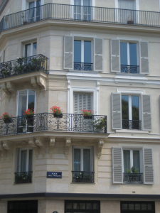 In honor of my beloved Paris, let’s talk about shutters. In my humble opinion, nobody does shutters better than the French. Classic, elegant, tasteful and actually quite functional as opposed to our (often) vinyl interpretations on our side of the pond.
That said… shutters do not have to be functional, and it’s okay if they’re vinyl. But how can we make our vinyl, nonfunctional, imitation shutters look more authentic? Size. Yes, when it comes to shutters, size matters. 
Shutters that are too narrow or too short for the window size look like an afterthought, at best. They add color and dress the bare windows, but they don’t fool anybody. Make sure 1) there is enough room on either side of the windows for properly sized shutters; 2) the width of the shutters fits the scale of the window — they could actually function; and 3) the length is appropriate — if shut, the shutters will cover the window completely and not leave a little hem showing.
Thank you, Paris, for educating me on shutters during my trip in 2010. And my sincere sympathies to you and your people.
Surprising House Color Trend — White
February 12, 2014 § Leave a comment
Classic but always with a modern twist, white is trending now as a house color on new construction. Whether we’re craving our grandparents’ old homestead, or we like a crisp, uncomplicated look, white is in. White siding with white trim. But the surprise element lies in the accessories. Fresh options include silver for the metal color (not the traditional black), white or pastel door colors (nolonger black or red), medium-toned metal roof colors (not just charcoal shingle anymore), mismatched out-buildings (that old classic farm look is coming back in a big way), and even (gasp!) white shutters on a white house.
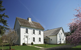
The beauty of white is that it really is timeless. Not only that, but it shows off your colorful flowers and the greenery of your landscaping, the orange patio umbrella and Adirondack chairs, and the turquoise of your backyard pool (okay maybe I’m going a little overboard).
See if a fresh pop of white brings out the character in your house.
Is Your House Comfortable in its Color?
March 18, 2013 § 4 Comments
 Wherever I go I study house color, trim color, front doors, and overall curb appeal (it’s kind of an obsession). And this house (even with its imperfections) struck me today as a good example of a house that is comfortable in its skin.
The siding color is yellow but not too lemony and not too orange. Kind of pale but not too cream. Buttery but not too saturated. It’s just, in a word, perfect for this little house.
The trim is not white-white but an off-white without being too beige. A whiter white would look too crisp and a little too Cape Cod for this antique. Off-white gives the house an aged, relaxed, comfortable look. No face-lift needed here.
And the accent color, a soft weathered green with just a touch of blue is really not an accent color at all. Instead of interrupting the house color, like black shutters would, the green simply finishes the house like curtain panels finish a room.
The point is, these homeowners let their house speak to them when it was time to pick a house color palette and didn’t try to make the house into something it isn’t.
Shutter Color Inspiration for Stone and Brick Houses
January 10, 2013 § 6 Comments
One approach to choosing an accent color for your stone or brick home is to let the stone or brickwork dictate the color. How easy is that. The stonework on this house and walkway revealed a whole palette of dusty blue-gray greens from which the shutter paint was then custom-mixed to a perfectly coordinated color.
In the brick example, this Old Town red brick contains a lot more colors than just red. Purple is what pops out and that gorgeous shade was the inspiration for a dark purple shutter color: Ben Moore’s Caponata AF-650. Dark purple shutters are a wonderful option for other homes as well, not just red brick.


Natural wood tones always work for shutters, especially on stone or brick and especially if the shutters are actually wood and not vinyl. Old World wonderful.
When selecting a shutter color, take your color cues from your house. Chances are pretty good that if you have a stone or brick house, you have quite a palette of colors to choose from already.
Brick House Trim Colors
December 26, 2012 § 338 Comments

Creamy white trim with black shutters (and door) give brick houses like these on historic Nantucket Island in Massachusetts a classic traditional look that is timeless. But for a more contemporary look, use the brick itself for your trim color inspiration. Choose a color that you see in the brick or the grout– tan or taupe or another earthen color. If you select a color from the brick, it will blend with the brick and provide less contrast than the white. The overall effect will be soothing and contemporary but it will call less attention to the architectural details. The Boston building below is hardly contemporary, but the color scheme is taken from the brick and grout and is one example of using coordinating trim colors instead of contrasting trim.

Choosing Paint Colors for House Trim and Doors
November 29, 2012 § 448 Comments

The front door is the focal point of your house and it can make a big splash. (Even though Great Britain’s former Prime Minister Tony Blair reportedly changed his 10 Downing Street door color from conservative black to Labour Party red as seen in this photo from the Daily Mail, evidently it was all an April Fool’s joke — see the full story at http://news.bbc.co.uk/1/hi/magazine/8677004.stm)
Doubtful that changing your own front door color will create as much of a stir in the neighborhood, but you’ll want to give it considerable thought anyway.
But first, what about the trim color?
House trim color: If you have a small house and you want it to look bigger, consider painting the edge trim the same color as the house or just a shade lighter. This will blend the corners of the house in with the body and draw your eye to color — hopefully, the front door. If you want to show off the trim in a more contemporary way, consider painting the edge trim two shades darker than the house color. To accent your trim in a traditional way, choose contrast by using either white or cream. If you have a stone house, the grout color is a great trim color.
The message here is to avoid too many different hues (different colors) when painting the house, trim, doors and shutters. Unless you have an architectural masterpiece, I would avoid choosing trim colors that are unrelated to the house color (for example, painting a gray house with navy blue trim, red shutters and red garage doors). Not only will you draw attention to all the different colors themselves and away from the front door (regardless of what color IT is), but you will have visual chaos!
Exception: If you have an old Victorian home, you may want to accent all the different architectural elements with paint in many different colors.
Trim around windows: To keep the windows looking as large as possible, paint the trim around the windows the same as the window frames, either white or cream or whatever color the window frames are. Matching the trim to the actual windows will make them look bigger than if you break up the color by painting a dark trim around a white window or a white trim around a dark window.
Garage door color: Unless you want to broadcast to your neighbors that you have a three-car garage, you probably don’t want to highlight your garage doors. Standard garage doors should usually be painted either the color of the house or a couple of shades darker to “anchor” them. Plus, by painting the garage doors the house color or a little darker, your house will look bigger and less chopped up. The focus is reserved for the front door. Note: yes, metal garage doors can be painted even if they’re white when installed. Just clean the doors very well and use a good primer.
Exceptions: Garage doors associated with brick homes are often painted either the trim color, the grout color, or the shutter color — black or dark green, for example. No need to try and match a paint color to the brick. The other exception is the new carriage-style garage doors, designed to be the focal point on the front of a home. If you have fancy garage doors, it’s okay to show them off! Even keeping them white or the trim color is okay.
Shutter color: For a traditional look, match your shutters to the roof color. If you have a dark gray or black roof, black shutters look terrific. It’s like adding a touch of black to a living room to dress it up a bit. Matching the shutters to the roof makes it look like you planned your roof color as part of the overall house palette. Dark brown shutters with a brown roof color give a similar, traditional look as black shutters with a gray/black roof. And brown is supposedly the new black. But for a classic home, black will never go out of style.
If you have lots of really small windows or don’t want dark shutters, consider choosing a color that blends with the house color. Here’s one strategy: choose your house color in the medium range. Then go lighter for the trim and a shade or two darker for the shutters (or remove the shutters altogether). And choose a completely different hue for the front door. This contemporary look focuses attention on the front door. There are no distracting colors anywhere else on the house.
Front door color: It’s time to create your focal point, the front door. This is the area you want guests to find when they pull in the driveway. Color is the way to do it although a shiny black door with a brass kickplate, brass door handle, and big colorful wreath is a classic. If you don’t want black, consider a rich dark red in a semi-gloss finish. Dark red (not cherry) seems to work with almost all house colors.
Here are a few other ideas:
- Light green house. Traditional: Dark purple door (especially nice if you have lilacs and other purple flowers in your landscape) and white door trim. For a modern look: Rusty red.
- Dark green house. Traditional: Rusty red door or natural wood and cream door trim. Modern: Turquoise.
- Light blue house. Traditional: Dark red door or navy blue door with white door trim. Modern: Dark olive green.
- Dark blue house. Traditional: Maroon door (play up the nautical look) with cream door trim. Modern: Lime green.
- Red house (or brick). Traditional: Black door with brass accents (classic) and white door trim. Modern: Grass green.
- Brick house. Traditional: Mahogany door with light grout color door trim. Modern: Dark purple.
- Pink house. In the North, a charcoal or black door. In the South, anything punchy. White door trim.
- Gray house. Traditional: Navy blue or red door with white door trim. Modern: Bright lemon yellow.
- Brown or tan house. Traditional: Dark green door with white door trim. Modern: Robin’s Egg Blue.
- Yellow house. Black door, black shutters, white door trim (a classic look). Modern: Dark red.
- White house. Traditional: Black, red or other dark rich color. Modern (or in warmer climates): Any bright, cheerful color that works with your landscape plantings. White trim everywhere.
One woman I read about paints her front door for every season. It might be cranberry red during the winter, purple in the spring, raspberry during the summer, and rust during the fall. Every year it’s different.
Don’t forget the roof: Consider the roof color when you’re making your house color choices and if you’re getting a new roof, choose something that coordinates with your house color. There are many choices in roof colors these days particularly in the brown family– many more choices than just slate gray or black. Don’t pass up the opportunity to finish the job with a well-coordinated roof.
Choosing Shutters and Trim for Historic Homes
November 1, 2011 § Leave a comment
 Historic brick homes like this one, built in 1810, have an exterior look to maintain. Many are under the control of town boards that determine what changes can be made to the house. But even if you own an old home or are considering buying one that is not in an historic district, don’t even think about replacing the wood shutters with easy-maintenance vinyl or the wooden front door with fiberglass.
Exterior “upgrades” that only consider the time management issues of the homeowner are not upgrades at all. Instead, embrace your older home and its history. Preserve the look by choosing a paint trim color that is not too new-looking. A gray, beige, or grayed-white will give an aged look to the trim that is appropriate for the age of the house. Charcoal instead of black will give the shutters and door a faded-black look that freshens up the paint job without destroying the look of the house. Use wrought iron or brass for your metal instead of nickel (too contemporary). And use native plants for your landscaping instead of the current, most trendy flowering shrubs.
Buck the urge to over-improve with new man-made materials. Let’s preserve as much history as we can!
House Color, Trim, Shutters: Gold Medal Combo
April 7, 2010 § 2 Comments
 The unexpected color combination on this historic home (now a B&B in Sackets Harbor, NY) really pops off the street. Whether it’s the hint of green in the gold siding, the Jamaican rum-like warmth of the shutters, or simply the combination, I’m not sure. But coupled with cream trim and accents of black, this combination is a winner.
The house color looks like Ben Moore’s Marblehead Gold (HC-11), and the shutters look like a slightly darker version of Copper Kettle (1218). I should have rung the doorbell to ask (I’ve been known to do that).
The stone steps unfold seamlessly from the foundation right onto the sidewalk and the delicate scrollwork in the iron railing ties in beautifully with the sign and even the shutter “dogs.” And for those of you who have asked about using cream window trim with white windows, here’s a great example of how nicely it works.
