Making a House Color Splash
March 15, 2016 § Leave a comment
I have driven past this house for years and every time, I do a double take. Situated next to a busy roadway, there is nowhere to stop, get out of the car, and snap a decent photo. But that does not deter me.
The red brick wall is not part of the yard. And who cares about it anyway. It is the roof color and the coordinating front door in a spectacular (guessing here) Starry Night Blue (BM 2067-20) that grabs our attention. The rest of the trim is a quiet brown taken right from the brick. We don’t even notice the window trim at all, and that’s the point.

The roof looks like Vermont Mottled Purple slate, but honestly I have no idea. All I can say is that this house creates, in its traditional neighborhood, a huge House Color Splash. Kudos! And I cannot wait to drive by again.
Don’t forget about the roof color when you are planning your exterior color scheme. It is absolutely fine to keep it neutral, but if you have the personality to withstand the gawking passersby if you decide to add color to the roof, then go for it. Just remember to tie it into the rest of the house with shutters and/or front door to match. I will thank you.
Black Brings It
March 20, 2013 § Leave a comment
Who says black is not a house color? Certainly not me. Black is to houses what a little black dress is to a stylish woman. A great way to show your stuff.
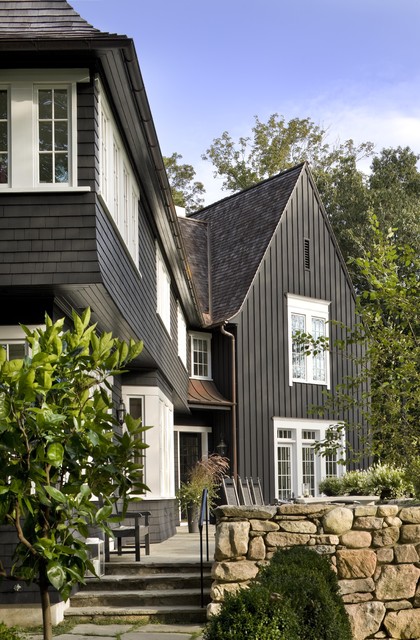
Black is both dramatic and neutral. It attracts attention and shies away from it. Black blends with almost any environment, yet it makes all other features stand out, like the crisp white windows on this house. Since the trim on the rest of the house is also black, the white windows and window trim take center stage. The natural cedar roof creates warmth and texture. And the bronze gutters look like jewelry.
Another feature that stands out is the rock wall. The backdrop of black allows the depth of color on the rock wall to come forward — much more effectively than if the house were another more typical earth tone.
The mix of siding materials adds an additional layer of texture. The tall board and batten siding on the high gabled section makes a tower of that end of the house. The shakes on the rest bring it on home.
Yes, black maintains its reputation as the color of sophistication. Even for siding.
Choosing a Paint Color for the Cottage
May 31, 2012 § 3 Comments
It’s time to repaint the cottage — it has been that shade of grassy olive green since about 1970 and I think we’re ready for a chang e especially since the cottage next door is also green, just a darker shade. You might think that choosing a color for my own place would be easy for me since I work with color all the time. But just like you struggle with paint color schemes, I have to go through that process too.
First of all, what colors are already in the neighborhood? We have dark green on one side, beige siding on the other, and brown and beige two doors away on either side. So that leaves quite a few options.
Next, what color is the roof? It’s a gray metal roof with a white fascia piece in front. The roof doesn’t show from the front, but it’s quite prominent on the sides so roof color is a consideration.
What color are the windows and other non-changing elements? The windows are all white vinyl (I know, but they’re easy maintenance for a cottage). We had the chimney removed (that had been the inspiration for the brick orange Adirondack chair).
So with fandeck in hand, I spun through the color possibilities. I eliminated yellow and white because they would take too many coats to cover the green. Red was thrown around as a possibility but I didn’t like the idea of red next to the dark green. Not summery enough. Orange is a great accent color but our cottage is not interesting enough architecturally to draw that much attention from a wild paint color. That brought me to gray and blue.
I tried some grays, both dark and light, on the Sherwin-Williams paint site and liked several with the gray roof. My reservation was that the cottage would need color added somewhere — otherwise it would look kind of blah. (Note: I LOVE the Nantucket weathered cedar look, but you need salt air to pull that off.)
 Finally, I tried blue. Hmmm… not a bad idea. I ended up with a WoodScapes opaque stain in a color called Chesapeake (SW3051) with a cool white trim (Rhinestone– it’s on the blue side of white) and my Adirondack chair color for the accent. I like a dark blue cottage color — it speaks to the lake water in the background and does not attract too much attention from passersby. I also like the contrast with the windows especially for a summer cottage. I used the Adirondack chair color (a custom red-orange) for the doors including the big garage door facing the road. Now it’s easy to find the party.
Choosing House Colors: Gray-Green?
January 20, 2012 § Leave a comment
 Look all around your environment for color inspiration. Sometimes the most complex color palettes come from places we might least expect, like a kayaking trip, for example. Look at the different shades and tones in the water and sky. They evoke a calmness that’s relaxing to look at. Then the red kayak pops out of the photo — we know it doesn’t belong there but it grabs our attention.
What if we use this scenic palette for a house exterior! The gray-green of that  water is not a color you would necessarily pick out of a paint store color chip lineup, but it’s a great house color. It’s muddy and dark and has a little bit of brown mixed with green and gray. Very complex — not a Crayola color, that’s for sure!! But paired with cream trim, a brown roof and pops of red accents, the combination fits right into its environment just like the house was plucked from the shores of Maine.
Choosing House Colors: Taupe?
January 10, 2012 § 3 Comments
 When selecting the palette of colors for your exterior, use natural materials in the environment as your inspiration. This stonework has all the colors you need for your entire house, from the dark charcoal of the roof to the taupey gray siding and even the orangey brick walkway.
Tying your house color in with its surroundings “grounds” the house — it looks like it belongs there. A house that strays too far from the natural palette looks more like a spaceship that has landed on a foreign planet. Don’t do that to your neighborhood. Save your taste-specific color applications for inside the house.
Choosing a House Paint Color: Look at your roof first
October 21, 2011 § Leave a comment
 The dark blue and white color scheme on this house (below right) created a contrast that brought out the less-than-attractive features: the stained roof (not being replaced), the dirty garage doors, and the foundation latticework originally designed to camouflage, not stand out.
With the roof in mind, we chose a color that would blend instead of highlight. Although the homeowners would have preferred any number of brighter, lighter colors, the green-gray of Benjamin Moore’s Duxbury Gray HC-163 accomplished the task of incorporating the roof and the other features into a unified whole. We kept the slightly off-white trim the same as well as the shutters. But the finished look is very different. The house now appears bigger and cleaner. And the white trim highlights the windows, doors, and porch. And that’s it. The homeowners can now add colorful landscaping, pots of flowers, and other seasonal decorations.
What I tell homeowners is when you are selecting a color for your house, you really have to determine what the house wants to be. It sounds strange, but you need to look at the entire house: the roof color, the foundation color, the garden, the stonework, and yes, even the neighbors’ homes. If you simply paint the house your favorite color, you will end up with a complete disaster and an expensive mistake to fix.


 Talk about fitting in! Dark, rich tree-bark brown is about as close to nature as you can get for a house color that will fit unapologetically into almost any landscape.
 Dark blue-green pine needles and rich cedar mulch present a warm house color palette perfect for homes that want to sit quietly in a wooded environment or at least conjure up the same.
 Black wrought iron is the best metal for hardware, lighting and accessories.