Spring Into Unexpected Color
January 22, 2014 § Leave a comment
Designers are adding pops of color to the previous year’s light neutral color palette and in the most unexpected places. Look up for an opportunity to add color to your white kitchen. Pull some of that ceiling color down into the room with dishes, placemats, and other accessories. And create “flow” between rooms by adding a touch of your ceiling color to the adjoining room.
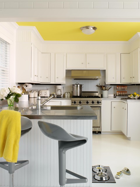
Color trends like this year’s fuschia are fun when you can add the color with inexpensive pillows or a single upholstered chair (http://www.worldmarket.com/product/fuchsia-nina-chair.do). Keeping the base of the room neutral lets you change your color palette when fresh new opportunities arise. Or with the seasons.
Color Your Home Happy
January 18, 2013 § Leave a comment
 Whether you live in a deluxe villa or a double-wide, you deserve a happy home. And the place to start is by adding color. Numerous studies have shown that color influences the way we feel and can even be used to describe our emotions (“I’m in a blue mood”).* But what may influence us the most is a lack of color.
The study found that people with depression associated their mood with the color gray. And you don’t have to paint your walls gray to have a gray aura in your home. Take a look around your house, in the corners and shadowed areas and particularly the ceiling. Do you see gray? Do you feel blah? Well then… time for color.
Start by painting your ceiling either a bright white or a tint of your wall color. That will either maximize the light reflection in the room (and bolster your mood) or make the room feel bigger and more open. Either way, you’ll feel better.
Next, if you’re timid about your color-selecting skills and afraid to make a mistake with the wall color, then start small. Add some colorful accessories to the room — pillows, artwork, other changeable items. Doing that will help you create a palette of colors you like without making a big investment or paying a painter to repaint two or three times.
When you’re ready to take the plunge and add color to your walls, try an accent wall first. Pick the wall that you see when you enter the room (the focal wall) and paint that a color you like. Add accents to the room in the same color to pull the room together. Keeping three walls neutral with pops of color on an accent wall and accessories here and there will help you step into the world of color without any Crayola catastrophes.
Note: There is nothing wrong with neutrals and whites in the home. To many people, neutral means calm. But if you are somebody who likes to wear color and you are drawn to color yet your home does not reflect that love of color, then it’s time to add color. That’s what I’m talking about.
*http://www.livescience.com/6084-colors-describe-happiness-depression.html
Return of the Gilded Age, Well Not Exactly
January 3, 2013 § 1 Comment

We have Downton Abbey, Princess Kate, and the popularity of all things English to thank for the resurgence of gold in interior design right now. At least that’s my opinion… And what a welcome sight it is.
After too many years degilding homes of anything that even hinted of gold, brass or yellow, the hue of royalty has returned.
The new interpretation, however, is decidedly fresh as we see in this living room from Traditional Home magazine. The wall color is so subtle that it accentuates even the creamy tan stripe on the window panel and the moldings on the ceiling. The gold demilune table and classic gold-framed art above it pop. As does the Chinese porcelain, as if pulled directly from the painting. Even the floor color is perfect, establishing a solid grounding upon which to layer all those beautiful blues and wheat tones.
The look is not your grandmother’s living room, with all due respect to your grandmother. Gold is nolonger shunned from updated decor.
Welcome back, gold.
Interior designer: Joseph Minton, with Paula Lowes and Michelle M. Wade
What Color Should I Paint My Ceiling?
November 29, 2012 § 266 Comments
The ceiling is the fifth wall and many decorators and designers feel that keeping the ceiling white is like “throwing a sheet over the room” (Christopher Lowell said that years ago). But there are a few conditions to consider before painting the ceiling anything other than white:
1) Is your ceiling heavily textured? In many old houses, the ceiling is patterned (and God forbid, “popcorned”) and therefore very difficult to paint well. Also, painting it anything other than white will call attention to it and maybe that’s not what you want. One solution is to have your ceilings replastered to match your walls and painted, but if that’s out of the question, I would stick with white.
2) Is your ceiling a smooth plaster? If so, you should definitely paint it. How lucky you are! See below for what color.
2A) Is your ceiling really high? If so, you can paint it virtually any color that goes with the rest of the room. If you’d like to bring the ceiling down visually, consider a color darker than your wall color or a warm color (both will advance and appear to bring the ceiling down to a level that’s more in scale with your room). Also consider adding crown moulding if it’s not already there. The moulding will also bring the ceiling down by calling your eye’s attention to it. And it really finishes the room.
|
|
|


2B) Is your ceiling low or average height? Consider painting it a tint of the wall color. If your walls are a medium blue, then your ceiling would be the very lightest blue on the color swatch or even lighter (white with a dash of blue). This will help to round out the room and make the ceiling part of the overall decor — not just that white sheet over the top.
3) Does your room have enough light? Bright white ceilings do help bounce light back into the room so if your room is already dark, pay special attention to the ceiling color. White can be used effectively, but light tints on the ceiling will also reflect light. Just avoid a ceiling color that is going to absorb all the light and leave the room dark.
4) Are you painting a guest bath? I like to paint the wall color right up over the ceiling in a guest bathroom. Doing that makes the room feel larger by blending the walls and ceiling together and avoiding sharp lines and corners. Or do something kind of exotic on the ceiling, like the Moroccan tent (see photo above).
5) Are you painting a bedroom? In what other room do we lie around and stare at the ceiling? Why not paint it something interesting. In a bedroom, the sky’s the limit (literally) — from puffy blue clouds on a backdrop of sky blue to a quilt of squares in different colors (Candice Olson did a fabulous multi-colored geometric ceiling in a master bedroom). And in kids’ rooms, the ceiling is just one more space to use your creativity.
Hope this helps the “Do I paint the ceiling?” dilemma.
Ceiling Drama
January 17, 2012 § 2 Comments
 If your room has a high ceiling or an interesting shape or slope, paint it for maximum drama! This restaurant has creamy woodwork (molding, columns, and wainscoting) everywhere except the ceiling and the stairwell walls. There, the paint color is a soft gray-blue. The effect is summery, warm, cottagey, and welcoming especially with the dark hardwood floors and accents.
Lighting is bronze, industrial on the ceiling and sconces for warmth along the wood walls. Mirrors double the width of the long and narrow space.
The food? (oh yah, that was excellent too!)

Crown Molding: A Crowning Achievement or a Hot Mess
July 15, 2011 § Leave a comment
 If lighting is the jewelry in the room, the crown molding is like a proper hem — no stitches showing. Crown molding covers the seam between wall and ceiling and adds weight and architecture to the room. And by drawing the eye upward, crown molding can create the framework for painting the ceiling something other than white. But done improperly, crown molding will lead to painting miscues and a hot mess.
I ran into just such a situation today on a high-end new construction job. The carpenter had “built up” the molding by using a couple of inches of wall between the crown at the top along the ceiling and another cheaper piece of finish molding along the bottom edge (photo shows how it’s supposed to look). The idea was to make the finished unit (crown + wall + smaller molding — all painted trim color) look like a giant (read: expensive!) piece of crown molding. What happened was that the carpenter did not finish the edges at the doorway leaving wall space exposed. The painter then came along and, not having a finished piece of molding to serve as the starting point, he (or she) drew a LINE on the wall with a pencil and started painting wall color on the other side of it. Oh…my…gosh… and this was high-end construction??
So two warnings:
If you are using crown molding, make sure you get an experienced carpenter who has the sense to finish edges. If you’re putting it up yourself, do your research first and know how you’re going to go around corners and finish edges properly.
If you are painting a wall, you must have a piece of architectural molding or the wall edge in order to move from one color to another. Never draw a vertical line on the wall to separate two colors unless you’re painting stripes. That’s it!
Phew! ‘Nuf said…
Can I Paint My Ceiling Dark?
January 22, 2011 § Leave a comment
 Next time you’re in a large restaurant or a public building, look up at the ceiling. If it’s like the one in this old library in Nashua, New Hampshire, it’s dark. Of course, this ceiling is three stories high. The effect of the dark ceiling is to bring it down visually and make the enormous space seem a little cozier to us way down on the floor.
The same is true in a room in your home. If you have a large space with a high ceiling and particularly if the ceiling really feels too high, then painting it a dark color will square out the room and make its dimensions seem a little more homey.
Unfortunately, if you have a 7-ft ceiling in a bedroom, a dark ceiling might make you feel like you’re the batter in a waffle iron. Cozy is not quite the word to describe that effect. So I recommend a lighter tint for smaller rooms. You can still move away from the white ceiling, but just use a tint of the wall color (10-30% of the full-strength hue). Or use a coordinating tint — something you pull from the bedding or other accent pieces. Using a tint on the ceiling will highlight any crown moulding you have in the room and will unify the color scheme.
Caution: because the ceiling is horizontal and does not get much light shining on it, any color you choose will appear darker up there than it does on the paint chip. Try a sample board first before tackling the ceiling job — a neck-breaker and mess-maker, for sure!
