Color Inspiration is Everywhere
February 19, 2018 § 2 Comments

While scrolling through the interwebs today I bumped into this tweet from Architectural Digest highlighting 20 cute items from Walmart. Okay, that I had to see. And I have to agree — there are lots of really “super cute things” that I had not noticed while shopping for cheap soap dispensers.
But the item that caught my eye and sent me off to color dreamland was a gorgeous ribbed glass bowl in the most deliciously subtle tones of green. It reminded me of the Farrow & Ball color palette — you know — those paint colors that look like velvet in shades and tones that no other paint company seems to match. There’s something about them (trade secrets, I suspect) that gives a room or a piece of furniture a hue that whispers sophistication. Not one of them will show up in a Crayola box.


Cooking Apple Green No. 32
There are two obvious things that distinguish Farrow & Ball from other more mainstream paint lines: the number of colors (way fewer) and the price (way more). And although many home projects and palettes of colors might not be worth the extra expense because the subtle tonal difference or undertone might not be noticed, I find that the blues and greens in Farrow & Ball are far superior for their soft, sophisticated richness.
Maybe it’s the largess of their English roots (Farrow & Ball is located in the United Kingdom). Or maybe it’s the fewer number of perfect colors (only 132) so that every color decision is a successful one. Or the fact that the company has maintained its original formulation. Or maybe it’s the mystique. But whatever it is … I love it.

What makes F&B different
Regardless of the paint line you prefer, keep your eyes open for color inspirations. They are everywhere — even Walmart.
Adding POPS of Color — Orange
October 10, 2016 § Leave a comment
 Is there any color happier than orange? Okay, full disclosure. Orange — that special red-orange that you see on maple trees in the Fall in New England — is my favorite color. I don’t wear it, but I love looking at it.
Fall is a wonderful time to add a touch of orange to your home. Go all in with a peppery accent wall in a guest bedroom. Or go easy with a few orange candles on the mantle. I like to switch out my light blue throw pillows on the sofa for orange this time of year. Keeping my sofa neutral lets me do that, and on that first chilly October day, orange pillows warm the room instantly.

What goes with orange? If you want energy, blue (like SW Indigo). Just look at the sky in the photo and how those two complementary colors work off each other. If you want a bit more calm in the room, use a warm gray as a back drop, like the fence in the photo (and SW Dorian Gray).
 Another way to add orange without switching out your furniture and paint color is to introduce a large framed photo of Fall colors. I like to stick with the season we’re in so the photo would come down in the winter and be replaced by a cozy winter scene. Seasonal changes keep the room looking vibrant and fresh.
If all those ideas and colors are still over the top, there’s always squash soup and pumpkin-spice muffins. Sometimes a little color on the dinner table is all you need to enjoy the autumn season.
Stay cozy, my friends.
That Huge TV is so Ugly — What to do
January 21, 2014 § 2 Comments
 Electronics have plagued designers and esthetically driven homeowners since the demise of the TV console with doors. We’re now learning to embrace the large shiny black rectangle.
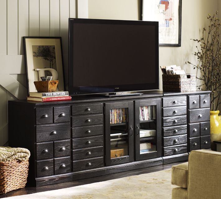
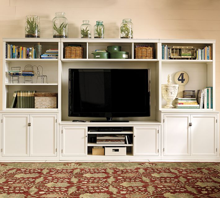
If you are trying to disguise your elephant in the living room, blend it. A black cabinet and other black accessories will help to camouflage the electronic “stuff of life” better than a white or light-colored cabinet will. See how the TV pops out of the white cabinet? And the bigger the TV, or course, the bigger the pop!
Try camouflage in your home office as well. Dark charcoal gray is another wonderful color for blending printers and monitors and other less-than-attractive devices so necessary to our everyday existence. Computers and TVs (etc.) are functional. We don’t necessarily want to see them.