Can I Paint My Ceiling Dark?
January 22, 2011 § Leave a comment
 Next time you’re in a large restaurant or a public building, look up at the ceiling. If it’s like the one in this old library in Nashua, New Hampshire, it’s dark. Of course, this ceiling is three stories high. The effect of the dark ceiling is to bring it down visually and make the enormous space seem a little cozier to us way down on the floor.
The same is true in a room in your home. If you have a large space with a high ceiling and particularly if the ceiling really feels too high, then painting it a dark color will square out the room and make its dimensions seem a little more homey.
Unfortunately, if you have a 7-ft ceiling in a bedroom, a dark ceiling might make you feel like you’re the batter in a waffle iron. Cozy is not quite the word to describe that effect. So I recommend a lighter tint for smaller rooms. You can still move away from the white ceiling, but just use a tint of the wall color (10-30% of the full-strength hue). Or use a coordinating tint — something you pull from the bedding or other accent pieces. Using a tint on the ceiling will highlight any crown moulding you have in the room and will unify the color scheme.
Caution: because the ceiling is horizontal and does not get much light shining on it, any color you choose will appear darker up there than it does on the paint chip. Try a sample board first before tackling the ceiling job — a neck-breaker and mess-maker, for sure!
Flooring Challenges: Working around the color scheme
November 15, 2010 § 4 Comments
 Are you living with a slate floor from the early ’80s? Many of you are. Slate is a wonderful material for the foyer as it’s easy to mop up after muddy boots and dogs trample through. But many slate floors have a distinct color palette (the gray-greens, blue-greens, purples and rusty reds) all in one small square footage. Busy? Yes. And out-dated? Yup.
Besides throwing a rug over it or replacing it, the other approach is to embrace the color palette presented to you by the previous owners. Currently, the gray-blue-greens are quite popular in fabric lines and even paint stores.  And purple is a great accent color. So if you are updating your foyer and are cursing the flooring, take heart. Pull a palette from the floor at least for the foyer area. Blending the floor with the surroundings will make it less of a color feature in your room.
And as always, create a focal point just inside the front door. A large piece of art, a bench, or a mirror– something to draw the eye upward away from the floor.
If you are planning to install new flooring in your entryway, choose a neutral that will stand up to decades of wall color changes and will look just as terrific 20 years from now as it does today.
Choosing a Roof Color for a White House
May 7, 2010 § Leave a comment
 Choosing a roof color these days can be overwhelming with all the choices available to us. We’ve gone from classic black and charcoal to every shade of brown, red, green, and even blue. This white house with navy blue shutters looks spectacular with its multi-hued, architectural style blue roof. It really stands out in the neighborhood lined with browns and charcoals. And with a white house, adding a little color to the roof (at least on this house) certainly adds interest without going overboard.
If you have a white colonial and want to replace your roof with a metal style, I suggest sticking to the darker, more traditional colors. A metal roof adds an air of informality (and a touch country) to the house itself so keep that in mind when you’re selecting a roof style. Nothing wrong with metal, but you won’t want to attract too much attention to it if you have a traditional metropolitan house. If you live in the country or the mountains, anything goes!
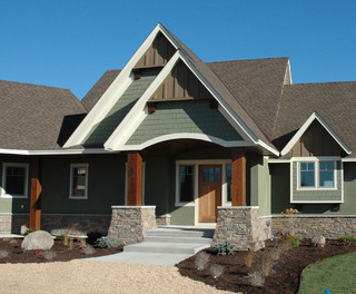
House Color, Trim, Shutters: Gold Medal Combo
April 7, 2010 § 2 Comments
 The unexpected color combination on this historic home (now a B&B in Sackets Harbor, NY) really pops off the street. Whether it’s the hint of green in the gold siding, the Jamaican rum-like warmth of the shutters, or simply the combination, I’m not sure. But coupled with cream trim and accents of black, this combination is a winner.
The house color looks like Ben Moore’s Marblehead Gold (HC-11), and the shutters look like a slightly darker version of Copper Kettle (1218). I should have rung the doorbell to ask (I’ve been known to do that).
The stone steps unfold seamlessly from the foundation right onto the sidewalk and the delicate scrollwork in the iron railing ties in beautifully with the sign and even the shutter “dogs.” And for those of you who have asked about using cream window trim with white windows, here’s a great example of how nicely it works.
Good Design Learns from History
February 4, 2010 § 2 Comments
 This historic New England barn is original to the property, and its characteristic beauty helps to define the classic regional style. Owning an historic property can be a real joy for those whose passion is preserving the beauty of the past, but don’t think you have to own a historic treasure to enjoy the pleasures of a striking outbuilding.
If you need more space for a workroom or your vehicles, you can add a lot of character to your property by incorporating the unmatched elements, colors, and materials used in previous centuries to make your own history, whether it’s a barn, a large work shed, or simply your garage.
I get lots of questions about how to match exterior colors and blend materials between house and garage, but as you can see from this photo, there’s absolutely nothing matching between this barn and the accompanying house. From the unpainted board-and-batten style siding, brass lighting, and farm-style scale, this barn stands on its own. The colonial house has traditional, painted, horizontal lap siding and white windows. The bridge color between house and barn is black — the black windows on the barn carry over to the accent color on the house (note the black shutters and lighting as well as the black pergola and fence next to the driveway). By painting the wood accessories on the house black instead of leaving them natural, the unpainted barn takes center stage.
Even if you have no plans to build a major additional structure in your yard, keep this basic design principle in mind when you’re working on your exterior. Colors and materials do not have to match.
My Old House is Just Not Me
August 20, 2008 § 25 Comments
Many of you have a modern aesthetic. You like clean lines, unfussy details, neutral colors, and minimal furnishings. You probably should have moved to a downtown loft space, but you are now part of suburbia. You write in that you’ve decorated the inside of your new home to reflect your taste, but the outside is a disaster.
If you are stuck in an exterior from another era when brick facades were popular and split levels were all the rage, or if some weird architectural detail haunts your house, the easiest and cheapest solution is to paint. For example, if you now own a split level with one-half brick and the other half siding, it’s okay to paint the house all one neutral color to modernize the appearance from the street and actually make the house look bigger since it’s no longer broken up visually.
NOTE: If you own a home that is either listed on your town’s historic register or is in an area of period homes, then do not alter the exterior except to maintain its historic value. Chances are that if you live on the main street in your town and have purchased an older home, the town’s historic commission has already contacted you — they will tell you exactly what you can and more importantly cannot do to your home. Before you renovate the exterior, be careful of “upgrading” to cheaper materials, styleless features, and “modernizations” that will come back to haunt you when you try to sell.
Changing a color palette, however, may be a relatively safe way to modernize without destroying the home’s history. If you live in a colonial but have modern tendencies, you can reflect your modern taste in your house color palette. Choosing three or even four colors off the same paint chip for your siding and trims or painting your house and trim all one color reserving a vibrant shocker for the front door can give even a “boring” (to some) old colonial a modern personality.
Consider Your Home’s Roof Color: A Major Design Statement
May 31, 2007 § 385 Comments
Not too long ago, roof color was black — or a shade of black. Today, coordinating roof and house colors or choosing a new roof can be quite a project. So many choices and expensive ones at that. It is important to make a wise decision to avoid a long-term design disaster.
If you’re due for a new roof, congratulations! You now have a chance to select your roof color from the myriad choices that are available. Here are a few guidelines and considerations:
Traditional Shingle Roofs
- Gray or blue house. Stay with a traditional roof color like dark gray or black. That way your roof will blend with your house and make the whole structure seem bigger. Any other roof color will stand out too much and make the house look chopped up.
- Cream, tan, or light brown house. Consider the many brown roof options, some of them with a mixture of browns that really make the house look updated and terrific. A brown roof will blend with the cream or tan and make the house look bigger. Black and gray roofs just look ordinary. A brown roof looks like you actually planned out your entire color scheme.
- White house. Dark gray and black are traditional, but they work. Blue is also a terrific option. Red or green metal on a white farmhouse give a traditional country look. Bottom line on a white house: you have lots of options.
- Red, green, or yellow house. You can go either way, a brown or a gray/black roof. I prefer a brown roof for red and green house colors and a black roof for a yellow house.
Of course, the same suggestions apply if you are stuck with your roof color and are looking for a paint color for the house.
- Black/gray roof. The ideal house colors are gray, blue, white, and yellow.
- Brown roof. The ideal house colors are cream, tan, brown, red, green.
- Green roof and other colors. You can either use the roof as an accent color to the house or try to blend it by using a lighter tint of the roof color on the house itself.
Nontraditional Roofs
What about metal roofs? They’re all over Colorado, Upstate New York, and other areas of the world where snow on the roof is a major factor in the winter. Metal roofs come in a rainbow of colors, from red to green to brown to purple. If you have a metal roof, you are making a design statement (whether you mean to or not, of course) and you can treat it as an accent color, kind of like picking a front-door color. However, if you do not want to call attention to your metal roof, choose a natural roof color like dark charcoal, bronze, black, or brown instead of a color like blue.
What about terracotta roofs? These are traditionally seen on Mediterranean style homes and are a definite design feature. Keep the house color neutral to highlight the beautiful roof and the other architectural elements that are undoubtedly present.
Other nontraditional roof materials. Just like a thatched roof on an English cottage, a nontraditional roof is a design feature of the home. Hopefully, you want it that way. Choose a house color that makes the roof look like you planned it as a feature.
Regardless of what kind of roof you have, make sure you consider it when making house color decisions.
