Freshen Your House Color: Paint Your Trim
October 21, 2011 § Leave a comment
 Amazing what just a little paint can do to freshen up a house. Just changing the trim color from siding color (beige) to white brought this house from drab to defined. Suddenly the architectural details emerged: the substantial window trim, the fascia and soffit, and the detail around the front door. A simple fix really but effective.
Houses need contrast. When choosing a trim color, select either a  different color from your siding or a different shade of the siding color. Not only will the house be more updated and interesting to look at, but also the house will look as if the entire house was repainted, not just the trim.
Choosing a House Paint Color: Look at your roof first
October 21, 2011 § Leave a comment
 The dark blue and white color scheme on this house (below right) created a contrast that brought out the less-than-attractive features: the stained roof (not being replaced), the dirty garage doors, and the foundation latticework originally designed to camouflage, not stand out.
With the roof in mind, we chose a color that would blend instead of highlight. Although the homeowners would have preferred any number of brighter, lighter colors, the green-gray of Benjamin Moore’s Duxbury Gray HC-163 accomplished the task of incorporating the roof and the other features into a unified whole. We kept the slightly off-white trim the same as well as the shutters. But the finished look is very different. The house now appears bigger and cleaner. And the white trim highlights the windows, doors, and porch. And that’s it. The homeowners can now add colorful landscaping, pots of flowers, and other seasonal decorations.
What I tell homeowners is when you are selecting a color for your house, you really have to determine what the house wants to be. It sounds strange, but you need to look at the entire house: the roof color, the foundation color, the garden, the stonework, and yes, even the neighbors’ homes. If you simply paint the house your favorite color, you will end up with a complete disaster and an expensive mistake to fix.
Choosing a New Roof Color
October 4, 2011 § 4 Comments
 Sometimes a house looks a little too hot for the neighborhood. And for this orange brick house in a neighborhood of other orange brick houses, the matching orange roof took the house over the top (literally!).
The cool grays and whites in the trimwork could not balance the warmth of this overall orange color scheme. To give the eye a cool compress, we chose a gray roof that picks up the many gray tones in the brick trim around the windows and doors and contrasts nicely with the orange brick. The roof is Georgetown Gray by Certainteed. Now the palette of warm and cool colors distributed evenly makes the house look balanced and pulled together.
If you are choosing a new roof, remember that the roof color is as much  a part of your home’s color scheme as the siding and trim colors. Even more so because you will not be changing the roof anytime soon. It is okay to choose a roof color from the same hue family as the siding color (a brown roof with a tan house, for example). But remember to create contrast somewhere, either with the trim color or the pop of color on the front door. If you have a brick house, choose a neutral color that is in your brick or choose a dark neutral that will allow your brick to take center stage. When in doubt, seek the help of a professional in your area or write to me. I’ll help you. A second set of eyes is critical before you make that big investment.
Driving up to your house should make you say, “Ahhhh, good to be home.”
Bold, Beautiful and Blue Roof
October 1, 2011 § Leave a comment
 Some houses whisper. Some houses shout. This house sings opera! What makes this house so melodic is perfectly obvious to everybody who drives by. It has the most incredible roof and door color: a rich sapphire blue like you’ve never seen before except maybe in the Mediterranean. We’re certainly not accustomed to seeing that color on a traditional burgundy brick colonial, usually relegated to browns and charcoals (not that there’s anything wrong with browns and charcoals — I love them too).
This house tosses conventional color schemes out the window yet manages to look both whimsical and classy at the same time. It peeks out from behind big shade trees making it even more alluring to passersby. Like a secret garden around the corner, the act of discovery is part of the thrill.
The door color alone would be quite a find, but the fact that the roof is the same rich blue makes this house an opera star I want to discover again and again. Big applause!!
Choosing Dark Trim for your House
October 1, 2011 § Leave a comment
 Contrast creates dramatic curb appeal. And on a house like this one with architectural features galore, dark trim accents all of them, from the gable trim, custom windows, and sculpted roofline to the stonework and doors.
Dark trim takes a really large, light-colored house and brings the scale down to normal by outlining the windows and doors and making them appear smaller. It’s what we call the “eyeliner effect.” It works great on large houses with big windows; however, small windows may look even smaller framed out in black.
No matter. If you are tired of white trim, consider a darker color. If you want maximum contrast, choose a really dark shade. If you want to minimize the contrast between house color and trim to avoid making your house look smaller, then choose a trim color whose “value” is no more than two shades darker than your house color on the paint strip. That will help the colors to blend thereby making the house appear less chopped up and visually bigger.
Bold House Color Statement
October 1, 2011 § 2 Comments
 Call it dark charcoal, call it midnight blue, or just call it black. It’s a knock-out house color that made me slam on the brakes when I drove by. What’s more dramatic than the pairing of opposites black and white, but who would think to put them on a house? Obviously somebody did and it looks spectacular.
The soft yellow chiffon door is perfect. More lemon? Too strong. More orange? Halloween. And although I’m not a big fan of white shutters, they make sense here. Another convention that was slapped in the face was the idea that dark equals small. You don’t even notice how small this house is because it is so well put together. From the gray roof to the brick steps and pops of floral color, this house is a winner.
The beauty of this bold house color statement is that it fits perfectly in any neighborhood!
Grabbing Attention at the Front Door: How to Pick a Door Color
July 25, 2011 § 12 Comments
 Red, yellow, and blue are primary colors that attract attention. Used alone or in combination, they will definitely grab your eye. So it’s no great surprise that this house with its pale yellow siding, royal blue door, and red foundation plantings made me slam on the brakes for a quick photo.
The first color you notice is the royal blue. That shade is what many would consider to be the definition of “blue” and with the white trim around the door, it pops. And that is precisely what a front door should do. There should be no mistaking the front door for the service entrance (I just love saying that… you know what I mean … usually the door into the garage).
The front door does not have to be a primary color, for sure, but it should stand out significantly enough from the rest of the house to be a welcoming entrance, and there should be a clearly defined path leading up to it. Front doors that, despite their color, are obscured from view behind a large bush just do not function well. I’ve been to some houses that were so confusing that I ended up walking around the house into the back yard looking for the way in… (this happens primarily when there is no sidewalk or stone pathway to follow — the subject of another post).
If you have two doors on the front of your house, be sure to let people know which door is preferable. Plantings, lights, and a visible doorbell or knocker will guide your guests to the preferred entrance and prevent your greeting partygoers in the mudroom. I suggest painting your main entry door the accent color and the other “service” doors the siding color. Then your guests will not be forced to choose between red doors, numbers 1, 2, or 3.
These are little points in the grand scheme of curb appeal, but I just thought I’d mention them anyway.
Choosing Siding Color (or Colors) for your House
July 19, 2011 § 4 Comments
 If your house has an architectural feature — maybe a porch, a large portico, or a distinctive garage — consider using an accent color for the siding instead of the color you’ve chosen for the house.* The effect is obvious. The accent color will stand out. This color technique is perfect for large houses that might look too massive if they were all the same color. Dividing up the exterior color gives you an opportunity to highlight the design of your home and make a large-scale house a bit cozier.
Speaking of a massive house that could use a little visual down-sizing, maybe we should consider accenting the architectural detail on the White House with a little color! … (oh, forget it… we’d get into that red state/blue state thing — no wonder the place is still white!)
Anyway, color can be used creatively to re-scale a large structure and add visual interest.
If you want your house to look bigger, however, this technique is NOT for you. Dividing up the exterior color chops up the house and calls attention to small areas. If your small house currently has a multi-colored siding palette, consider painting it all one color and using the accent colors for doors, shutters, furniture, flowers, and other accessories.
*The construction of the Doyle Center in Leominster, MA, is really interesting. Here’s a link: http://www.thetrustees.org/what-we-care-about/climate-change/green-buildings/doyle-conservation-center.html
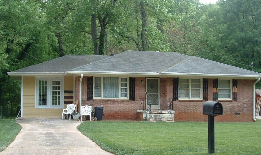
Can I Paint My 1960s Ranch?
June 21, 2011 § 3 Comments
 The answer is yes! With the growing popularity of the spray-painting technique for painting houses (not just lawn furniture anymore), it is becoming easier to paint over rough, textured surfaces like brick and get a good result in a reasonable amount of time.
Check out HGTV.com for some great before-and-after brick house projects. In one show, “Curb Appeal: The Block,” the designer John Gidding takes a paint sprayer to an old ’60s ranch and brings it into the new millenium.
Check with your paint store first, of course. And you might want to hire a professional painter to avoid over-spraying into your neighbor’s driveway (not a good thing…). But if you have a brick house with a) zig-zag-patterned brick; b) really obnoxious brick colors; or c) just tired, run-down plain old red brick, then get inspired! Paint will give your house a fresh new look!
Long-Distance Decorating! From the US to Iraq and Back!
February 15, 2011 § 2 Comments

 It’s not every day I receive a phone call from Iraq to work on a house in Atlanta but last April I did. The guy on the other end of the line had started renovating a house for his mother and was making all the decisions long-distance. Imagine that! Working with a builder on a house renovation is a challenge when you’re on-site — but from thousands of miles away? And for his mother? I was intrigued.
After the builder chose an unapproved yellow for the new addition (see Before Photo on right), my “soldier friend” (as I call him) was not pleased and asked me to come up with a new color scheme for the exterior. And we did not stop there. By way of blog posts, emails, photos, and occasional phone calls, we moved on to porch, shutters, and even the garden shed. Then we moved inside to make paint color decisions, choose light fixtures, and decide how to update the kitchen and bathroom. He sent me photos of options he found online and I gave my advice.
From Iraq to Boston to Iraq and on to Atlanta. The power of the internet is making long-distance decorating possible.
P.S. His mom loves what we’ve done so far! And she loves her son! Success!
