Choosing a Color Palette for Your House: It’s a Natural
January 29, 2013 § Leave a comment
 Another drive-by sighting of some curb appeal. This time, the stone wall pops out partly because of its mix of natural stones (and not just one kind) but also because the house color is drawn from the wall’s palette of natural hues. Even the front steps coordinate nicely with the wall.
Any of the wall’s creams, beiges, browns, and grays would have worked for a paint color, but the builders chose a light creamy yellow for the siding with a beige shingle on the portico. White trim pulls the house together and the black door makes the dramatic statement.
It’s so easy to choose your house color from nature. You cannot make a mistake.
Choosing House Colors: Bark Brown?
February 28, 2012 § Leave a comment
 Talk about fitting in! Dark, rich tree-bark brown is about as close to nature as you can get for a house color that will fit unapologetically into almost any landscape.
What I love about this brown house, however, is how creative the homeowners were when it came time to choose a new roof color. Instead of opting for a light brown, gray, or dark forest green (all great options, by the way), they chose a light sage dimensional roof that looks spectacular. Then they pulled the trim color from the lightest shingle tone and used that for trim around the dark brown windows (also a nice touch), the corner trim, and the garage doors.
The result? Something different! How refreshing! Are they locked into a green roof? Yes. But who cares…
Choosing House Colors: Pine-Green?
February 8, 2012 § Leave a comment
 Dark blue-green pine needles and rich cedar mulch present a warm house color palette perfect for homes that want to sit quietly in a wooded environment or at least conjure up the same.
Although much of the leafy countryside in many landscapes is a mixture of greens, notice that most have a yellow undertone. But not pine green. It leans more toward blue and for that reason can really stand out in a grove of maple trees.
To warm up the cool green shade, add brown and no better place than the roof (a gray roof is fine too but it will keep the house cool). Creamy trim provides contrast between the two darker shades and serves to outline the architectural detail (dark trim will get lost but use it if you are seeking camouflage).
For the front door, why not splurge and get solid wood stained a darker version of the roof color or choose a similar paint hue like Maple Syrup (Ben Moore 1105).  Black wrought iron is the best metal for hardware, lighting and accessories.
Once again, nature’s palette does all the work.
Choosing House Colors: Gray-Blue?
January 24, 2012 § Leave a comment
 You do not have to look very far in nature to find a palette of coordinating colors from which to pluck your house paint chips. This time we’re looking at a glassy pond reflecting the blue of the sky. This blue, however, is not a primary saturated hue but rather a complex shade that has grays and greens in it as well.
 So going to the paint store, you’ll want to move toward the muddy gray part of the fan deck and find your blue there. Stay away from the clear Crayola blues or you will end up with a house color that may in fact glow in the dark.
Look carefully at the colors around the pond and you will find your accent colors. Autumn red for the door, dark woody brown for the front step treads, crisp cloud white for the trim, and pops of golden yellow for your flower pots.
With nature as your color palette, you cannot make a mistake.
Choosing Colors that “Pop”
June 6, 2011 § Leave a comment
 It may seem obvious, but opposites attract. And when it comes to color, opposites attract attention! These bright orange pansies are the perfect complement to the rich azure blue ceramic basket on the front step of this home. Orange and blue are opposites on the color wheel and, because of that, they give each other a vibrant visual energy that draws your eye. Cheerful, welcoming, fun — everything you want your house to say.
The other opposites? Red with green and purple with yellow.
If you’re planning your garden, planting some annuals in pots, or painting some accent furniture for the yard or the porch, think about what colors will pop off each other. Talk about curb appeal… you’ll certainly attract some attention from the road.
Good Design Learns from History
February 4, 2010 § 2 Comments
 This historic New England barn is original to the property, and its characteristic beauty helps to define the classic regional style. Owning an historic property can be a real joy for those whose passion is preserving the beauty of the past, but don’t think you have to own a historic treasure to enjoy the pleasures of a striking outbuilding.
If you need more space for a workroom or your vehicles, you can add a lot of character to your property by incorporating the unmatched elements, colors, and materials used in previous centuries to make your own history, whether it’s a barn, a large work shed, or simply your garage.
I get lots of questions about how to match exterior colors and blend materials between house and garage, but as you can see from this photo, there’s absolutely nothing matching between this barn and the accompanying house. From the unpainted board-and-batten style siding, brass lighting, and farm-style scale, this barn stands on its own. The colonial house has traditional, painted, horizontal lap siding and white windows. The bridge color between house and barn is black — the black windows on the barn carry over to the accent color on the house (note the black shutters and lighting as well as the black pergola and fence next to the driveway). By painting the wood accessories on the house black instead of leaving them natural, the unpainted barn takes center stage.
Even if you have no plans to build a major additional structure in your yard, keep this basic design principle in mind when you’re working on your exterior. Colors and materials do not have to match.
Camouflage the Neighbors (and other eyesores)
August 19, 2008 § 1 Comment
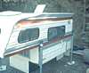 Despite your attempts at diplomacy, your neighbor has decided to park his rusty old camper on your end of his front yard. This predicament is particularly significant if you are trying to sell your house, but it is not pleasant at any time. What to do. If he really will not haul the camper to the rear out of sight, then move on to plan B. Your landscape.
The old saying, “Good fences make good neighbors,” may apply in your case, but if you think that a stockade fence might be a bit aggressive, hedges are the next best thing. Lilacs, forsythia, or a traditional row of arbor vitae will form a quick-growing visual barrier between your property and your neighbor’s.
Eyesores in your own yard can be camouflaged as well. Fencing around a large air conditioner and garbage cans, lattice work around the perimeter of the deck to conceal the yard machinery underneath, a garden of sunflowers between the house and the aluminum shed, and the list goes on. Stand back on the curb or the edge of the property and pretend you are a visitor to your house for the first time. What do you notice in the yard that’s not so great? That’s what needs to be either removed or camouflaged.
