Celebrating Authentically
November 30, 2016 § Leave a comment
 After years of using fake greenery around and on my front door in a futile attempt to make holiday decorating easy and inexpensive (true confessions — you’ve heard of the cobbler’s children having no shoes?), well my big, beautifully-adorned-with-more-fakery wreath fell apart onto the closet floor.
That single event made quite an impact, literally and figuratively, of course. I am SO fed up with fake everything: plastic wreaths, plastic lights, plastic balls, plastic blow-up Santas, plastic reindeer in the yard. For me this year, after quite a year, I am settling down to a visually simple, quiet, authentic holiday season.
I don’t mind others’ decorations at all — the lights, the colors, the flashing sleigh on the roof, and everything else that makes children’s jaws drop in sheer delight — don’t get me wrong. But I guess with the kids all out of the house, I don’t feel the need to create a spectacle. And it’s okay.
For those of you who share my desire for a simpler holiday, I’m here to say that it’s okay. A few special ornaments or treasures from past years displayed among some fresh greens on the dining room table or mantle can provide the essence of the season without the hassle and the clean-up on January 2. For those who adore the season of color and lights, go for it. The rest of us will appreciate all you do to make our neighborhoods sparkly and special.
 So today I am going out to buy a big plain evergreen bough wreath. Then, I’ll tie a big light blue floral ribbon on it and hang it on the front door. Then I’ll snip some pine from the backyard and stick the branches in my big blue pot on the front porch. Maybe even put a spotlight on the door so the house looks welcoming at night. And with that done, I can focus on making the holiday special and memorable for my family and … for me.
(wreath: LLBean)
Make You Happy — Consignment Love
January 18, 2016 § Leave a comment
A home stager’s life can be unsettling. Furniture comes and goes, from storage unit to my own living room and then off to somebody’s vacant home and then back again two months later. My husband jokes that he has to turn the light on before he enters a room or he might trip over an ottoman that wasn’t there a few minutes ago.
And as a stager, I often un-decorate a home to make it more appealing (or at least not unappealing) to a wide swath of potential buyers. Family photos? Gone. Floral drapes? Too busy. Oriental rugs? Too taste-specific. So life is full of light neutral walls, white window panels, generic art, plain slipcovers, and sisal rugs. Everything looks good at the end in a Pottery Barn kind of way, but I am growing tired of meh.
Enter my favorite consignment store. And inspiration.
Finally I am going to buy something other than white plates and Parson’s chairs. And for me. These French blue dishes with gently scalloped edges and little raised dots around the rim are totally taste-specific. Mine.  And the chairs with their cane backs, girly curves, and cream leather seats are too old-fashioned for today’s young buyers. They would spray-paint them white! Not me.
I have found love, and these items will stay in my home. I can come home every night and expect to see them there, not in somebody’s 1800s farmhouse kitchen with a For Sale sign in the front yard.
My point to all this? Surround yourself with what makes YOU happy. Don’t let your job take over your home. Have a sacred space that’s your own. Hang onto things that mean something to you and make you feel good. All that! And more this New Year.
Kitchen Cabinet Color: Move over Back Splash
January 30, 2013 § Leave a comment
Kitchen cabinet color is in. From yellow to navy to this refreshing mint, cabinets and kitchen islands are getting a paint job. And it’s not just old cabinets that are being refreshed. New kitchen designs are showing painted cabinets in colors that were once reserved for bathrooms and laundry areas. And it’s a bold move because, unlike wall color, you are unlikely to re-do cabinet paint color anytime soon. Call it confidence or general optimism (or a craving for it) but cabinet color will be here to stay for some time.
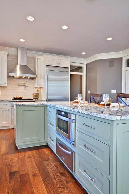
If you’re a little unsure of painting all your cabinets a particular color, try painting the back of an open cabinet or the center island first. That’s what I did. And I was hooked from that point on. (My cabinets have had two color transformations since discovering color in the kitchen.)
One suggstion for choosing a paint color for your cabinets: take a look at the colors in adjoining rooms and pick a color that will pull the public areas together. A pillow color in the adjoining family room might make a terrific cabinet color in the kitchen. You are limited only by…hmmmm… nothing really. Enjoy!
Choosing a Color Palette for Your House: It’s a Natural
January 29, 2013 § Leave a comment
 Another drive-by sighting of some curb appeal. This time, the stone wall pops out partly because of its mix of natural stones (and not just one kind) but also because the house color is drawn from the wall’s palette of natural hues. Even the front steps coordinate nicely with the wall.
Any of the wall’s creams, beiges, browns, and grays would have worked for a paint color, but the builders chose a light creamy yellow for the siding with a beige shingle on the portico. White trim pulls the house together and the black door makes the dramatic statement.
It’s so easy to choose your house color from nature. You cannot make a mistake.
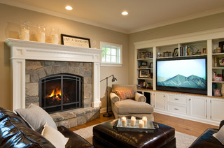
Tired Brick Fireplace Takes Cover
January 9, 2013 § 4 Comments
 Sometimes the “bones” of an old house fall under the category of “What were they thinking?” You could say that about this brick fireplace with its random placement of dark bricks and the outdated brass enclosure. But not to worry. Your family room is not doomed to the styles of 1972 — you have options. One of the best ones is to paint the brick as shown in the after photo (from Southern Living Magazine’s Makeovers).
The homeowners covered the offensive brick with a flat, textured paint in the green wall color. They painted the hearth in a natural stone color. Then they added two bookshelves for a built-in look and painted them the same green. The new fireplace insert in a bronze color blends nicely. A narrower mantel and corbels painted cream pop off the green — art finishes the focal point.
The overall result is a fireplace wall with emphasis on everything but the original dated fireplace. When faced with old brick or other outdated hardscape in your home, consider painting it for an almost instant update without the expense of covering it or replacing it. This makeover was a huge success. No more ugly brick.
Hop the Trend: Consignment Stores
December 29, 2012 § Leave a comment
Okay, I admit it. I am a consignment store junkie. And with good reason. Not only is it “green” to furnish your home with items that have been around awhile, it’s amazing what you can find for a fraction of the retail price for a new item. And the consignment bug has started to spread to my clients. During one project, we were looking for a settee of a specific length to fit in a tight spot. Tricky to find new anyway unless we went custom. My client decided to check out the local consignment store, and he found the perfect piece. Even the legs and wood color were perfect. Call it luck or call it karma.

The Cannery Exchange in Newport Beach, CA. (photo credit: Jody Tiongco)
I am convinced that these vintage pieces have a soul — they certainly have a history visible by the lovely worn patina on the arms or the scratches on the tabletop. But every scratch has a story attached to it, and that story comes with the piece to its new home.
You can always paint and recover a chair, for example, if you want a painted furniture look. Again, you’re probably starting with a chair that’s far better constructed than what you can find now so you’re already ahead. It’s like finding a piece of gently worn designer clothing or better yet a piece with the tags still hanging on it. Bonus!
Give your home some character by adding a piece or two of consignment furniture. But beware. You might catch the consignment bug too.
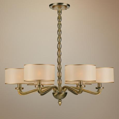
Getting Down to Brass Tacks about Brass
December 11, 2012 § Leave a comment
What a difference a decade makes. What used to be the lighting 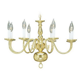 fixture of choice in upscale homes is now (still, even after several years out of favor) being tossed in a dumpster by young home owners who view the shiny yellow metal as the equivalent of how we viewed our grandmother’s dark brown paneling. Of no value.
Instead there are dozens of metal choices and finishes for lighting and other home accessories like light switch covers and doorknobs. So anti-shiny-brass are today’s home buyers that some are just shy of insisting that even all shiny brass door hinges be switched out to something else.
Note: these design trends may be regional and they don’t apply to historic homes so don’t panic if you love your brass chandelier and it fits your home’s decor perfectly. But If you are not happy with your shiny traditional yellow brass chandelier in your dining room or kitchen, you have three options:
1) Thumb your nose at metal color trends and simply wait for shiny yellow brass to come back in style. Kind of like you kept your go-go boots and bell bottoms from junior high. Yes, both trends came back around but not quite the way they looked in the late 60s. But still, doing nothing is always a design option.
2) Paint the shiny brass chandelier a different color. I once stood on a ladder, leaned over the dining table and painted my client’s brass chandelier first with a base coat of matte black to cover all the sheen and then a faux finish of browns and oranges to simulate a rustic bronze finish. It worked. The house sold.
3) Replace the old chandelier with a more current brass option like this one. The metal is toned down (antiqued) and the candelabra bulbs are covered with contemporary silk drum shades — a traditional yet updated look. Honestly, the antique brass has been around forever, and it went through a period of disfavor right around the time the shiny metal took over. But the muted finish, with updated shades, is back and looking good.
Neutral but Never Boring
December 10, 2012 § 2 Comments
Does your home scream 1972 when you enter the front door? Are you stuck with metallic wallpaper on the ceiling in the guest bath, orange shag carpet in the basement, or an avocado bathtub? Then maybe it’s time to update. But this time, instead of hopping on the latest hot new trend (I could name a few here, but I’ll resist), how about giving your home a classic re-do. Something that will stand the test of time, or at least a decade or two, without branding your home with a particular year. For that kind of longevity, we turn to a neutral palette, but neutral does not have to mean beige and it’s hardly ever boring.
-The key to a neutral palette is texture. You could have an all-white living room but if that white includes fuzzy white pillows, a shiny white marble table top, and some warm white chenille upholstery, then the room will have plenty of interest.
-Neutral does not have to mean just one color either. In this room, the walls are a latte color, the sofa is dark brown leather, and there is plenty of color in the books and objects on the white bookshelves. What makes this room work so well is that the stonework on the fireplace is a feature and because the other furnishings do not stomp all over the subtle colors in the stones, the room’s palette includes peaches and golds and grays and tans and taupes — more than enough colors.
-Neutral allows you to bring in color in the art, pillows, and other more temporary furnishings and accessories without clashing with a strong wall color and a brightly colored sofa.
-Neutral allows you to change your accessories with the seasons and the holidays without overpowering the existing color palette or the holiday decorations.
-And when you’re selling your house, neutral allows potential buyers to see themselves in your home and that is critical for a successful sale.
So as you choose tile and furnishings and paint for your newly updated space, consider neutral because neutral does not have to be boring.
Zen Holiday Decorating: An Oasis from Mall Madness
November 8, 2012 § Leave a comment
 Does your beautifully decorated home brace for the onslaught of holiday decorations every year? When your artfully arranged furniture is sidelined to make space for the tree and your oh-so-subtle color scheme is squashed by the big footed Santa and his reindeer? I feel your pain… 😉
I’m here to help. But before that, if you have children, then forget about it. Do up the most spectacular Christmas you can imagine and enjoy the blinking lights and the kaleidoscope of colors for as long as your children appreciate your home’s transformation. And for the young-at-heart who still enjoy reliving this most festive time, then relax. Go ahead and hang all those old ornaments on the tree. The holidays are for celebrating and reminiscing too.
Now for those of you who would prefer a light touch to the holiday decorating and would like to create an oasis from the mall madness, this tip is for you.
Limit your holiday color scheme of ornaments, ribbons, and decorations to white. That’s it. Then, just as the photo suggests from http://www.traditionalhome.com, add the necessary sparkle with glass ornaments, silver and gold metallic objects to reflect candlelight, and simple greens. You will be amazed at how festive your home looks without even an ounce of Santa’s sleigh red.
Choosing House Colors: Bark Brown?
February 28, 2012 § Leave a comment
 Talk about fitting in! Dark, rich tree-bark brown is about as close to nature as you can get for a house color that will fit unapologetically into almost any landscape.
What I love about this brown house, however, is how creative the homeowners were when it came time to choose a new roof color. Instead of opting for a light brown, gray, or dark forest green (all great options, by the way), they chose a light sage dimensional roof that looks spectacular. Then they pulled the trim color from the lightest shingle tone and used that for trim around the dark brown windows (also a nice touch), the corner trim, and the garage doors.
The result? Something different! How refreshing! Are they locked into a green roof? Yes. But who cares…
