Pink Doors and Why They Work
February 5, 2018 § Leave a comment

Pink — a trend we’ve been watching for the past couple of years — is no longer labeled, as my mother used to say, SS&G (sweet, simple, and “girlish”). On the contrary. The color keeps popping up with some staying power, and where it has grabbed my attention the most is at the front door.
This Pleasant Pink by Benjamin Moore is a comfortably sophisticated hue that blends rose with peach and a touch of gray undertone that keeps it from looking too bubble-gummy or baby’s room. Antique brass metal hardware (as on the London door above) will give the color an aged quality that keeps it from looking too trendy.

Why does pink work so well as a door color? Because it compliments many exterior house colors and coordinates with pinks and whites and purples in the landscape plantings. Here are a few ideas:
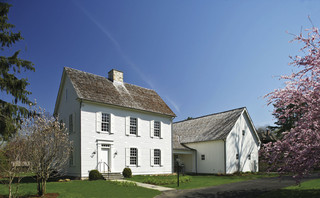
Behr’s Road Less Traveled from the 2018 palette is a soft mushroomy gray brown that coordinates nicely with stone walls and wooded environs and looks fabulous with white trim and a pink door. And although cherry blossoms do not last very long, for a few weeks out of the year your house will have traffic slowing down to take photos.


Another house color that looks great with a pink door is gray– it’s a classic combination. This gray, Benjamin Moore’s Stormy Monday, paired with pink creates a quiet traditional combo whose matched undertones make the marriage work. Pink perennials in the yard draw your eye to the coordinating front door.


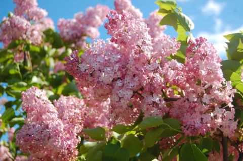
Three other colors paired with pink create quite the wow factor and a stunning bush of pink lilacs ties the whole look together.
Charcoal Blue, a Sherwin Williams color, offers the most drama. Not for everyone, but a dark navy house can be very striking, and the softness of the pink door creates a balanced look paired with silver-toned metal door accessories.
Farrow & Ball’s Slipper Satin is a gorgeous color to paint both siding and trim. Paired with a pink door and a dark brown porch deck and oil-rubbed bronze accessories, you’ve got your drama.
Finally, we have a dark charcoal, Glidden’s Flagstone Grey, that also coordinates well with stonework and contrasts beautifully with pink.

![farrow-ball-sample-pot-slipper-satin-2004-22227-p[ekm]480x480[ekm]](https://i0.wp.com/yourcolorcoach.blog/wp-content/uploads/2018/02/farrow-ball-sample-pot-slipper-satin-2004-22227-pekm480x480ekm.png?w=156&h=156&crop=1&ssl=1 "farrow-ball-sample-pot-slipper-satin-2004-22227-p[ekm]480x480[ekm]")


As you contemplate freshening up your home’s exterior this Spring, see if a glossy pink door with fresh hardware might be the answer to enhanced curb appeal. If you change out the door hardware, don’t forget to match the porch light– an inexpensive upgrade that can make a huge difference. Add a fresh door mat and pot of pink annuals on the porch step and brace yourself for compliments.
Happy Thinking-About-Spring Day, Everybody.
Trending Front Door Colors
April 25, 2016 § 1 Comment
 What’s trending now in front door colors? Soft pastels. Although the traditional black and red will never go out of style on colonial homes, the palettes of many contemporary and new construction houses have been softened in recent years.
People are still loving the neutral siding colors: whites, grays, gray-blues, and sages. But instead of the dynamic contrast of a front door that shouts, we now have front doors that sing softly.
Possibilities:


Benjamin Moore’s offerings:
- Corn Silk, 198
- Revere Pewter, HC-172
- Simply White, OC-117
- Soft Pink, 2012-70
- Gentle Gray, 1626
- Touch of Gray, 2116-60
- Moon Shadow, 1516
- Colony Green, 694
- Yarmouth Blue, HC-150, a personal favorite of mine.
Spring is here! Consider painting your front door with a soft new hue. You’ll love it.
(Photo: Better Homes & Gardens)
Making a House Color Splash
March 15, 2016 § Leave a comment
I have driven past this house for years and every time, I do a double take. Situated next to a busy roadway, there is nowhere to stop, get out of the car, and snap a decent photo. But that does not deter me.
The red brick wall is not part of the yard. And who cares about it anyway. It is the roof color and the coordinating front door in a spectacular (guessing here) Starry Night Blue (BM 2067-20) that grabs our attention. The rest of the trim is a quiet brown taken right from the brick. We don’t even notice the window trim at all, and that’s the point.

The roof looks like Vermont Mottled Purple slate, but honestly I have no idea. All I can say is that this house creates, in its traditional neighborhood, a huge House Color Splash. Kudos! And I cannot wait to drive by again.
Don’t forget about the roof color when you are planning your exterior color scheme. It is absolutely fine to keep it neutral, but if you have the personality to withstand the gawking passersby if you decide to add color to the roof, then go for it. Just remember to tie it into the rest of the house with shutters and/or front door to match. I will thank you.
Change Your Front Door Color
February 8, 2016 § 2 Comments
 Driving through a little town recently, I glanced around as usual, admiring architecture, making a mental note about what color combinations to try and which ones really do not work, and generally looking for color and design inspiration. One house called out to me as I cruised by — quickly I made a U-turn and headed back for a closer look. Like a beacon of happiness, the bright, sunny, yellow door popped off the crisp, white house with black roof and shutters. What a stunning house to drive home to every day.
February seems to bring thoughts of Spring and those quick and easy, yet big-bang-for-the-buck house projects. And the front door color is one of them. If you’re tired of black or red for the front door, and particularly if you have a white house, there is no reason to keep the status quo. Shake it up. What is your favorite color? What color are your spring flowering shrubs? What color does your front door want to be? (Okay, that last one may be a bit weird, but you get it.)
Guidelines for choosing a new front door color:
- Make sure that new color shows up at least two other places in the front yard, for example, in the landscape plants, flower pots, patio umbrella, or other accessories.
- Consider a brighter sheen for a softer paint color. That will add life and a little pizzazz to a color that doesn’t stand out too much on its own.
- Realize that if your front door is under a porch overhang, the color of the door will darken. Go a bit brighter unless, of course, you get full afternoon sun shining on the door. In that case, go a bit darker.
- Give yourself choices. Try three different colors and look at them at different times of the day and in different weather conditions. Don’t rush the decision.
So this year, while you’re skimming through seed catalogues and planning your Spring garden colors, choose a new front door color too. You’ll love how it brightens your spirits.
From Color Inspirations to Paint
February 4, 2016 § Leave a comment
Walking into a pottery shop is like immersing yourself in a box of crayons, all pristine and unbroken with endless possibilities of combinations.
 This set of dazzling bowls caught my eye. Mesmerizing is how I’d describe them with an array of blues from turquoise to cornflower. (The dishes are mine now.)
Whatever the inspiration, there is a paint project waiting. In my mind’s eye driving home, I see these dishes in a dining room painted any one of the colors with crisp white trim. Maybe even a shiny white bead board around the wainscoting to bring out the hues in the room. I can also see any one of these colors on the walls in a kitchen with white cabinets and a white subway tile backsplash. Or maybe one of these colors for the backsplash! (Head is spinning with ideas.)


Accent walls give us a way to add a small amount of color drama to the focal area of a room without painting everything. Especially nice in open-floor-plan spaces where walls may incorporate several rooms. How about one of these rich hues for your front door? Spring painting is right around the corner. (Ben Moore’s Calypso Blue, Bermuda Blue, and Deep Mulberry)
Let the color in front of you and surrounding you inspire you. Wrap yourself up in it. Do something for yourself and create a happy house. It’s just paint!
Surprising House Color Trend — White
February 12, 2014 § Leave a comment
Classic but always with a modern twist, white is trending now as a house color on new construction. Whether we’re craving our grandparents’ old homestead, or we like a crisp, uncomplicated look, white is in. White siding with white trim. But the surprise element lies in the accessories. Fresh options include silver for the metal color (not the traditional black), white or pastel door colors (nolonger black or red), medium-toned metal roof colors (not just charcoal shingle anymore), mismatched out-buildings (that old classic farm look is coming back in a big way), and even (gasp!) white shutters on a white house.
The beauty of white is that it really is timeless. Not only that, but it shows off your colorful flowers and the greenery of your landscaping, the orange patio umbrella and Adirondack chairs, and the turquoise of your backyard pool (okay maybe I’m going a little overboard).
See if a fresh pop of white brings out the character in your house.
Front Door Personality
August 28, 2013 § 6 Comments
 As much as I love eggplant, both as a vegetable and a paint color, it just didn’t work on my house. With the eave creating a shadow, the beautiful, rich purple color only lit up in the late afternoon when the sun hit it just right. For those few moments, the Caponata (Ben Moore AF-650) looked spectacular. Then it went back to black.
So… inspired by some fabric I saw awhile ago with golds and light blues, I ventured into a rarely seen color combination — hey, why not, it’s just paint! The new door and bench are Yarmouth Blue (Ben Moore HC- 150) and although the neighbors have not commented yet, I love it. The house color is Richmond Gold (HC-41) and the trim is Cameo White. I may paint the trim a less-yellow hue in the spring, but for now, it’s fine.
If your front door is in the shadow of a porch or a big tree in the front yard, consider a light front door color, something even (dare I say?) pastel. You may be really pleased with how the lighter door color can change the personality of the house from stodgy traditional to young and perky. See what you think!
Is Your Home Ready for its Close-Up Shot?
May 1, 2013 § Leave a comment
 In real estate, a picture is worth a hundred home visits — at least to many potential buyers who cast off rejects as fast as they can hit the Next button.
If you’re preparing your home for the market (or if your home is already on and just sitting), here’s a tip that might get your home ready for its close-up shot and looking good on the big screen (or at least the laptop):
Take photos of your house from the street and then take a shot of every room from the doorway. Then put them on the computer and take a look at what the public is seeing online.
Ask yourselves:
1) Does the photo of the house from the street show that the house is kept up? Is there stuff in the yard? Are there weeds in the garden? Is there peeling paint anywhere? (You can see the to-do list forming, can’t you…)
2) In the photo from the front door, can you see into other parts of the house or is the foyer closed off and dark? Is there old carpeting on the floor or is it tile or hardwood?
3) Inside, are any rooms dark? Do the curtains cover the windows? Is your furniture in sad shape or is there too much of it in a room? (These are the areas to address)
4) And lastly, is there something in the photo that immediately grabs your eye — and not in a good way? It could be a crooked picture or a sloppy bed. That is what the public remembers from that photo.
With to-do list in hand, fix those items that are keeping your house from getting a personal visit from potential buyers. Selling a house is far more than just listing it with an agency and sticking a sign in the front yard. Make sure you value the importance of photos that show your home to its best advantage.
Is Your House Comfortable in its Color?
March 18, 2013 § 4 Comments
 Wherever I go I study house color, trim color, front doors, and overall curb appeal (it’s kind of an obsession). And this house (even with its imperfections) struck me today as a good example of a house that is comfortable in its skin.
The siding color is yellow but not too lemony and not too orange. Kind of pale but not too cream. Buttery but not too saturated. It’s just, in a word, perfect for this little house.
The trim is not white-white but an off-white without being too beige. A whiter white would look too crisp and a little too Cape Cod for this antique. Off-white gives the house an aged, relaxed, comfortable look. No face-lift needed here.
And the accent color, a soft weathered green with just a touch of blue is really not an accent color at all. Instead of interrupting the house color, like black shutters would, the green simply finishes the house like curtain panels finish a room.
The point is, these homeowners let their house speak to them when it was time to pick a house color palette and didn’t try to make the house into something it isn’t.
Do You Have Two Front Doors?
March 13, 2013 § Leave a comment
 Many of us have more than one entrance on the front of the house, and sometimes one is rarely used. How do you indicate which door you want visitors to enter? Do you paint both doors an accent color or just one?
If you use the main front door as your guest entrance — if you’re having a party, say, and don’t want people traipsing through the kitchen — then paint that front door an accent color (red in this case) and all other doors a color that coordinates with your siding (maybe a shade or two darker or just the trim color). If you paint both front doors red, we are not only left with two focal points but we’re confused as to which door is preferable. Painting only one red door will announce which one is open for guests. In this photo example, the homeowners painted both doors red but distinguished the front door from the porch entrance with a wreath. Not quite as clear as using color, but it works.
Now here is where it gets tricky. If you NEVER want anyone to go to the front door, then paint that door a neutral color that coordinates with the siding and paint the porch door red. It’s okay. The same applies to all the various side doors, garage doors, and shed doors. Paint them all a coordinating color but not the same as your main door. That guest entrance is special.
Just a guideline if you’re struggling with too many doors and what to paint them.
