Speaking of Red, What’s the Best Front Door Color?
February 26, 2023 § Leave a comment
Quick answer? Not red. Necessarily.
Red is a traditional door color that is steeped in history and folklore as it symbolizes a welcoming home, a safe haven for travelers, a harbinger of good luck, and protection from ghosts and evil spirits. And it certainly is striking, particularly on a white house.

But before you run out to the paint store, a study done by Zillow in 2022 found that buyers would pay $6500 more for a house with a door color they found desirable and conversely would pay $6500 less for a house with a front door they didn’t like. The door color that brought the highest offer? Black.

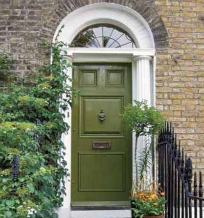
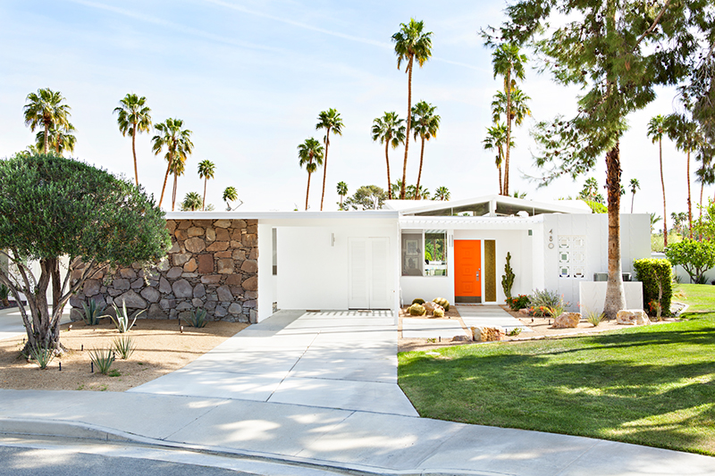
Now black isn’t for everybody, but red obviously isn’t either. The same study found that Slate Blue and an earthy Olive Green came in second and third. (Note the stone and brick on these two houses — we’ll come back to that.)

Colors to be avoided? Pale Pink and Cement Gray as they were described by respondents as “shabby and dated.”
Not to be contrary, but only a year later another trend study found Soft Rose (aka pink) and Dark Charcoal (aka gray) to be two of the recommended front door options for 2023.


Okay, let’s unpack this because you cannot pick your front door color based on folklore or some conflicting color trends. It just doesn’t work.
A front door color should be chosen based on your
- House color. Do you have a neutral house color or is it already making a color statement? Obviously you don’t have to have a red door for luck or a black door to sell your house, but there are some color combinations that are better than others.
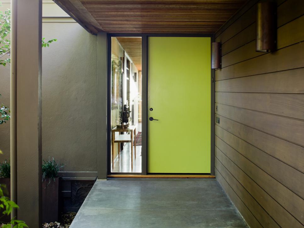
- House style. Is your house from a particular style era? Colonial? Mid-century? Modern houses can support bright crayola colors. Traditional homes sometimes match shutters to the door color and might even keep them light for a blended, softer look.
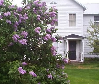
- Landscape colors. Do you have flowering shrubs next to the entry? A big rhododendron or lilac bush? There may be a color opportunity just steps away.
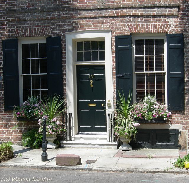
- Materials. Is your house brick or stone? Natural materials on the front of a house often present challenges to picking a door color because there may be multiple colors already in that brick or stone, and the house may appear busy. Choosing a door color to complement that stonework is tricky.
- Roof color. Sometimes it plays a pretty big role in the overall house palette. (I’ll talk about roof color another day.)
HOUSE COLOR
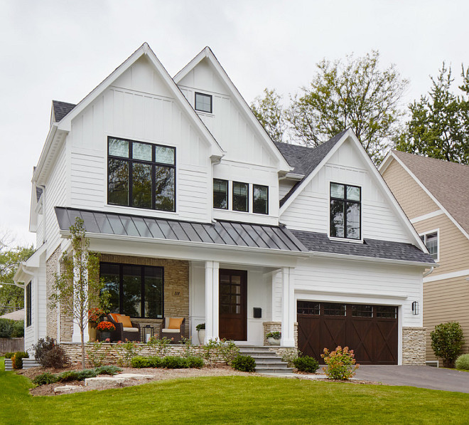
If you have a white house…
You have a rainbow of choices before you. But tie that front door color in somehow so it doesn’t look like a random walk through the crayon box.
What if my house already makes a statement — it’s red?
If the front door is under a porch overhang, I suggest keeping the door light. With all that house color, a creamy white works, and you can still find the door without the porch light on.

What if my house is black?
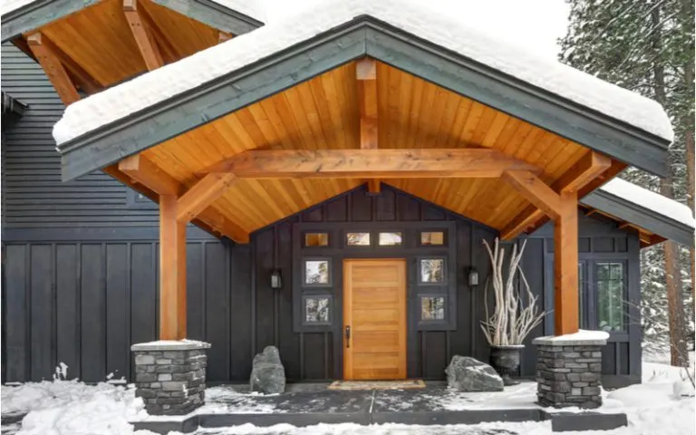
All door color options are open to you — even black. And keeping the whole house black lets the greenery take top billing. But the door color I like best for a black house is a natural wood door — it totally warms up the house and is very inviting.

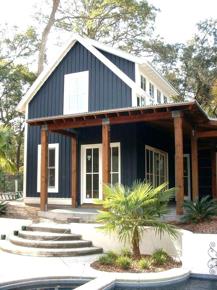
What if my house is not black but it’s still dark — like navy blue?
There is nothing fresher than a splashy sunny yellow door on a navy blue house.

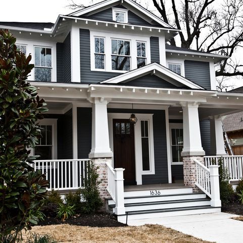
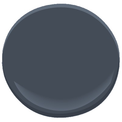
What if my house is charcoal gray?
You really cannot beat the warmth of wood. Or the color of wood — a rich gold paint color.
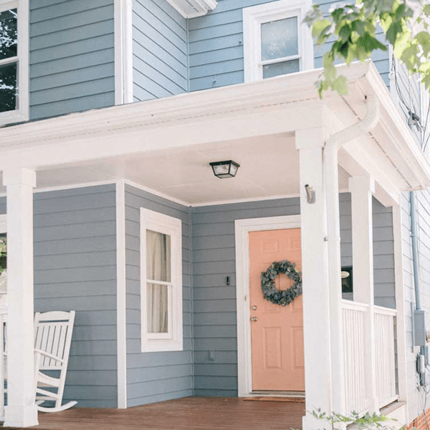
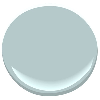
What if my house is light — like this gray-blue?
This house picks up some of the warm peach tones from the front porch and gives this more traditional house color a fresh look.
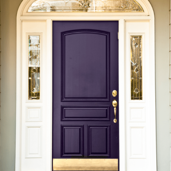
What if my house is green?
Omgosh… try a regal shade of purple. And plant some irises. It’s a stunning combination.
HOUSE STYLE
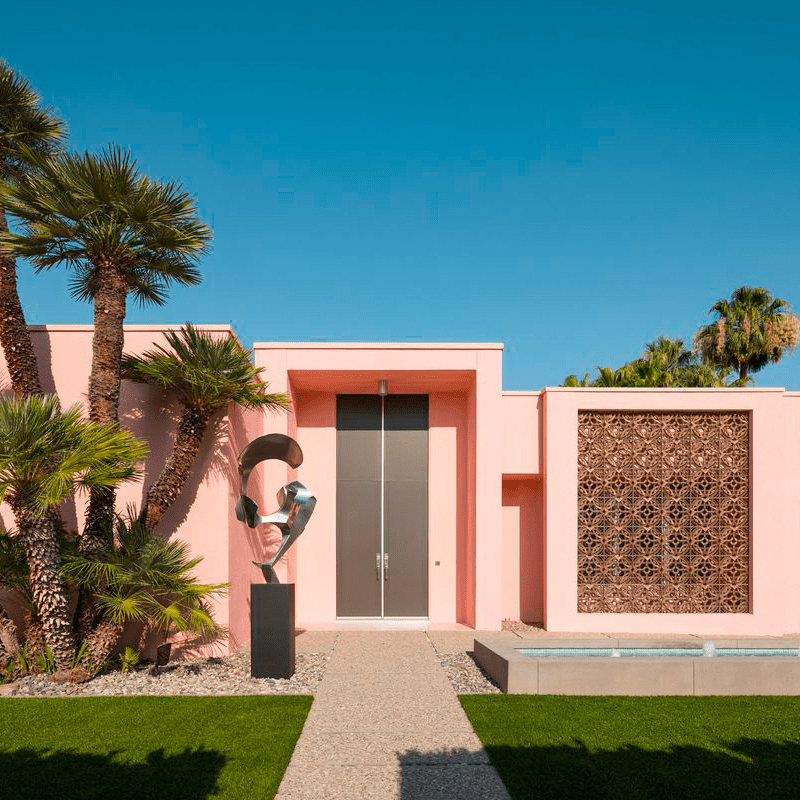
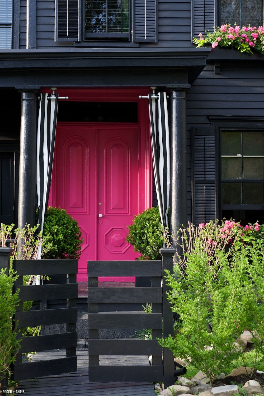
Here’s where a nod to regional trends and a tip-of-the-hat to history play a part in color choices. I’ll just pick two examples. The soft blend of tones on this neo-European style traditional home speaks to the part of the world where shutters actually function. The pink house waves from Palm Springs. Note the choice of door color — to calm the perky exterior. House styles have some parameters. After that, it’s all about your taste.

Now back to reality…
LANDSCAPE COLORS
Notice how the landscaping dictates the door color? It is such a great trick, and it really pulls the curb appeal to a higher level. Will it bring in the highest offer on your home? Maybe not, but if you’re not moving, then it’s not an issue.


HOUSE MATERIALS
What if my house is brick?
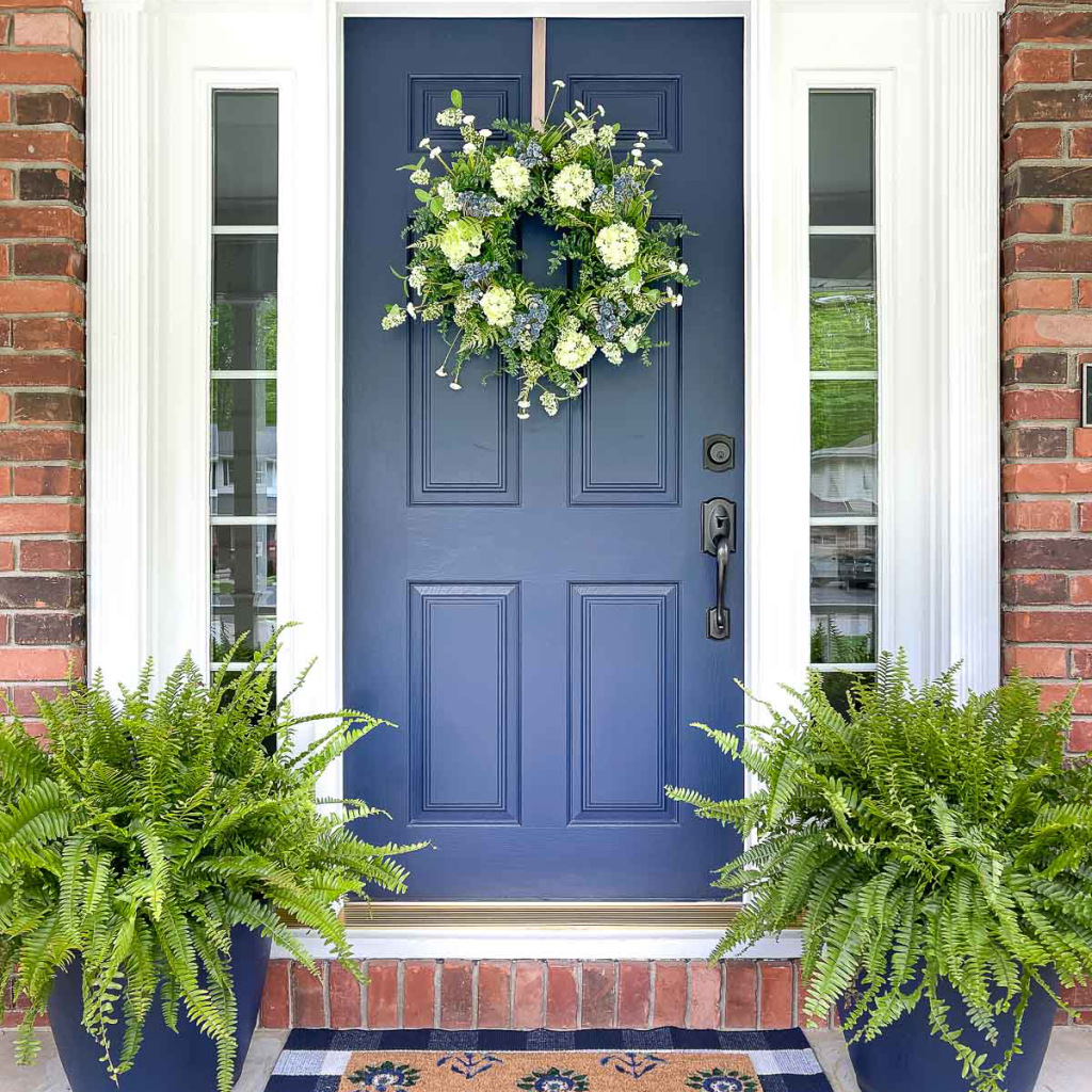
Solid dark colors like navy are classic door colors with brick. As is black, of course. One color to avoid? Red because bricks are not actually red and trying to match them for a door color is a challenge.
What if my house has multiple colors or stone textures?
My absolute go-to color for coordinating front door and stonework without introducing another accent color is Sherwin Williams Urbane Bronze! It is a miracle front door color!

If you need help with color, feel free to comment below, hit the button for a Color Consultation, or shoot me an email at yourcolorcoach@gmail.com.
I would be happy to help you.
Hope you have a Colorful Day!
Barbara, Your Home & Color Coach
Curb Appeal Refresh: The Front Door
May 22, 2019 § Leave a comment
Some of you may remember when the fashion industry changed the skirt hem length every year — from maxi to mini to midi and then back to comfortably above the knee.
Front door color has followed a fashion trend of its own. A decade ago, red was all the rage — and for some it continues to be the most welcoming front door color. Black with a metal kick plate has always offered a sophisticated read on the front entry. But what has followed in more recent years has been a busting-out of traditional exterior curb appeal. Here’s what front door colors we were talking about just 3 years ago.
So it is time to update those door trends again. No more copycat door-painting just to be fashionable. We’re stepping out of the shade of the porch to a bold new entryway that will set each house apart from its neighbors.
But first, let’s talk about house colors. What has changed:
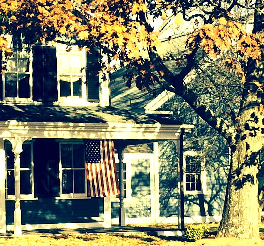
–More white houses. It used to be that white fell to farmhouses and antique colonials. Not anymore. There is plenty of white new construction, which opens up a fan deck of front door options.
–More gray houses. Always a neutral that fits into almost any environment, the gray interior trend moved to the outside and remains. Gray also opens up a fan deck of front door options, maybe just a few fewer than white.
–More Crayola color and less safe beige. Dark and rich are replacing light and airy. Briarwood is moving to Hale Navy. Rich Cream is moving to Merlot Red. Even some developments are providing a rainbow of siding options instead of the light neutrals from years past. <<applause>> If you have a bold red house, you probably don’t need me to tell you what color to paint your front door (lol!), but I’ll offer suggestions anyway.
–More midcentury renos, both contemporary and ranch style. With a surge in client interest for open-concept living (uh-oh to that trend, but that’s another story), people have realized that it is easier to update an already open midcentury home with the high vaulted ceilings and the great-room flow than it is to modify a boxy colonial. Big surprise there. So we are seeing a plethora of exterior colors (even black) as a result of these one-story re-dos.
Back to the front door. Here are some ideas for redoing your front door color to refresh your home.
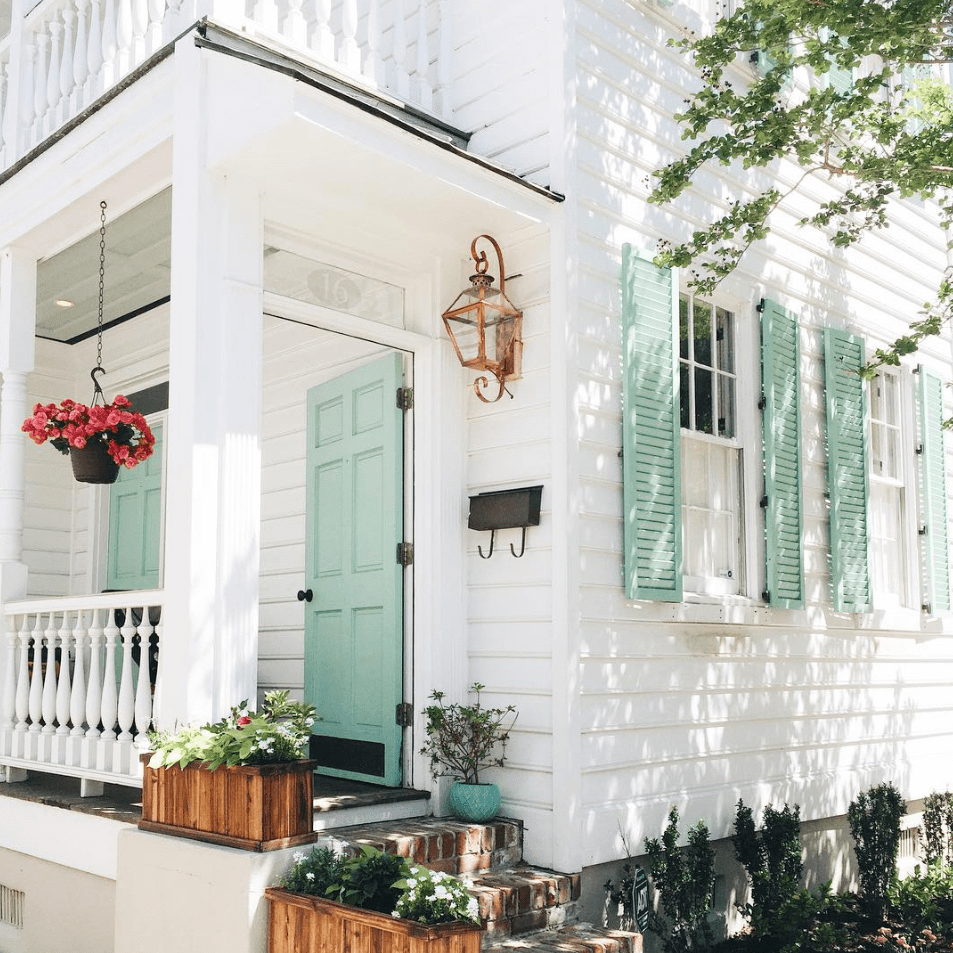
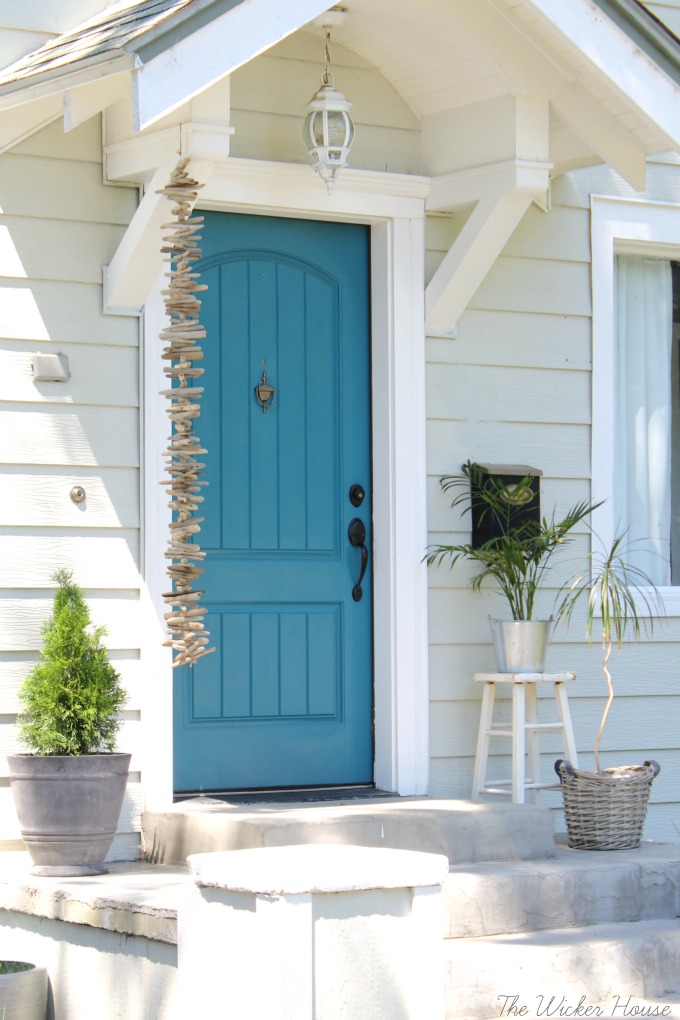
Teal and Turquoise — I cannot believe that I used to recommend turquoise only for tropical house locations or homes that at least had a pool. What used to be a quest to coordinate house colors with the local environment is now a challenge to ignore it. Where teal and turquoise work: on gray, white, black, yellow, red, okay almost every house color except blue. Where they do not work: on dirty or faded house siding (the bright color makes the house look worse) and on other blues like colonial blue.
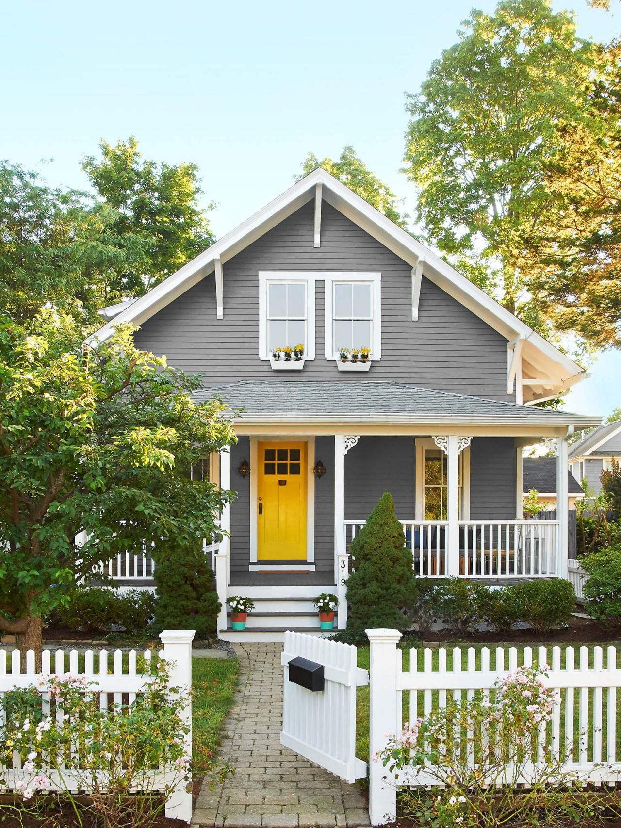
Yellow and Orange — not everybody’s favorite colors but they are so happy. I love them on a front door. Where they work: on dark house colors like navy, green-browns, dark and light grays, neutral gray brick, and white. Where they do not work: Again, on any color that looks faded, aged, or dirty.
Lime Green — fresh and springy and a wonderful coordinating color for your landscape. Where it works: dark gray, navy blue, even red brick, chocolate brown, black. Where it does not work: any other green or dirty beige.
Pink and Purple – always beautiful on a white house with coordinating landscape trees but also on a dark house for a real pop of warmth in the neighborhood. Where they work: white, gray, navy. Where they do not work: on yellow beiges and orange beiges because of the undertones and on anything that has a faded or dirty appearance.

If the bright colors will not work with your house color, try natural or even white.
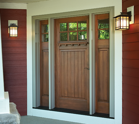
Natural Wood or wood-look – always a classic. Where it works: navy and red, for sure. And just about every other house color.
White — yes white! What white does is make the whole entry area look larger since it blends with the white trim color. It also creates a blank canvas for holiday decor — wreathes, flower pots, etc. There is nothing quite like white as a backdrop to a variety of color palettes around the entryway. Where it works: especially good on a house with a lot of color already and crisp white trim. Also works on neutrals when you want to maintain a soft neutral palette throughout — be sure to add textures though with lots of greenery and baskets or wicker furniture. White also works on aged or faded houses where the bright colors do not. Crisp white perks everything up.

I hope these ideas dazzle your thinking and inspire you to head to the paint store. Happy painting, everybody!
Front Door Color –Refresh for Brick Homes
May 20, 2019 § 6 Comments
I wrote my first blog post about front door color back in 2012 when it seemed like red and black were the most common options for traditional homes. And shutters? Well black and then black again.

But today I stumbled upon a couple of photos from Beacon Hill in Boston that blew my traditional color palette out of the fan deck, so to speak. It was love at first sight of that rich gorgeous blue — yet to be identified by name and brand.

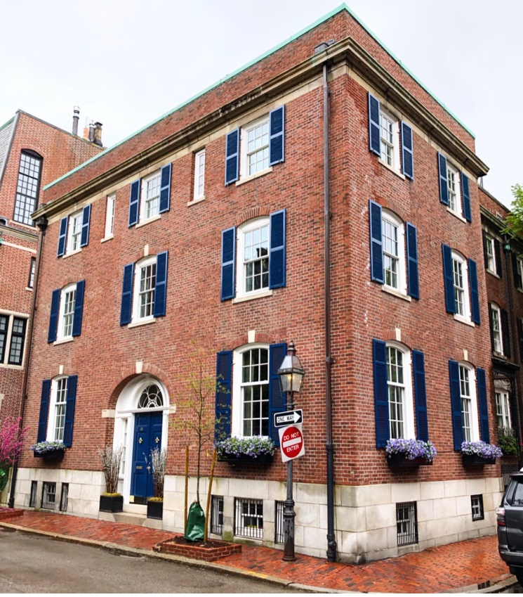
Photo: @buildingsofnewengland
Just guessing here (I didn’t find anything in the Sherwin Williams paint line), but Benjamin Moore has Dark Royal Blue 2065-20 that comes pretty close for now until I can track this color down.

Benjamin Moore 2065-20
What I love about this color for the front door (and shutters for that matter) is that it’s dark enough be traditionally tasteful and even replace black on many houses like the 1912 Colonial above, but it has hue enough to excite the senses and certainly stand out from the crowd of traditional black and Charleston Green doors and shutters (not that there’s anything wrong with traditional!).

And I’m just talking about brick homes — because door colors on painted houses and more contemporary homes have gone right through the color palette. More updates on that later.
In the meantime I’m going to appreciate that stunning blue on the brick Rhoades House and open my fan deck to more brick home door color ideas.
Orange Twist to the Red Revival
September 18, 2017 § 2 Comments

Apples, pumpkins, falling leaves — there’s something about Autumn in New England that, despite our recent warm temperatures, makes us cozy up to the changing seasons. Maybe that’s why some of us live here.
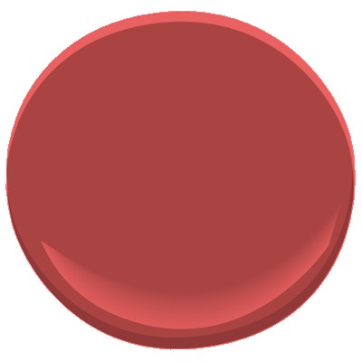
My newest door color obsession is a revival of the orangey red of another decade, and that may signal the end of the light, neutral, blue and even light lemon yellow door color trend I’ve focused on for the past several years. This red, Million Dollar Red (Benjamin Moore 2003-10) is as perfect on a traditional white colonial as it is on a black modern home. There is no mistaking where the door is — it screams Welcome!
What I love most about it is its “orangeyness.” Orange is a happy color no matter what. So a red on the orange side (versus pink) says this is a happy home. The color also has an updated, contemporary feel as opposed to the more traditional burgundy red (also great, of course, but more serious and refined).

Adding an orangey red as an accent color on the interior is also a great way to torque up the energy. Try it on the back of a white bookshelf, or on a pouf ottoman in the family room, or even on a focal wall in the front entry. A little bit of red warms up a room a lot. So before painting an entire room red, make sure you want to amp up the temperature in there. Using red on items that can be removed in the hot summer makes sense to me: pillows, bedding, throws, and art. Then I look forward to my seasonal exchange when I swap out the cool blue accessories for red.
Enjoy Autumn… whatever it means to you and wherever you are. And love how the color orangey red makes you feel. Warm and Happy.
Fab Front Door Color Ideas
November 14, 2014 § 3 Comments
Your front door does not have to be red. Or black. Or green. Or any other traditional color (although there’s nothing wrong with that). Have some fun with your front door color by looking around your yard for inspiration. Or step outside the box by choosing a contrasting color in an unexpected lighter tone. Once you decide on the color, spread it around a bit more by painting a bench or a pot the same color and planting annuals and other flowering shrubbery around the yard to pull the whole look together.
For a BLUE or GRAY house: Consider warm sunny yellow (Ben Moore Concord Ivory HC-12).

For a golden BROWN house, surprise your neighbors with a light shade of contrasting blue (Ben Moore Yarmouth Blue HC-150).
For a white house, consider using a color from your plantings around the yard. Here, the purple lilacs provide the inspiration (Ben Moore Cabernet 2116-30).

For a red house, I still love creamy white trim and a navy door (Ben Moore Hale Navy HC-154).
For a green house, use a natural wood toned door or paint it an earthy rusty brown (Ben Moore Ten Gallon Hat 1210).

And of course a yellow house still looks absolutely smashing with a traditional red door (Ben Moore Moroccan Red 1309).
Your front door should reflect a little bit of you and the home you’ve created on the other side of it.
