Curb Appeal: Go Big or Go Home
July 22, 2011 § Leave a comment

 When it comes to landscape plantings, you don’t need contrasting color to make an impact. Look at this green house — not a single pink annual in sight.
What makes an impact is the scale of the plantings like the big hosta and the white hydrangeas all in various shades of greens and creams — in front of a green house! Who would ever think!
If you want a big bang for the buck (as they say), use large blooms (hydrangeas, peonies) and big leaves (hosta in various shades) to enhance your home’s summer curb appeal with minimal fuss.
Choosing Siding Color (or Colors) for your House
July 19, 2011 § 4 Comments
 If your house has an architectural feature — maybe a porch, a large portico, or a distinctive garage — consider using an accent color for the siding instead of the color you’ve chosen for the house.* The effect is obvious. The accent color will stand out. This color technique is perfect for large houses that might look too massive if they were all the same color. Dividing up the exterior color gives you an opportunity to highlight the design of your home and make a large-scale house a bit cozier.
Speaking of a massive house that could use a little visual down-sizing, maybe we should consider accenting the architectural detail on the White House with a little color! … (oh, forget it… we’d get into that red state/blue state thing — no wonder the place is still white!)
Anyway, color can be used creatively to re-scale a large structure and add visual interest.
If you want your house to look bigger, however, this technique is NOT for you. Dividing up the exterior color chops up the house and calls attention to small areas. If your small house currently has a multi-colored siding palette, consider painting it all one color and using the accent colors for doors, shutters, furniture, flowers, and other accessories.
*The construction of the Doyle Center in Leominster, MA, is really interesting. Here’s a link: http://www.thetrustees.org/what-we-care-about/climate-change/green-buildings/doyle-conservation-center.html
Can I Paint My 1960s Ranch?
June 21, 2011 § 3 Comments
 The answer is yes! With the growing popularity of the spray-painting technique for painting houses (not just lawn furniture anymore), it is becoming easier to paint over rough, textured surfaces like brick and get a good result in a reasonable amount of time.
Check out HGTV.com for some great before-and-after brick house projects. In one show, “Curb Appeal: The Block,” the designer John Gidding takes a paint sprayer to an old ’60s ranch and brings it into the new millenium.
Check with your paint store first, of course. And you might want to hire a professional painter to avoid over-spraying into your neighbor’s driveway (not a good thing…). But if you have a brick house with a) zig-zag-patterned brick; b) really obnoxious brick colors; or c) just tired, run-down plain old red brick, then get inspired! Paint will give your house a fresh new look!
Choosing Colors that “Pop”
June 6, 2011 § Leave a comment
 It may seem obvious, but opposites attract. And when it comes to color, opposites attract attention! These bright orange pansies are the perfect complement to the rich azure blue ceramic basket on the front step of this home. Orange and blue are opposites on the color wheel and, because of that, they give each other a vibrant visual energy that draws your eye. Cheerful, welcoming, fun — everything you want your house to say.
The other opposites? Red with green and purple with yellow.
If you’re planning your garden, planting some annuals in pots, or painting some accent furniture for the yard or the porch, think about what colors will pop off each other. Talk about curb appeal… you’ll certainly attract some attention from the road.
Long-Distance Decorating! From the US to Iraq and Back!
February 15, 2011 § 2 Comments

 It’s not every day I receive a phone call from Iraq to work on a house in Atlanta but last April I did. The guy on the other end of the line had started renovating a house for his mother and was making all the decisions long-distance. Imagine that! Working with a builder on a house renovation is a challenge when you’re on-site — but from thousands of miles away? And for his mother? I was intrigued.
After the builder chose an unapproved yellow for the new addition (see Before Photo on right), my “soldier friend” (as I call him) was not pleased and asked me to come up with a new color scheme for the exterior. And we did not stop there. By way of blog posts, emails, photos, and occasional phone calls, we moved on to porch, shutters, and even the garden shed. Then we moved inside to make paint color decisions, choose light fixtures, and decide how to update the kitchen and bathroom. He sent me photos of options he found online and I gave my advice.
From Iraq to Boston to Iraq and on to Atlanta. The power of the internet is making long-distance decorating possible.
P.S. His mom loves what we’ve done so far! And she loves her son! Success!
Choosing a Roof Color for a White House
May 7, 2010 § Leave a comment
 Choosing a roof color these days can be overwhelming with all the choices available to us. We’ve gone from classic black and charcoal to every shade of brown, red, green, and even blue. This white house with navy blue shutters looks spectacular with its multi-hued, architectural style blue roof. It really stands out in the neighborhood lined with browns and charcoals. And with a white house, adding a little color to the roof (at least on this house) certainly adds interest without going overboard.
If you have a white colonial and want to replace your roof with a metal style, I suggest sticking to the darker, more traditional colors. A metal roof adds an air of informality (and a touch country) to the house itself so keep that in mind when you’re selecting a roof style. Nothing wrong with metal, but you won’t want to attract too much attention to it if you have a traditional metropolitan house. If you live in the country or the mountains, anything goes!
Choosing a Door Color for a Historic Home
May 6, 2010 § Leave a comment
 Sometimes there’s absolutely nothing more dramatic than a bright, cherry-tomato-red front door. Instead of a more conservative black semi-gloss, the homeowners of this gray limestone with white window and door trim, wrought iron railings and lampposts, and concrete steps have punctuated their predictable historic facade with a splash of red right off the vine!
No need to wave a flag for guests to know where to ring the doorbell. The entry boldly exclaims, “Welcome Home!”
Nice choice!
Good Design Learns from History
February 4, 2010 § 2 Comments
 This historic New England barn is original to the property, and its characteristic beauty helps to define the classic regional style. Owning an historic property can be a real joy for those whose passion is preserving the beauty of the past, but don’t think you have to own a historic treasure to enjoy the pleasures of a striking outbuilding.
If you need more space for a workroom or your vehicles, you can add a lot of character to your property by incorporating the unmatched elements, colors, and materials used in previous centuries to make your own history, whether it’s a barn, a large work shed, or simply your garage.
I get lots of questions about how to match exterior colors and blend materials between house and garage, but as you can see from this photo, there’s absolutely nothing matching between this barn and the accompanying house. From the unpainted board-and-batten style siding, brass lighting, and farm-style scale, this barn stands on its own. The colonial house has traditional, painted, horizontal lap siding and white windows. The bridge color between house and barn is black — the black windows on the barn carry over to the accent color on the house (note the black shutters and lighting as well as the black pergola and fence next to the driveway). By painting the wood accessories on the house black instead of leaving them natural, the unpainted barn takes center stage.
Even if you have no plans to build a major additional structure in your yard, keep this basic design principle in mind when you’re working on your exterior. Colors and materials do not have to match.
Camouflage the Neighbors (and other eyesores)
August 19, 2008 § 1 Comment
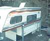 Despite your attempts at diplomacy, your neighbor has decided to park his rusty old camper on your end of his front yard. This predicament is particularly significant if you are trying to sell your house, but it is not pleasant at any time. What to do. If he really will not haul the camper to the rear out of sight, then move on to plan B. Your landscape.
The old saying, “Good fences make good neighbors,” may apply in your case, but if you think that a stockade fence might be a bit aggressive, hedges are the next best thing. Lilacs, forsythia, or a traditional row of arbor vitae will form a quick-growing visual barrier between your property and your neighbor’s.
Eyesores in your own yard can be camouflaged as well. Fencing around a large air conditioner and garbage cans, lattice work around the perimeter of the deck to conceal the yard machinery underneath, a garden of sunflowers between the house and the aluminum shed, and the list goes on. Stand back on the curb or the edge of the property and pretend you are a visitor to your house for the first time. What do you notice in the yard that’s not so great? That’s what needs to be either removed or camouflaged.
Consider Your Home’s Roof Color: A Major Design Statement
May 31, 2007 § 385 Comments
Not too long ago, roof color was black — or a shade of black. Today, coordinating roof and house colors or choosing a new roof can be quite a project. So many choices and expensive ones at that. It is important to make a wise decision to avoid a long-term design disaster.
If you’re due for a new roof, congratulations! You now have a chance to select your roof color from the myriad choices that are available. Here are a few guidelines and considerations:
Traditional Shingle Roofs
- Gray or blue house. Stay with a traditional roof color like dark gray or black. That way your roof will blend with your house and make the whole structure seem bigger. Any other roof color will stand out too much and make the house look chopped up.
- Cream, tan, or light brown house. Consider the many brown roof options, some of them with a mixture of browns that really make the house look updated and terrific. A brown roof will blend with the cream or tan and make the house look bigger. Black and gray roofs just look ordinary. A brown roof looks like you actually planned out your entire color scheme.
- White house. Dark gray and black are traditional, but they work. Blue is also a terrific option. Red or green metal on a white farmhouse give a traditional country look. Bottom line on a white house: you have lots of options.
- Red, green, or yellow house. You can go either way, a brown or a gray/black roof. I prefer a brown roof for red and green house colors and a black roof for a yellow house.
Of course, the same suggestions apply if you are stuck with your roof color and are looking for a paint color for the house.
- Black/gray roof. The ideal house colors are gray, blue, white, and yellow.
- Brown roof. The ideal house colors are cream, tan, brown, red, green.
- Green roof and other colors. You can either use the roof as an accent color to the house or try to blend it by using a lighter tint of the roof color on the house itself.
Nontraditional Roofs
What about metal roofs? They’re all over Colorado, Upstate New York, and other areas of the world where snow on the roof is a major factor in the winter. Metal roofs come in a rainbow of colors, from red to green to brown to purple. If you have a metal roof, you are making a design statement (whether you mean to or not, of course) and you can treat it as an accent color, kind of like picking a front-door color. However, if you do not want to call attention to your metal roof, choose a natural roof color like dark charcoal, bronze, black, or brown instead of a color like blue.
What about terracotta roofs? These are traditionally seen on Mediterranean style homes and are a definite design feature. Keep the house color neutral to highlight the beautiful roof and the other architectural elements that are undoubtedly present.
Other nontraditional roof materials. Just like a thatched roof on an English cottage, a nontraditional roof is a design feature of the home. Hopefully, you want it that way. Choose a house color that makes the roof look like you planned it as a feature.
Regardless of what kind of roof you have, make sure you consider it when making house color decisions.
