House Colors with Personality
November 20, 2014 § Leave a comment
Nothing shy about this pretty pink house. And instead of tempering it with neutral (black or gray for the shutters and door), the homeowners went Victorian bold with a rich blue like Ben Moore’s Blue Macaw 784.

When you have an old house, it’s fun to use old historic color schemes that make a statement. This one certainly does with its two-toned mustard/olive combo clarified with white trim and a traditional brick red door (Ben Moore Cottage Red).

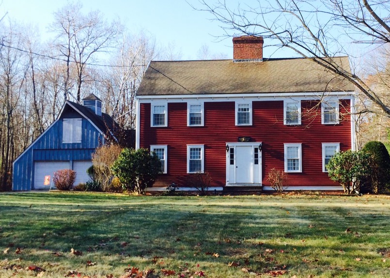
I always love a tastefully done red-white-and-blue scheme, shown here with a blue garage attached to the red house. White (Ben Moore’s Brilliant White) as both trim and accent color pulls the look together.

This dark brown house is a classic New England Cape. Its simplicity is what captures the eye. No accent color needed on this traditional solid wood door with black hinges.

Make a statement in your neighborhood. Tastefully, of course.
Choosing House Colors: Bark Brown?
February 28, 2012 § Leave a comment
 Talk about fitting in! Dark, rich tree-bark brown is about as close to nature as you can get for a house color that will fit unapologetically into almost any landscape.
What I love about this brown house, however, is how creative the homeowners were when it came time to choose a new roof color. Instead of opting for a light brown, gray, or dark forest green (all great options, by the way), they chose a light sage dimensional roof that looks spectacular. Then they pulled the trim color from the lightest shingle tone and used that for trim around the dark brown windows (also a nice touch), the corner trim, and the garage doors.
The result? Something different! How refreshing! Are they locked into a green roof? Yes. But who cares…
What Color Is It? Really…
February 26, 2011 § 2 Comments
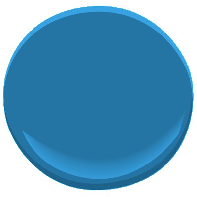
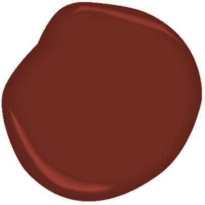
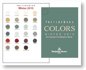
You’d like a Pottery Barn-approved Benjamin Moore color from the Pottery Barn fandeck to update your color scheme. So you pick a nice rich color like Bittersweet Chocolate 2114-10 for the entry hall — with a name like that it’s got to be a rich chocolate brown, right? Well not so fast.
After painting a couple of coats on the wall, you notice that it looks like a dark eggplant purple when the sun shines on it. Hmmm… what is going on here? So you head back to Ben Moore to take a look at their fandeck that has ALL the paint colors and their related shades and tones. And voila! The lighter tones of Bittersweet Chocolate are decidedly purple with names like Hint of Violet 2114-60 and Victorian Mauve 2114-50. And that explains why the color Bittersweet Chocolate is not what we might think of as dark chocolate brown.
When you pick a color from a paint chart that does not contain the shades and tones for that particular hue, the best way to find out what color you’ve REALLY chosen is to:
1) Find the color on the big fandeck and check up and down the strip of shades and tones. You’ll see what that underlying hue is.
2) Also check the color next to a bright white piece of paper. The true hue should pop out even better.
Colors also change with the light. So there’s nothing quite like painting a sample board and sticking it to the wall in the area you want to paint. Check the color at night as well as on a cloudy day. Once you’re satisfied that you like the color all the time, then go ahead and paint away!
