Dramatic Outside Color Creates Dazzling Interior
October 13, 2015 § Leave a comment
 “Bring the outside in” — how many times have you heard that line before — but honestly, what a great idea! And one of the best ways to do it is with an accent wall that pulls a color right out of the view from the window. (Yes, accent walls are back.) This bedroom from a resort in Aruba has an incredible palette of blues and greens from which to choose the accent wall behind the bed. And how spectacular is it!
But you can do the same with the view from your bedroom. Choose a color that pops out at you when you stare out the window — it helps if there’s a beautiful maple in full color or a blossoming bush.
If your bedroom faces a concrete high-rise, not to worry. Your color palette is completely open to a view you might fantasize about. Create a bedroom oasis that reminds you of your trip to Bali (okay, maybe just your favorite House Hunters International on HGTV). Be bold or be subtle. Just be a force of change in your bland bedroom. And go ahead. Bring that outside in!
Marital (Decorating) Mismatches
December 10, 2014 § Leave a comment
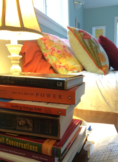 Are you and your significant other on the same page when it comes to the “stuff” of life around the house? The newspapers, magazines, mail, books, TV clickers, recycling cords and the like? Are you one to snatch the Sports Page right out of his or her hands as you make your daily pilgrimage to the recycling bin? Or are you content to let paper pile up on the coffee table until you get around to reading it? If you both treat life’s eternal clutter the same way… then congratulations. At least you don’t fight about it. But what if you are mismatched? Here are some ideas:
1. Make a deal to keep the main public space (maybe the living room) clear and ready for guests who pop in. At the end of each day, spend 5 minutes picking stuff up and putting it away. If you can only manage one room of the house, then that’s okay.
2. Contain clutter with baskets and bins. Little stuff on counters and tables may drive you crazy, but your partner needs to know where to find that restaurant receipt from last weekend. Make an agreement that things left on the kitchen counter can be found in a certain basket or bin by the recharging station.
3. Which brings me to the Recharging Station. Have one. That way you can find your phone when you are ready to leave for the day and more importantly, you can contain cords and loose devices to one particular spot instead of draping them out of every outlet. Rescue the TV clickers from under the cushions and keep them in a dedicated clicker basket.
4. And speaking of baskets and bins (see #2 above), invest in them. Closets, garages, spare bedrooms, offices, and every other clutter-prone area will benefit visually from containing the loose items in baskets rather than letting loose items and papers pile up. Both partners win. One gets to keep the stuff. The other sees some semblance of organization and unity.
5. If you are the neat one of the pair, give your partner space to mess up. For people who need everything out in full view instead of behind cupboard doors, your neatnik nagging is undoubtedly really annoying. Not everybody can be as organized as you. Give your spouse a space that he or she can call home and not be under constant pressure to pick stuff up.
6. If you are the messy one, appreciate how clutter can affect your partner’s mood and even creativity. Make an occasional attempt to go through piles and purge — even if you just move piles from one area to another. Any free space will encourage marital bliss.
7. Most importantly, take a chill pill. Fighting over “stuff” is pretty silly in the grand scheme of things.
Hope this helps.
Ready to Immerse Your Home in Color?
November 25, 2014 § Leave a comment
 As with haute couture in the fashion world, we often look to hotels and other public spaces for trends in home color and design. Look no further than The William, a boutique hotel in New York, where each room immerses its guests in a paint bucket of saturated color punctuated by droplets of white for chroma relief. I am not sure if you can order up a particular color to match your luggage, but nevertheless, your experience there will be unforgettable.
Are we ready to move this color trend into the home? Some already have, but many of us will take a little while to move back into the rich dark hues of a decade ago. I’m just getting used to the freshness and brightness of white walls. But who knows.
 If you are contemplating a project that involves intense color, start with a small space like a guest bath or a guest room where the color will make a huge impact and the cost of painting over it will be minimal. Make sure you have adequate lighting so the color will show “true” and you will not end up in a cave. And remember to punctuate your color with white or cream to make the color “pop” and add bits of black not only to avoid the I-got-lost-in-a-box-of-crayons look but also to add an air of sophistication to the project.
Full color on!
(photos from Dwell magazine)
From a Little Girl’s Room to a Teen Girl’s Haven: Navigating the Transformation
September 6, 2012 § Leave a comment
Decorating a teen’s room is way different from decorating a young child’s room, and I’m not just talking about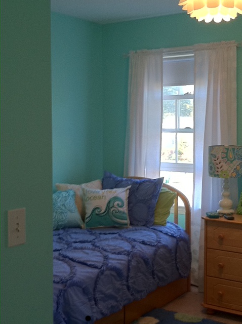 the comforter and the curtains. When you’re decorating a little girl’s room for the first time (when they’re really little), there’s not much push-back from her. She loves flowers, polka dots, pinks and purples. But as she grows older, she develops her own style and wants to do things her own way. As a decorator, we have to take that into account when we’re called upon to work on a young teen’s room. How to take her very strong requirements for her room and mesh them with the aesthetic sensibilities of mom and dad.
 This project is a prime example. The Before Photo shows a bedroom of many colors, stripes and dots in a fairly white room. As you can see from the swaths of color that she painted next to her bed, the teen living there was pretty much done with white walls. So that’s where we started. She picked a cool, vibrant blue-green that was a reflection of her personality (not her mom’s). From there, we found cornflower blue bedding (Pottery Barn) as well as some accent pillows and accessories to pull the colors together.
My major role in this project? To prevent color overload. The remedy? Adding white to the room to offer some visual relief from the intense hues. I found white tone-on-tone polka dot fabric for the window panels (custom-made), a white lamp with a lamp shade that pulled all the colors together (Pottery Barn), and a white fuzzy pillow for the bed (Pier 1). I also added the floral light fixture on the ceiling (Lamps Plus) — a great find for a teen room. The result was a room that all three of us (teen, mom, and decorator) could love.
