Hanging Art: Tips from a Home Stager
March 4, 2023 § 1 Comment
As a home stager, the one thing that stands out to me when I enter someone’s home is their artwork on the walls. Sometimes it makes a smashing impact. Other times it seems a bit random. Where is the art located? How high is it hung? And how have they grouped the pieces together?
Hanging art in the right places and at the right level to view optimally makes a huge difference in the overall effect of having art at all. Here are a few tips that might help you get the most impact from the art you select for your home.
WHERE SHOULD I HANG ART?
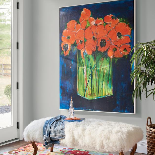
Hang art on the focal wall.
That’s generally the wall you see from the doorway. It’s what grabs the eye as you enter the room. It may be different from an accent wall that you painted behind the bed on a non-focal wall. The focal wall is visible from the door and it’s where your art will have the biggest impact. You can hang art elsewhere, but there should be something fabulous on that focal wall.

____________________________
HOW HIGH DO I HANG IT?
Rule of Thumb — 57″ on center
The biggest mistake I see is hanging art too high. On a plain wall, hang the art so the center of the piece is 57″ off the floor. That gives most people a direct eye-level look at the art when they are standing up. Like in a gallery. If you have to look up to see a single piece of art, it’s too high.
____________________________
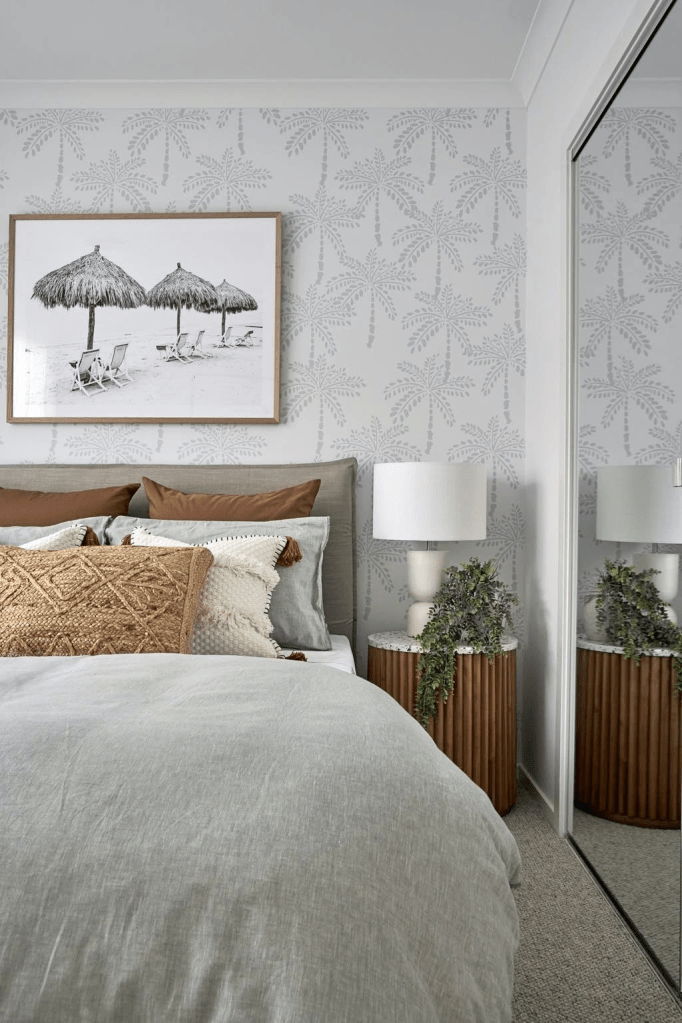
HOW HIGH DO I HANG IT OVER FURNITURE?
6-8″ from the top of the furniture
Another mistake I see often is art hanging midway in the space between the top of the furniture and the ceiling. It may be tempting to split the distance and hang the art there. But chances are good that the art will be too high. There should be some breathing room above the art or it will feel too big for that space. If it feels too big, move it to another location.
When hanging art over furniture, the 57″ Rule does not apply. In that situation, the bottom of the art should be 6-8″ from the top of the furniture, in this case the headboard.
____________________________
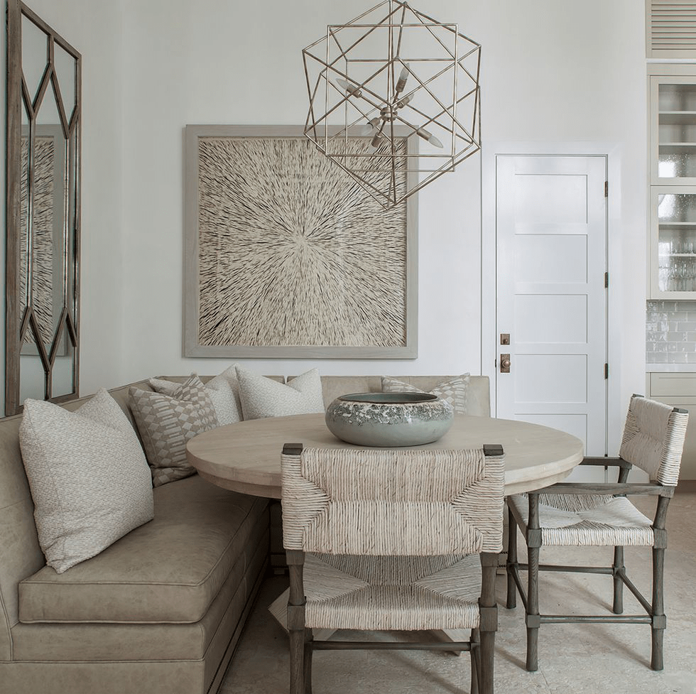
WHAT ABOUT IN A DINING ROOM?
Since people are seated in the dining room, the art is often hung a bit lower so that it is viewable by people sitting down at the table. If the art is hung too high in this room, it’s really noticeable.
____________________________
HOW FAR APART DO I SPACE THE ART?
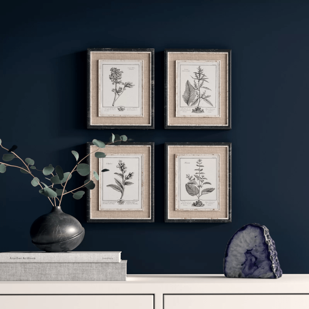
3-6″ at most
In a geometric grouping, when all the frames are the same size, it is important to keep the art close together so they are seen as a grouping and not as individual pieces. In terms of location on the wall, make sure the center of the grouping is 57″ off the floor. Doing a practice arrangement of the art on the floor will save putting too many holes in the wall. Measure twice, as they say…
____________________________
HOW DO I ARRANGE A RANDOM GROUPING?
On the floor first
Arranging and rearranging a grouping on the floor will help with later placement on the wall. I play around with the arrangement until I get one that pleases me. A couple of guidelines:
- Keep the same distance between pieces of art. This creates cohesion and makes the arrangement look like a grouping. It is not always possible, but to my eye it looks nicer.
- Avoid “rivers.” The long lines of space running horizontally or vertically without interruption between the pictures are called “rivers.” Avoiding them is an old high school yearbook rule for laying out photos. It stuck with me, and I do follow it. (The exception is when the grouping is geometric as above — all the frames are the same and are displayed in a grid.)
The center of the grouping should be 57″ off the floor.


____________________________
WHAT ABOUT DIFFERENT FRAMES AND SIZES?
Start with the biggest piece
For a large arrangement, spreading out on the floor will help a lot. Start with the biggest piece and work out and around from there. Remember that if there is a sofa below, leave 6-8″ between the top of the sofa and the bottom of the first piece of art. Notice how the two pieces on the far left line up on their right side. It is important to keep the distance between pieces the same throughout for an intentionally collected arrangement.

If you need help with color, feel free to comment below, hit the button for a Color Consultation, or shoot me an email at yourcolorcoach@gmail.com.
I would be happy to help you.
Hope you have a Colorful Day!
Barbara, Your Home & Color Coach
Going Big-Art Big
January 10, 2019 § Leave a comment
“Little stuff reads Clutter — big stuff reads Drama.”
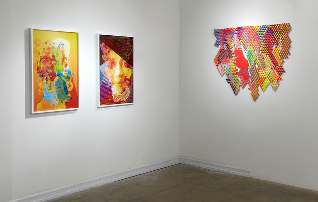
That is the mantra of a home stager, but the staging principle (what shows up best on camera) translates nicely into home decorating. That is not to say that you can’t have collections of treasures and portraits of the family scattered around your home, but going big successfully draws the eye and establishes the personality for the room.

Of course color does help! I’m enjoying the oranges and reds this cold winter morning, but contrast is all you need for major dramatic impact.

Go ahead. Make a statement!
Or create a serene backdrop for pared-down furnishings.

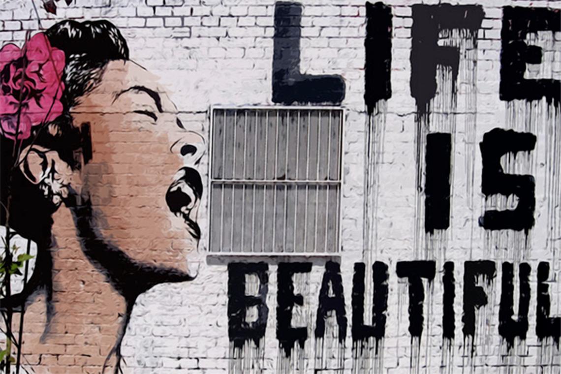
Or go for a wall mural — yes, big is back!

One caveat. Keep the furnishings in front of the art relatively simple for maximum effect. I’m about to install a piece of art that’s 60″ tall — can’t wait to show you the end result in my client’s family room.
Happy 2019 Everybody! I’ll be back with more color talk soon!
The World’s Favorite Color? Where Have I Been?
February 22, 2018 § Leave a comment

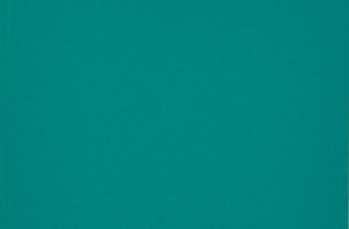
Late to the party here, but better late than never. At least that’s what I said to myself yesterday when I scrolled onto THIS beautiful hue and found out that it was crowned The World’s Favourite Colour. No great surprise since it represents some of the world’s most exquisitely beautiful treasures like Bali — an island so gorgeous its name alone sounds relaxing.
Last summer there was a questionnaire sent out — ’round the globe, as it were — to find out which color appealed to the most people. (I totally missed it! Arrrgh!)
“The competition organised by Hull 2017 UK City of Culture and paper merchant GF Smith invited people to select their favourite shade online by hovering over an infinite palette of shades with their mouse until they landed on the colour they found most appealing.”
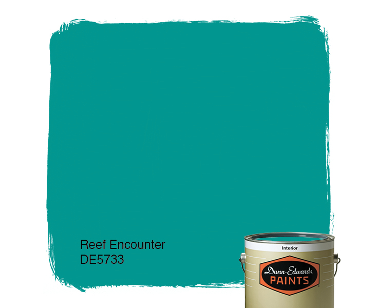
The winner was this rich teal that nature inspires and artists incorporate to capture the beauty that surrounds us.
The closest paint color approximation I could find was a Duron Paints shade, Sea Sphinx. 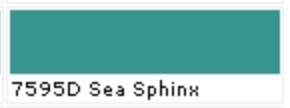
But there were others:

There are plenty of other ways to introduce the color into your decor — window treatments, accessories, and more art, of course.
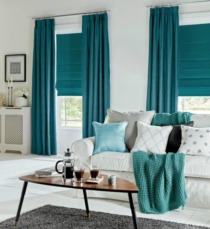
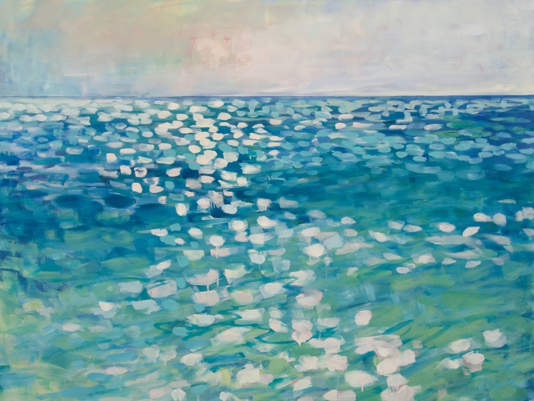
On an accent wall of Marrs Green, this art pops!
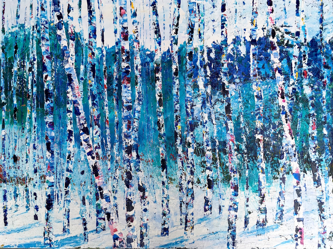
And so does this one!
Though I have blogged about “teal” before, I guess there’s a reason. It appeals to vast numbers of people worldwide. It is a little bit blue, yet a little bit green. It’s the warmest ocean color and a color that appears in natural gems and plant life. It is rejuvenating in all its forms.


")
It looks great with the full green/blue spectrum and all its values, and it forms a calm backdrop to pops of heat. Marrs Green — The World’s Favorite Color.
Don’t Let Your Art Fade Away
February 17, 2014 § Leave a comment
 Old faded jeans and old faded glory aside, old faded artwork in your house is a No-Go. If you have art prints that have hung on the wall in your bright cheery living room for several years, take a close look at them. Do they have a blue-green aura to them? Are flowers that used to be red sort of a strange blue? Is there any red or pink left in the piece at all? No?? Then haul it down. It’s done. Off to the recycle bin. Use the frame for something new that will add life to your room. Just this next time, opt for glass that will prevent color-fading. It’s more expensive but worth every penny if you love your art and prints.
Don’t be stubborn. Love your faded jeans, but get rid of your faded art.
