Color Your Home Happy
January 18, 2013 § Leave a comment
 Whether you live in a deluxe villa or a double-wide, you deserve a happy home. And the place to start is by adding color. Numerous studies have shown that color influences the way we feel and can even be used to describe our emotions (“I’m in a blue mood”).* But what may influence us the most is a lack of color.
The study found that people with depression associated their mood with the color gray. And you don’t have to paint your walls gray to have a gray aura in your home. Take a look around your house, in the corners and shadowed areas and particularly the ceiling. Do you see gray? Do you feel blah? Well then… time for color.
Start by painting your ceiling either a bright white or a tint of your wall color. That will either maximize the light reflection in the room (and bolster your mood) or make the room feel bigger and more open. Either way, you’ll feel better.
Next, if you’re timid about your color-selecting skills and afraid to make a mistake with the wall color, then start small. Add some colorful accessories to the room — pillows, artwork, other changeable items. Doing that will help you create a palette of colors you like without making a big investment or paying a painter to repaint two or three times.
When you’re ready to take the plunge and add color to your walls, try an accent wall first. Pick the wall that you see when you enter the room (the focal wall) and paint that a color you like. Add accents to the room in the same color to pull the room together. Keeping three walls neutral with pops of color on an accent wall and accessories here and there will help you step into the world of color without any Crayola catastrophes.
Note: There is nothing wrong with neutrals and whites in the home. To many people, neutral means calm. But if you are somebody who likes to wear color and you are drawn to color yet your home does not reflect that love of color, then it’s time to add color. That’s what I’m talking about.
*http://www.livescience.com/6084-colors-describe-happiness-depression.html
Making Sense of Color Trends
January 8, 2013 § 1 Comment
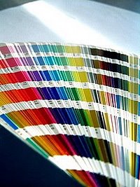
 Is anybody else’s head spinning as you look at the color trends for 2013 or is it just me?
When we look at the Benjamin Moore Color forecast, we clearly see pastels — a look refreshingly optimistic every few years after we finish huddling in our dark, cozy dens and want out. Here we see a pale yellow added tastefully to warm gray walls — a really soft, uplifting combo. (Lemon Sorbet 2019-60 is the Ben Moore paint color of the year if you haven’t already heard.)
The other color combos from Ben Moore introduce Dusty Mauve (2174-40) back into the mix (been a few years, like 30), in combination with Golden Straw (2152-50) and a soft navy (Evening Dove (2128-30). The other trends from Ben Moore show us more Coastal blues and greens (never out of fashion in my book), and more taupes and grays, a trend we have been in for a few years now. Here is a link to the Ben Moore colors and combos: http://www.benjaminmoore.com/en-us/for-your-home/trends-2013
And then there’s Sherwin-Williams. Talk about something for everybody…I’ll say. I wouldn’t call this a color trend. It’s more like a smorgasbord. 
We have the Vintage Moxie Collection, an Easter basket of colors to choose from including Radiant Lilac (SW0074) and Aloe (SW6464, the Sherwin-Williams Color of the Year).
Then if you’re still in a chalky-earthy color mood, there’s the Honed Vitality Collection including all colors we’ve been using already like Unusual Gray (SW7059) and Roycroft Suede (SW2842), both terrific exterior colors. http://www.sherwin-williams.com/architects-specifiers-designers/inspiration/color-forecast/2013-color-forecast/honed-vitality/
Sherwin-Williams went Peter Max with its High Voltage collection — Electric Lime (SW6921) and Feverish Pink (SW6859) are colors I would reserve for a pillow or a picture frame. Maybe a front door color if you’re so inclined. Yikes! http://www.sherwin-williams.com/architects-specifiers-designers/inspiration/color-forecast/2013-color-forecast/high-voltage/
Finally Sherwin-Williams offers the dark, moody, masculine colors for anybody who’s left. The Olde World Gold (SW7700) and Plum Brown (SW6272) are both terrific exterior colors as are most of this Midnight Mystery collection. http://www.sherwin-williams.com/architects-specifiers-designers/inspiration/color-forecast/2013-color-forecast/midnight-mystery/
What Sherwin-Williams has shown us with their lack of consensus when it comes to color trends for 2013 is that we are more diverse in our color likes and personalities than ever before. Pretty much anything goes. So paint what you love. If you are caught up in color trends, then stick to whites and neutrals for your walls and add pops of trendy colors in things like pillows, accessories of all kinds, and even front door colors. Things you can switch out easily when the next hot new trend comes along because who knows what the color experts will throw at us next year.
Choosing a Metal Roof Color
January 7, 2013 § 4 Comments
Just a pet peeve of mine, but I really do not care for a bright red metal roof on an old historic stone house. I know that some of my bias is regional–I’m sorry if I’ve offended anybody’s taste. But what I much prefer is a color that comes from the stone itself. What that does is blend the roof with the house and not call it out like a big old stop sign on a dirt road.
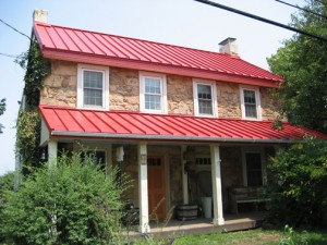

This photo shows a neutral option for a metal roof color. Perfect actually for the little stone house above.
If you are choosing a metal roof color for your home and you do NOT want to feature the roof as the focal point of the neighborhood, choose a color that blends or approximates a traditional roof color (grays, bronze, brown, charcoal, black). On the other hand, if you need people to find your house in a snowstorm, then choose a bright Crayola color and love it. Fair warning.
Return of the Gilded Age, Well Not Exactly
January 3, 2013 § 1 Comment

We have Downton Abbey, Princess Kate, and the popularity of all things English to thank for the resurgence of gold in interior design right now. At least that’s my opinion… And what a welcome sight it is.
After too many years degilding homes of anything that even hinted of gold, brass or yellow, the hue of royalty has returned.
The new interpretation, however, is decidedly fresh as we see in this living room from Traditional Home magazine. The wall color is so subtle that it accentuates even the creamy tan stripe on the window panel and the moldings on the ceiling. The gold demilune table and classic gold-framed art above it pop. As does the Chinese porcelain, as if pulled directly from the painting. Even the floor color is perfect, establishing a solid grounding upon which to layer all those beautiful blues and wheat tones.
The look is not your grandmother’s living room, with all due respect to your grandmother. Gold is nolonger shunned from updated decor.
Welcome back, gold.
Interior designer: Joseph Minton, with Paula Lowes and Michelle M. Wade
Black: Sophisticated, Modern, House Color?
January 2, 2013 § Leave a comment
Just like the LBD (little black dress), black houses are popping up all over and with predictably dramatic effect. The trend seems to be particularly hot in Southern California although I’ve seen it in Massachusetts too. Why black? Well, why not.
-Black as a house color fits into any neighborhood and certainly stands out from the myriad white, yellow, and beige houses already out there.
-Black looks terrific in the winter if you have snow in your area. We all know how dirty white houses can look even after a fresh snowfall.
-Black can make a small, insignificant ranch look modern and even spacious. Add a pop of bright color to the door and you have a stand-out in the neighborhood instead of a ho-hum been-done-before.
-Black, like white, makes any color look good. Imagine the opportunities for vibrant landscape color along the foundation of a black house.
-Black is a color to consider if you plan to paint your red brick rambler. If you’re tired of the tract house vibe, why not make a major statement.
When does black on the house NOT work? When it starts to fade unevenly and make the house look like charred remains of a terrible event.
If you decide to paint your house black, you must prepare to keep the paint fresh, the lawn mowed, the weeds pulled, the clutter corralled, and the driveway plowed because your house will create quite a sensation on the block. Nobody will drive by without noticing. And that’s kind of fun.
Bored with beige yet? Consider black.
Have a Colorful New Year!
December 31, 2012 § Leave a comment
Here’s one New Year’s resolution I just know you can keep. Add one piece of color to your life. Whether it’s a fresh orange pillow on the sofa, a bright red tape dispenser for your desk, a sunny yellow spatula for beside the stove, or one of these fun pops of colorful furniture.
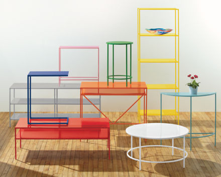
Why add color? So simple. Color can lift your spirits, soothe the beast, fire up the team, warm some hearts, and remind you of being a kid. And what a great way to start out the New Year.
Have a Colorful New Year Everybody!
What’s All the Buzz about Undertones?
December 28, 2012 § 5 Comments
Determining a beige color undertone (defined by color expert Maria Killam as “a colour applied under or seen through another colour”) can be tricky. Beige can have one of several undertones: pink, yellow, or green are the basics. If you have dining room furniture with a decidedly yellow/orange hue and walls with a pink undertone like Benjamin Moore’s Georgetown Pink Beige HC-56, then yikes, you have a problem. Off to the paint store.
Bottom Line: Mixing pink-beige with yellow-beige (or yellow/orange) is a big no-no. Fix: Choose a paint with a different (non-pink) undertone like Benjamin Moore’s Monroe Bisque HC-26 that has a yellow undertone and looks great with the golden oak.


If you avoid the mistake of mixing pink and yellow undertones, you’re on your way to understanding them. The other nuances of what undertones to mix and not to mix will come much easier. Note: Mixing pink and yellow vibrant hues is perfectly okay. It’s just the dreaded undertones that can trip you up. Beware.
Does Your House Welcome You Home?
December 18, 2012 § Leave a comment
Other than your golden retriever, what says “Welcome Home” better than an open, organized, well-lit, warmly decorated entryway. Isn’t it nice to swing open the door, hang up your keys, dock your cell phone, stash your purse, and find a free hanger for your coat? … That rarely happens, you say? Still tripping over sneakers and backpacks? Gotcha.
Well, how about a New Year’s Resolution to start with the entryway — whether you come in through the garage or the front door, it doesn’t matter. There are so many organizing ideas available now to help you customize an entry to fit your family and lifestyle. And although some require talent with power tools, there are many other options including stackable cubbies and DIY shelf systems that will tame the clutter.
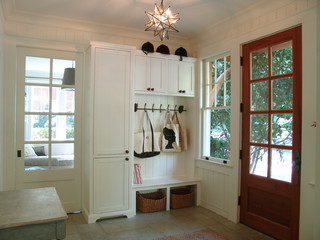
Light woods and white are wonderful in entryways that lack natural light. But if you have large windows, any favorite wall color will look great. Consider choosing an accent color from an adjoining room to give you the “flow” you’re looking for.
Before you tackle any other in-home projects this coming year, make sure your entryway welcomes you home.
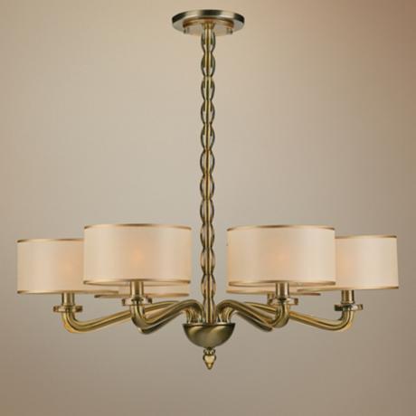
Getting Down to Brass Tacks about Brass
December 11, 2012 § Leave a comment
What a difference a decade makes. What used to be the lighting 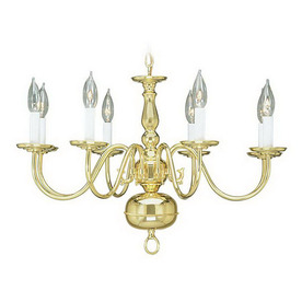 fixture of choice in upscale homes is now (still, even after several years out of favor) being tossed in a dumpster by young home owners who view the shiny yellow metal as the equivalent of how we viewed our grandmother’s dark brown paneling. Of no value.
Instead there are dozens of metal choices and finishes for lighting and other home accessories like light switch covers and doorknobs. So anti-shiny-brass are today’s home buyers that some are just shy of insisting that even all shiny brass door hinges be switched out to something else.
Note: these design trends may be regional and they don’t apply to historic homes so don’t panic if you love your brass chandelier and it fits your home’s decor perfectly. But If you are not happy with your shiny traditional yellow brass chandelier in your dining room or kitchen, you have three options:
1) Thumb your nose at metal color trends and simply wait for shiny yellow brass to come back in style. Kind of like you kept your go-go boots and bell bottoms from junior high. Yes, both trends came back around but not quite the way they looked in the late 60s. But still, doing nothing is always a design option.
2) Paint the shiny brass chandelier a different color. I once stood on a ladder, leaned over the dining table and painted my client’s brass chandelier first with a base coat of matte black to cover all the sheen and then a faux finish of browns and oranges to simulate a rustic bronze finish. It worked. The house sold.
3) Replace the old chandelier with a more current brass option like this one. The metal is toned down (antiqued) and the candelabra bulbs are covered with contemporary silk drum shades — a traditional yet updated look. Honestly, the antique brass has been around forever, and it went through a period of disfavor right around the time the shiny metal took over. But the muted finish, with updated shades, is back and looking good.
Neutral but Never Boring
December 10, 2012 § 2 Comments
Does your home scream 1972 when you enter the front door? Are you stuck with metallic wallpaper on the ceiling in the guest bath, orange shag carpet in the basement, or an avocado bathtub? Then maybe it’s time to update. But this time, instead of hopping on the latest hot new trend (I could name a few here, but I’ll resist), how about giving your home a classic re-do. Something that will stand the test of time, or at least a decade or two, without branding your home with a particular year. For that kind of longevity, we turn to a neutral palette, but neutral does not have to mean beige and it’s hardly ever boring.
-The key to a neutral palette is texture. You could have an all-white living room but if that white includes fuzzy white pillows, a shiny white marble table top, and some warm white chenille upholstery, then the room will have plenty of interest.
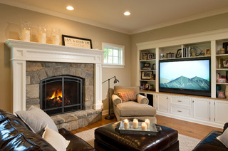
-Neutral does not have to mean just one color either. In this room, the walls are a latte color, the sofa is dark brown leather, and there is plenty of color in the books and objects on the white bookshelves. What makes this room work so well is that the stonework on the fireplace is a feature and because the other furnishings do not stomp all over the subtle colors in the stones, the room’s palette includes peaches and golds and grays and tans and taupes — more than enough colors.
-Neutral allows you to bring in color in the art, pillows, and other more temporary furnishings and accessories without clashing with a strong wall color and a brightly colored sofa.
-Neutral allows you to change your accessories with the seasons and the holidays without overpowering the existing color palette or the holiday decorations.
-And when you’re selling your house, neutral allows potential buyers to see themselves in your home and that is critical for a successful sale.
So as you choose tile and furnishings and paint for your newly updated space, consider neutral because neutral does not have to be boring.
