The Renaissance of Wallpaper: With a twist
September 17, 2012 § Leave a comment
 The first thing my husband did when we moved into our house many years ago was rip a long piece of wallpaper off the bathroom wall. “We won’t be keeping this,” he proclaimed. Well, I wasn’t planning to start a bathroom renovation that afternoon (I had to hide the ugly blemish with towels for months), but he certainly had the right idea. All the wallpaper came down eventually and was replaced with paint.
Many of us have visions of homes with old faded wallpaper and knick-knacks everywhere or rooms where every available inch of real estate was covered: ceiling, switch plates, wastebaskets– even the window treatments matched the wallpaper.
The rebirth of wallpaper that we’re experiencing, however, is far different from what you lived through in your grandmother’s parlor.
1) Contemporary wallpaper makes a bold statement either with color, texture, large graphic design, or all three.
2) The wallpaper is a feature of the room, like a piece of art, and not simply a wall covering upon which to layer a hodgepodge of family photos, diplomas, and other objects of interest.
And that’s the major difference. It’s more about what else is going on (or not) in the room and less about the wallpaper itself. Contemporary use of wallpaper involves a more judicious placement in areas like the focal wall in a foyer (as in the photo), the walls in a guest bath, the headboard wall in the master bedroom, and the walls above wainscoting in the dining room. The wallpaper is also selected to be the appropriate scale in the room (you won’t see so many little tiny pink flowers anymore). And the furnishings in a room with bold, contemporary wallpaper harmonize with it, both through color and fabric design and scale.
So be adventuresome. If you’re feeling like your room is just a little too blah, even after you’ve painted a fresh new color, try wallpapering an accent wall. Just for fun. Your grandmother would be proud.
From a Little Girl’s Room to a Teen Girl’s Haven: Navigating the Transformation
September 6, 2012 § Leave a comment
Decorating a teen’s room is way different from decorating a young child’s room, and I’m not just talking about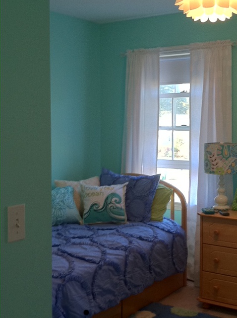 the comforter and the curtains. When you’re decorating a little girl’s room for the first time (when they’re really little), there’s not much push-back from her. She loves flowers, polka dots, pinks and purples. But as she grows older, she develops her own style and wants to do things her own way. As a decorator, we have to take that into account when we’re called upon to work on a young teen’s room. How to take her very strong requirements for her room and mesh them with the aesthetic sensibilities of mom and dad.
 This project is a prime example. The Before Photo shows a bedroom of many colors, stripes and dots in a fairly white room. As you can see from the swaths of color that she painted next to her bed, the teen living there was pretty much done with white walls. So that’s where we started. She picked a cool, vibrant blue-green that was a reflection of her personality (not her mom’s). From there, we found cornflower blue bedding (Pottery Barn) as well as some accent pillows and accessories to pull the colors together.
My major role in this project? To prevent color overload. The remedy? Adding white to the room to offer some visual relief from the intense hues. I found white tone-on-tone polka dot fabric for the window panels (custom-made), a white lamp with a lamp shade that pulled all the colors together (Pottery Barn), and a white fuzzy pillow for the bed (Pier 1). I also added the floral light fixture on the ceiling (Lamps Plus) — a great find for a teen room. The result was a room that all three of us (teen, mom, and decorator) could love.
Choosing House Colors: Gray-Blue?
January 24, 2012 § Leave a comment
 You do not have to look very far in nature to find a palette of coordinating colors from which to pluck your house paint chips. This time we’re looking at a glassy pond reflecting the blue of the sky. This blue, however, is not a primary saturated hue but rather a complex shade that has grays and greens in it as well.
 So going to the paint store, you’ll want to move toward the muddy gray part of the fan deck and find your blue there. Stay away from the clear Crayola blues or you will end up with a house color that may in fact glow in the dark.
Look carefully at the colors around the pond and you will find your accent colors. Autumn red for the door, dark woody brown for the front step treads, crisp cloud white for the trim, and pops of golden yellow for your flower pots.
With nature as your color palette, you cannot make a mistake.
Updating a Porch with Columns
January 10, 2012 § Leave a comment
 When it comes to exterior design elements, if it looks too big up close, it’s probably perfect. And that certainly applies to porch columns. Spindly toothpick posts do nothing for the overall curb appeal of a house except add busy detail (Victorian houses with turned porch columns are the reluctant exception).
If you are building a porch or modernizing the one you have, select a few oversized columns with substantial girth. Resist the well-meaning but uninformed little voice that says the columns are too big for the house. They’re not.
