How Do We Pick Colors?
May 23, 2018 § 1 Comment
We are attracted to colors that are pleasing to us, and nature provides the best inspiration. Color palettes are everywhere, but not everything we see is pleasing to the eye. Why do some colors whisper sweetly at us whereas others, when combined, seem to claw at each other for dominance?
As color enthusiasts, we are all familiar with the color wheel as the foundation of basic color theory and the resource for learning the characteristics of various colors (or “hues”) and which colors work together.

Hue Value: Besides the obvious differences between the colors in this rainbow wheel, one of the easiest characteristics to see is the value (whether one color is lighter or darker than another). Color professionals and other color lovers know this, but just in case… if we look at the second ring in from the outside, we can see that moving toward the outside of the wheel (adding black) makes the hue darker (a shade of the original). Moving toward the center of the wheel (adding white) makes the hue lighter (a tone of the original color).
Color Clarity: The clarity, whether a color is Crayola-crayon clear or kind of muddy looking, is another color characteristic that contributes to our particular color taste and definitely influences which colors go together and which ones fight.
Clear colors are vibrant and are used not only in packaging and advertising because they attract so much attention but also in some modern decorating and architectural color schemes.


On the other hand, the same color (green) when altered by mixing its opposite color with it becomes quieter and more subdued and can blend easily into a landscape. That’s why “grayed-down” colors work well on an exterior – at least for the siding (doors are a different story!).


TIP Mixing clear colors with grayed-down colors (especially if they’re in the same color family – say green) does not work. The clear color suddenly looks garish, and the grayed-down color suddenly looks dirty. It is probably one of the biggest decorating mistakes I see.
Undertone: One of the hardest color characteristics to identify is a color’s undertone, but every neutral has one. And what may on its own look like a simple beige or gray may actually reveal another color (for example, pink, green, yellow) when placed next to another color (or white).


In large quantity (like a floor), either tile above might read “beige.” But the tile on the left has a pink undertone, and the one on the right has a green undertone. It is important to decipher the undertones particularly in carpet, counter, tile, and other materials and avoid mixing undertones when you add fabrics, paint, and furniture, and other surfaces. The kitchen below is an expensive mistake.

There are whole books and courses on undertones alone. I refer you to Maria Killam who literally wrote the book on Undertones. Professional designers, decorators and color experts need to be very familiar with undertones before specifying color.
TIP Don’t Mix Undertones!
So How Do Colors Work Together Successfully?
Almost any color will look good by itself or mixed with white. But we don’t pick colors to stand alone most of the time. We choose color combinations. And that’s where the fun is – figuring out which color combinations work together and how to use each color effectively, whether you’re designing a magazine cover or a living room.
Using the color wheel again, here are some combinations:
A monochromatic color scheme is an easy way to decorate a room as it uses many different shades and tones of one color (hue) like you would find up and down a particular color strip in the fan deck.

TIP If you use a monochromatic color scheme, make sure that the clarity of the color is the same throughout. In the words of Maria Killam, “don’t mix clean with dirty.”
Complementary colors are opposites on the color wheel and they tend to have energy when they’re together. So using them in an application makes a big splash like on a magazine cover when you want it to leap off the shelf at you while you’re standing at the checkout counter.

Complementary Colors

More Complementary Colors

Analogous colors are side-by-side on the color wheel and tend to be either cool (blues and greens) or warm (red/orange/yellow).

Cool colors all used together actually create a calm feeling, and they are often used in high-stress settings like hospitals.

And what better color scheme when you want to generate warmth and draw customers into a hot coffee shop than to use analogous warm colors like pink and orange.


TIP When you are using an analogous color scheme, show those subtle color differences off by pairing with plenty of white! White makes colors pop!
Sharply contrasting colors like black and white provide the starkest contrast, but white with gray and a pop of vibrant neon can really look striking, both in packaging and in a room.


Neutrals are not always beiges and grays as you can see from this neutral living room, but they don’t always show up on a typical color wheel. Many of you may be in what we might refer to as the Gray Period of recent years (gray replaced beige of decades past as the neutral of choice).

TIP Add texture (nubby pillows, shiny metals, soft fabrics) if you decorate with a neutral color scheme to add visual interest in a room without a lot of color and contrast.
Whites — who knew — are so numerous that if you Google “shades of white” you get 982,000,000 results. So there are whites, and then there are WHITES. Unless you are painting an art museum interior, I suggest avoiding a chalky white for your wall color. That particular white is so vivid it practically glows in the dark.

TIP Choosing an off-white (a “white” that leans more toward a color like beige, gray, yellow, or blue) gets you more mileage and will age more gracefully than a pure toothpaste white.
Color trends may come and go, but it’s helpful to know why certain color schemes work and how to make adjustments in ones that don’t.
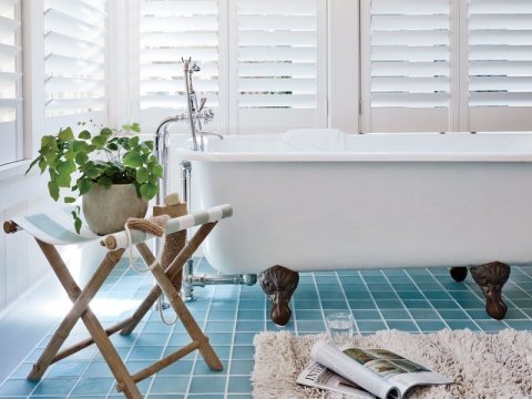
Beat the Blues with a Beach Bathroom
January 30, 2018 § Leave a comment

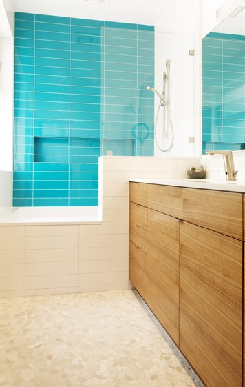
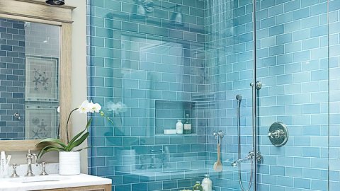
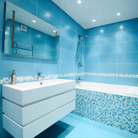
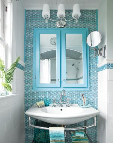
Nothing quite like a beach scene to distract from the snowflakes drifting by my office window. So here I am scrolling through photos of the most beautiful beaches in the world and dreaming of what it would feel like to be barefoot in the sand. Arguably one of the most beautiful of all of nature’s color combinations, there is something healing about blues and greens together. Not a big surprise.

But the funny thing (to me) is that I find myself thumbing through the part of the fan deck that I rarely use — occasionally for kids rooms — the bright clear Crayola colors. Maybe it’s a reaction to years of neutrals and grays upon grays, but my eye and my spirit are drawn to the crystal clear hues that one encounters about three feet in as you wade into the water. That color.
The rest of the palette is just as lovely especially all together. Whether you pick one as the floor tile color and another, maybe in a lighter value, for the walls, the combinations for color placement are endless.


Add in the the sandy white for bathroom fixtures, and the other colors for art and accessories, and voila.


A little splash of paradise in the privacy of your own home.
Houzz
Not-So-New Kitchen Flooring Ideas
June 2, 2014 § 2 Comments
 Kitchen floors always pose a challenge. Do we continue the not-always-practical hardwoods throughout or do we interrupt the flow with a more indestructible surface alternative? In this kitchen by Designer Sarah Richardson, she used a linoleum tile to create a colorful and durable floor to complement the light pastel blue and white palette. What we do not see is the adjoining room and how the two areas are connected.
Here is my rule of thumb:
If you have a small house, continue the hardwood floors throughout the downstairs public areas (living room, dining room, family room if there is one, and kitchen). That way, the house will appear larger and less chopped up into individual rooms.
If you have an old house (or a large one) with distinct room divisions, go ahead and select an alternative flooring that offers color or durability (although carrying the hardwood throughout is okay too). I recommend using the color palette to pull the public areas together so in Sarah’s case, the adjoining room would have some light blue in it. Mixing and matching within the color palette will create the feeling of a larger, more pulled-together house — even if the rooms are boxy and divided by walls and small doors.
Just like there are more options than granite and Formica for your kitchen counter top, there are now numerous exciting alternatives to wood and tile on your kitchen floor.
Home-Staging Tips That Help You Sell
January 17, 2014 § Leave a comment
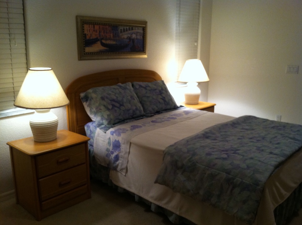
Tip 1: Make the Master Bedroom a cozy nest.
Remove outdated window treatments.
Dress the bed to look welcoming.
Add art above the headboard.
Make sure there is adequate lighting.
Tip 2: Clear the path to the room’s focal point.
Take away unnecessary furniture.
Remove dark window valances.
Rearrange furniture to feature focal area.

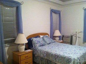
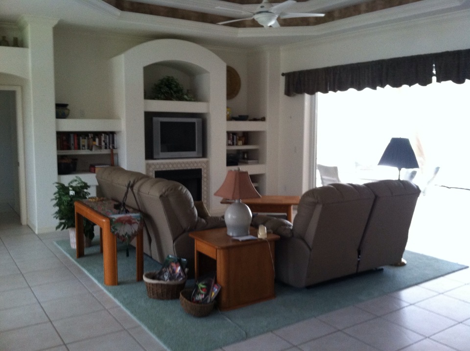
Tip 3: Remove styling that dates the house.
Less is more when you’re trying to attract young buyers.
Remove rugs to show off tile or hardwood floors.
Reorient furniture to add space.
Before shots:

Neutral but Never Boring
December 10, 2012 § 2 Comments
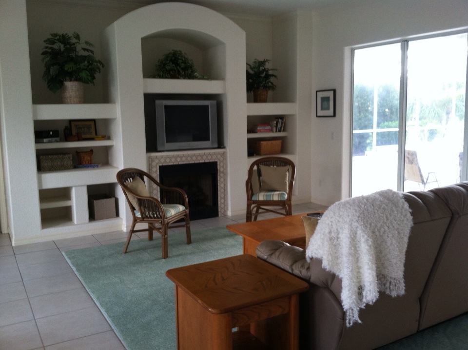
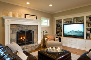
Does your home scream 1972 when you enter the front door? Are you stuck with metallic wallpaper on the ceiling in the guest bath, orange shag carpet in the basement, or an avocado bathtub? Then maybe it’s time to update. But this time, instead of hopping on the latest hot new trend (I could name a few here, but I’ll resist), how about giving your home a classic re-do. Something that will stand the test of time, or at least a decade or two, without branding your home with a particular year. For that kind of longevity, we turn to a neutral palette, but neutral does not have to mean beige and it’s hardly ever boring.
-The key to a neutral palette is texture. You could have an all-white living room but if that white includes fuzzy white pillows, a shiny white marble table top, and some warm white chenille upholstery, then the room will have plenty of interest.
-Neutral does not have to mean just one color either. In this room, the walls are a latte color, the sofa is dark brown leather, and there is plenty of color in the books and objects on the white bookshelves. What makes this room work so well is that the stonework on the fireplace is a feature and because the other furnishings do not stomp all over the subtle colors in the stones, the room’s palette includes peaches and golds and grays and tans and taupes — more than enough colors.
-Neutral allows you to bring in color in the art, pillows, and other more temporary furnishings and accessories without clashing with a strong wall color and a brightly colored sofa.
-Neutral allows you to change your accessories with the seasons and the holidays without overpowering the existing color palette or the holiday decorations.
-And when you’re selling your house, neutral allows potential buyers to see themselves in your home and that is critical for a successful sale.
So as you choose tile and furnishings and paint for your newly updated space, consider neutral because neutral does not have to be boring.
Which Came First? The house color or the foundation plantings?
October 1, 2012 § 2 Comments
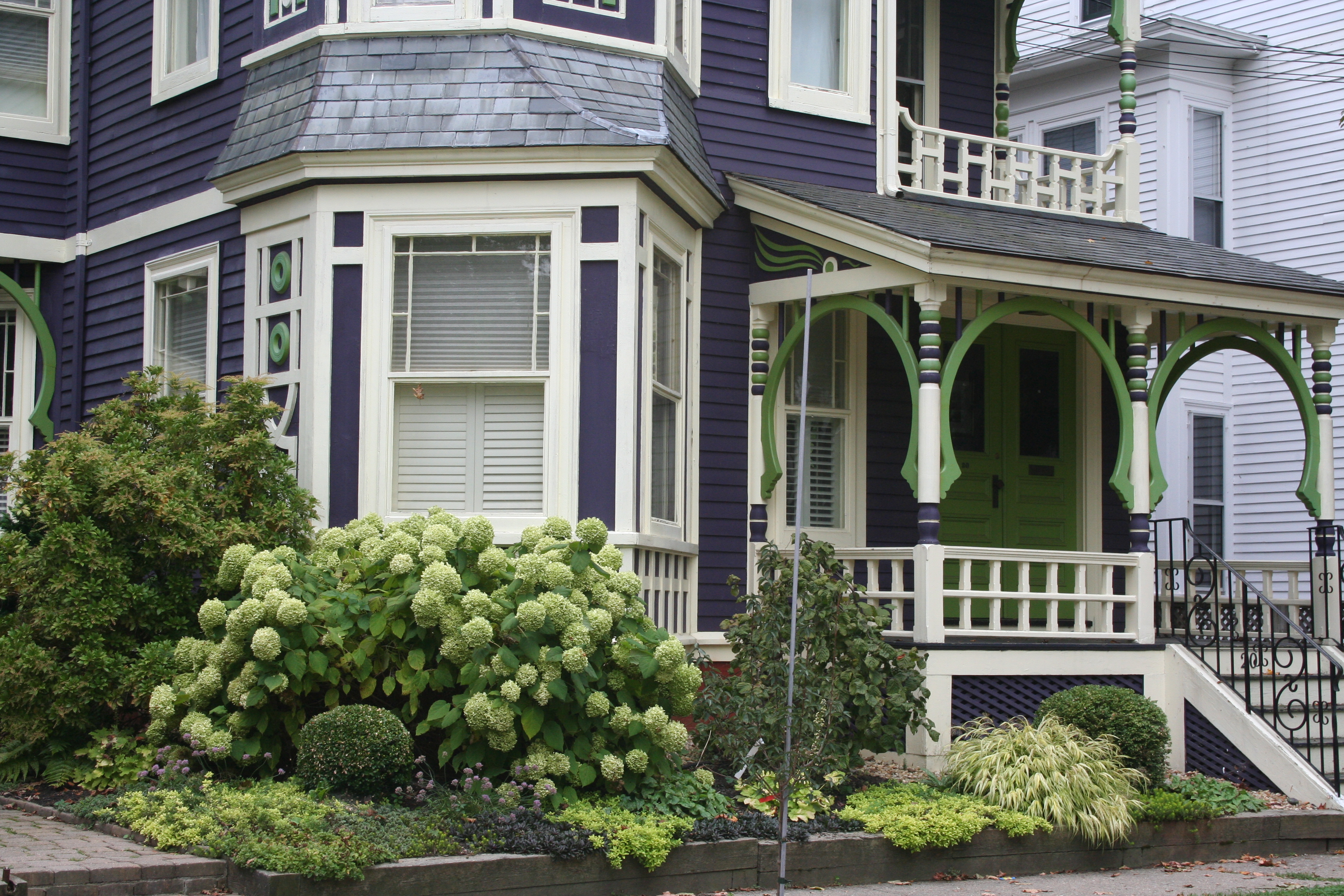 My guess? Neither. Take a close look at the roof, and the house color palette is revealed. The deep purples and greens of that slate roof present a palette the homeowners can use for their house: rich grape for the siding color tempered by a neutral cream trim and lime green for the accent color to highlight the Victorian embellishments.
But the homeowners did not stop there. To enhance the palette and spread the accent color out onto the landscape, they planted a gorgeous lime green Hydrangea coupled with other lime green plants, shrubs, and ground-cover species. Peeking out from under all that greenery is a purple flowering ground color pulling the whole look together.
Not to be matchy-matchy or anything, but this house rocks. There’s just enough contrast to keep our interest and show off the house detail without introducing new colors that might make the house too busy. Afterall, the house itself has so much detail that you wouldn’t want it to get lost in a rainbow of foundation plantings and annuals.
Bold, Beautiful and Blue Roof
October 1, 2011 § Leave a comment
 Some houses whisper. Some houses shout. This house sings opera! What makes this house so melodic is perfectly obvious to everybody who drives by. It has the most incredible roof and door color: a rich sapphire blue like you’ve never seen before except maybe in the Mediterranean. We’re certainly not accustomed to seeing that color on a traditional burgundy brick colonial, usually relegated to browns and charcoals (not that there’s anything wrong with browns and charcoals — I love them too).
This house tosses conventional color schemes out the window yet manages to look both whimsical and classy at the same time. It peeks out from behind big shade trees making it even more alluring to passersby. Like a secret garden around the corner, the act of discovery is part of the thrill.
The door color alone would be quite a find, but the fact that the roof is the same rich blue makes this house an opera star I want to discover again and again. Big applause!!
The “Accent Wall” is Back!
July 7, 2011 § 2 Comments
 Maybe it never really went away for some people, but for others the thought of an “accent wall” just screams ’80s. But you know, honestly, they’re not a bad idea… in some cases. Accent walls (I should dream up another name!) can take a large room and create a cozy nook, or a di
 ning area. Like this kitchen. The walls were a gray blue, and half of the large space was dominated by white cabinets and a slate tile backsplash. So we pulled some of the orange out of the tile and created an “area of interest” on the other end of the room. The color is Tucson Red (1300).
Using an accent color on one wall is also a great way to warm up a loft or other modern, non-descript space that needs instant architecture. We call it “color blocking” — yes another term from the high-fashion ’80s (I’m dating myself) — but it’s a terrific way to take a neutral, often white, space and add large pops of color. Instant focal point!
When an accent wall doesn’t work is when the room is too small or too square. Painting one wall a different color might just chop up the room too much. But if you have a long narrow room, painting the far wall a warm color will bring it forward visually and make the room feel less like a bowling alley and more like a well-designed, pulled-together space created by you.
Update Your Backsplash to Sell
June 17, 2011 § 3 Comments
 Honey onyx mosaic tiles — love ’em! We switched out the old ceramic backsplash in a “modern” kitchen (still had Formica counters with oak trim) and updated the look of the whole room (okay, we changed the cabinet knobs too). The white melamine cabinets, Formica counter tops, and linoleum floor all stayed! It was a wonderful transformation for a minimal cost to the homeowners who were updating to sell.

We chose the onyx for its variety of warm colors (would blend the oak trim nicely), its scale (the small tiles would add interest to the plain white cabinets), and its ease of installation (mosaics require fewer cuts!). The biggest benefit? These tiles came from one of our prominent “big box” stores so the homeowners did not pay a lot for materials. A bonus when you’re preparing your home for the market!

