Creating a Neutral Living Room
May 29, 2007 § 5 Comments
Neutral doesn’t need to be blah. A neutral color scheme can have color, from tans to greens to blues to light yellows. The big difference between “neutral” and other color schemes is that neutral schemes do not use accent colors that are opposite on the color wheel. For example, in a room with sage green walls, a complimentary color scheme might include a red chair or red pillows on the sofa whereas a neutral color scheme would replace the complimentary color with texture.
Another difference between a neutral scheme and other designs is that neutral rooms tend not to have a mixture of lots of large patterns. Neutral schemes do not want to attract particular attention to one piece of furniture but create an overall restful look.
When you are creating a neutral living room:
- Add Texture. If you are keeping a monochromatic color scheme, whether it’s beige, white, green or blue, you need to create visual interest in the room. And texture is a great way to do that. By adding nubby pillows and a soft mohair throw on the sofa, woven wood blinds on the windows, and a sisal rug on the floor, you have added various textures to the room and created not only tactile but visual interest. The textures stand out against the neutral backdrop.
- Keep your large furniture pieces solid. A large flowered, multi-colored sofa does not lend itself to a neutral color scheme unless the pattern is tone-on-tone (various shades of the same hue). The fabric on the furniture can have lots of texture, however, and even a small pattern. But the sofa needs to read as one color when you stand back. Keeping the large pieces in a solid color allows for maximum versatility. You won’t get tired of them either.
- Use colorful artwork as your focal point. Instead of using color in your furnishings, let colorful art attract all the attention. Just like an art gallery has white walls to highlight the color in the artwork, a neutral background is ideal for featuring an art collection in your living room.
- Add color with your accessories. As a decorator, it’s really fun to use a neutral color scheme and add color with pots, baskets, art, vases, flowers, candles, and collectibles. Then you can change the color with the seasons or when you get tired of it. I like to have winter pillows and summer pillows. My winter pillows are a red Ralph Lauren floral print (kind of stuffy but warm) and my summer pillows are beige and light yellow striped with fringe (fun and carefree looking). And with my neutral living room, I can change the accessories as new colors come into fashion. Much cheaper than redoing the living room every few years.

Consider neutral when a) you’re selling your house (neutral schemes allow buyers to see themselves in your home); b) you live in a small house without much light (a monochromatic color scheme will make the room appear larger); and 3) you like to change your mind about color frequently (instead of repainting and recovering the furniture every few years, change out the accessories only). Neutral color schemes never go out of style. You can add to them and subtract from them as your tastes and home interior styles change.
Color Combos that Add Drama and Curb Appeal
May 25, 2007 § Leave a comment
Whether you are choosing a landscape palette to coordinate with your house colors or giving your living room a fresh kick, contrasting colors give that punch of color that just says Wow.
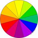
The colors that are opposite on the color wheel are complimentary — they offer the most contrast and add the biggest pizzazz to your decorating scheme. We already know that adding blue-and-green pillows to a blue sofa will make the colors blend, but adding orange pillows to the blue sofa will make those colors “pop.” And the same is true when you’re planning your front yard landscape.
For example, if you have a blue or blue-gray house with a black door and want to add some drama and curb appeal, consider focusing on oranges and orangey yellows (like Stella de Oro daylilies, for example) in your garden. The complimentary colors enhance each other and make both the house and the garden stand out.
If you have a brick house, the green plantings are really going to stand out. I would suggest using a mixture of greens including some of the yellow-green shrubs (like a jade barberry) and the yellow-green hosta to enhance both the garden and the brick.
If you have a yellow house with a black door, a hot pink rhododendron bush in the front yard will look smashing. You don’t have to use the exact color that is opposite on the color wheel. You can use the colors that are on either side of the opposite color. You’ll still get contrast and a more sophisticated palette.
Use your front door as your inspiration. If you’ve chosen a contrasting color for the front door of your house, say a rusty red on a louisburg green (Ben Moore HC113) house, carry that color into the front yard with a red azalea, a burning bush, and a bed of red tulips.
If you’ve chosen a lighter green house (like prescott green, Ben Moore HC140) and a dark purple door, add a beautiful lilac bush to your yard and other purple shrubs and flowers. This latter color scheme does not use contrasting reds to go opposite the green but adjacent (analogous) colors in the blue and purple family. Although the contrast is not as dramatic, coordinating the landscape and door color still makes an eye-catching curb appeal. The key is to choose plants that bloom at different times so you have continuous color in your yard.
The English garden look with a variety of colors in the garden is traditional and quite lovely. But if you’d like real drama in your front yard landscape, consider sticking to just one color family in the garden. My sister-in-law has a stunning totally blue garden with every kind of blue and blue-purple flower mixed with white flowers to bring out the color. White always enhances color, inside and out.
If your house is white, you have free reign of the color wheel. But my best advice is to select flowers and flowering shrubs that have the same color intensity instead of mixing the bright flowers with the pastels. If you stick with either all bright or all pastel, you can mix all the colors and create a spectacular landscape.
Just a little color planning that extends from the house, trim, and front door colors to the landscape plantings will give your yard that finished designer-inspired look.
Choosing a Tasteful House Color
May 7, 2007 § 66 Comments
I do a lot of driving. And as a decorator, what I find myself doing for much of the time is looking at house colors and analyzing them. From Upstate New York to Massachusetts, I’ve seen everything from spearmint green to black. Some colors really work and by that I mean that they draw your eye to the house and the surrounding landscape, but they allow your eye to move on. Other colors draw your eye directly to the house colors themselves and you don’t notice anything else. And you find yourself staring at the color and wondering, “What were they thinking!!”

Here’s what I suggest when it’s time to choose an exterior house color. This is particularly important if you’re selecting permanently installed siding as you’re stuck with the color for 20 years or more.
1. Look at nature. If you live in Florida, nature gives you everything from wonderful pastel shell tones like light pinks and peaches to bright hibiscus reds. And the sky and ocean provide the cool side of the palette. So when you’re choosing a house color, select colors that you see in your surroundings. A bright coral house in Florida looks perfectly acceptable because the color appears naturally in that environment.
If you live in Wisconsin or Vermont, however, that’s a different story. Nature in the north gives you earth tones like browns and olive greens and rust and even black. Spearmint green really stands out against a backdrop of evergreens and that’s not a good thing. So when you’re choosing a house color in New England, choose a color and a hue value that appear in nature. That would not include bright turquoise but might include a grayed-down slate blue like Benjamin Moore’s Jamestown Blue (HC-148).
2. Look at your neighbors. It’s the reverse of “keeping up with the Joneses.” You do not want the same house color as your next-door neighbor even if he stole your favorite color.
3. Respect history. If you live in an old house, choose a color that might have appeared on the original. There are many colors in the historical palette, but there are several that are not. When in doubt, stick with the tried and true historical palette, such as Benjamin Moore’s HC colors. This tasteful array of hues suits most homes, especially traditional style colonials, old or new. Richmond Gold (HC-41) looks great with black shutters and cream trim. And the greens, such as Louisburg Green (HC-113) blend beautifully with natural surroundings.
4. White works. White homes have a presence, a traditional elegance that fits in many historic areas. But in the winter, they either get washed out or they look dirty gray. White works if you keep up with the paint job and keep the house’s exterior clean. Be sure to add color with your door and landscape plantings. And black or dark green shutters.
5. Victorians follow their own rules. If you live in an old Victorian home, do some research and discover all your color combination options. All rules of conventional taste can be broken when you’re highlighting the detailed trim on an old painted lady.
6. Where to use purple. There’s an old brick house in Cambridge, Massachusetts, with a dark purple metal roof and dark purple front door. The combination is quite stunning. Purple is great as an accent color on front doors, wreaths, and landscape plantings. A little purple can go a long way, but used carefully, it’s a great color.
7. Blend or be seen. The bottom line for house color is to decide whether you want your house to blend tastefully with the others in the neighborhood or stand out as the focal point on the block. If you decide to go off the natural palette and opt for a crayola-bright color, consider using that hue for a door color or some other accent instead of the house color. You’ll make just as big a statement and stay within the realm of good taste.
One more thing. House color is important to your children. When I was away at camp one summer, my parents painted our house orange with green shutters. (Orange was supposed to be gold but the paint store messed up and my parents did not have the color sense to stop the presses.) Horrified is the word to describe my shock when I returned from camp. From that point on, my house was known and identified around town as “the pumpkin house.” Don’t do that to your children!
Follow the guidelines and select a paint color for your home that will show your good taste and make your home look its best.
