Brick Historic House: Trim, Shutters, and Roof Made Easy
November 1, 2010 § Leave a comment
 For those of you with historic brick homes, you cannot beat crisp white trim and charcoal black for your shutter color and roof. Forget about updating your shutters and installing a new multi-colored, dimensional roof. Basic black and white may seem blah, but honestly, good taste and traditional styling are never boring.
Express your own creativity in your landscaping. Keep the plantings symmetrical around the front door to coordinate with the symmetry of your formal house design, but add color and variety of shapes and sizes. Another tip: if you do not want to match all the window treatments on the inside of the house (even though it does look spectacular on a house like this), then at least have matching white lining on the curtains, white sheers, or plantation shutters. Mixing things up with a rainbow of window colors just ruins the formal look.
Living in a historic home is not for everybody. There’s a certain expectation — I’ll talk about informal living in another post… but for now, viva la tradition!
How Bold House Colors Can Work
September 30, 2010 § 2 Comments

 What is more refreshing than a creamsicle — that delicious pairing of tangy orange with smooth creamy vanilla! That’s just how I would describe these two houses — absolutely luscious!
Although we don’t often see orange as a house color, the addition of creamy gray-white either as trim color or as part of the architecture makes the combo work. The result is warm and happy without going off the color charts of good taste.
The stucco example here is a house turned patisserie on the grounds of Versailles in France. The other example is a modern home, one of the creative designs by Victoria Mohar of MoharDesign in Somerville, Massachusetts. It is so refreshing to see creative color combinations that work and that push the house color envelope a bit.
If you’re introducing a bold color into your exterior color scheme, pair it with a well-respected neutral, like creamy vanilla. The result will be refreshment for your neighborhood.
Paint Color and Home Staging
September 7, 2010 § Leave a comment
 Decorating a house and selling it are two different things. Although the original rich yellow paint color created a warm and cozy kitchen feeling, warm and cozy in real estate jargon translates into small. And when it comes to kitchens, it seems, the bigger the better.
To show this kitchen to better advantage, we chose a calmer paint color that created less contrast with the ceiling color. That little trick raised the ceiling in the room and created a more open feeling — translated: bigger. Other than removing a piece of art from the wall and replacing a couple of light bulbs, no additional changes were made to the room.
So although you may feel that the kitchen lost its personality when the paint was neutralized (and neutral doesn’t mean beige — more on that in another post), creating a neutral palette allowed the actual selling features of the room to come forward: shiny hardwood floors, solid wood cabinets, large decorative window, center island with cooktop, updated lighting. You get the picture…
Banish Old Brass with Paint
August 5, 2010 § 6 Comments
 Brass will be back at some point, but there are lots of alternative metals on the market these days that make shiny, brassy… well… brass seem really dated and ordinary. I see these brass candelabra chandeliers everywhere. I even had one in my own home until I decided I couldn’t stand it anymore.
 I suppose I could have replaced it at relatively low cost, but then I would have to take it down, etc, etc. I decided that the quickest fix was to paint it. So I got my tallest ladder, moved the table out of the way, and primed the brass. All of it. Then I gave it a coat of matte black acrylic paint. (I was liking it better already.) I then drew on the inner artist somewhere in me to apply several different colors: dark brown, burnt umber, lighter brown, in kind of a faux finish of sorts to make the finished product look more like oil-rubbed bronze (my version).
I even painted the little candlesticks a creamy yellow, found leather-like chandelier shades at my local home improvement store, and used a scrap of fabric for a chain cover. There. All set — I love it. Time to put the ladder away.
If you have old lighting in your home, you can either replace it or paint it! Just remember when working with lighting of any kind, turn off the power first!
Top Three Tips for Selling Your House Fast
August 4, 2010 § 1 Comment
 This house sold with multiple offers at the Open House. (Incredible in this picky buyer’s market.) What made this house stand out and what can we all take home from this experience? Here are three top tips:
1. When in doubt, move it out. Although this property had some big things going for it (location, location, location), the family had lived in the house for twenty-plus years and had accumulated not only their own trappings but also lots of odd furniture and artifacts from deceased relatives. This happens to many of us. What do we do with all that stuff? The answer is clear when you’re trying to sell your house: move it all out.
At the first visit, we tagged items that needed to go — things like extra side chairs and small tables, worn furniture, family photos, large area rugs, antiques and breakables — and we left each room with furniture that would identify the room’s function to buyers. The reasonable and highly motivated homeowners then made many trips to a storage facility to clear the decks and let the house “breathe.”
2. Open the door, fix your floor. Remember that old adage, something like, if you want to know if a fellow is well-dressed, look down? Well just like polished shoes, the first thing buyers notice when they open the front door is the floor, and if yours is covered by old, worn or stained carpeting, uh-oh. In general, carpeting is out. Buyers are looking for hardwood floors and tile, both of which provide easy maintenance and no safe haven for dust allergens. If you have hardwoods covered by large area rugs (like these homeowners did), congratulations! Simply roll up the rugs, buff up the floors and go “Cha-ching!” If you have wall-to-wall carpeting, don’t panic. Have it professionally cleaned, and that will help.
3. Make it sunny, welcome the money. You’ve undoubtedly heard this before, but it’s worth mentioning again. The message here is lighten and brighten. This house had dark rooms with rich wall color and heavy window treatments. We lightened the wall color and opened up the windows by removing the heavy drapes and replacing them with airy sheer panels that framed the windows but did not block the light. The result in this family room? An ahhhh feeling.
If you are overwhelmed by the prospects of preparing your house for the market, talk to your realtor. He or she will find you the help you need to get the job done quickly so you can have that “Ahhhh feeling” too!
Light and Color and Your House Paint
July 31, 2010 § 3 Comments
Sometimes color appears out of nowhere and dazzles you — even for only a few moments — like it did the day I snapped this photo in the late afternoon sun. The yellow of this barn grabbed my attention and said, “Stop where you are and look at me — I am gorgeous!” A few moments later, the barn was in shadow and the intense color was gone for another day.
When you’re choosing a house color, be sure to paint some sample colors on the house and look at them in various lights — early morning, late afternoon — and on cloudy days as well. You may see the color change. That might be a good thing or maybe not. I once watched my living room color change from tan to gray to green to pink all in the course of a 12-hour period. To a color person like myself, that experience was horrendous. I had the primer out within the week. (The color I painted my living room was taupe — the mysterious color that accepts other hues around it and changes like a chameleon. Some people actually like that — I have clients who do — but not so much for me at least on the interior.)
Color depends on light. And light or the lack of it can change your perception of the color itself. What you thought was one color in the paint store or even when you opened up the can turns out to be quite something else once it’s applied to your wall, whether it’s inside or out. Use your sampling time to see how light affects not only the color you’ve chosen but also the “value” of the color (how intense it is). If the color attracts too much attention for your taste, move more toward the gray side of that particular hue. Dull it down a touch and you’ll get it right. Color will be more intense on a large area anyway, like the side of your house. Check it out first before the painters arrive.
Choosing a Roof Color for a White House
May 7, 2010 § Leave a comment
 Choosing a roof color these days can be overwhelming with all the choices available to us. We’ve gone from classic black and charcoal to every shade of brown, red, green, and even blue. This white house with navy blue shutters looks spectacular with its multi-hued, architectural style blue roof. It really stands out in the neighborhood lined with browns and charcoals. And with a white house, adding a little color to the roof (at least on this house) certainly adds interest without going overboard.
If you have a white colonial and want to replace your roof with a metal style, I suggest sticking to the darker, more traditional colors. A metal roof adds an air of informality (and a touch country) to the house itself so keep that in mind when you’re selecting a roof style. Nothing wrong with metal, but you won’t want to attract too much attention to it if you have a traditional metropolitan house. If you live in the country or the mountains, anything goes!
Choosing a Door Color for a Historic Home
May 6, 2010 § Leave a comment
 Sometimes there’s absolutely nothing more dramatic than a bright, cherry-tomato-red front door. Instead of a more conservative black semi-gloss, the homeowners of this gray limestone with white window and door trim, wrought iron railings and lampposts, and concrete steps have punctuated their predictable historic facade with a splash of red right off the vine!
No need to wave a flag for guests to know where to ring the doorbell. The entry boldly exclaims, “Welcome Home!”
Nice choice!
House Color, Trim, Shutters: Gold Medal Combo
April 7, 2010 § 2 Comments
 The unexpected color combination on this historic home (now a B&B in Sackets Harbor, NY) really pops off the street. Whether it’s the hint of green in the gold siding, the Jamaican rum-like warmth of the shutters, or simply the combination, I’m not sure. But coupled with cream trim and accents of black, this combination is a winner.
The house color looks like Ben Moore’s Marblehead Gold (HC-11), and the shutters look like a slightly darker version of Copper Kettle (1218). I should have rung the doorbell to ask (I’ve been known to do that).
The stone steps unfold seamlessly from the foundation right onto the sidewalk and the delicate scrollwork in the iron railing ties in beautifully with the sign and even the shutter “dogs.” And for those of you who have asked about using cream window trim with white windows, here’s a great example of how nicely it works.
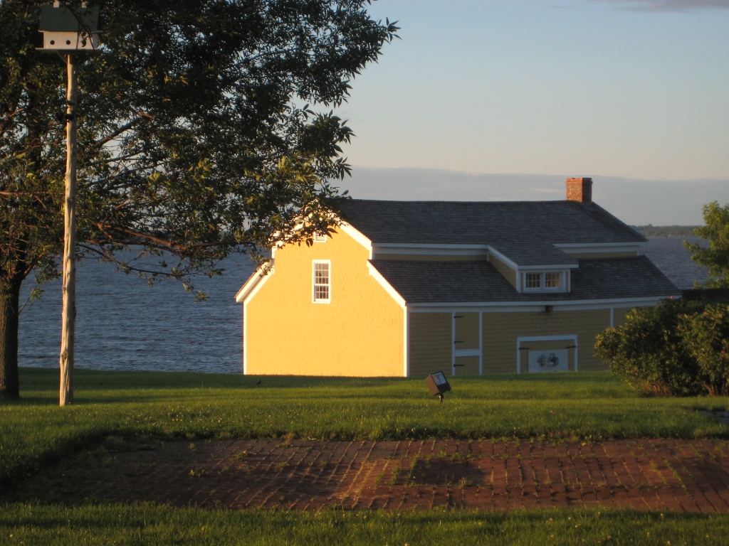
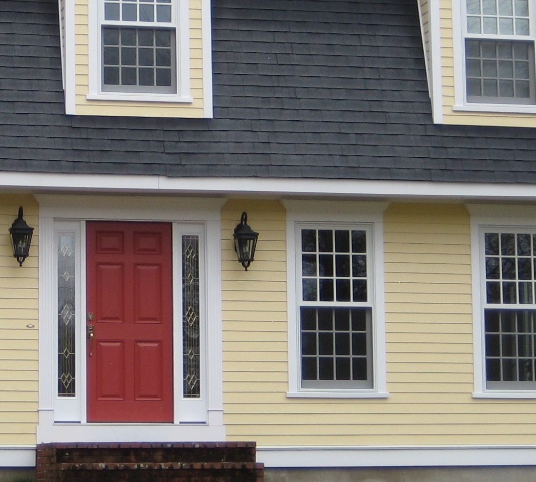
Choosing a Yellow for Your House Color
March 25, 2010 § 6 Comments
 Yellow can be a tough color, ranging from almost orange to acidic green. This one, Traditional Yellow (170) by Benjamin Moore, gives the house a cheerful, welcoming look. It’s terrific with crisp white trim, a dark charcoal/black roof, wrought iron metal for lights, and a striking red door. The yellow has just enough orange in it to be warm without turning peach.
Yellows that have green undertones tend to look cold on traditional homes. What we commonly refer to as lemon yellow has a touch of green in it, enough to make you pucker when you see a big house that color. Having said that, if you love the green side of yellow, consider pairing it with dark eggplant purple. The combination is a bit edgey and modern but can work, again with a black roof and white trim.
