Crown Molding: A Crowning Achievement or a Hot Mess
July 15, 2011 § Leave a comment
 If lighting is the jewelry in the room, the crown molding is like a proper hem — no stitches showing. Crown molding covers the seam between wall and ceiling and adds weight and architecture to the room. And by drawing the eye upward, crown molding can create the framework for painting the ceiling something other than white. But done improperly, crown molding will lead to painting miscues and a hot mess.
I ran into just such a situation today on a high-end new construction job. The carpenter had “built up” the molding by using a couple of inches of wall between the crown at the top along the ceiling and another cheaper piece of finish molding along the bottom edge (photo shows how it’s supposed to look). The idea was to make the finished unit (crown + wall + smaller molding — all painted trim color) look like a giant (read: expensive!) piece of crown molding. What happened was that the carpenter did not finish the edges at the doorway leaving wall space exposed. The painter then came along and, not having a finished piece of molding to serve as the starting point, he (or she) drew a LINE on the wall with a pencil and started painting wall color on the other side of it. Oh…my…gosh… and this was high-end construction??
So two warnings:
If you are using crown molding, make sure you get an experienced carpenter who has the sense to finish edges. If you’re putting it up yourself, do your research first and know how you’re going to go around corners and finish edges properly.
If you are painting a wall, you must have a piece of architectural molding or the wall edge in order to move from one color to another. Never draw a vertical line on the wall to separate two colors unless you’re painting stripes. That’s it!
Phew! ‘Nuf said…
The “Accent Wall” is Back!
July 7, 2011 § 2 Comments
 Maybe it never really went away for some people, but for others the thought of an “accent wall” just screams ’80s. But you know, honestly, they’re not a bad idea… in some cases. Accent walls (I should dream up another name!) can take a large room and create a cozy nook, or a di
 ning area. Like this kitchen. The walls were a gray blue, and half of the large space was dominated by white cabinets and a slate tile backsplash. So we pulled some of the orange out of the tile and created an “area of interest” on the other end of the room. The color is Tucson Red (1300).
Using an accent color on one wall is also a great way to warm up a loft or other modern, non-descript space that needs instant architecture. We call it “color blocking” — yes another term from the high-fashion ’80s (I’m dating myself) — but it’s a terrific way to take a neutral, often white, space and add large pops of color. Instant focal point!
When an accent wall doesn’t work is when the room is too small or too square. Painting one wall a different color might just chop up the room too much. But if you have a long narrow room, painting the far wall a warm color will bring it forward visually and make the room feel less like a bowling alley and more like a well-designed, pulled-together space created by you.
Can I Paint My 1960s Ranch?
June 21, 2011 § 3 Comments
 The answer is yes! With the growing popularity of the spray-painting technique for painting houses (not just lawn furniture anymore), it is becoming easier to paint over rough, textured surfaces like brick and get a good result in a reasonable amount of time.
Check out HGTV.com for some great before-and-after brick house projects. In one show, “Curb Appeal: The Block,” the designer John Gidding takes a paint sprayer to an old ’60s ranch and brings it into the new millenium.
Check with your paint store first, of course. And you might want to hire a professional painter to avoid over-spraying into your neighbor’s driveway (not a good thing…). But if you have a brick house with a) zig-zag-patterned brick; b) really obnoxious brick colors; or c) just tired, run-down plain old red brick, then get inspired! Paint will give your house a fresh new look!
Kitchen Decisions
June 15, 2011 § Leave a comment
 And you thought picking a paint color was hard? Try a kitchen renovation. The number of decisions that have to be made seemingly all at the same time is daunting to even a seasoned renovator. What kind of cabinets? What color? What style? How many? Where to put them? What stain? What knobs? And that’s just the cabinets! Okay… before I get carried away, here’s an example of how the homeowners and I managed the decisions on their renovated kitchen.
The first decision was to pick the cabinets: white painted wood with a shaker-style door. They knew they wanted white because it was classic and would brighten up their small kitchen. Pewter knobs would be the jewelry. They also picked out their appliances: stainless steel. Next came the counter top and that’s when they called me into the project. We discussed concrete, honed granite, and soapstone and settled on soapstone as it had a nice finish and seemed appropriate to the age and style of the home. Shiny granite was out!
The next decision was what to do with the floor. They had hardwood in the adjoining living room but considered tile for the kitchen area because they had heard that it was easier to clean and was okay in wet areas. All true. But I convinced them that carrying the wood all the way through from living room to kitchen would widen the entire space and give the area a more continuous feel.
The backsplash was the next item and both homeowners wanted color. They just could not agree on what color and which material to use. I warned them that glass might be a little trendy for their brick-fireplaced kitchen and suggested they look at slate. The colors are natural and earthy and very appropriate for a slightly more rustic look in the kitchen. At the same time, the white cabinets really make the wonderful palette of earthy colors pop off the counter! The slate also looks terrific with both counter top and stainless!
Lighting was next with some recessed cans with LED fixtures around the perimeter and under-cabinet strips for task lighting, a couple of pendants over the eating areas, and a creative track system of lighting above the island. Track lighting is back! In a big way! And its flexibility makes it appealing — you can maneuver the spots anywhere you’d like them and you can change them too!
 Wall color was last on the list of decisions. We went with a rich red-orange accent wall on the other end of the kitchen by the dining area — to create a warm dining space and give the homeowner the red she craved. The rest of the walls are a gray blue that picks up on the tile and coordinates well with stainless and white.
Kitchen done. Just in time for a relaxing summer!
Door and Trim Colors: What to accent
May 18, 2011 § 8 Comments


Choosing an accent color for your house is easier than you might think. If you’re starting with a neutral house and want to add a pop of color, first consider where you want to see that accent color. These Florida homeowners wanted to liven up their drab gray home so they chose a bright blue and highlighted the trim with it (below). They kept the front door white. The result? The house was outlined in blue, which made the house seem smaller, and the builder-white door looked like it had just been installed. (In fairness to the homeowners, this was an experiment! They weren’t crazy about it either!)
What we suggested was that they paint over everything blue with a lighter gray to soften the edges and make the house seem bigger. Then we gave them a few ideas for the front door color, including a buttery yellow — a terrific accent to gray. The warmth of the yellow simply lights up the front entry, and the accompanying yellow pots and greenery finish off the look.
Your front door is the place to start when you’re applying an accent color. The whole idea is to draw your visitors to the entry and welcome them in!
What Color Is It? Really…
February 26, 2011 § 2 Comments
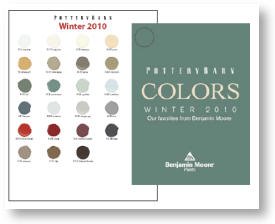
You’d like a Pottery Barn-approved Benjamin Moore color from the Pottery Barn fandeck to update your color scheme. So you pick a nice rich color like Bittersweet Chocolate 2114-10 for the entry hall — with a name like that it’s got to be a rich chocolate brown, right? Well not so fast.
After painting a couple of coats on the wall, you notice that it looks like a dark eggplant purple when the sun shines on it. Hmmm… what is going on here? So you head back to Ben Moore to take a look at their fandeck that has ALL the paint colors and their related shades and tones. And voila! The lighter tones of Bittersweet Chocolate are decidedly purple with names like Hint of Violet 2114-60 and Victorian Mauve 2114-50. And that explains why the color Bittersweet Chocolate is not what we might think of as dark chocolate brown.
When you pick a color from a paint chart that does not contain the shades and tones for that particular hue, the best way to find out what color you’ve REALLY chosen is to:
1) Find the color on the big fandeck and check up and down the strip of shades and tones. You’ll see what that underlying hue is.
2) Also check the color next to a bright white piece of paper. The true hue should pop out even better.
Colors also change with the light. So there’s nothing quite like painting a sample board and sticking it to the wall in the area you want to paint. Check the color at night as well as on a cloudy day. Once you’re satisfied that you like the color all the time, then go ahead and paint away!
Long-Distance Decorating! From the US to Iraq and Back!
February 15, 2011 § 2 Comments

 It’s not every day I receive a phone call from Iraq to work on a house in Atlanta but last April I did. The guy on the other end of the line had started renovating a house for his mother and was making all the decisions long-distance. Imagine that! Working with a builder on a house renovation is a challenge when you’re on-site — but from thousands of miles away? And for his mother? I was intrigued.
After the builder chose an unapproved yellow for the new addition (see Before Photo on right), my “soldier friend” (as I call him) was not pleased and asked me to come up with a new color scheme for the exterior. And we did not stop there. By way of blog posts, emails, photos, and occasional phone calls, we moved on to porch, shutters, and even the garden shed. Then we moved inside to make paint color decisions, choose light fixtures, and decide how to update the kitchen and bathroom. He sent me photos of options he found online and I gave my advice.
From Iraq to Boston to Iraq and on to Atlanta. The power of the internet is making long-distance decorating possible.
P.S. His mom loves what we’ve done so far! And she loves her son! Success!
Adding Smart Color to Any Room
February 9, 2011 § Leave a comment
Spring is coming and are we ready! It’s time to add color to our homes. But before you drag all your furniture to the middle of the floor, take down all the artwork, and dash off to the paint store for a can of Chivalry Copper SW6353 or Chartreuse SW0073, stop! Think about how you want to add color to your room, especially if it’s a trendy new color hot off the pages of STIR Magazine (www.swstir.com).
If you are the type of person who loves to dive into a color trend head first and is not daunted by the idea of switching it all out when the next trend rolls in, then you are all set. But if you are the type of person who desperately wants to update your room but you are not planning to update again for many years, then I’m really talking to you.
Adding smart color to your room means painting the walls and installing tile and other architectural materials in a color that will stand the test of time and hold up to upcoming color trends without making your house look dated. Remember Harvest Gold? Avocado Green? How many of us are stuck in houses where the owners put a color trend into a fixture that would need to stay there for 20 years??
Here’s a way to stay current or get trendy in a smart way. Put the color in the items and materials that can be changed easily later. In this bedroom featured on the BHG site in a piece by Debra Wittrup (www.bhg.com/decorating/color/schemes/cozy-color-schemes-for-every-room), the designer painted the walls a warm taupe– flexible and adaptable to almost any color scheme. Then the wonderful melon color was added in the window panels, the lampshade, the pillows, bed linens, and accessories. If the home owner gets tired of melon, out it goes to be replaced by another fun color scheme with relative ease.
Now, granted paint is cheap and relatively easy to switch out, but trendy paint colors can also be applied to small pieces of furniture, like a wooden table or chair, instead of the four walls of your room. Accent walls are another way to add smart color to any room without the hassle and expense of a complete overhaul.
Enjoy color! Be smart about it!
Banish the Blues with Uplifting Hues
February 4, 2011 § 1 Comment
As I ran around my house the other day screaming, “I need natural light!” I was reminded of the adorable card I received awhile back with an 8-year-old’s words of wisdom captured creatively by © Kate Harper Designs. Could such a simple suggestion for getting yourself out of the winter doldrums be expressed more eloquently? BTW, you’ll love Kate’s whole collection — check it out at http://kateharperdesigns.com/.
 Just like the lack of natural light in the winter can affect our moods, so can color. And of course, color and light (or the lack of it) work together.
The other morning as I turned the lights on again in my living room for yet another dreary gray wintry day, I glanced at the wall behind the sofa one last time. That’s it! No more dark and dramatic — I cannot stand it any longer. I dashed to the garage for the can of primer and rolled away my winter blahs. What a transformation! All of a sudden the room felt lighter and brighter and amazingly enough, so did I!
The same thing happened when I moved my office into my son’s old north-facing bedroom. The wall color he had chosen was rich and cozy and cave-like — we even painted his ceiling to create the mood he requested. It worked for him since sleeping in there did not seem to be a problem. But for me? Forget it. I tried adding lamps and task lighting, but the dark walls drove me nuts. Again, I dragged the paint primer from the garage, threw down a drop cloth and primed over the entire room from ceiling on down. Unbelievable — we went from cave-like to cathartic in one afternoon!
The lack of color in a room can be just as depressing as colors that are too dark without adequate light. Anyone who has builder-white walls will note that the white turns to gray in the shadows. And although gray is the new beige for neutral wall color, if it’s not for you, then paint it out!
Warm yellows like Ben Moore’s Sweet Butter (171) will certainly brighten your day. And fresh springy greens like Folk Art (528) will liven up a gray-green that’s bringing you down. Add a little Sea View (836) to a piece of furniture in your room and you’ll think you’re on vacation! I painted the walls in my new office a whisper of yellow called Marble White (Ben Moore 942) and voila! Let there be light!
So if the winter blahs have you feeling blue, take the greeting card’s sage advice and paint yourself (or your room) a different color. Since our homes are extensions of ourselves, then it makes perfect sense that brightening our spirits may be as easy as picking a different wall color. It worked for me!
Can I Paint My Ceiling Dark?
January 22, 2011 § Leave a comment
 Next time you’re in a large restaurant or a public building, look up at the ceiling. If it’s like the one in this old library in Nashua, New Hampshire, it’s dark. Of course, this ceiling is three stories high. The effect of the dark ceiling is to bring it down visually and make the enormous space seem a little cozier to us way down on the floor.
The same is true in a room in your home. If you have a large space with a high ceiling and particularly if the ceiling really feels too high, then painting it a dark color will square out the room and make its dimensions seem a little more homey.
Unfortunately, if you have a 7-ft ceiling in a bedroom, a dark ceiling might make you feel like you’re the batter in a waffle iron. Cozy is not quite the word to describe that effect. So I recommend a lighter tint for smaller rooms. You can still move away from the white ceiling, but just use a tint of the wall color (10-30% of the full-strength hue). Or use a coordinating tint — something you pull from the bedding or other accent pieces. Using a tint on the ceiling will highlight any crown moulding you have in the room and will unify the color scheme.
Caution: because the ceiling is horizontal and does not get much light shining on it, any color you choose will appear darker up there than it does on the paint chip. Try a sample board first before tackling the ceiling job — a neck-breaker and mess-maker, for sure!
