My Old House is Just Not Me
August 20, 2008 § 25 Comments
Many of you have a modern aesthetic. You like clean lines, unfussy details, neutral colors, and minimal furnishings. You probably should have moved to a downtown loft space, but you are now part of suburbia. You write in that you’ve decorated the inside of your new home to reflect your taste, but the outside is a disaster.
If you are stuck in an exterior from another era when brick facades were popular and split levels were all the rage, or if some weird architectural detail haunts your house, the easiest and cheapest solution is to paint. For example, if you now own a split level with one-half brick and the other half siding, it’s okay to paint the house all one neutral color to modernize the appearance from the street and actually make the house look bigger since it’s no longer broken up visually.
NOTE: If you own a home that is either listed on your town’s historic register or is in an area of period homes, then do not alter the exterior except to maintain its historic value. Chances are that if you live on the main street in your town and have purchased an older home, the town’s historic commission has already contacted you — they will tell you exactly what you can and more importantly cannot do to your home. Before you renovate the exterior, be careful of “upgrading” to cheaper materials, styleless features, and “modernizations” that will come back to haunt you when you try to sell.
Changing a color palette, however, may be a relatively safe way to modernize without destroying the home’s history. If you live in a colonial but have modern tendencies, you can reflect your modern taste in your house color palette. Choosing three or even four colors off the same paint chip for your siding and trims or painting your house and trim all one color reserving a vibrant shocker for the front door can give even a “boring” (to some) old colonial a modern personality.
Bring Your Summer Vacation Home: How to Achieve the Cottage Style
August 18, 2008 § Leave a comment
If you own a cottage or rent one somewhere, you know what the cottage style is all about: old painted furniture, vintage fabrics, mixes of woods and different styles of furniture. It’s all about care-free and comfortable living because that’s what vacations are for.

To bring that feeling and more importantly the lifestyle home with you, all you need is a relaxed attitude about your furnishings. Instead of upholstered furniture that warrants surveillance when your children and their friends are around (say nothing of the pets), just invest in some washable custom slipcovers. White is actually best since you can always bleach out the jelly stains if necessary. Cover the expensive sofa and chairs and just feel your blood pressure lowering. You’re relaxing already. And who says wicker is just for porches. A good coat of spray paint will freshen up even the most weather-beaten wicker and make it presentable for your living room.
If you haven’t inherited a cellar full of old furniture that would be perfect for your new relaxed cottage look, then let the furniture hunt begin. Plan what you need, of course, to avoid coming home with impulse purchases, but start the search for the perfect old coffee table, end table, console, buffet, china hutch, whatever you need to create your cottage lifestyle. Visit consignment stores, yard sales, thrift shops, and flea markets. The point is: If you like the piece and it fits, then buy it. If it fits and you don’t like the look, buy it anyway and paint it.
Cottages are typically dumping grounds for old furniture that’s replaced in the permanent home. And to make the furniture look better, it’s often painted. Time and wear rough up the edges on these cottage relics, but you can recreate the look with paint and some sandpaper. You don’t want things to match. Furniture and other items are acquired over time, sometimes decades, so if the piece has a function, it works.
The best part about the cottage style is how comfortable your guests will be when they visit you. No pretense. No uncomfortable questions about where to sit. Your home will feel warm and inviting to everyone.
Updating Old Furniture
July 17, 2008 § 9 Comments
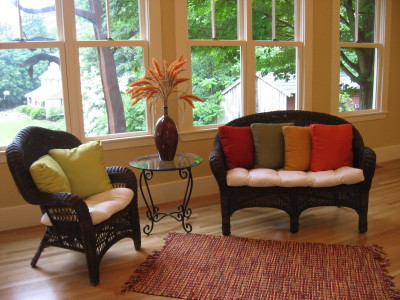 I love a bargain. And if I can get something for free, all the better. I got this wicker settee from a friend moving to a city condo and the chair was a consignment store find. Both original pieces were not so great-looking. The chair was a dingy “white” and the settee a pretty banged-up natural wicker. All it took to update this furniture was two cans of dark brown spray paint and a tarp to cover the grass in the backyard. Within an hour, the furniture had been rescued.
For cushions, I used an inexpensive cotton (even covered some buttons) and splurged on a few new pillows.
Don’t overlook old furniture that can be spruced up with a little elbow grease. It’s really fun and rewarding to take what might have gone to the dump and make it fresh and usable again.
Reviving Old Furniture with Wall Color
May 13, 2008 § 16 Comments
 Do you have a sofa from the 80s that looked great back then but kind of looks sad at the moment? Of course, you can slipcover it, but how about punching up the color behind it. We took a living room with blah beige striped wallpaper and pastel patterned upholstery (in good condition) and brought it to life with a soft blue-green paint color (Benjamin Moore’s stratton blue HC-142) and some new pillows. What a difference. All of a sudden the sofas looked intentional and the room came alive.
The trick here is to pick a wall color that is rich but subdued. You need a greyed down shade for this effect to work. Otherwise, a bright wall color might just make your furniture look even older. But a nice tasteful splash of wall color will give your furniture a few more years of life. And in this age of recycling, re-purposing, and reusing old stuff, it’s all about making what you have work.
Before you drag your old furniture off to the consignment store, try painting your room.
Garage Doors Have a New Look
February 13, 2008 § 41 Comments
 Garage doors rival the front door for attention these days as the look of the garage door becomes increasingly sophisticated and worthy of notice. This particular garage door even has lights trained on it to show off its beauty at night. Who could imagine that the old standard garage doors whose plain and often tennis-ball-dented faces needed camouflaging would be replaced by such distinctive architectural specimens.
Having said all that, please note that if you have one of these carriage doors or plan to get one or two or three, go ahead and show them off. But if your garage still has the garden variety garage door, you are best to paint it the house color with trim color around the outside and refrain from highlighting it. Continue to focus all eyes on your front door.
Adding Unexpected Color to Your Home
January 9, 2008 § 16 Comments

Next time you feel inspired to add color to your home, consider painting the stair risers on your front staircase. Usually they are painted white, a nice contrast against the wooden stair treads, but how practical is that. It doesn’t take long before the riser is all scuffed up with black shoe marks going up the stairs. Why not solve that problem by painting the risers a different color, something darker that will hide the shoe marks but will coordinate with your decor.
You can take a color out of the tile in the entryway or borrow the color from an adjoining room. Either way, the stairs will become a more important feature in your decorating scheme and yet another place to add some unexpected color to your home.
Spring Decorating: Whatever You Like
January 7, 2008 § 17 Comments

Those of us in the decorating business are already studying the spring color schemes and it seems that almost anything goes. We’ve got Barbara Barry’s new soft green and beige palette, a very subtle sophisticated combination similar to the ice blue/chocolate combination we’ve enjoyed over the past few years.
Then there’s Pottery Barn’s red walls with white furniture and bright yellow, orange, and lime green accents, a flashback to the ’70s but with a twist.
Chocolate brown is still hot, and this year we’re adding bold patterned furniture and pillows in place of the textured neutrals of yesterday.
One color that’s making a comeback is dark teal. I’ve seen it paired with burnt orange this time in a strikingly rich paisley fabric from Calico Corners. The look is rich and perfect for a big upholstered chair in a study. I never thought I’d welcome back teal, but it’s looking good.
Ceilings are getting color in a big way this year. Check out the cover of HOME magazine (shown above). They’re showing bright lemon yellow walls and a robin’s egg blue ceiling. I think we’re coming out of our shell, so to speak…
Looking further into the magazine, we find REALLY brightly colored walls of grape, kelly green, classic royal blue, and canary yellow. What makes these colors work is their pairing with bright white. Very crisp and fresh.
White kitchens are back as are white living rooms, again paired with bright accents. There’s just nothing like white for a clean look — people seem to love it.
The organic neutrals are still in, though, especially for more traditional homes so don’t throw everything out. You can always update your look with new accessories like pillows and lamps. But once again, we’re seeing styles and colors for spring that can fit most everyone’s tastes and that’s a good thing.
More soon.
Creating a Peaceful Space
October 6, 2007 § 14 Comments
 Sometimes you just want to relax. Whether it’s in a bedroom, a master bath, or some other special place like this library, there are times when you want to enter a room and just say Ahhhhh. When planning that relaxing space, start with the wall color. This room is Gentle Gray (Benjamin Moore) and it reads a very soft blue that is picked up in the carpet color, window shades, and pillows. To add to the earthy Zen feel yet create some warmth, we added a chocolate brown sofa and chair cushions. The texture on the sofa makes it cozy and the silk pillows add some sheen. We topped off the space with satin nickel and glass accents for some sparkle. We kept the accessories spare to avoid visual clutter.
The big tip for creating a peaceful room is to choose colors that are soothing to you and avoid too much contrast that is jarring to the eye. Use texture to add interest instead of bright colors and you’ll have a space you can collapse into at the end of the day.
