Farmhouse Kitchen Renovation
August 3, 2010 § Leave a comment
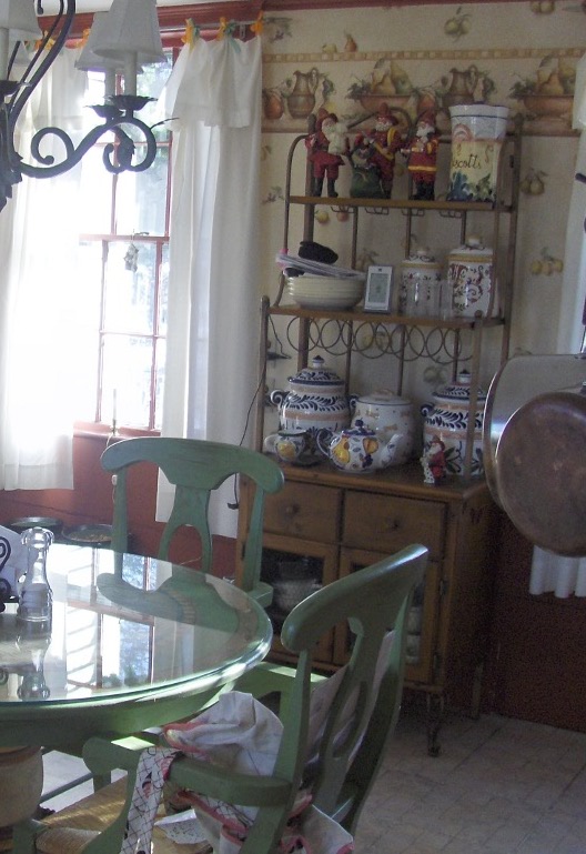
 This historic New England farmhouse kitchen posed a challenge to the homeowner when it came time for a remodel. How do you update your kitchen while keeping with the age and style of your home? You cannot simply drop a slick granite countertop into a kitchen whose bones date back to the mid-18th century.
With its layers upon layers of early architecture and more recent updates, the de-construction was bound to expose some surprises, but plans for the new kitchen proceeded. Since the homeowners are gourmet cooks, the appliances were purchased first. Form follows function in a busy kitchen where every weekend welcomes a different group of dinner guests.
The design team, which also included a local kitchen designer and the homeowner who is an artist, went through the wish list and created a floorplan that incorporated everything. The gas range took center stage followed by a bake station, double ovens and a large farmhouse sink. The round table and chairs were replaced by a sizeable peninsula with food prep station and leather-seated bar stools for guests. We chose soapstone for the countertops in keeping with the period and kept the woods and tile in natural tones with minimal contrast to make the rather small kitchen appear larger.
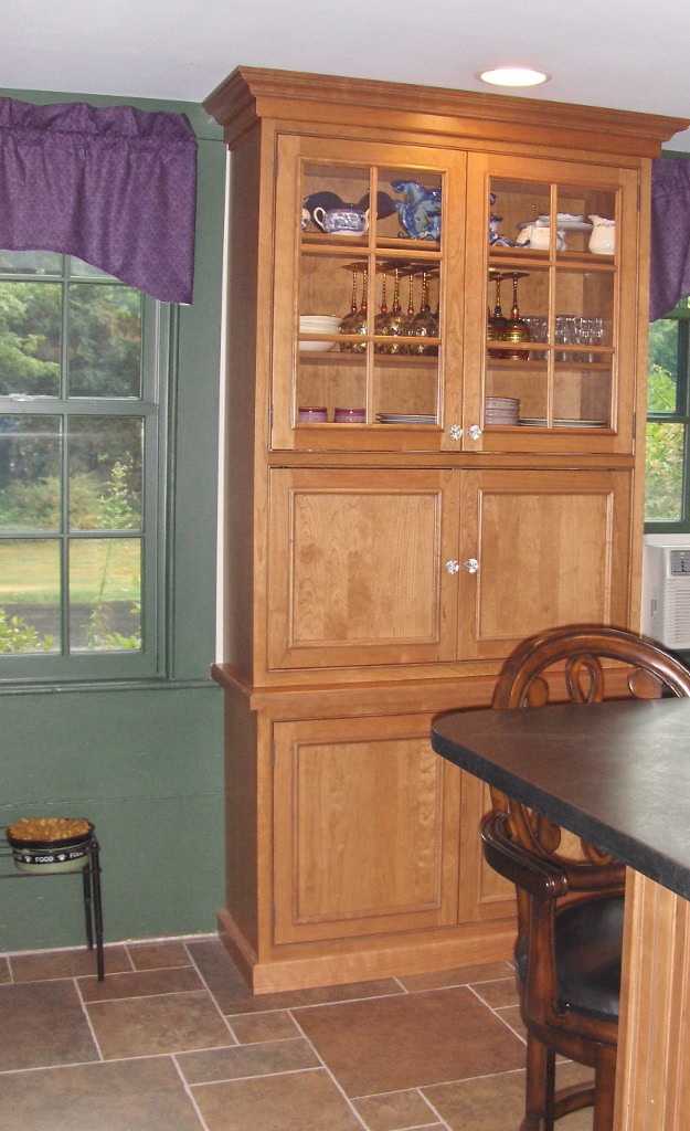
 We brought the forest green and grape accent colors in from the wallpaper in the adjoining family room to create flow between the back-to-back rooms, and we added a built-in cabinet to replace the free-standing piece that housed collections and other kitchen clutter. The clean lines of the new cabinet also helped to enlarge the space.

 The updated kitchen, even with all its bells and whistles, manages to maintain the old early American character found in the rest of the house and provide its homeowners with a much more efficient and workable space for cooking and entertaining.
Light and Color and Your House Paint
July 31, 2010 § 3 Comments
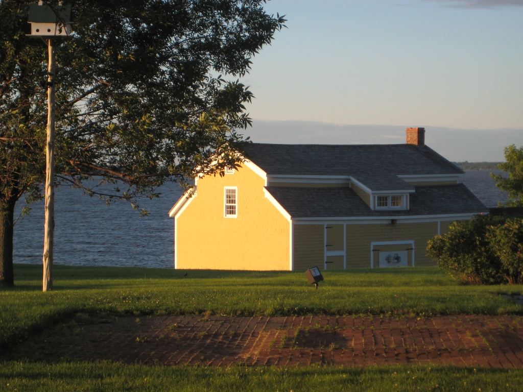
Sometimes color appears out of nowhere and dazzles you — even for only a few moments — like it did the day I snapped this photo in the late afternoon sun. The yellow of this barn grabbed my attention and said, “Stop where you are and look at me — I am gorgeous!” A few moments later, the barn was in shadow and the intense color was gone for another day.
When you’re choosing a house color, be sure to paint some sample colors on the house and look at them in various lights — early morning, late afternoon — and on cloudy days as well. You may see the color change. That might be a good thing or maybe not. I once watched my living room color change from tan to gray to green to pink all in the course of a 12-hour period. To a color person like myself, that experience was horrendous. I had the primer out within the week. (The color I painted my living room was taupe — the mysterious color that accepts other hues around it and changes like a chameleon. Some people actually like that — I have clients who do — but not so much for me at least on the interior.)
Color depends on light. And light or the lack of it can change your perception of the color itself. What you thought was one color in the paint store or even when you opened up the can turns out to be quite something else once it’s applied to your wall, whether it’s inside or out. Use your sampling time to see how light affects not only the color you’ve chosen but also the “value” of the color (how intense it is). If the color attracts too much attention for your taste, move more toward the gray side of that particular hue. Dull it down a touch and you’ll get it right. Color will be more intense on a large area anyway, like the side of your house. Check it out first before the painters arrive.
Brick Tudor Siding, Trim, and Roof Color
July 27, 2010 § 6 Comments
 Brick is one of those design elements that people either love or hate. Well over half of the questions that come to me have to do with brick: How do we work with the brick? How do we pick a siding that goes with the brick? What about roof color and brick? Can I paint my brick? How can I possibly live with this brick?
Here is a photo of an early-last-century, Tudor-style home with the signature brick gabled entry and chimney. The brick is monochromatic (not a lot of contrast between individual bricks), and it is a very pleasant dark muted red color.
The new homeowners chose an olive green siding color which complements the brick and makes it stand out as a feature on the house. (That works great if you like the brick! I’ll address what to do if you hate your brick in another post.) The muted olive siding color balances the muted red of the brick so that the house elements are in harmony (a fancy way of saying “They just work!”). Even though the windows themselves are white, the homeowner chose cream for the trim color. Cream is much softer than white and is preferable to white on older homes or with earthy palettes. And see? You can use cream trim with white windows and not ruin the house.
As for the roof, obviously this is a new roof and the homeowners took advantage of the myriad choices available to them. The muted brown tones pick up on some of the browns in the brick and again pull a very visible element of this house — the roof — successfully into the palette.
Traditional wrought iron sconces and mailbox as well as period hardware on a solid wood door provide the perfect jewelry topped off by a real, not plastic, concrete urn on the front steps for summer flowers.
These homeowners took an old home and modernized it in a tasteful way that pays homage to the home’s original Tudor styling. The result is both fresh and historic. Perfect house synergy.
A Window to Paris
July 12, 2010 § Leave a comment
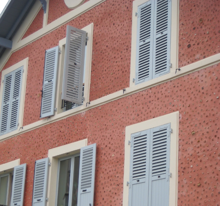
 The windows in Paris are almost as intriguing as the doors! First of all, the shutters actually work, the windows have no screens, and there are no bugs! Plus the shutters are fabulous soft colors of whites and taupes and light blues. The soft colors against the stucco and stone are simply spectacular. Not a black shutter anywhere to be found. I’m thinking that there may be room for more shutter colors in the palette — even on this side of the pond! Why limit ourselves to dark colors!


For stucco and stone homes, consider the subtle sensibilities of French architecture and the superb use of color on shutters. Tres bien!
Choosing a Door Color for a Historic Home
May 6, 2010 § Leave a comment
 Sometimes there’s absolutely nothing more dramatic than a bright, cherry-tomato-red front door. Instead of a more conservative black semi-gloss, the homeowners of this gray limestone with white window and door trim, wrought iron railings and lampposts, and concrete steps have punctuated their predictable historic facade with a splash of red right off the vine!
No need to wave a flag for guests to know where to ring the doorbell. The entry boldly exclaims, “Welcome Home!”
Nice choice!
Details Make the Difference at the Front Door
April 26, 2010 § Leave a comment
 Say nothing of the new Arts & Crafts windows, textured roof, earthy natural taupe siding color, crisp white trim, and fresh landscaping, the entryway of this renovated colonial is a knock-out.
The homeowners took their time to get all the details right. The enlarged portico with dry-stacked stone porch and columns, the tapered pillars above, the arched wood ceiling, wide chunk white contrasting trim, a period pendant light fixture, and the solid wood door with period wrought-iron hardware. There’s even a little black door-bell (with undoubtedly a charming ring on the inside).
What can I say… there goes the neighborhood…
Blond Brick Siding Color and Trim
April 25, 2010 § Leave a comment
 Blond brick and light-colored stone seem to pose challenges when it comes to picking coordinating paint colors for siding and trim. This house does it right. The taupe siding color comes right out of the aging blond brick, giving the house an updated look. Taupe allows the brick to show off its depth of color, including other shades of browns and peaches, without adding another hue to the mix. You cannot go wrong with neutrals, especially when you’re dealing with stone and brick.
White trim offers a crisp contrast between the siding and brick and ties in the white windows, also original to the house. The homeowners took what used to be a tired ordinary blond brick and made it look fresh and contemporary.
House Color, Trim, Shutters: Gold Medal Combo
April 7, 2010 § 2 Comments
 The unexpected color combination on this historic home (now a B&B in Sackets Harbor, NY) really pops off the street. Whether it’s the hint of green in the gold siding, the Jamaican rum-like warmth of the shutters, or simply the combination, I’m not sure. But coupled with cream trim and accents of black, this combination is a winner.
The house color looks like Ben Moore’s Marblehead Gold (HC-11), and the shutters look like a slightly darker version of Copper Kettle (1218). I should have rung the doorbell to ask (I’ve been known to do that).
The stone steps unfold seamlessly from the foundation right onto the sidewalk and the delicate scrollwork in the iron railing ties in beautifully with the sign and even the shutter “dogs.” And for those of you who have asked about using cream window trim with white windows, here’s a great example of how nicely it works.
Lighting Makes All the Difference
March 11, 2010 § Leave a comment
 This yellow historic New England barn has lots of terrific architectural elements — cupula, weathervane, clerestory windows over the door, even a windmill in the back — but find the light fixture on this massive building! It’s the tiny white squiggle right above the big green barn door. Rats! A missed opportunity to finish this grand piece of history in style.
Here’s another example of a big barn (it also has a cupula out of view), but it has an appropriately scaled light fixture above the door. This blue barn has my vote. Nice!

Good Design Learns from History
February 4, 2010 § 2 Comments
 This historic New England barn is original to the property, and its characteristic beauty helps to define the classic regional style. Owning an historic property can be a real joy for those whose passion is preserving the beauty of the past, but don’t think you have to own a historic treasure to enjoy the pleasures of a striking outbuilding.
If you need more space for a workroom or your vehicles, you can add a lot of character to your property by incorporating the unmatched elements, colors, and materials used in previous centuries to make your own history, whether it’s a barn, a large work shed, or simply your garage.
I get lots of questions about how to match exterior colors and blend materials between house and garage, but as you can see from this photo, there’s absolutely nothing matching between this barn and the accompanying house. From the unpainted board-and-batten style siding, brass lighting, and farm-style scale, this barn stands on its own. The colonial house has traditional, painted, horizontal lap siding and white windows. The bridge color between house and barn is black — the black windows on the barn carry over to the accent color on the house (note the black shutters and lighting as well as the black pergola and fence next to the driveway). By painting the wood accessories on the house black instead of leaving them natural, the unpainted barn takes center stage.
Even if you have no plans to build a major additional structure in your yard, keep this basic design principle in mind when you’re working on your exterior. Colors and materials do not have to match.
