Can I Paint My 1960s Ranch?
June 21, 2011 § 3 Comments
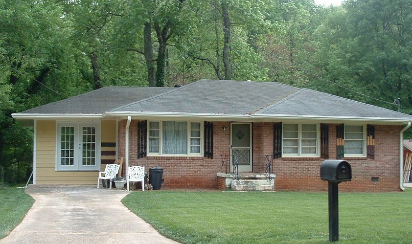
 The answer is yes! With the growing popularity of the spray-painting technique for painting houses (not just lawn furniture anymore), it is becoming easier to paint over rough, textured surfaces like brick and get a good result in a reasonable amount of time.
Check out HGTV.com for some great before-and-after brick house projects. In one show, “Curb Appeal: The Block,” the designer John Gidding takes a paint sprayer to an old ’60s ranch and brings it into the new millenium.
Check with your paint store first, of course. And you might want to hire a professional painter to avoid over-spraying into your neighbor’s driveway (not a good thing…). But if you have a brick house with a) zig-zag-patterned brick; b) really obnoxious brick colors; or c) just tired, run-down plain old red brick, then get inspired! Paint will give your house a fresh new look!
Kitchen Decisions
June 15, 2011 § Leave a comment
 And you thought picking a paint color was hard? Try a kitchen renovation. The number of decisions that have to be made seemingly all at the same time is daunting to even a seasoned renovator. What kind of cabinets? What color? What style? How many? Where to put them? What stain? What knobs? And that’s just the cabinets! Okay… before I get carried away, here’s an example of how the homeowners and I managed the decisions on their renovated kitchen.
The first decision was to pick the cabinets: white painted wood with a shaker-style door. They knew they wanted white because it was classic and would brighten up their small kitchen. Pewter knobs would be the jewelry. They also picked out their appliances: stainless steel. Next came the counter top and that’s when they called me into the project. We discussed concrete, honed granite, and soapstone and settled on soapstone as it had a nice finish and seemed appropriate to the age and style of the home. Shiny granite was out!
The next decision was what to do with the floor. They had hardwood in the adjoining living room but considered tile for the kitchen area because they had heard that it was easier to clean and was okay in wet areas. All true. But I convinced them that carrying the wood all the way through from living room to kitchen would widen the entire space and give the area a more continuous feel.
The backsplash was the next item and both homeowners wanted color. They just could not agree on what color and which material to use. I warned them that glass might be a little trendy for their brick-fireplaced kitchen and suggested they look at slate. The colors are natural and earthy and very appropriate for a slightly more rustic look in the kitchen. At the same time, the white cabinets really make the wonderful palette of earthy colors pop off the counter! The slate also looks terrific with both counter top and stainless!
Lighting was next with some recessed cans with LED fixtures around the perimeter and under-cabinet strips for task lighting, a couple of pendants over the eating areas, and a creative track system of lighting above the island. Track lighting is back! In a big way! And its flexibility makes it appealing — you can maneuver the spots anywhere you’d like them and you can change them too!
 Wall color was last on the list of decisions. We went with a rich red-orange accent wall on the other end of the kitchen by the dining area — to create a warm dining space and give the homeowner the red she craved. The rest of the walls are a gray blue that picks up on the tile and coordinates well with stainless and white.
Kitchen done. Just in time for a relaxing summer!
Long-Distance Decorating! From the US to Iraq and Back!
February 15, 2011 § 2 Comments

 It’s not every day I receive a phone call from Iraq to work on a house in Atlanta but last April I did. The guy on the other end of the line had started renovating a house for his mother and was making all the decisions long-distance. Imagine that! Working with a builder on a house renovation is a challenge when you’re on-site — but from thousands of miles away? And for his mother? I was intrigued.
After the builder chose an unapproved yellow for the new addition (see Before Photo on right), my “soldier friend” (as I call him) was not pleased and asked me to come up with a new color scheme for the exterior. And we did not stop there. By way of blog posts, emails, photos, and occasional phone calls, we moved on to porch, shutters, and even the garden shed. Then we moved inside to make paint color decisions, choose light fixtures, and decide how to update the kitchen and bathroom. He sent me photos of options he found online and I gave my advice.
From Iraq to Boston to Iraq and on to Atlanta. The power of the internet is making long-distance decorating possible.
P.S. His mom loves what we’ve done so far! And she loves her son! Success!
Banish the Blues with Uplifting Hues
February 4, 2011 § 1 Comment
As I ran around my house the other day screaming, “I need natural light!” I was reminded of the adorable card I received awhile back with an 8-year-old’s words of wisdom captured creatively by © Kate Harper Designs. Could such a simple suggestion for getting yourself out of the winter doldrums be expressed more eloquently? BTW, you’ll love Kate’s whole collection — check it out at http://kateharperdesigns.com/.
 Just like the lack of natural light in the winter can affect our moods, so can color. And of course, color and light (or the lack of it) work together.
The other morning as I turned the lights on again in my living room for yet another dreary gray wintry day, I glanced at the wall behind the sofa one last time. That’s it! No more dark and dramatic — I cannot stand it any longer. I dashed to the garage for the can of primer and rolled away my winter blahs. What a transformation! All of a sudden the room felt lighter and brighter and amazingly enough, so did I!
The same thing happened when I moved my office into my son’s old north-facing bedroom. The wall color he had chosen was rich and cozy and cave-like — we even painted his ceiling to create the mood he requested. It worked for him since sleeping in there did not seem to be a problem. But for me? Forget it. I tried adding lamps and task lighting, but the dark walls drove me nuts. Again, I dragged the paint primer from the garage, threw down a drop cloth and primed over the entire room from ceiling on down. Unbelievable — we went from cave-like to cathartic in one afternoon!
The lack of color in a room can be just as depressing as colors that are too dark without adequate light. Anyone who has builder-white walls will note that the white turns to gray in the shadows. And although gray is the new beige for neutral wall color, if it’s not for you, then paint it out!
Warm yellows like Ben Moore’s Sweet Butter (171) will certainly brighten your day. And fresh springy greens like Folk Art (528) will liven up a gray-green that’s bringing you down. Add a little Sea View (836) to a piece of furniture in your room and you’ll think you’re on vacation! I painted the walls in my new office a whisper of yellow called Marble White (Ben Moore 942) and voila! Let there be light!
So if the winter blahs have you feeling blue, take the greeting card’s sage advice and paint yourself (or your room) a different color. Since our homes are extensions of ourselves, then it makes perfect sense that brightening our spirits may be as easy as picking a different wall color. It worked for me!
Can I Paint My Ceiling Dark?
January 22, 2011 § Leave a comment
 Next time you’re in a large restaurant or a public building, look up at the ceiling. If it’s like the one in this old library in Nashua, New Hampshire, it’s dark. Of course, this ceiling is three stories high. The effect of the dark ceiling is to bring it down visually and make the enormous space seem a little cozier to us way down on the floor.
The same is true in a room in your home. If you have a large space with a high ceiling and particularly if the ceiling really feels too high, then painting it a dark color will square out the room and make its dimensions seem a little more homey.
Unfortunately, if you have a 7-ft ceiling in a bedroom, a dark ceiling might make you feel like you’re the batter in a waffle iron. Cozy is not quite the word to describe that effect. So I recommend a lighter tint for smaller rooms. You can still move away from the white ceiling, but just use a tint of the wall color (10-30% of the full-strength hue). Or use a coordinating tint — something you pull from the bedding or other accent pieces. Using a tint on the ceiling will highlight any crown moulding you have in the room and will unify the color scheme.
Caution: because the ceiling is horizontal and does not get much light shining on it, any color you choose will appear darker up there than it does on the paint chip. Try a sample board first before tackling the ceiling job — a neck-breaker and mess-maker, for sure!
Flooring Challenges: Working around the color scheme
November 15, 2010 § 4 Comments
 Are you living with a slate floor from the early ’80s? Many of you are. Slate is a wonderful material for the foyer as it’s easy to mop up after muddy boots and dogs trample through. But many slate floors have a distinct color palette (the gray-greens, blue-greens, purples and rusty reds) all in one small square footage. Busy? Yes. And out-dated? Yup.
Besides throwing a rug over it or replacing it, the other approach is to embrace the color palette presented to you by the previous owners. Currently, the gray-blue-greens are quite popular in fabric lines and even paint stores.  And purple is a great accent color. So if you are updating your foyer and are cursing the flooring, take heart. Pull a palette from the floor at least for the foyer area. Blending the floor with the surroundings will make it less of a color feature in your room.
And as always, create a focal point just inside the front door. A large piece of art, a bench, or a mirror– something to draw the eye upward away from the floor.
If you are planning to install new flooring in your entryway, choose a neutral that will stand up to decades of wall color changes and will look just as terrific 20 years from now as it does today.
Brick Historic House: Trim, Shutters, and Roof Made Easy
November 1, 2010 § Leave a comment
 For those of you with historic brick homes, you cannot beat crisp white trim and charcoal black for your shutter color and roof. Forget about updating your shutters and installing a new multi-colored, dimensional roof. Basic black and white may seem blah, but honestly, good taste and traditional styling are never boring.
Express your own creativity in your landscaping. Keep the plantings symmetrical around the front door to coordinate with the symmetry of your formal house design, but add color and variety of shapes and sizes. Another tip: if you do not want to match all the window treatments on the inside of the house (even though it does look spectacular on a house like this), then at least have matching white lining on the curtains, white sheers, or plantation shutters. Mixing things up with a rainbow of window colors just ruins the formal look.
Living in a historic home is not for everybody. There’s a certain expectation — I’ll talk about informal living in another post… but for now, viva la tradition!
House and Trim Colors that Make a Statement
October 14, 2010 § 3 Comments
 Every now and then I see an accent color that whacks me over the head, and this bold expression of lemon yellow really does it to me this time! Usually a color that does not translate well onto siding or other large surfaces because it’s just too intense, this clear saturated primary color on a shutter paired with black wrought iron hardware on a subdued and sophisticated dark, gray-blue siding is a knock-out! What a statement!
What makes this combination work is the sharp contrast between the gray tone in the siding color and the bright clear shutter. If the siding were another warm clear color, the combination would scream like a caution light. But the calm understated siding lets the yellow attract all the attention. There’s no competition between the colors, just sheer harmony.
Another key to this combination is the “bridge” color that pulls the look together: white. The white trim makes the colors pop — as they say — and it’s critical whenever you use bright colors, either inside or out. White also gives your eye a chance to rest from the intensity of the palette.
But just like other bold statements, be prepared to attract a lot of buzz. And keep the lawn mowed.
Banish Old Brass with Paint
August 5, 2010 § 6 Comments
 Brass will be back at some point, but there are lots of alternative metals on the market these days that make shiny, brassy… well… brass seem really dated and ordinary. I see these brass candelabra chandeliers everywhere. I even had one in my own home until I decided I couldn’t stand it anymore.
 I suppose I could have replaced it at relatively low cost, but then I would have to take it down, etc, etc. I decided that the quickest fix was to paint it. So I got my tallest ladder, moved the table out of the way, and primed the brass. All of it. Then I gave it a coat of matte black acrylic paint. (I was liking it better already.) I then drew on the inner artist somewhere in me to apply several different colors: dark brown, burnt umber, lighter brown, in kind of a faux finish of sorts to make the finished product look more like oil-rubbed bronze (my version).
I even painted the little candlesticks a creamy yellow, found leather-like chandelier shades at my local home improvement store, and used a scrap of fabric for a chain cover. There. All set — I love it. Time to put the ladder away.
If you have old lighting in your home, you can either replace it or paint it! Just remember when working with lighting of any kind, turn off the power first!
Top Three Tips for Selling Your House Fast
August 4, 2010 § 1 Comment
 This house sold with multiple offers at the Open House. (Incredible in this picky buyer’s market.) What made this house stand out and what can we all take home from this experience? Here are three top tips:
1. When in doubt, move it out. Although this property had some big things going for it (location, location, location), the family had lived in the house for twenty-plus years and had accumulated not only their own trappings but also lots of odd furniture and artifacts from deceased relatives. This happens to many of us. What do we do with all that stuff? The answer is clear when you’re trying to sell your house: move it all out.
At the first visit, we tagged items that needed to go — things like extra side chairs and small tables, worn furniture, family photos, large area rugs, antiques and breakables — and we left each room with furniture that would identify the room’s function to buyers. The reasonable and highly motivated homeowners then made many trips to a storage facility to clear the decks and let the house “breathe.”
2. Open the door, fix your floor. Remember that old adage, something like, if you want to know if a fellow is well-dressed, look down? Well just like polished shoes, the first thing buyers notice when they open the front door is the floor, and if yours is covered by old, worn or stained carpeting, uh-oh. In general, carpeting is out. Buyers are looking for hardwood floors and tile, both of which provide easy maintenance and no safe haven for dust allergens. If you have hardwoods covered by large area rugs (like these homeowners did), congratulations! Simply roll up the rugs, buff up the floors and go “Cha-ching!” If you have wall-to-wall carpeting, don’t panic. Have it professionally cleaned, and that will help.
3. Make it sunny, welcome the money. You’ve undoubtedly heard this before, but it’s worth mentioning again. The message here is lighten and brighten. This house had dark rooms with rich wall color and heavy window treatments. We lightened the wall color and opened up the windows by removing the heavy drapes and replacing them with airy sheer panels that framed the windows but did not block the light. The result in this family room? An ahhhh feeling.
If you are overwhelmed by the prospects of preparing your house for the market, talk to your realtor. He or she will find you the help you need to get the job done quickly so you can have that “Ahhhh feeling” too!
