Chocolate Brown Wall Color
December 27, 2012 § 313 Comments
Everybody loves chocolate, it seems. So no big surprise that some people are choosing to paint their walls a deep rich brown that invokes the inside of a truffle. Mmmm delicious. Brown is dark. There’s no way around that. So if you’re looking for a light and airy feel, brown is not for you. But if you’re longing for a cozy, warm, relaxing room that invites people to snuggle up, brown is the perfect color.
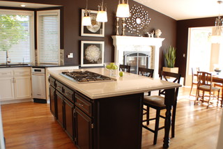
Brown has many shades, of course, from cocoa to almost black. There are warm browns, like Benjamin Moore’s cognac snifter (1148) and taupe browns like fox hollow brown (1235). The one ingredient to a successful brown room is light. Before you roll the first swath of paint, examine your room’s lighting. Do you have large windows giving natural light? Do you have adequate light from the ceiling (recessed cans)? Do you have enough lamps in the room? Lighting is the key to showing off the beautiful nuance of brown.
Once you paint the room, you can add light and contrast by placing light furniture in the room, whether it’s a cream-colored slipcover on your sofa, a champagne comforter on the bed, or white or cream woodwork. You’ll need the contrast to balance the dark color on the walls. And the dark wall color will highlight all your light-colored furnishings. Embrace brown.
Brick House Trim Colors
December 26, 2012 § 338 Comments

Creamy white trim with black shutters (and door) give brick houses like these on historic Nantucket Island in Massachusetts a classic traditional look that is timeless. But for a more contemporary look, use the brick itself for your trim color inspiration. Choose a color that you see in the brick or the grout– tan or taupe or another earthen color. If you select a color from the brick, it will blend with the brick and provide less contrast than the white. The overall effect will be soothing and contemporary but it will call less attention to the architectural details. The Boston building below is hardly contemporary, but the color scheme is taken from the brick and grout and is one example of using coordinating trim colors instead of contrasting trim.

Does Your House Welcome You Home?
December 18, 2012 § Leave a comment
Other than your golden retriever, what says “Welcome Home” better than an open, organized, well-lit, warmly decorated entryway. Isn’t it nice to swing open the door, hang up your keys, dock your cell phone, stash your purse, and find a free hanger for your coat? … That rarely happens, you say? Still tripping over sneakers and backpacks? Gotcha.
Well, how about a New Year’s Resolution to start with the entryway — whether you come in through the garage or the front door, it doesn’t matter. There are so many organizing ideas available now to help you customize an entry to fit your family and lifestyle. And although some require talent with power tools, there are many other options including stackable cubbies and DIY shelf systems that will tame the clutter.
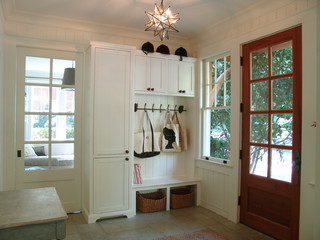
Light woods and white are wonderful in entryways that lack natural light. But if you have large windows, any favorite wall color will look great. Consider choosing an accent color from an adjoining room to give you the “flow” you’re looking for.
Before you tackle any other in-home projects this coming year, make sure your entryway welcomes you home.
Getting Down to Brass Tacks about Brass
December 11, 2012 § Leave a comment
What a difference a decade makes. What used to be the lighting 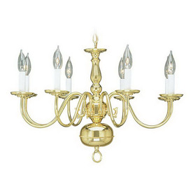 fixture of choice in upscale homes is now (still, even after several years out of favor) being tossed in a dumpster by young home owners who view the shiny yellow metal as the equivalent of how we viewed our grandmother’s dark brown paneling. Of no value.
Instead there are dozens of metal choices and finishes for lighting and other home accessories like light switch covers and doorknobs. So anti-shiny-brass are today’s home buyers that some are just shy of insisting that even all shiny brass door hinges be switched out to something else.
Note: these design trends may be regional and they don’t apply to historic homes so don’t panic if you love your brass chandelier and it fits your home’s decor perfectly. But If you are not happy with your shiny traditional yellow brass chandelier in your dining room or kitchen, you have three options:
1) Thumb your nose at metal color trends and simply wait for shiny yellow brass to come back in style. Kind of like you kept your go-go boots and bell bottoms from junior high. Yes, both trends came back around but not quite the way they looked in the late 60s. But still, doing nothing is always a design option.
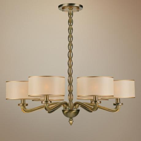
2) Paint the shiny brass chandelier a different color. I once stood on a ladder, leaned over the dining table and painted my client’s brass chandelier first with a base coat of matte black to cover all the sheen and then a faux finish of browns and oranges to simulate a rustic bronze finish. It worked. The house sold.
3) Replace the old chandelier with a more current brass option like this one. The metal is toned down (antiqued) and the candelabra bulbs are covered with contemporary silk drum shades — a traditional yet updated look. Honestly, the antique brass has been around forever, and it went through a period of disfavor right around the time the shiny metal took over. But the muted finish, with updated shades, is back and looking good.
Neutral but Never Boring
December 10, 2012 § 2 Comments
Does your home scream 1972 when you enter the front door? Are you stuck with metallic wallpaper on the ceiling in the guest bath, orange shag carpet in the basement, or an avocado bathtub? Then maybe it’s time to update. But this time, instead of hopping on the latest hot new trend (I could name a few here, but I’ll resist), how about giving your home a classic re-do. Something that will stand the test of time, or at least a decade or two, without branding your home with a particular year. For that kind of longevity, we turn to a neutral palette, but neutral does not have to mean beige and it’s hardly ever boring.
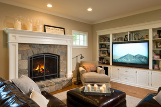
-The key to a neutral palette is texture. You could have an all-white living room but if that white includes fuzzy white pillows, a shiny white marble table top, and some warm white chenille upholstery, then the room will have plenty of interest.
-Neutral does not have to mean just one color either. In this room, the walls are a latte color, the sofa is dark brown leather, and there is plenty of color in the books and objects on the white bookshelves. What makes this room work so well is that the stonework on the fireplace is a feature and because the other furnishings do not stomp all over the subtle colors in the stones, the room’s palette includes peaches and golds and grays and tans and taupes — more than enough colors.
-Neutral allows you to bring in color in the art, pillows, and other more temporary furnishings and accessories without clashing with a strong wall color and a brightly colored sofa.
-Neutral allows you to change your accessories with the seasons and the holidays without overpowering the existing color palette or the holiday decorations.
-And when you’re selling your house, neutral allows potential buyers to see themselves in your home and that is critical for a successful sale.
So as you choose tile and furnishings and paint for your newly updated space, consider neutral because neutral does not have to be boring.
Painting Your House Red
December 3, 2012 § Leave a comment
What Color Should I Paint My Ceiling?
November 29, 2012 § 266 Comments
The ceiling is the fifth wall and many decorators and designers feel that keeping the ceiling white is like “throwing a sheet over the room” (Christopher Lowell said that years ago). But there are a few conditions to consider before painting the ceiling anything other than white:
1) Is your ceiling heavily textured? In many old houses, the ceiling is patterned (and God forbid, “popcorned”) and therefore very difficult to paint well. Also, painting it anything other than white will call attention to it and maybe that’s not what you want. One solution is to have your ceilings replastered to match your walls and painted, but if that’s out of the question, I would stick with white.
2) Is your ceiling a smooth plaster? If so, you should definitely paint it. How lucky you are! See below for what color.
2A) Is your ceiling really high? If so, you can paint it virtually any color that goes with the rest of the room. If you’d like to bring the ceiling down visually, consider a color darker than your wall color or a warm color (both will advance and appear to bring the ceiling down to a level that’s more in scale with your room). Also consider adding crown moulding if it’s not already there. The moulding will also bring the ceiling down by calling your eye’s attention to it. And it really finishes the room.
|
|
|


2B) Is your ceiling low or average height? Consider painting it a tint of the wall color. If your walls are a medium blue, then your ceiling would be the very lightest blue on the color swatch or even lighter (white with a dash of blue). This will help to round out the room and make the ceiling part of the overall decor — not just that white sheet over the top.
3) Does your room have enough light? Bright white ceilings do help bounce light back into the room so if your room is already dark, pay special attention to the ceiling color. White can be used effectively, but light tints on the ceiling will also reflect light. Just avoid a ceiling color that is going to absorb all the light and leave the room dark.
4) Are you painting a guest bath? I like to paint the wall color right up over the ceiling in a guest bathroom. Doing that makes the room feel larger by blending the walls and ceiling together and avoiding sharp lines and corners. Or do something kind of exotic on the ceiling, like the Moroccan tent (see photo above).
5) Are you painting a bedroom? In what other room do we lie around and stare at the ceiling? Why not paint it something interesting. In a bedroom, the sky’s the limit (literally) — from puffy blue clouds on a backdrop of sky blue to a quilt of squares in different colors (Candice Olson did a fabulous multi-colored geometric ceiling in a master bedroom). And in kids’ rooms, the ceiling is just one more space to use your creativity.
Hope this helps the “Do I paint the ceiling?” dilemma.
Quick Updates for the Holidays
November 20, 2012 § Leave a comment
Do you have friends and family coming to the house for the holidays? Here’s one way to make sure they don’t drive right past the house. Change the numbers on the front so they are visible from the road. There are so many new options out there for something other than the standard big-box-store metal numerals. Be creative.

Zen Holiday Decorating: An Oasis from Mall Madness
November 8, 2012 § Leave a comment
 Does your beautifully decorated home brace for the onslaught of holiday decorations every year? When your artfully arranged furniture is sidelined to make space for the tree and your oh-so-subtle color scheme is squashed by the big footed Santa and his reindeer? I feel your pain… 😉
I’m here to help. But before that, if you have children, then forget about it. Do up the most spectacular Christmas you can imagine and enjoy the blinking lights and the kaleidoscope of colors for as long as your children appreciate your home’s transformation. And for the young-at-heart who still enjoy reliving this most festive time, then relax. Go ahead and hang all those old ornaments on the tree. The holidays are for celebrating and reminiscing too.
Now for those of you who would prefer a light touch to the holiday decorating and would like to create an oasis from the mall madness, this tip is for you.
Limit your holiday color scheme of ornaments, ribbons, and decorations to white. That’s it. Then, just as the photo suggests from http://www.traditionalhome.com, add the necessary sparkle with glass ornaments, silver and gold metallic objects to reflect candlelight, and simple greens. You will be amazed at how festive your home looks without even an ounce of Santa’s sleigh red.
Which Came First? The house color or the foundation plantings?
October 1, 2012 § 2 Comments
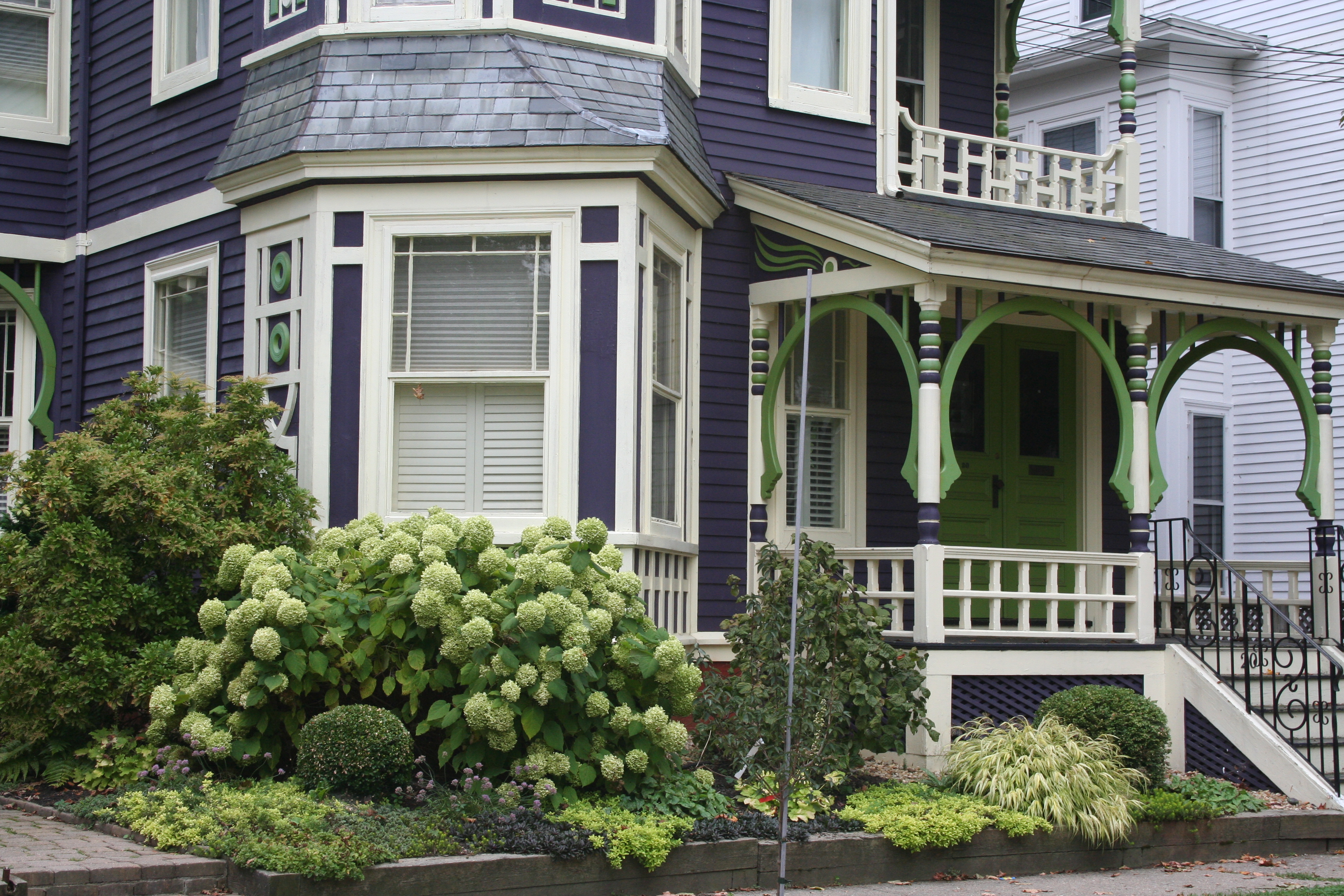 My guess? Neither. Take a close look at the roof, and the house color palette is revealed. The deep purples and greens of that slate roof present a palette the homeowners can use for their house: rich grape for the siding color tempered by a neutral cream trim and lime green for the accent color to highlight the Victorian embellishments.
But the homeowners did not stop there. To enhance the palette and spread the accent color out onto the landscape, they planted a gorgeous lime green Hydrangea coupled with other lime green plants, shrubs, and ground-cover species. Peeking out from under all that greenery is a purple flowering ground color pulling the whole look together.
Not to be matchy-matchy or anything, but this house rocks. There’s just enough contrast to keep our interest and show off the house detail without introducing new colors that might make the house too busy. Afterall, the house itself has so much detail that you wouldn’t want it to get lost in a rainbow of foundation plantings and annuals.
