houzz, Pinterest, and the Barrage of Creative Ideas
November 20, 2012 § Leave a comment
At last count, there were 867,525 spaces on houzz.com to feed your quest for inspiration. Hours — days –of poring over photos of beautiful designs. And then there’s Pinterest where, by their account, “millions of new pins are added every week.” Is anybody out there feeling overwhelmed by the sheer volume of ideas??
If you are planning a renovation, big or small, to any part of your house, here are a few tips to avoid creative overload:
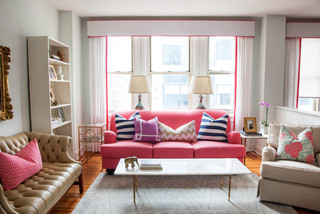
-Realize that not every good idea will work in your home. Although that wall color online looks spectacular with the view of the ocean out the window, the same color may look completely different in your room with limited natural light. When you’re choosing wall color, start with your own home, the lighting you have, and the colors, furniture, and artwork in other rooms. A beautiful wall color inspiration is most likely already there.
-Stick with what you love, not something you think you should love because it’s fashionable. As we all know, trends come and go, and unless you want to re-do your home with every new trend, your home will be defined by the period in which the trend was popular. Look at metallic wallpaper from the 70s, for example. If you love it, then go for it. But try to avoid catching a wave only to find yourself tossed up on the beach in a year or two.
-And finally, unless you’re well organized at assigning ideas to a particular project or room as they come cascading into your head via web sites and social media, then focus on one project at a time. Try to avoid mission creep unless you have the budget and time to devote to starting and, most importantly, finishing all your projects. You will be bombarded with ideas and inspiration that may have you ripping up carpet in your family room when you really wanted to work on the bathroom first. Stay focused.
Enjoy the opportunity to see how millions of other creative people have transformed their homes. We are truly living in an age of enlightenment bordering on informational hysteria. Try and stay calm.
Zen Holiday Decorating: An Oasis from Mall Madness
November 8, 2012 § Leave a comment
 Does your beautifully decorated home brace for the onslaught of holiday decorations every year? When your artfully arranged furniture is sidelined to make space for the tree and your oh-so-subtle color scheme is squashed by the big footed Santa and his reindeer? I feel your pain… 😉
I’m here to help. But before that, if you have children, then forget about it. Do up the most spectacular Christmas you can imagine and enjoy the blinking lights and the kaleidoscope of colors for as long as your children appreciate your home’s transformation. And for the young-at-heart who still enjoy reliving this most festive time, then relax. Go ahead and hang all those old ornaments on the tree. The holidays are for celebrating and reminiscing too.
Now for those of you who would prefer a light touch to the holiday decorating and would like to create an oasis from the mall madness, this tip is for you.
Limit your holiday color scheme of ornaments, ribbons, and decorations to white. That’s it. Then, just as the photo suggests from http://www.traditionalhome.com, add the necessary sparkle with glass ornaments, silver and gold metallic objects to reflect candlelight, and simple greens. You will be amazed at how festive your home looks without even an ounce of Santa’s sleigh red.
The Renaissance of Wallpaper: With a twist
September 17, 2012 § Leave a comment
 The first thing my husband did when we moved into our house many years ago was rip a long piece of wallpaper off the bathroom wall. “We won’t be keeping this,” he proclaimed. Well, I wasn’t planning to start a bathroom renovation that afternoon (I had to hide the ugly blemish with towels for months), but he certainly had the right idea. All the wallpaper came down eventually and was replaced with paint.
Many of us have visions of homes with old faded wallpaper and knick-knacks everywhere or rooms where every available inch of real estate was covered: ceiling, switch plates, wastebaskets– even the window treatments matched the wallpaper.
The rebirth of wallpaper that we’re experiencing, however, is far different from what you lived through in your grandmother’s parlor.
1) Contemporary wallpaper makes a bold statement either with color, texture, large graphic design, or all three.
2) The wallpaper is a feature of the room, like a piece of art, and not simply a wall covering upon which to layer a hodgepodge of family photos, diplomas, and other objects of interest.
And that’s the major difference. It’s more about what else is going on (or not) in the room and less about the wallpaper itself. Contemporary use of wallpaper involves a more judicious placement in areas like the focal wall in a foyer (as in the photo), the walls in a guest bath, the headboard wall in the master bedroom, and the walls above wainscoting in the dining room. The wallpaper is also selected to be the appropriate scale in the room (you won’t see so many little tiny pink flowers anymore). And the furnishings in a room with bold, contemporary wallpaper harmonize with it, both through color and fabric design and scale.
So be adventuresome. If you’re feeling like your room is just a little too blah, even after you’ve painted a fresh new color, try wallpapering an accent wall. Just for fun. Your grandmother would be proud.
From a Little Girl’s Room to a Teen Girl’s Haven: Navigating the Transformation
September 6, 2012 § Leave a comment
Decorating a teen’s room is way different from decorating a young child’s room, and I’m not just talking about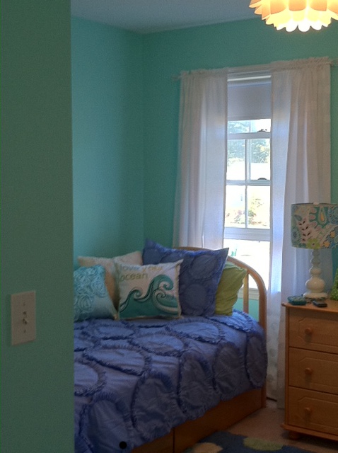 the comforter and the curtains. When you’re decorating a little girl’s room for the first time (when they’re really little), there’s not much push-back from her. She loves flowers, polka dots, pinks and purples. But as she grows older, she develops her own style and wants to do things her own way. As a decorator, we have to take that into account when we’re called upon to work on a young teen’s room. How to take her very strong requirements for her room and mesh them with the aesthetic sensibilities of mom and dad.
 This project is a prime example. The Before Photo shows a bedroom of many colors, stripes and dots in a fairly white room. As you can see from the swaths of color that she painted next to her bed, the teen living there was pretty much done with white walls. So that’s where we started. She picked a cool, vibrant blue-green that was a reflection of her personality (not her mom’s). From there, we found cornflower blue bedding (Pottery Barn) as well as some accent pillows and accessories to pull the colors together.
My major role in this project? To prevent color overload. The remedy? Adding white to the room to offer some visual relief from the intense hues. I found white tone-on-tone polka dot fabric for the window panels (custom-made), a white lamp with a lamp shade that pulled all the colors together (Pottery Barn), and a white fuzzy pillow for the bed (Pier 1). I also added the floral light fixture on the ceiling (Lamps Plus) — a great find for a teen room. The result was a room that all three of us (teen, mom, and decorator) could love.
Design Star 2011 Finale
September 12, 2011 § 1 Comment
 Okay HGTV fans. This is it! The finale between Meg and Karl is on tonight. For those who don’t follow Design Star, it’s not too late to check in. Design Star has spun off several excellent designers (David Bromstad, Kim Myles) and like them or not, these designers influence TV viewers and their expectations. I see that all the time.
So who is it going to be? Meg has a lovely fresh preppy style and a bubbly on-air personality. Karl’s architectural background gives him a very professional, big-picture design. He nailed the small-cottage challenge!
Move over Candice. Here comes a new face on HGTV!

Do You Love Citrus? Adding happy color to your home
August 11, 2011 § Leave a comment
 I just wrote a piece for Joelle Spear’s “Life in Metrowest” blog about how to add warm, bright colors to your home. Thought you might like to check it out.
http://homesmetrowestma.com/2011/bring-warm-colors-home-written-by-guest-blogger-barbara-meglis
The “Accent Wall” is Back!
July 7, 2011 § 2 Comments
 Maybe it never really went away for some people, but for others the thought of an “accent wall” just screams ’80s. But you know, honestly, they’re not a bad idea… in some cases. Accent walls (I should dream up another name!) can take a large room and create a cozy nook, or a di
 ning area. Like this kitchen. The walls were a gray blue, and half of the large space was dominated by white cabinets and a slate tile backsplash. So we pulled some of the orange out of the tile and created an “area of interest” on the other end of the room. The color is Tucson Red (1300).
Using an accent color on one wall is also a great way to warm up a loft or other modern, non-descript space that needs instant architecture. We call it “color blocking” — yes another term from the high-fashion ’80s (I’m dating myself) — but it’s a terrific way to take a neutral, often white, space and add large pops of color. Instant focal point!
When an accent wall doesn’t work is when the room is too small or too square. Painting one wall a different color might just chop up the room too much. But if you have a long narrow room, painting the far wall a warm color will bring it forward visually and make the room feel less like a bowling alley and more like a well-designed, pulled-together space created by you.
Update Your Backsplash to Sell
June 17, 2011 § 3 Comments
 Honey onyx mosaic tiles — love ’em! We switched out the old ceramic backsplash in a “modern” kitchen (still had Formica counters with oak trim) and updated the look of the whole room (okay, we changed the cabinet knobs too). The white melamine cabinets, Formica counter tops, and linoleum floor all stayed! It was a wonderful transformation for a minimal cost to the homeowners who were updating to sell.

We chose the onyx for its variety of warm colors (would blend the oak trim nicely), its scale (the small tiles would add interest to the plain white cabinets), and its ease of installation (mosaics require fewer cuts!). The biggest benefit? These tiles came from one of our prominent “big box” stores so the homeowners did not pay a lot for materials. A bonus when you’re preparing your home for the market!

Kitchen Decisions
June 15, 2011 § Leave a comment
 And you thought picking a paint color was hard? Try a kitchen renovation. The number of decisions that have to be made seemingly all at the same time is daunting to even a seasoned renovator. What kind of cabinets? What color? What style? How many? Where to put them? What stain? What knobs? And that’s just the cabinets! Okay… before I get carried away, here’s an example of how the homeowners and I managed the decisions on their renovated kitchen.
The first decision was to pick the cabinets: white painted wood with a shaker-style door. They knew they wanted white because it was classic and would brighten up their small kitchen. Pewter knobs would be the jewelry. They also picked out their appliances: stainless steel. Next came the counter top and that’s when they called me into the project. We discussed concrete, honed granite, and soapstone and settled on soapstone as it had a nice finish and seemed appropriate to the age and style of the home. Shiny granite was out!
The next decision was what to do with the floor. They had hardwood in the adjoining living room but considered tile for the kitchen area because they had heard that it was easier to clean and was okay in wet areas. All true. But I convinced them that carrying the wood all the way through from living room to kitchen would widen the entire space and give the area a more continuous feel.
The backsplash was the next item and both homeowners wanted color. They just could not agree on what color and which material to use. I warned them that glass might be a little trendy for their brick-fireplaced kitchen and suggested they look at slate. The colors are natural and earthy and very appropriate for a slightly more rustic look in the kitchen. At the same time, the white cabinets really make the wonderful palette of earthy colors pop off the counter! The slate also looks terrific with both counter top and stainless!
Lighting was next with some recessed cans with LED fixtures around the perimeter and under-cabinet strips for task lighting, a couple of pendants over the eating areas, and a creative track system of lighting above the island. Track lighting is back! In a big way! And its flexibility makes it appealing — you can maneuver the spots anywhere you’d like them and you can change them too!
 Wall color was last on the list of decisions. We went with a rich red-orange accent wall on the other end of the kitchen by the dining area — to create a warm dining space and give the homeowner the red she craved. The rest of the walls are a gray blue that picks up on the tile and coordinates well with stainless and white.
Kitchen done. Just in time for a relaxing summer!
What Color Is It? Really…
February 26, 2011 § 2 Comments
You’d like a Pottery Barn-approved Benjamin Moore color from the Pottery Barn fandeck to update your color scheme. So you pick a nice rich color like Bittersweet Chocolate 2114-10 for the entry hall — with a name like that it’s got to be a rich chocolate brown, right? Well not so fast.
After painting a couple of coats on the wall, you notice that it looks like a dark eggplant purple when the sun shines on it. Hmmm… what is going on here? So you head back to Ben Moore to take a look at their fandeck that has ALL the paint colors and their related shades and tones. And voila! The lighter tones of Bittersweet Chocolate are decidedly purple with names like Hint of Violet 2114-60 and Victorian Mauve 2114-50. And that explains why the color Bittersweet Chocolate is not what we might think of as dark chocolate brown.
When you pick a color from a paint chart that does not contain the shades and tones for that particular hue, the best way to find out what color you’ve REALLY chosen is to:
1) Find the color on the big fandeck and check up and down the strip of shades and tones. You’ll see what that underlying hue is.
2) Also check the color next to a bright white piece of paper. The true hue should pop out even better.
Colors also change with the light. So there’s nothing quite like painting a sample board and sticking it to the wall in the area you want to paint. Check the color at night as well as on a cloudy day. Once you’re satisfied that you like the color all the time, then go ahead and paint away!
