Adding Smart Color to Any Room
February 9, 2011 § Leave a comment
Spring is coming and are we ready! It’s time to add color to our homes. But before you drag all your furniture to the middle of the floor, take down all the artwork, and dash off to the paint store for a can of Chivalry Copper SW6353 or Chartreuse SW0073, stop! Think about how you want to add color to your room, especially if it’s a trendy new color hot off the pages of STIR Magazine (www.swstir.com).
If you are the type of person who loves to dive into a color trend head first and is not daunted by the idea of switching it all out when the next trend rolls in, then you are all set. But if you are the type of person who desperately wants to update your room but you are not planning to update again for many years, then I’m really talking to you.
Adding smart color to your room means painting the walls and installing tile and other architectural materials in a color that will stand the test of time and hold up to upcoming color trends without making your house look dated. Remember Harvest Gold? Avocado Green? How many of us are stuck in houses where the owners put a color trend into a fixture that would need to stay there for 20 years??
Here’s a way to stay current or get trendy in a smart way. Put the color in the items and materials that can be changed easily later. In this bedroom featured on the BHG site in a piece by Debra Wittrup (www.bhg.com/decorating/color/schemes/cozy-color-schemes-for-every-room), the designer painted the walls a warm taupe– flexible and adaptable to almost any color scheme. Then the wonderful melon color was added in the window panels, the lampshade, the pillows, bed linens, and accessories. If the home owner gets tired of melon, out it goes to be replaced by another fun color scheme with relative ease.
Now, granted paint is cheap and relatively easy to switch out, but trendy paint colors can also be applied to small pieces of furniture, like a wooden table or chair, instead of the four walls of your room. Accent walls are another way to add smart color to any room without the hassle and expense of a complete overhaul.
Enjoy color! Be smart about it!
Banish the Blues with Uplifting Hues
February 4, 2011 § 1 Comment
As I ran around my house the other day screaming, “I need natural light!” I was reminded of the adorable card I received awhile back with an 8-year-old’s words of wisdom captured creatively by © Kate Harper Designs. Could such a simple suggestion for getting yourself out of the winter doldrums be expressed more eloquently? BTW, you’ll love Kate’s whole collection — check it out at http://kateharperdesigns.com/.
 Just like the lack of natural light in the winter can affect our moods, so can color. And of course, color and light (or the lack of it) work together.
The other morning as I turned the lights on again in my living room for yet another dreary gray wintry day, I glanced at the wall behind the sofa one last time. That’s it! No more dark and dramatic — I cannot stand it any longer. I dashed to the garage for the can of primer and rolled away my winter blahs. What a transformation! All of a sudden the room felt lighter and brighter and amazingly enough, so did I!
The same thing happened when I moved my office into my son’s old north-facing bedroom. The wall color he had chosen was rich and cozy and cave-like — we even painted his ceiling to create the mood he requested. It worked for him since sleeping in there did not seem to be a problem. But for me? Forget it. I tried adding lamps and task lighting, but the dark walls drove me nuts. Again, I dragged the paint primer from the garage, threw down a drop cloth and primed over the entire room from ceiling on down. Unbelievable — we went from cave-like to cathartic in one afternoon!
The lack of color in a room can be just as depressing as colors that are too dark without adequate light. Anyone who has builder-white walls will note that the white turns to gray in the shadows. And although gray is the new beige for neutral wall color, if it’s not for you, then paint it out!
Warm yellows like Ben Moore’s Sweet Butter (171) will certainly brighten your day. And fresh springy greens like Folk Art (528) will liven up a gray-green that’s bringing you down. Add a little Sea View (836) to a piece of furniture in your room and you’ll think you’re on vacation! I painted the walls in my new office a whisper of yellow called Marble White (Ben Moore 942) and voila! Let there be light!
So if the winter blahs have you feeling blue, take the greeting card’s sage advice and paint yourself (or your room) a different color. Since our homes are extensions of ourselves, then it makes perfect sense that brightening our spirits may be as easy as picking a different wall color. It worked for me!
House and Trim Colors that Make a Statement
October 14, 2010 § 3 Comments
 Every now and then I see an accent color that whacks me over the head, and this bold expression of lemon yellow really does it to me this time! Usually a color that does not translate well onto siding or other large surfaces because it’s just too intense, this clear saturated primary color on a shutter paired with black wrought iron hardware on a subdued and sophisticated dark, gray-blue siding is a knock-out! What a statement!
What makes this combination work is the sharp contrast between the gray tone in the siding color and the bright clear shutter. If the siding were another warm clear color, the combination would scream like a caution light. But the calm understated siding lets the yellow attract all the attention. There’s no competition between the colors, just sheer harmony.
Another key to this combination is the “bridge” color that pulls the look together: white. The white trim makes the colors pop — as they say — and it’s critical whenever you use bright colors, either inside or out. White also gives your eye a chance to rest from the intensity of the palette.
But just like other bold statements, be prepared to attract a lot of buzz. And keep the lawn mowed.
Top Three Tips for Selling Your House Fast
August 4, 2010 § 1 Comment
 This house sold with multiple offers at the Open House. (Incredible in this picky buyer’s market.) What made this house stand out and what can we all take home from this experience? Here are three top tips:
1. When in doubt, move it out. Although this property had some big things going for it (location, location, location), the family had lived in the house for twenty-plus years and had accumulated not only their own trappings but also lots of odd furniture and artifacts from deceased relatives. This happens to many of us. What do we do with all that stuff? The answer is clear when you’re trying to sell your house: move it all out.
At the first visit, we tagged items that needed to go — things like extra side chairs and small tables, worn furniture, family photos, large area rugs, antiques and breakables — and we left each room with furniture that would identify the room’s function to buyers. The reasonable and highly motivated homeowners then made many trips to a storage facility to clear the decks and let the house “breathe.”
2. Open the door, fix your floor. Remember that old adage, something like, if you want to know if a fellow is well-dressed, look down? Well just like polished shoes, the first thing buyers notice when they open the front door is the floor, and if yours is covered by old, worn or stained carpeting, uh-oh. In general, carpeting is out. Buyers are looking for hardwood floors and tile, both of which provide easy maintenance and no safe haven for dust allergens. If you have hardwoods covered by large area rugs (like these homeowners did), congratulations! Simply roll up the rugs, buff up the floors and go “Cha-ching!” If you have wall-to-wall carpeting, don’t panic. Have it professionally cleaned, and that will help.
3. Make it sunny, welcome the money. You’ve undoubtedly heard this before, but it’s worth mentioning again. The message here is lighten and brighten. This house had dark rooms with rich wall color and heavy window treatments. We lightened the wall color and opened up the windows by removing the heavy drapes and replacing them with airy sheer panels that framed the windows but did not block the light. The result in this family room? An ahhhh feeling.
If you are overwhelmed by the prospects of preparing your house for the market, talk to your realtor. He or she will find you the help you need to get the job done quickly so you can have that “Ahhhh feeling” too!
House Color, Trim, Shutters: Gold Medal Combo
April 7, 2010 § 2 Comments
 The unexpected color combination on this historic home (now a B&B in Sackets Harbor, NY) really pops off the street. Whether it’s the hint of green in the gold siding, the Jamaican rum-like warmth of the shutters, or simply the combination, I’m not sure. But coupled with cream trim and accents of black, this combination is a winner.
The house color looks like Ben Moore’s Marblehead Gold (HC-11), and the shutters look like a slightly darker version of Copper Kettle (1218). I should have rung the doorbell to ask (I’ve been known to do that).
The stone steps unfold seamlessly from the foundation right onto the sidewalk and the delicate scrollwork in the iron railing ties in beautifully with the sign and even the shutter “dogs.” And for those of you who have asked about using cream window trim with white windows, here’s a great example of how nicely it works.
Choosing a Yellow for Your House Color
March 25, 2010 § 6 Comments
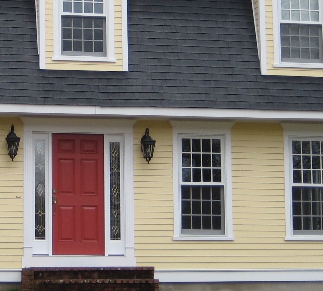
 Yellow can be a tough color, ranging from almost orange to acidic green. This one, Traditional Yellow (170) by Benjamin Moore, gives the house a cheerful, welcoming look. It’s terrific with crisp white trim, a dark charcoal/black roof, wrought iron metal for lights, and a striking red door. The yellow has just enough orange in it to be warm without turning peach.
Yellows that have green undertones tend to look cold on traditional homes. What we commonly refer to as lemon yellow has a touch of green in it, enough to make you pucker when you see a big house that color. Having said that, if you love the green side of yellow, consider pairing it with dark eggplant purple. The combination is a bit edgey and modern but can work, again with a black roof and white trim.
Quick Headboard or Wall Panel for Art Display
March 21, 2010 § 2 Comments
Is your artwork getting lost? One of my favorite pieces just seemed to float above the sofa in a sea of beige until I rolled out a piece of fabric and found my solution. I stapled the fabric right to the wall and trimmed it out with three pieces of painted moulding cut on a 45-degree angle with my miter box (handy little gadget!). Voila! Some drama, instant matting, and a terrific way to add color and contrast to an otherwise quiet palette. Especially good if your furniture and wall color are the same!
This technique is also a great way to create a headboard over a bed. The fabric adds height to the room and texture to the wall, and it is more interesting than a square of paint (although that will work too).
Once I decided what I was going to do, purchased the moulding and painted it, the whole project took about an hour to install.
Good Design Learns from History
February 4, 2010 § 2 Comments
 This historic New England barn is original to the property, and its characteristic beauty helps to define the classic regional style. Owning an historic property can be a real joy for those whose passion is preserving the beauty of the past, but don’t think you have to own a historic treasure to enjoy the pleasures of a striking outbuilding.
If you need more space for a workroom or your vehicles, you can add a lot of character to your property by incorporating the unmatched elements, colors, and materials used in previous centuries to make your own history, whether it’s a barn, a large work shed, or simply your garage.
I get lots of questions about how to match exterior colors and blend materials between house and garage, but as you can see from this photo, there’s absolutely nothing matching between this barn and the accompanying house. From the unpainted board-and-batten style siding, brass lighting, and farm-style scale, this barn stands on its own. The colonial house has traditional, painted, horizontal lap siding and white windows. The bridge color between house and barn is black — the black windows on the barn carry over to the accent color on the house (note the black shutters and lighting as well as the black pergola and fence next to the driveway). By painting the wood accessories on the house black instead of leaving them natural, the unpainted barn takes center stage.
Even if you have no plans to build a major additional structure in your yard, keep this basic design principle in mind when you’re working on your exterior. Colors and materials do not have to match.
Color Your Holidays
December 2, 2009 § Leave a comment
If you yearn for a fresh holiday look this season and prefer to leave the traditional decorations in the attic, try a more contemporary color scheme: apple green and silver; coral and gold; robin’s egg blue and white. As long as you add sparkle with shiny metals and twinkle lights, almost any color combination will look festive.
If your neutral or pastel color palette is soft and calming, and bold traditional colors seem to clash with your home’s style, then try using whites for your holiday color scheme:  white candles, white ornaments (like the ones in the photo available from Amazon.com), white dishes, white wrapping paper, and white lights. All the winter whites against your pastel palette will look quite striking.
If holiday memories are most important, then haul out the boxes and baskets of ornaments and figurines and revel in the nostalgia of your own traditions. No picture-perfect holiday décor can replace the fun of reliving childhood experiences and sharing stories from one generation to the next. Who cares if Grandma’s favorite tablecloth is a little worn around the edges. Use it anyway and enjoy this family time.
Happy Holidays from Your Home & Color Coach
Light Up the Holidays
November 24, 2009 § Leave a comment
What’s the one thing that separates this holiday season from all other holidays throughout the year? The sparkle and shimmer of lights. Regardless of what holiday colors we use to decorate our homes or even the particular holiday itself, decorating with lights tells everyone we are celebrating. Traditionally, we hang candles in the windows and string lights across the bushes to enhance our holiday curb appeal. We decorate with lights on the inside as well: the warm glow of firelight, candles on the dinner table, and maybe even a magnificent sparkling tree.
 This year, instead of altering your color palette for the holidays with the reds and greens of Christmas or blues of Hanukkah, focus on adding light to your home. One easy and “green” way to add light is by using reflective metals like silver and lots of glass. All the silver and glass will bounce light around the room and help to make any color scheme ready for the holidays. Look for old treasures from the attic or even the consignment store, especially silver ornaments, glass ornaments, silver candlesticks, glass candlesticks, mirrors, and silver trays like the one shown in this photo from Country Living Magazine (www.countryliving.com). Add white candles, white twinkle lights, and some evergreen cuttings from your yard, and voila! For maximum light reflection and a real wow factor, hang a giant mirrored ball (yes, disco) from the ceiling. Okay, you get the idea…
Enjoy your holidays!
