Choosing Paint Colors for House Trim and Doors
November 29, 2012 § 448 Comments

The front door is the focal point of your house and it can make a big splash. (Even though Great Britain’s former Prime Minister Tony Blair reportedly changed his 10 Downing Street door color from conservative black to Labour Party red as seen in this photo from the Daily Mail, evidently it was all an April Fool’s joke — see the full story at http://news.bbc.co.uk/1/hi/magazine/8677004.stm)
Doubtful that changing your own front door color will create as much of a stir in the neighborhood, but you’ll want to give it considerable thought anyway.
But first, what about the trim color?
House trim color: If you have a small house and you want it to look bigger, consider painting the edge trim the same color as the house or just a shade lighter. This will blend the corners of the house in with the body and draw your eye to color — hopefully, the front door. If you want to show off the trim in a more contemporary way, consider painting the edge trim two shades darker than the house color. To accent your trim in a traditional way, choose contrast by using either white or cream. If you have a stone house, the grout color is a great trim color.
The message here is to avoid too many different hues (different colors) when painting the house, trim, doors and shutters. Unless you have an architectural masterpiece, I would avoid choosing trim colors that are unrelated to the house color (for example, painting a gray house with navy blue trim, red shutters and red garage doors). Not only will you draw attention to all the different colors themselves and away from the front door (regardless of what color IT is), but you will have visual chaos!
Exception: If you have an old Victorian home, you may want to accent all the different architectural elements with paint in many different colors.
Trim around windows: To keep the windows looking as large as possible, paint the trim around the windows the same as the window frames, either white or cream or whatever color the window frames are. Matching the trim to the actual windows will make them look bigger than if you break up the color by painting a dark trim around a white window or a white trim around a dark window.
Garage door color: Unless you want to broadcast to your neighbors that you have a three-car garage, you probably don’t want to highlight your garage doors. Standard garage doors should usually be painted either the color of the house or a couple of shades darker to “anchor” them. Plus, by painting the garage doors the house color or a little darker, your house will look bigger and less chopped up. The focus is reserved for the front door. Note: yes, metal garage doors can be painted even if they’re white when installed. Just clean the doors very well and use a good primer.
Exceptions: Garage doors associated with brick homes are often painted either the trim color, the grout color, or the shutter color — black or dark green, for example. No need to try and match a paint color to the brick. The other exception is the new carriage-style garage doors, designed to be the focal point on the front of a home. If you have fancy garage doors, it’s okay to show them off! Even keeping them white or the trim color is okay.
Shutter color: For a traditional look, match your shutters to the roof color. If you have a dark gray or black roof, black shutters look terrific. It’s like adding a touch of black to a living room to dress it up a bit. Matching the shutters to the roof makes it look like you planned your roof color as part of the overall house palette. Dark brown shutters with a brown roof color give a similar, traditional look as black shutters with a gray/black roof. And brown is supposedly the new black. But for a classic home, black will never go out of style.
If you have lots of really small windows or don’t want dark shutters, consider choosing a color that blends with the house color. Here’s one strategy: choose your house color in the medium range. Then go lighter for the trim and a shade or two darker for the shutters (or remove the shutters altogether). And choose a completely different hue for the front door. This contemporary look focuses attention on the front door. There are no distracting colors anywhere else on the house.
Front door color: It’s time to create your focal point, the front door. This is the area you want guests to find when they pull in the driveway. Color is the way to do it although a shiny black door with a brass kickplate, brass door handle, and big colorful wreath is a classic. If you don’t want black, consider a rich dark red in a semi-gloss finish. Dark red (not cherry) seems to work with almost all house colors.
Here are a few other ideas:
- Light green house. Traditional: Dark purple door (especially nice if you have lilacs and other purple flowers in your landscape) and white door trim. For a modern look: Rusty red.
- Dark green house. Traditional: Rusty red door or natural wood and cream door trim. Modern: Turquoise.
- Light blue house. Traditional: Dark red door or navy blue door with white door trim. Modern: Dark olive green.
- Dark blue house. Traditional: Maroon door (play up the nautical look) with cream door trim. Modern: Lime green.
- Red house (or brick). Traditional: Black door with brass accents (classic) and white door trim. Modern: Grass green.
- Brick house. Traditional: Mahogany door with light grout color door trim. Modern: Dark purple.
- Pink house. In the North, a charcoal or black door. In the South, anything punchy. White door trim.
- Gray house. Traditional: Navy blue or red door with white door trim. Modern: Bright lemon yellow.
- Brown or tan house. Traditional: Dark green door with white door trim. Modern: Robin’s Egg Blue.
- Yellow house. Black door, black shutters, white door trim (a classic look). Modern: Dark red.
- White house. Traditional: Black, red or other dark rich color. Modern (or in warmer climates): Any bright, cheerful color that works with your landscape plantings. White trim everywhere.
One woman I read about paints her front door for every season. It might be cranberry red during the winter, purple in the spring, raspberry during the summer, and rust during the fall. Every year it’s different.
Don’t forget the roof: Consider the roof color when you’re making your house color choices and if you’re getting a new roof, choose something that coordinates with your house color. There are many choices in roof colors these days particularly in the brown family– many more choices than just slate gray or black. Don’t pass up the opportunity to finish the job with a well-coordinated roof.
What Color Should I Paint My Ceiling?
November 29, 2012 § 266 Comments
The ceiling is the fifth wall and many decorators and designers feel that keeping the ceiling white is like “throwing a sheet over the room” (Christopher Lowell said that years ago). But there are a few conditions to consider before painting the ceiling anything other than white:
1) Is your ceiling heavily textured? In many old houses, the ceiling is patterned (and God forbid, “popcorned”) and therefore very difficult to paint well. Also, painting it anything other than white will call attention to it and maybe that’s not what you want. One solution is to have your ceilings replastered to match your walls and painted, but if that’s out of the question, I would stick with white.
2) Is your ceiling a smooth plaster? If so, you should definitely paint it. How lucky you are! See below for what color.
2A) Is your ceiling really high? If so, you can paint it virtually any color that goes with the rest of the room. If you’d like to bring the ceiling down visually, consider a color darker than your wall color or a warm color (both will advance and appear to bring the ceiling down to a level that’s more in scale with your room). Also consider adding crown moulding if it’s not already there. The moulding will also bring the ceiling down by calling your eye’s attention to it. And it really finishes the room.
|
|
|


2B) Is your ceiling low or average height? Consider painting it a tint of the wall color. If your walls are a medium blue, then your ceiling would be the very lightest blue on the color swatch or even lighter (white with a dash of blue). This will help to round out the room and make the ceiling part of the overall decor — not just that white sheet over the top.
3) Does your room have enough light? Bright white ceilings do help bounce light back into the room so if your room is already dark, pay special attention to the ceiling color. White can be used effectively, but light tints on the ceiling will also reflect light. Just avoid a ceiling color that is going to absorb all the light and leave the room dark.
4) Are you painting a guest bath? I like to paint the wall color right up over the ceiling in a guest bathroom. Doing that makes the room feel larger by blending the walls and ceiling together and avoiding sharp lines and corners. Or do something kind of exotic on the ceiling, like the Moroccan tent (see photo above).
5) Are you painting a bedroom? In what other room do we lie around and stare at the ceiling? Why not paint it something interesting. In a bedroom, the sky’s the limit (literally) — from puffy blue clouds on a backdrop of sky blue to a quilt of squares in different colors (Candice Olson did a fabulous multi-colored geometric ceiling in a master bedroom). And in kids’ rooms, the ceiling is just one more space to use your creativity.
Hope this helps the “Do I paint the ceiling?” dilemma.
Which Came First? The house color or the foundation plantings?
October 1, 2012 § 2 Comments
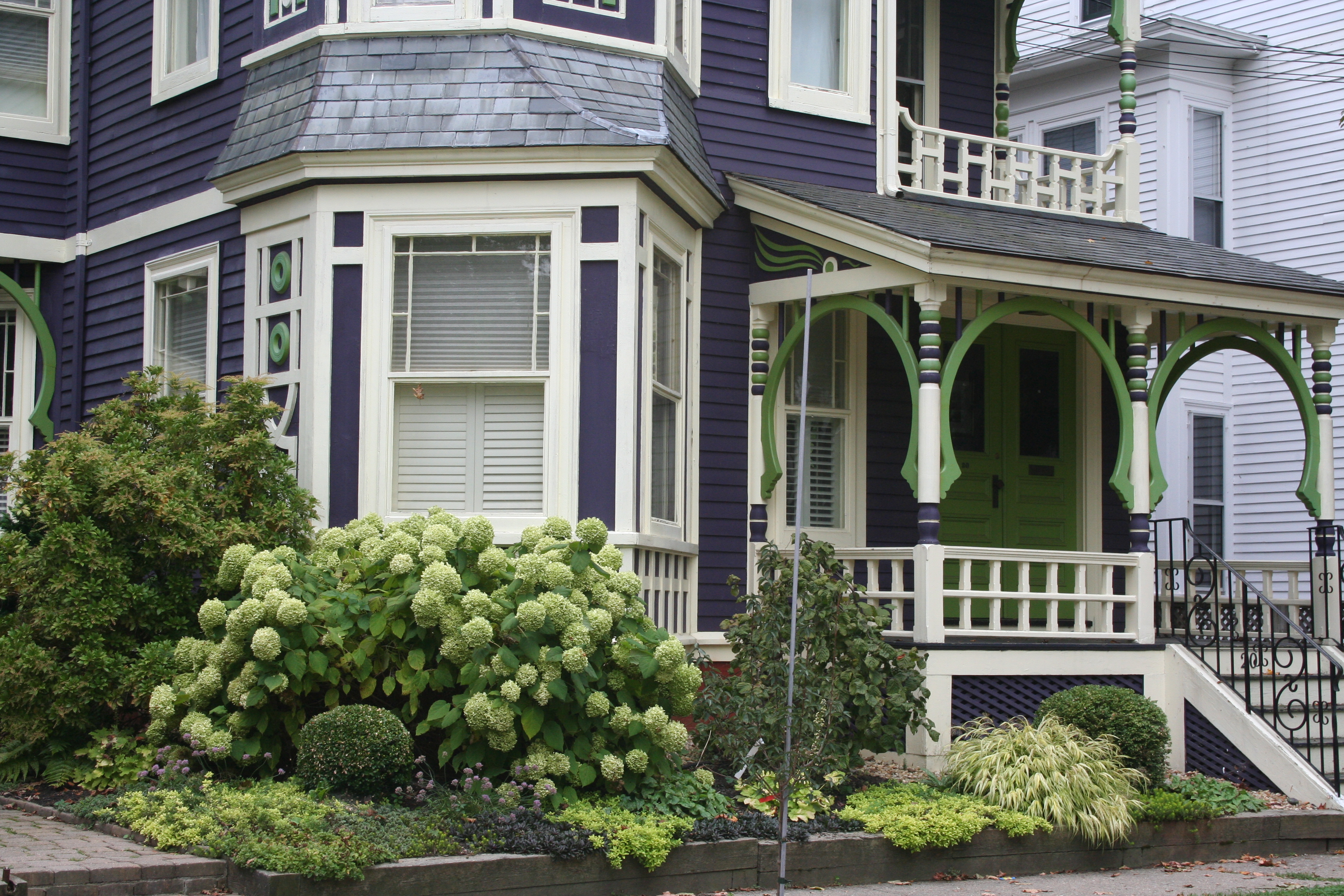 My guess? Neither. Take a close look at the roof, and the house color palette is revealed. The deep purples and greens of that slate roof present a palette the homeowners can use for their house: rich grape for the siding color tempered by a neutral cream trim and lime green for the accent color to highlight the Victorian embellishments.
But the homeowners did not stop there. To enhance the palette and spread the accent color out onto the landscape, they planted a gorgeous lime green Hydrangea coupled with other lime green plants, shrubs, and ground-cover species. Peeking out from under all that greenery is a purple flowering ground color pulling the whole look together.
Not to be matchy-matchy or anything, but this house rocks. There’s just enough contrast to keep our interest and show off the house detail without introducing new colors that might make the house too busy. Afterall, the house itself has so much detail that you wouldn’t want it to get lost in a rainbow of foundation plantings and annuals.
Choosing House Colors: Gray-Blue?
January 24, 2012 § Leave a comment
 You do not have to look very far in nature to find a palette of coordinating colors from which to pluck your house paint chips. This time we’re looking at a glassy pond reflecting the blue of the sky. This blue, however, is not a primary saturated hue but rather a complex shade that has grays and greens in it as well.
 So going to the paint store, you’ll want to move toward the muddy gray part of the fan deck and find your blue there. Stay away from the clear Crayola blues or you will end up with a house color that may in fact glow in the dark.
Look carefully at the colors around the pond and you will find your accent colors. Autumn red for the door, dark woody brown for the front step treads, crisp cloud white for the trim, and pops of golden yellow for your flower pots.
With nature as your color palette, you cannot make a mistake.
Design Star 2011 Finale
September 12, 2011 § 1 Comment
 Okay HGTV fans. This is it! The finale between Meg and Karl is on tonight. For those who don’t follow Design Star, it’s not too late to check in. Design Star has spun off several excellent designers (David Bromstad, Kim Myles) and like them or not, these designers influence TV viewers and their expectations. I see that all the time.
So who is it going to be? Meg has a lovely fresh preppy style and a bubbly on-air personality. Karl’s architectural background gives him a very professional, big-picture design. He nailed the small-cottage challenge!
Move over Candice. Here comes a new face on HGTV!

Crown Molding: A Crowning Achievement or a Hot Mess
July 15, 2011 § Leave a comment
 If lighting is the jewelry in the room, the crown molding is like a proper hem — no stitches showing. Crown molding covers the seam between wall and ceiling and adds weight and architecture to the room. And by drawing the eye upward, crown molding can create the framework for painting the ceiling something other than white. But done improperly, crown molding will lead to painting miscues and a hot mess.
I ran into just such a situation today on a high-end new construction job. The carpenter had “built up” the molding by using a couple of inches of wall between the crown at the top along the ceiling and another cheaper piece of finish molding along the bottom edge (photo shows how it’s supposed to look). The idea was to make the finished unit (crown + wall + smaller molding — all painted trim color) look like a giant (read: expensive!) piece of crown molding. What happened was that the carpenter did not finish the edges at the doorway leaving wall space exposed. The painter then came along and, not having a finished piece of molding to serve as the starting point, he (or she) drew a LINE on the wall with a pencil and started painting wall color on the other side of it. Oh…my…gosh… and this was high-end construction??
So two warnings:
If you are using crown molding, make sure you get an experienced carpenter who has the sense to finish edges. If you’re putting it up yourself, do your research first and know how you’re going to go around corners and finish edges properly.
If you are painting a wall, you must have a piece of architectural molding or the wall edge in order to move from one color to another. Never draw a vertical line on the wall to separate two colors unless you’re painting stripes. That’s it!
Phew! ‘Nuf said…
Kitchen Decisions
June 15, 2011 § Leave a comment
 And you thought picking a paint color was hard? Try a kitchen renovation. The number of decisions that have to be made seemingly all at the same time is daunting to even a seasoned renovator. What kind of cabinets? What color? What style? How many? Where to put them? What stain? What knobs? And that’s just the cabinets! Okay… before I get carried away, here’s an example of how the homeowners and I managed the decisions on their renovated kitchen.
The first decision was to pick the cabinets: white painted wood with a shaker-style door. They knew they wanted white because it was classic and would brighten up their small kitchen. Pewter knobs would be the jewelry. They also picked out their appliances: stainless steel. Next came the counter top and that’s when they called me into the project. We discussed concrete, honed granite, and soapstone and settled on soapstone as it had a nice finish and seemed appropriate to the age and style of the home. Shiny granite was out!
The next decision was what to do with the floor. They had hardwood in the adjoining living room but considered tile for the kitchen area because they had heard that it was easier to clean and was okay in wet areas. All true. But I convinced them that carrying the wood all the way through from living room to kitchen would widen the entire space and give the area a more continuous feel.
The backsplash was the next item and both homeowners wanted color. They just could not agree on what color and which material to use. I warned them that glass might be a little trendy for their brick-fireplaced kitchen and suggested they look at slate. The colors are natural and earthy and very appropriate for a slightly more rustic look in the kitchen. At the same time, the white cabinets really make the wonderful palette of earthy colors pop off the counter! The slate also looks terrific with both counter top and stainless!
Lighting was next with some recessed cans with LED fixtures around the perimeter and under-cabinet strips for task lighting, a couple of pendants over the eating areas, and a creative track system of lighting above the island. Track lighting is back! In a big way! And its flexibility makes it appealing — you can maneuver the spots anywhere you’d like them and you can change them too!
 Wall color was last on the list of decisions. We went with a rich red-orange accent wall on the other end of the kitchen by the dining area — to create a warm dining space and give the homeowner the red she craved. The rest of the walls are a gray blue that picks up on the tile and coordinates well with stainless and white.
Kitchen done. Just in time for a relaxing summer!
Choosing Colors that “Pop”
June 6, 2011 § Leave a comment
 It may seem obvious, but opposites attract. And when it comes to color, opposites attract attention! These bright orange pansies are the perfect complement to the rich azure blue ceramic basket on the front step of this home. Orange and blue are opposites on the color wheel and, because of that, they give each other a vibrant visual energy that draws your eye. Cheerful, welcoming, fun — everything you want your house to say.
The other opposites? Red with green and purple with yellow.
If you’re planning your garden, planting some annuals in pots, or painting some accent furniture for the yard or the porch, think about what colors will pop off each other. Talk about curb appeal… you’ll certainly attract some attention from the road.
When Tiling Goes Over the Top — Literally
February 16, 2011 § 3 Comments
 If you have ANY plans to sell your home within the next, say, 10 years, I do not recommend dipping your bathroom in a vat of mosaic glass tiles. I know they are stunningly effervescent especially in cool swimming pool shades of blues and greens, but my gut tells me that the extreme application of almost any material will become the “avocado green” of the next generation of home buyers.
When Leslie Marshall cautioned, “Choose your color confidently because retiling can be a costly venture,” (http://www.bhg.com/decorating/color/colors/add-color-without-paint/) she might have added that you should think twice before tiling every surface at ALL!
I know that floor-to-ceiling (including the ceiling!) tile is becoming popular in newly created “spa” bathrooms — yes, they’re easy to keep clean and they look spectacular too. Just keep in mind that somebody is going to have to chisel that color down from the rafters when the time comes to prepare your home for sale. Chances are pretty good that we will have moved our design aesthetic along to new ideas by then and your bathroom will be “just so last decade.”
The alternative? Think longevity for your bathroom. Add trendy color in ways that will be switched out easily either by you or whoever gets to whip your home into shape for resale. A little bit of tile color in the bathroom– on the floor, in the shower area, or around the mirror–will go a long way toward modernizing your bathroom without taking the room over the top.
Long-Distance Decorating! From the US to Iraq and Back!
February 15, 2011 § 2 Comments

 It’s not every day I receive a phone call from Iraq to work on a house in Atlanta but last April I did. The guy on the other end of the line had started renovating a house for his mother and was making all the decisions long-distance. Imagine that! Working with a builder on a house renovation is a challenge when you’re on-site — but from thousands of miles away? And for his mother? I was intrigued.
After the builder chose an unapproved yellow for the new addition (see Before Photo on right), my “soldier friend” (as I call him) was not pleased and asked me to come up with a new color scheme for the exterior. And we did not stop there. By way of blog posts, emails, photos, and occasional phone calls, we moved on to porch, shutters, and even the garden shed. Then we moved inside to make paint color decisions, choose light fixtures, and decide how to update the kitchen and bathroom. He sent me photos of options he found online and I gave my advice.
From Iraq to Boston to Iraq and on to Atlanta. The power of the internet is making long-distance decorating possible.
P.S. His mom loves what we’ve done so far! And she loves her son! Success!
